Configure Time Series Icons
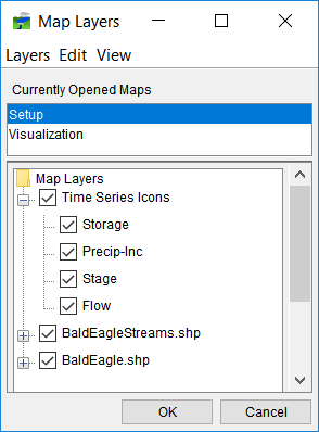
- Add three Time Series Icon Layers using the Map Layers window. These layers will be used to group time series icons either their data type.
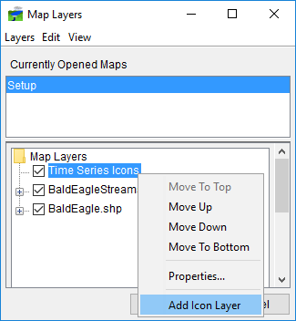
- Open Maps-> Map Layers… dialog
- As shown below Right-click on the Time Series Icons layer, and select the option Add Icon Layer. Call the layer "Flow". Repeat to add a "Precip", "Storage" and "Stage".
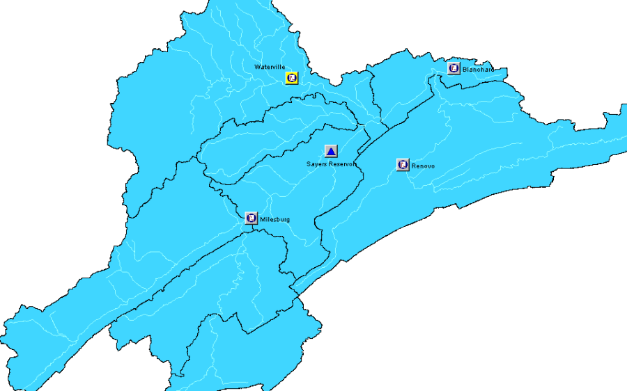
- Now, add four Time Series Icons (Renovo, Blanchard, Waterville, and Milesburg).
- Select the Time Series Icon Tool
 in the setup window.
 - Move your pointer over the map area where you would like to place an icon, then Ctrl+click. Repeat this at each location where you'd like a new Time Series Icon. Refer to Figure 1 to place a new Time Series Icon.
- Rename the icons by a right-click and select Rename
- Select the Time Series Icon Tool
- We will now add the Reservoir Icon (Sayers Reservoir).
- This will use the same three steps in the time series icons above but we will also right-click on the icon and select edit.
- Within the Time Series Icon Editor, there is an Icon option and we will change this to "Reservoir"
- Configure your new TS Icons
To configure each icon, right-click on it and choose edit from the context menu. The following properties dialog window will appear: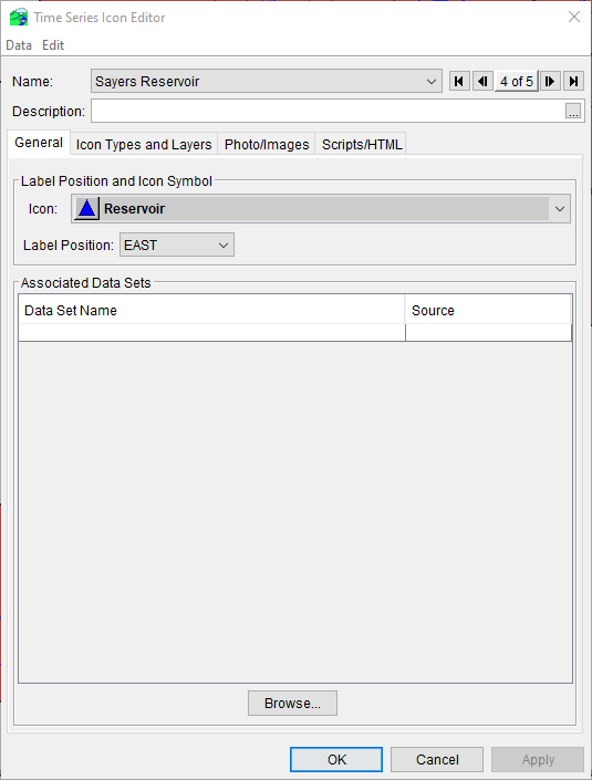
Sayers Reservoir Icon:
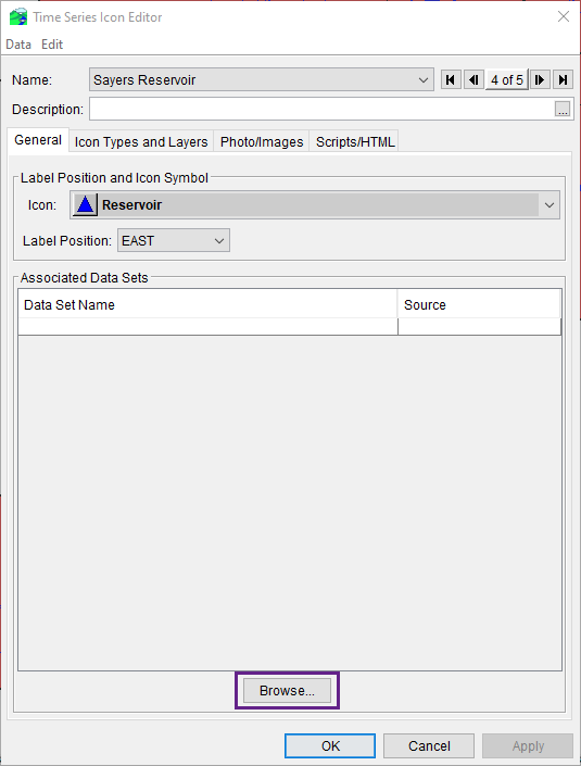
- Double click on the Sayers Reservoir icon to open its editor and change its icon to the reservoir symbol -

- Assign DSS Data to the icon:
- Select Browse... towards the bottom of the Time Series Icon Editor. This will open a DSSVue interface
- Open the DSS data file that contains our watershed's data. The data is located: HEC-RTS Data Visualization\DSS\BaldEagleDemo.dss
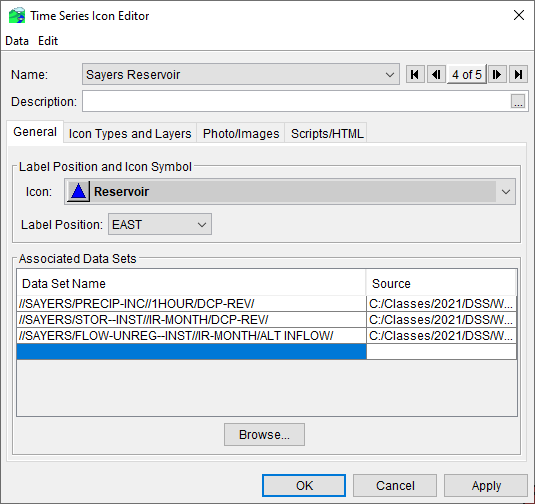
- Find and select the three pathnames listed below:
//SAYERS/PRECIP-INC//1HOUR/DCP-REV/
//SAYERS/STOR--INST//IR-MONTH/DCP-REV/
//SAYERS/FLOW-UNREG--INST//IR-MONTH/ALT INFLOW/
- Once all three pathnames have been selected in DSSVue press the Add Pathnames. You can close out of the DSSVue interface and select Apply on the Time Series Icon Editor to commit the changes. Your time series icon's editor should now look like:
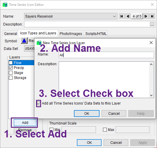
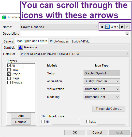
- Set the Icon's Types and Layers
Press the Icon Types and Layers tab:
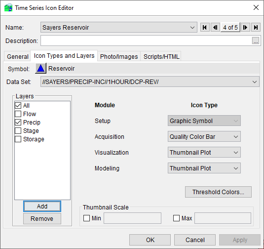
Pay attention to the c-part of the DSS file name. This will direct you as to which layer to include the data set.
Sayers Icon Data Sets Icon Type for the Data Visualization Module TS Icon Layer //SAYERS/PRECIP-INC//1HOUR/DCP-REV/
Thumbnail Plot Precip & All (discussed in next step) //SAYERS/STOR--INST//IR-MONTH/DCP-REV/ Thumbnail Plot Storage & All (discussed in next step) //SAYERS/FLOW-UNREG--INST//IR-MONTH/ALT INFLOW/ Thumbnail Plot Flow & All (discussed in next step) - We will also create a new layer labelled "All". When creating this label, we will select the button on the New Time Series Icon Layer Add all Timer Series Icons' Data Sets to this Layer.
- Your Time Series Icon Editor should look like the following now.
Waterville Icon:
- Double click on the Waterville icon to open its editor and change the label position to NORTHWEST.
- Also, if you did not close the Time Series Icon Editor from the prior steps, you can use the arrow icons to scroll through the icons
- Also, if you did not close the Time Series Icon Editor from the prior steps, you can use the arrow icons to scroll through the icons
- Assign DSS Pathnames to the icon:
//WATERVILLE/PRECIP-INC//1HOUR/DCP-REV/ Set the Icon's Types and Layers:
Sayers Icon Data Sets Icon Type for the Data Visualization Module TS Icon Layer //WATERVILLE/PRECIP-INC//1-HOUR/DCP-REV/
Thumbnail Plot Precip & All
Milesburg Icon:
- Double click on the Milesburg to open its editor
- Assign DSS Pathnames to the icon:
//MILESBURG/FLOW-UNREG--INST//1HOUR/DCP-REV/ - Set the Icon's Types and Layers:
This is going to be a Threshold Color Bar icon (change the Icon Type for Visualization to Threshold Color Bar), you'll need to set the colors for each threshold range. To do that, you'll need to select Threshold Colors… (lower right side of the Time Series Icon Editor window). Choose the "Regular Thresholds" for the Color Bar Type and set the Lower and Upper threshold limits so that you'll see green if the flow is below 1,000 cfs, red if it's above 2,000 cfs, and yellow if it's between these values.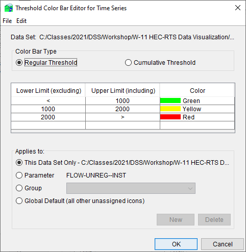
Renovo Icon:
- Double click on the Renovo icon to open its editor.
- Assign DSS Pathnames to this icon:
//RENOVO/PRECIP-INC//1HOUR/DCP-REV/ Set the Icon's Types and Layers:
Sayers Icon Data Sets
Icon Type for the Data Visualization Module TS Icon Layer //RENOVO/PRECIP-INC//1HOUR/DCP-REV/
Thumbnail Plot Precip & All
Blanchard Icon:
- Double click on the Blanchard icon to open its editor.
- Assign DSS Pathnames to the icon:
//BLANCHARD/FLOW-REG--INST//IR-MONTH/DCP-REV/
//BLANCHARD/STAGE--INST//IR-MONTH/DCP-REV - Set the Icon's Types and Layers:
Sayers Icon Data Sets | Icon Type for the Data Visualization Module | TS Icon Layer |
|---|---|---|
//BLANCHARD/FLOW-REG-INST//IR-MONTH/DCP-REV/ | Thumbnail Plot | Flow & All |
| //BLANCHARD/STAGE-INST//IR-MONTH/DCP-REV/ | Thumbnail Plot | Stage & All |
When finished configuring all the time series icons, Save the Watershed and switch to the Data Visualization module.