Creating a CAVI Dashboard Configuration to Help with Model Calibration
Tutorial Data
Download and unzip the following file within your CAVI project directory. The project already contains a forecast. CWMS version 3.4.1 was used to create this example.
Objective
The goal of this tutorial is to show you how to setup a CAVI Dashboard configuration that you can use to display modeling results for multiple locations within the watershed. Use of the dashboard is a quicker way to access results from multiple locations than selecting the elements in the CAVI map individually and opening results.
This tutorial focusses on HEC-HMS model results and demonstrates a workflow where you only need to open results from the CAVI dashboard and the HEC-HMS Combined Parameter Editor in order to calibrate your HEC-HMS model. Please refer to HEC-HMS Model Calibration in CWMS to see information about the watershed used for the example and a step by step process for how to calibrate an HEC-HMS model.
Steps
- Open the CAVI watershed, Workshop_HEC_RussianRiver.
- You can only configure a Dashboard configuration from an active forecast. Once the dashboard has been configured, it can be applied to any existing or new forecast. Open the forecast named HEC-HMS Model Calibration in CWMS.
- Run the forecast through HEC-HMS. We need results in the HEC-HMS output DSS file in order to select them from the CAVI Dashboard.
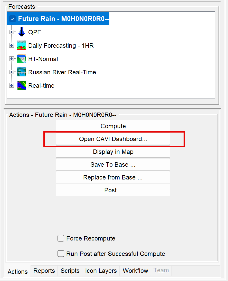
- Select the Future Rain forecast and then click the Open CAVI Dashboard button in the Actions pane as shown below.
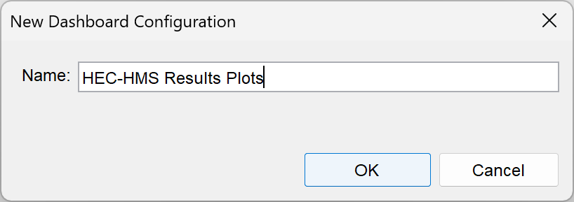
- Within the Dashboard editor, go to the File menu and click New Configuration. Name the new dashboard configuration HEC-HMS Results Plots and click OK.
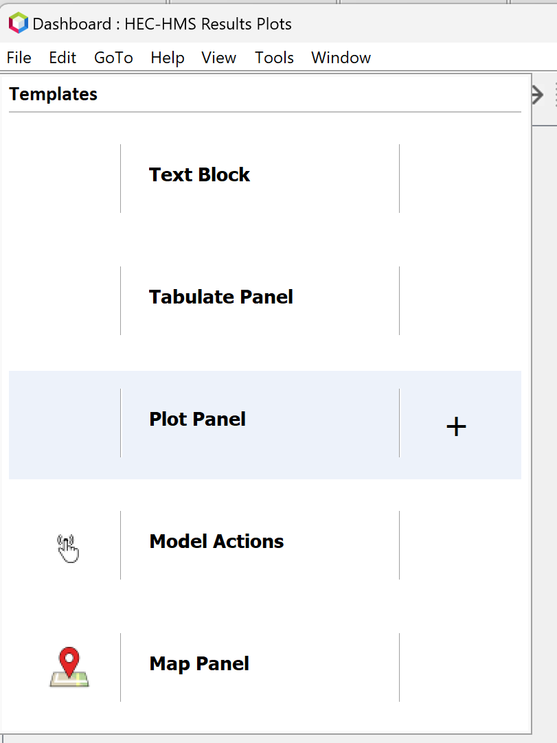
- With a dashboard configuration selected, go to the File menu and choose Add Widget. Select Plot Panel as shown below.
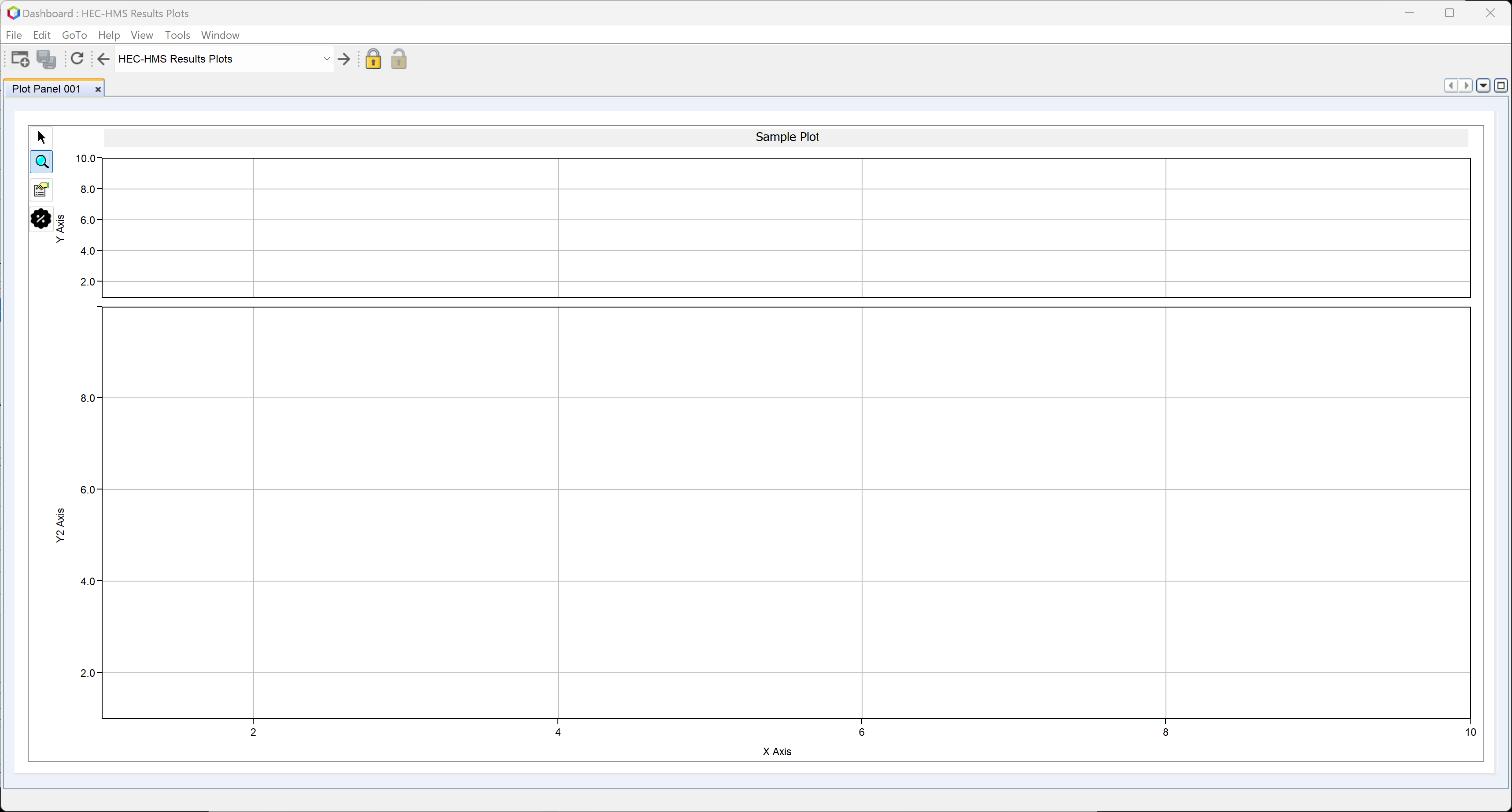
- You should see an empty plot panel tab as shown below.
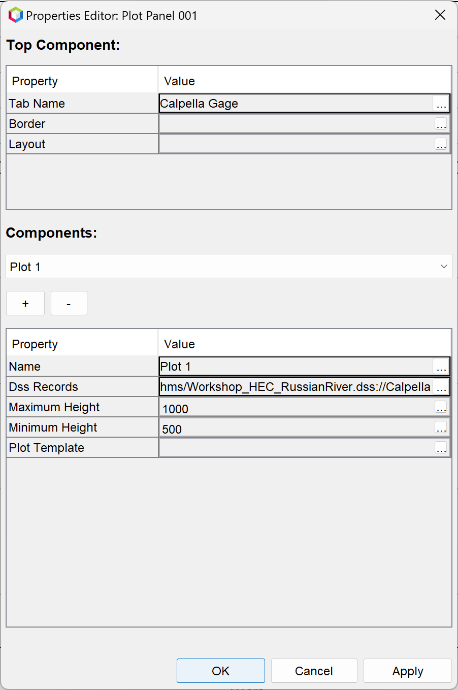
- Right click on the Plot Panel 001 tab and select Properties. The Properties Editor has a Top Component panel where you can change the name of the tab. As shown below, the tab was renamed Calpella Gage. This location has simulated and observed streamflow upstream of Coyote reservoir.
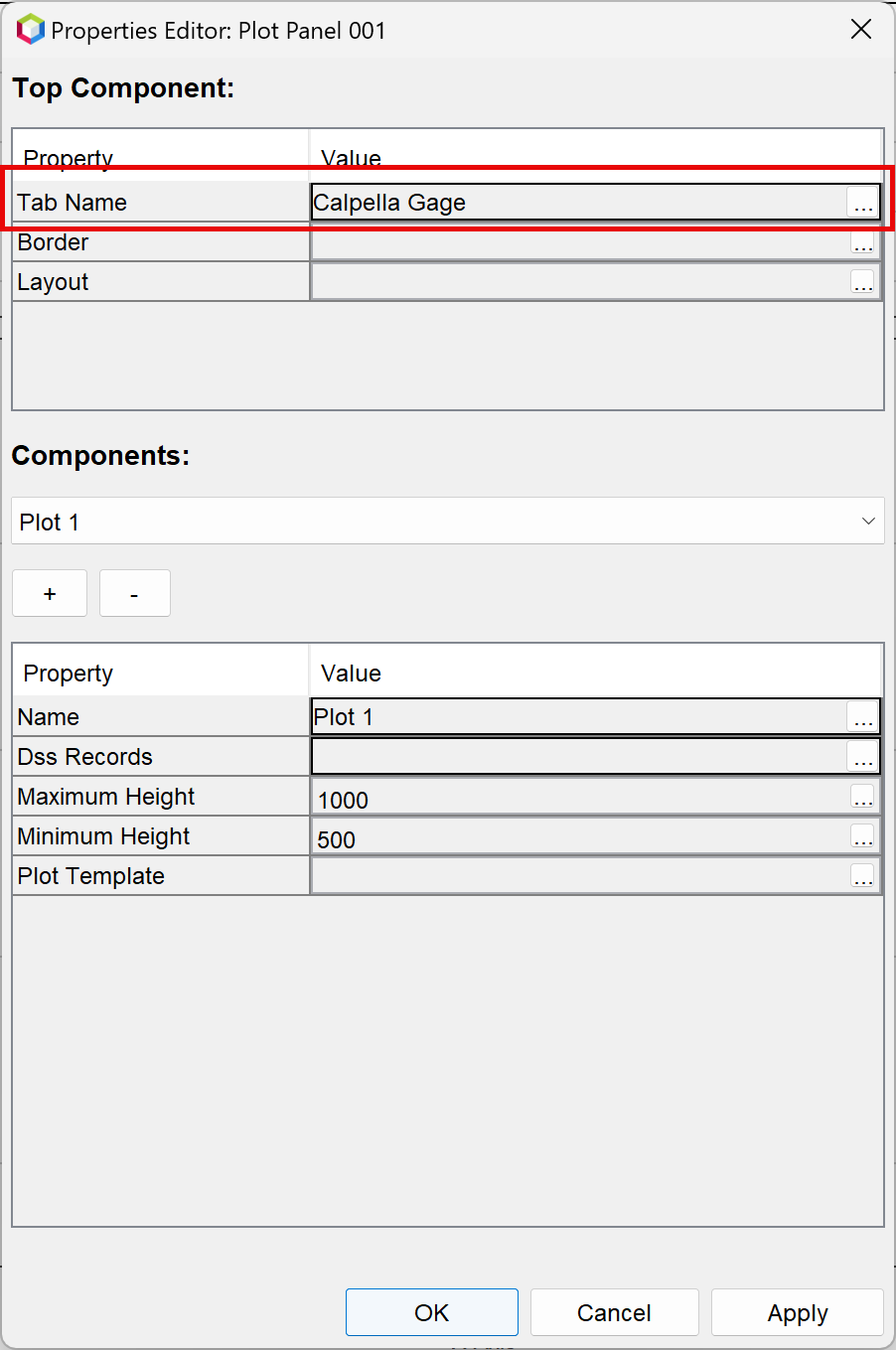
- In the Components panel, you can select the DSS records to be displayed in the plot. For this example, results from the HEC-HMS forecast DSS file were selected (not the Forecast.dss file). When running a simulation from the HEC-HMS combined parameter editor (accessed from the CAVI), results are only saved to a DSS file in the HMS folder. You have to run the HEC-HMS forecast from the CAVI in order for results to be copied into the forecast.dss file. Click the three ellipses in the Dss Records row to open the Pathname Selector editor shown below.
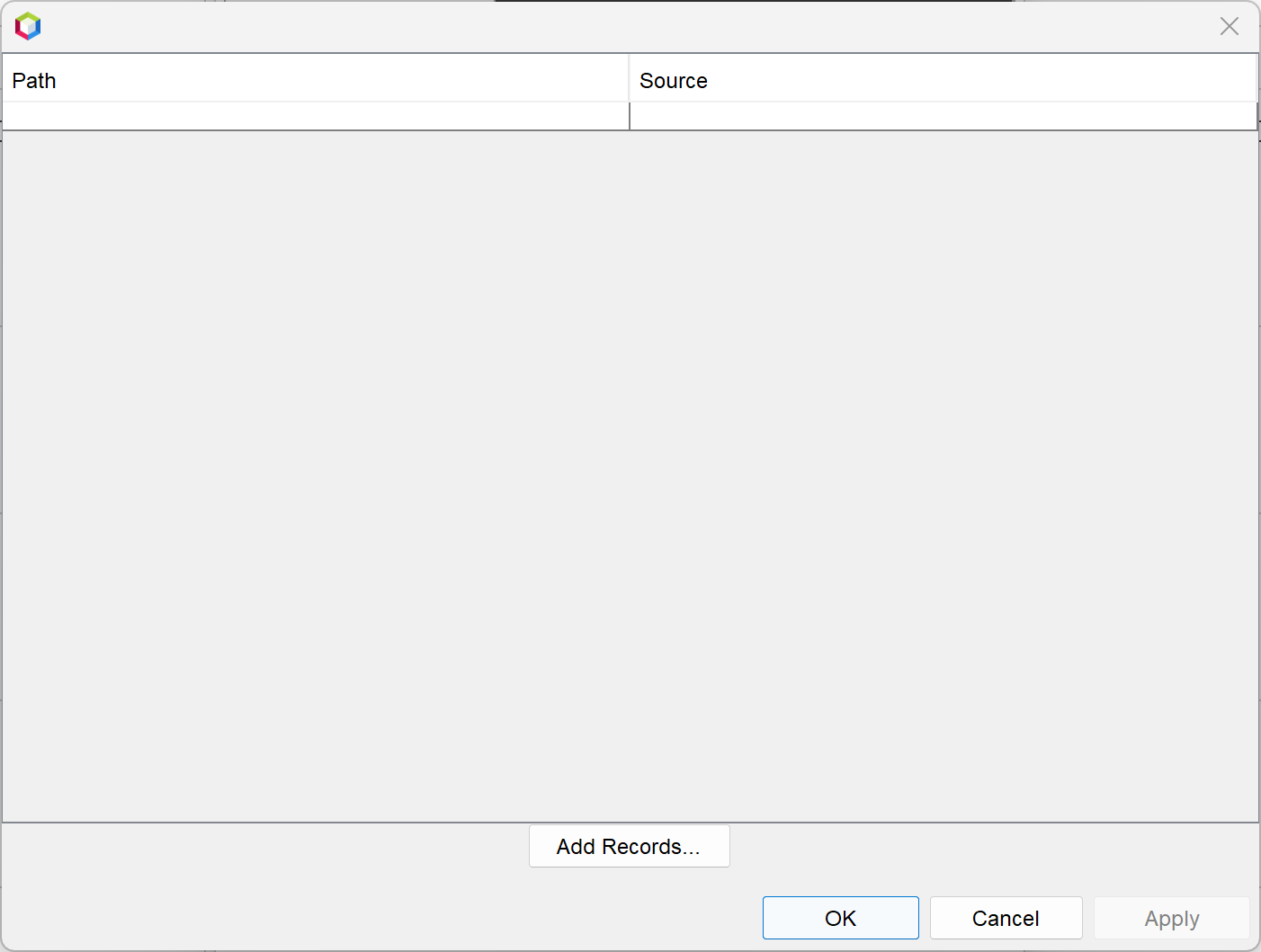
- Click the Add Records button to open a DSS file selector and pathname chooser. Navigate to the forecast's hms folder and select the Workshop_HEC_RussianRiver DSS file as shown below.

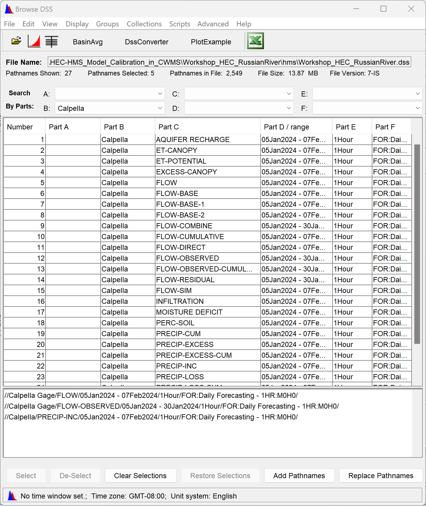
- Use the B-part pathname chooser and select Calpella Gage. Double click the FLOW and FLOW-OBSERVED records. Change the B-part to Calpella and choose the PRECIP-INC record. Once the records have been selected, click the Add Pathnames button as shown below.
- You should get a Change Pathname F Parts dialog, as shown below. Click Yes to ignore the f-part pathname. Ignoring the f-part pathname allows the dashboard configuration to be usable across multiple forecast alternatives.

- As shown in the figure below, click Apply in the Pathname Selector editor. Then click the OK button to close the editor.
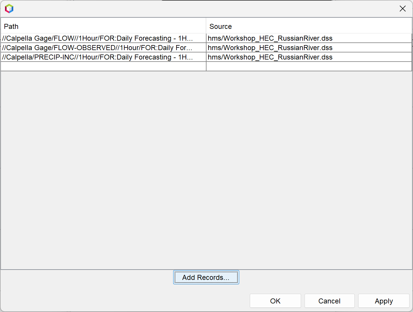
- As shown below, click Apply and OK to close the Widget Properties editor.
- The plot panel should look like the following figure. The simulated and observed streamflow are plotted in the upper graph and the subbasin average precipitation is plotted in the bottom graph.
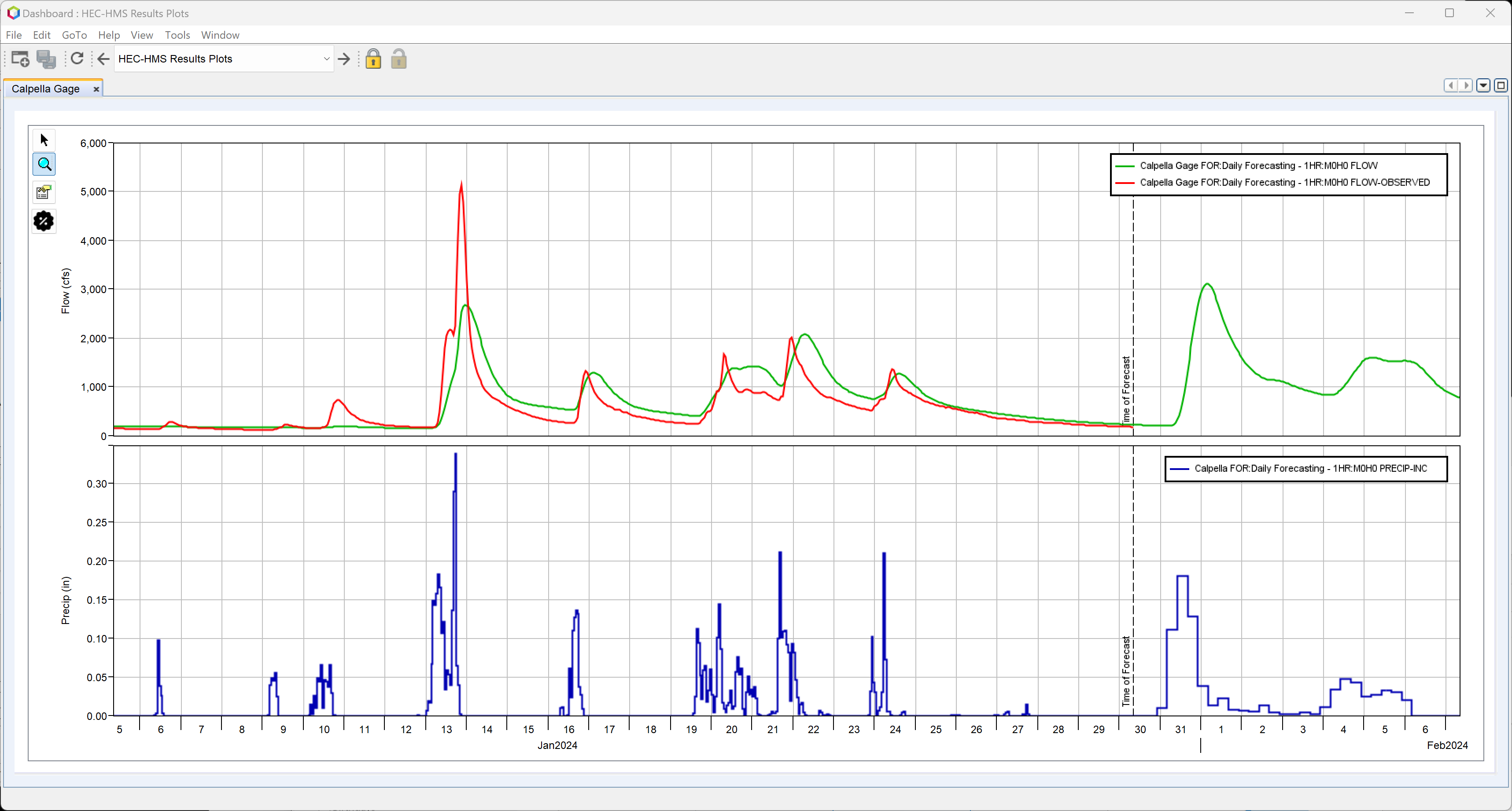
- You can customize the look and feel of the plot by clicking the plot panel properties button (below the magnifying glass on the upper left side of the plot window). You can also set the viewport weights by clicking the black gear icon button located below the plot panel properties button. Edits made to the plot displayed in the CAVI dashboard will persist between different forecasts; however, the formatting will be modified if time-series records displayed in the plot are missing when the plot is opened.
- As shown in the figure below, the following changes were made to the plot:
- The line style was changed for all time series.
- The legend was moved to the bottom of the panel.
- The viewport with flow results was assigned a weight of 75 percent and the viewport with precipitation was assigned a weight of 25 percent.

- As shown in the figure below, the following changes were made to the plot:
- Following steps as shown above, add additional plot widgets for Lake Mendocino (Coyote reservoir) and Lake Sonoma (Warm Springs reservoir) to plot simulated and observed reservoir elevation. As shown in the figure below, rename the plot tabs and configure the draw properties using similar conventions as step 16.
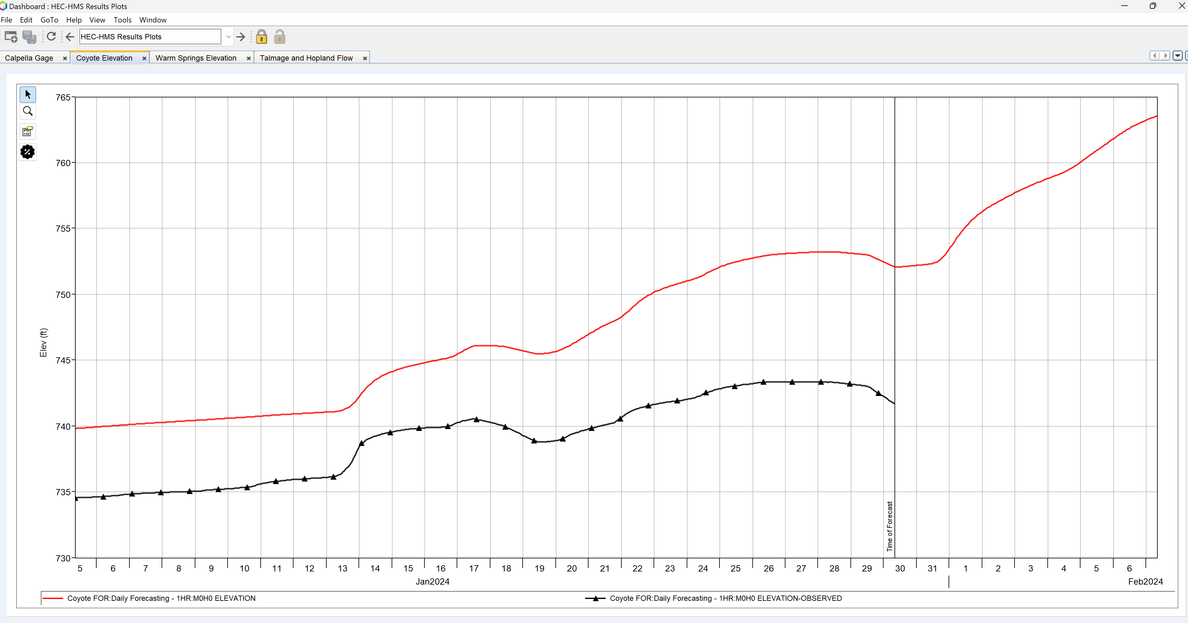
- Add one more plot widget. As shown below, name the tab Talmage and Hopland Flow. This widget will have multiple plot components. Within the Components area of the properties editor, rename Plot 1 to Talmage and select the FLOW and FLOW-OBSERVED time-series in the HMS output DSS file at the Talmage Gage location.

- Click the plus sign in the Components portion of the properties editor to add another plot. Rename this second plot to Hopland and select the FLOW and FLOW-OBSERVED time-series in the HMS output DSS file at the Hopland Gage location.
- As shown below, edit the maximum (500) and minimum (250) height for both the Hopland and Talmage locations in order for the plots to both display fully. Also, edit the plot line styles following similar conventions.

- You can re-arrange the plot widgets so they are displayed simultaneously within one window. Grab the Coyote Elevation tab and move it down and to the left as shown below.
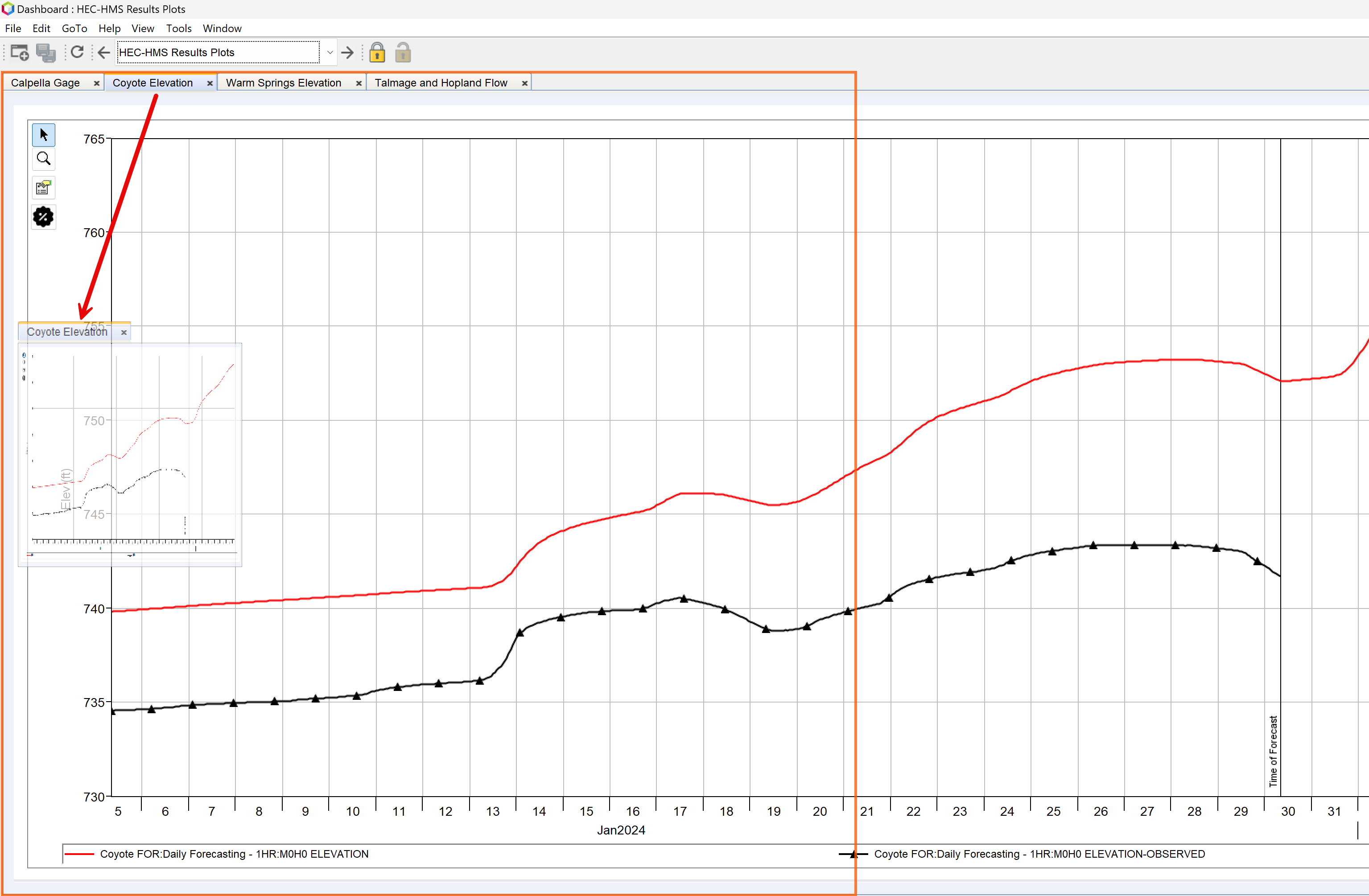
The dashboard configuration should look like the following after the Coyote Elevation tab was moved.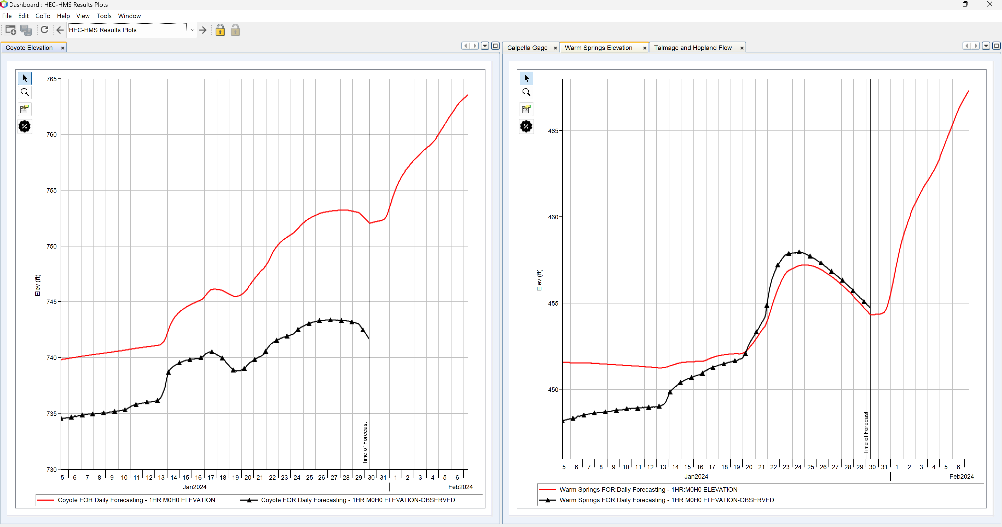
- Keep moving the tabs around until you have the plots configured as shown below. As shown in step 20, you will need to modify the minimum and maximum height for the plots to completely show results. You can also modify the font size for the legend and axis labels using the Plot Panel Properties editor (go to the Curves | Legend Item tab to increase the font size used in legends, go to Axis | X1 or Y1 | Axis Label and Tics tabs to increase the font size for axis units an labels). The final layout could look like the figure below.
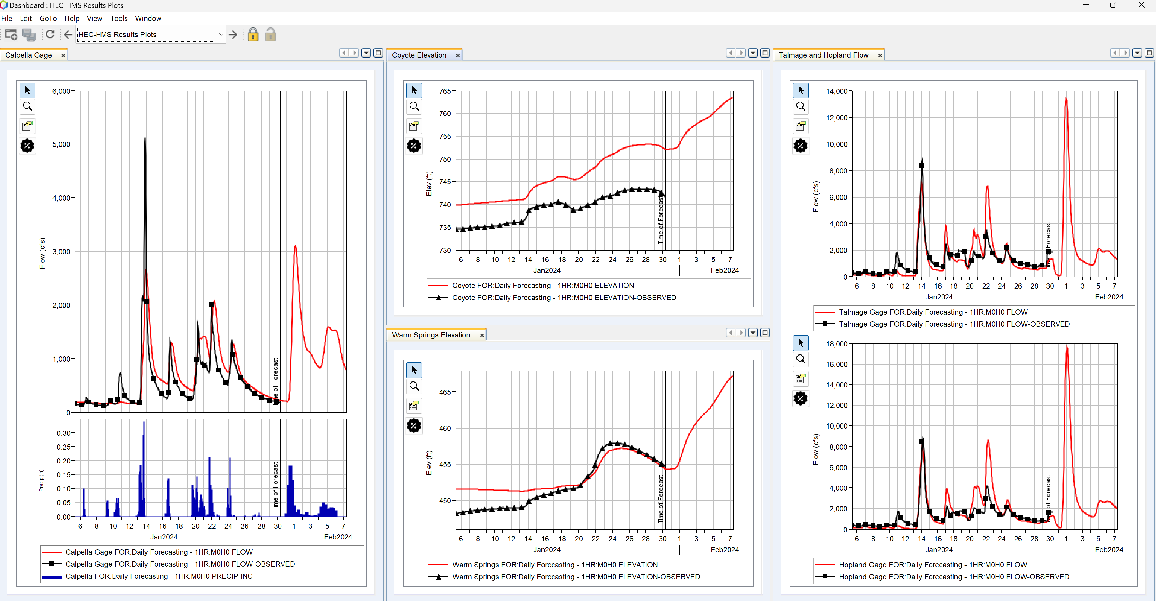
- If you are familiar with calibrating an HEC-HMS model and the options available with the combined parameter editor, try adjusting parameter overrides in the combined parameter editor for the Coyote, Upper, and Warm Springs zones to improve results (also use the Reservoirs tab to set the initial elevation).

The dashboard we configured would be available for any new forecasted created in the future. The program ignores the f-part names, which means the dashboard could be applied to forecast alternatives with different names (or alterative keys).
Download a copy of the solution watershed:
