Creating a Custom Dashboard Configuration
Overview
This tutorial demonstrates how to configure a Dashboard in HEC-RTS to display modeling results from multiple locations within a watershed. Using the Dashboard provides a faster and more efficient way to view results compared to manually selecting individual elements from the map window. It also offers customizable time-series plots, giving users greater flexibility than the default plot options.
The focus of this tutorial is on HEC-HMS model results. It introduces a streamlined workflow where you only need to use the Dashboard and the HEC-HMS Combined Parameter Editor to calibrate your model. By viewing results for multiple locations in the Dashboard, you can make informed adjustments to key parameters like initial soil moisture.
For more information about the example watershed and step-by-step calibration instructions, refer to HEC-HMS Model Calibration in CWMS.
Tutorial Data
Download and unzip the following file within your HEC-RTS watershed directory. (need more instructions here on exactly where to place the files?)
CWMS 3.4.1 was used to create this tutorial.
Step 1: Run the Forecast through the HEC-HMS Alternative
Dashboard configurations can only be created from an active forecast. Once configured, a Dashboard can be reused with any existing or future forecast.
- Launch HEC-RTS and open the Workshop_HEC_RussianRiver watershed provided with the tutorial data.
- Go to the Modeling tab and open the forecast titles HEC-HMS Model Calibration in CWMS.
- Right-click on the HEC-HMS alternative named Daily Forecasting - 1HR and select Compute Through Daily Forecasting - 1HR from the context menu.
Step 2: Launch the Dashboard
Now that you've run the forecast through HEC-HMS, it's time to launch the Dashboard.
- Select the Future Rain forecast.
- From the Actions tab, click Open CAVI Dashboard.
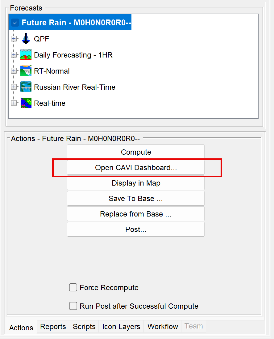
- The Dashboard will now open.
Step 3: Create a New Dashboard Configuration
- In the Dashboard, go to the File menu and select New Configuration.
- In the New Dashboard Configuration dialog, enter the name HEC-HMS Results Plots.
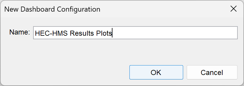
- Click OK to create the configuration.
Step 4: Add and Configure a Plot Panel Widget
You’ve created a new Dashboard configuration, but it’s currently empty. Now, it’s time to start adding widgets to populate your Dashboard.
To add a plot panel:
- Go to the File menu and choose Add Widget.
- From the Templates list, select Plot Panel.
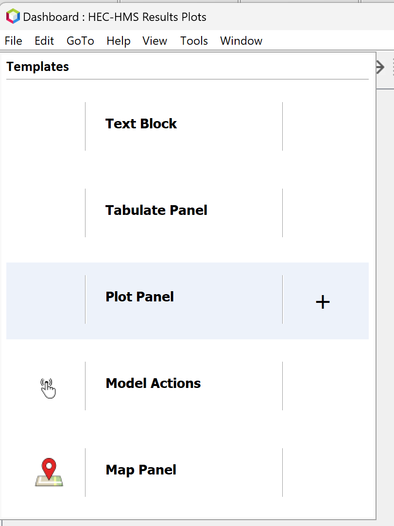
- Click outside the Templates window to close it and return to the Dashboard workspace.
- You should now see an empty plot panel tab as shown below.
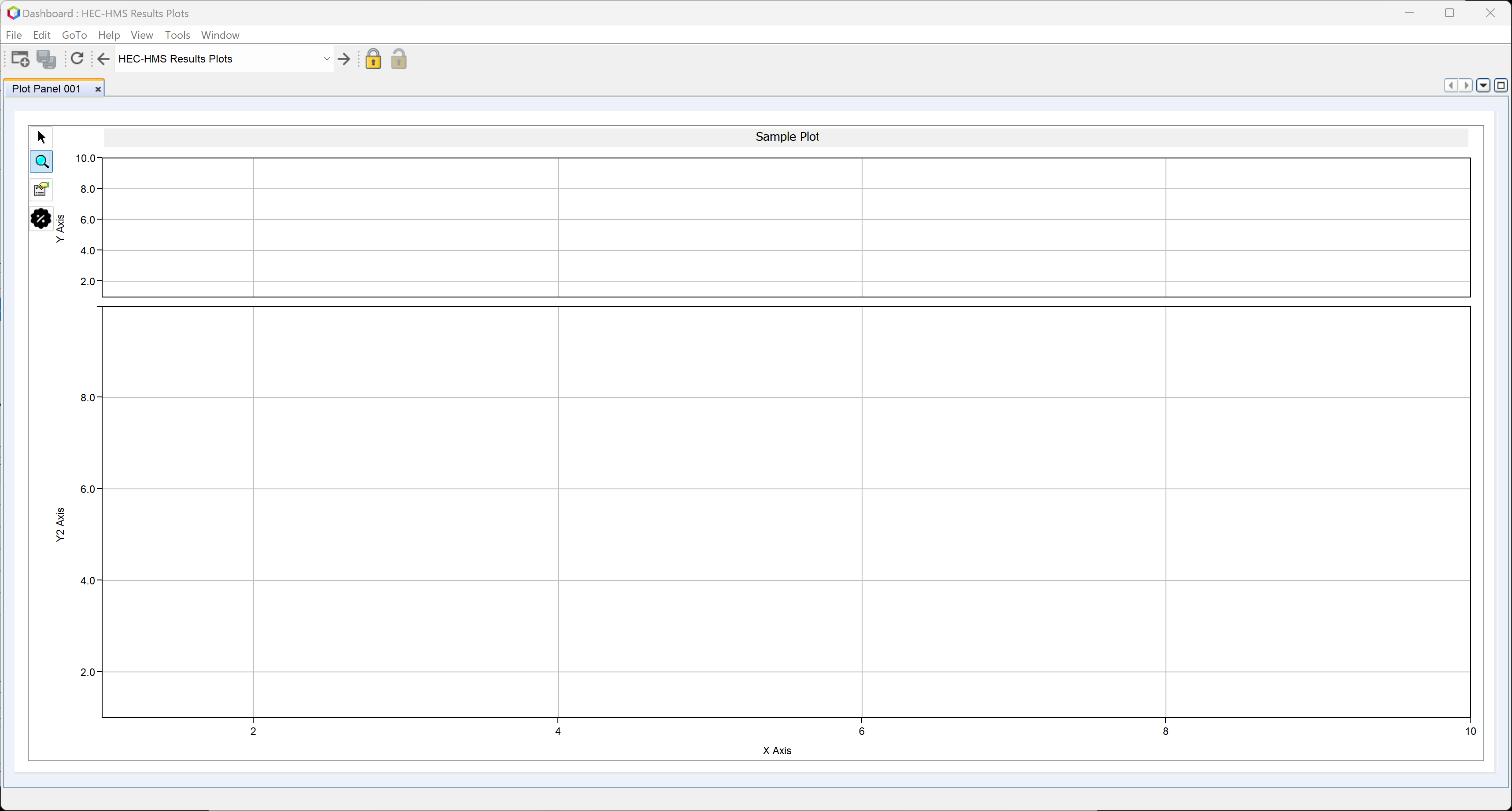
- Right-click the tab labeled Plot Panel 001 and select Properties.
- The Properties Editor will open.
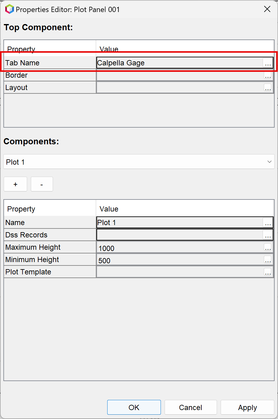
- In the Top Component panel, double-click the Value field next to Tab Name to open the text editor.
- Alternatively, click the ellipsis (...) to open the editor.
- Rename the tab to Calpella Gage and click OK.
- The updated tab name will now appear in the Properties Editor.
Step 5: Add Data to the Plot Panel
To add data to your plot panel:
- In the Components panel, click the ellipsis (…) next to the Dss Records field.
- The Pathname Selector dialog will open.
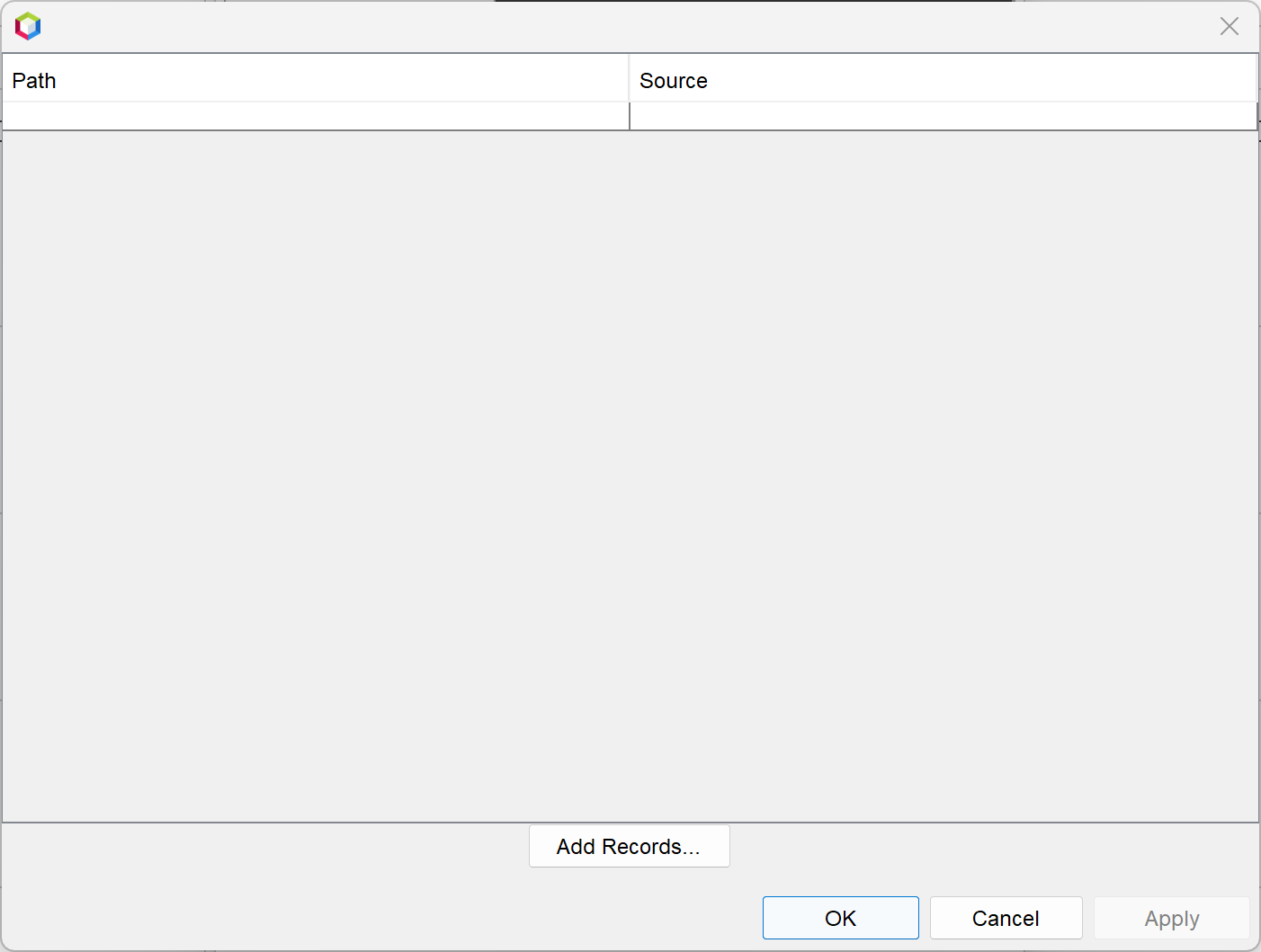
- Click Add Records to open the Open HEC-DSS File dialog.
- Navigate to the forecast's hms folder and select the Workshop_HEC_RussianRiver.dss file. Click Open.

- In the Browse DSS dialog:
- Use the B Part chooser to select Calpella Gage.
- Double-click the FLOW and FLOW-OBSERVED records to add them.
- Change the B Part to Calpella and select the PRECIP-INC record.
- The three selected records should appear at the bottom of the window.
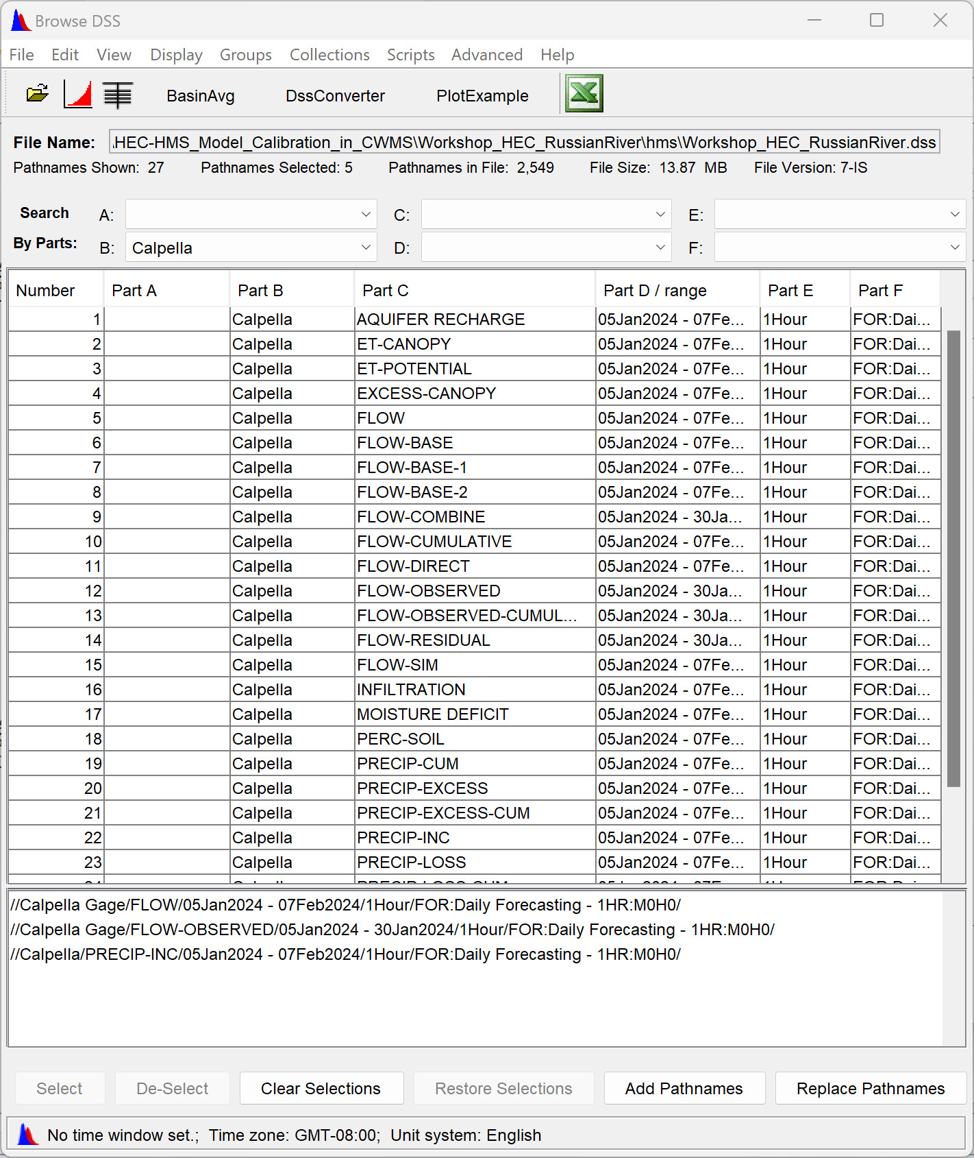
- Click the Add Pathnames button.
- When prompted with the Change Pathname F Parts dialog, click Yes to ignore the F Part. (This allows the configuration to be reused across different forecast alternatives).

- Close the Browse DSS dialog.
- In the Pathname Selector, click Apply, then OK.
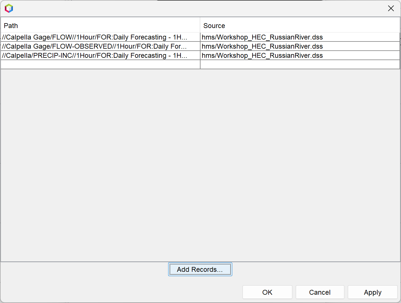
- Back in the Properties Editor, the Dss Records field will now display the selected file and pathnames.
- Click Apply to display the data in the plot panel, then click OK to close the dialog.
The plot panel will now display:
- Simulated and observed streamflow in the upper graph.
- Subbasin average precipitation in the lower graph.
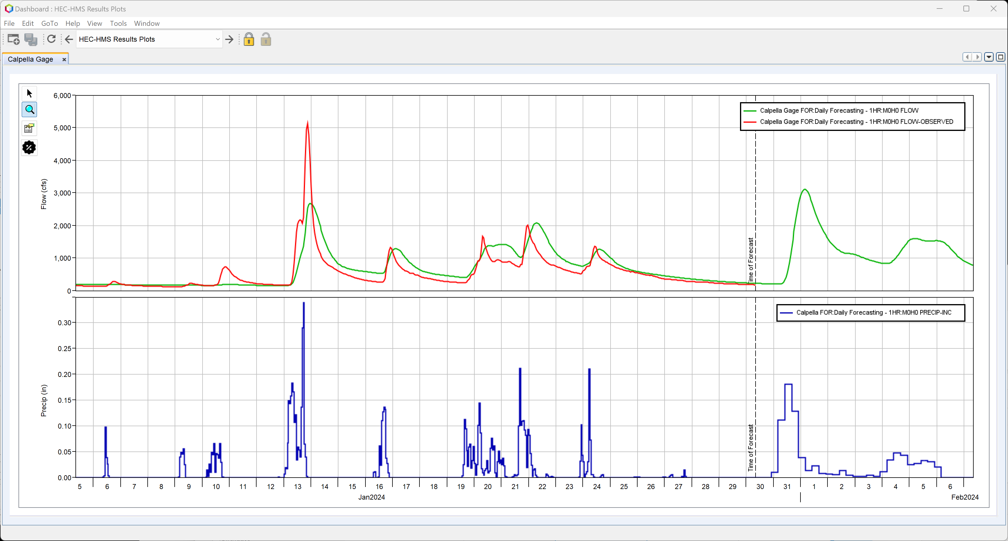
Step 6: Format the Initial Plot
You can customize the appearance of the plot panel to better suit your preferences. Formatting changes will be retained across forecasts, but may reset if any of the time-series data used in the plot is missing when the configuration is opened.
To format plot panel components:
- Click the Plot Panel Properties button (located just below the magnifying glass in the top-left corner of the plot panel).
- The Plot Panel Properties dialog will open.

- Use this dialog to edit plot components such as:
- Line styles and colors for curves
- Plot title
- Axis labels and scaling
- Legend position and appearance
- After making your changes, click Apply, then OK to close the dialog.
To adjust the size (weight) of each viewport in the plot:
- Click the Gear icon located just below the Plot Panel Properties button.
- The Set Plot Viewport Weights dialog will appear.

- Enter the desired percentage weights for each viewport.
- The total of all weights must equal 100%.
The following changes were made to the example plot panel shown below:
- Line styles for all time series were customized.
- The legend was moved to the bottom of the panel.
- The flow viewport (Viewport 0) was set to 75% of the panel height.
- The precipitation viewport (Viewport 1) was set to 25%.

This formatting enhances readability and emphasizes the most critical data in your analysis.
Step 7: Add Reservoir Elevation Plots
Next, you'll add plot panels for two reservoirs in the watershed: Lake Mendocino and Lake Sonoma.
Follow the same steps outlined in Steps 4 and 5, complete the following:
- Create two new plot panels:
- One for Lake Mendocino (Coyote Reservoir)
- One for Lake Sonoma (Warm Springs Reservoir)
- Add the following data to each panel:
- Simulated Reservoir Elevation (ELEVATION dataset)
- Observed Reservoir Elevation (ELEVATION-OBSERVED dataset)
Once added, your Dashboard should display separate tabs for each reservoir, with time-series plots showing both simulated and observed elevation data.
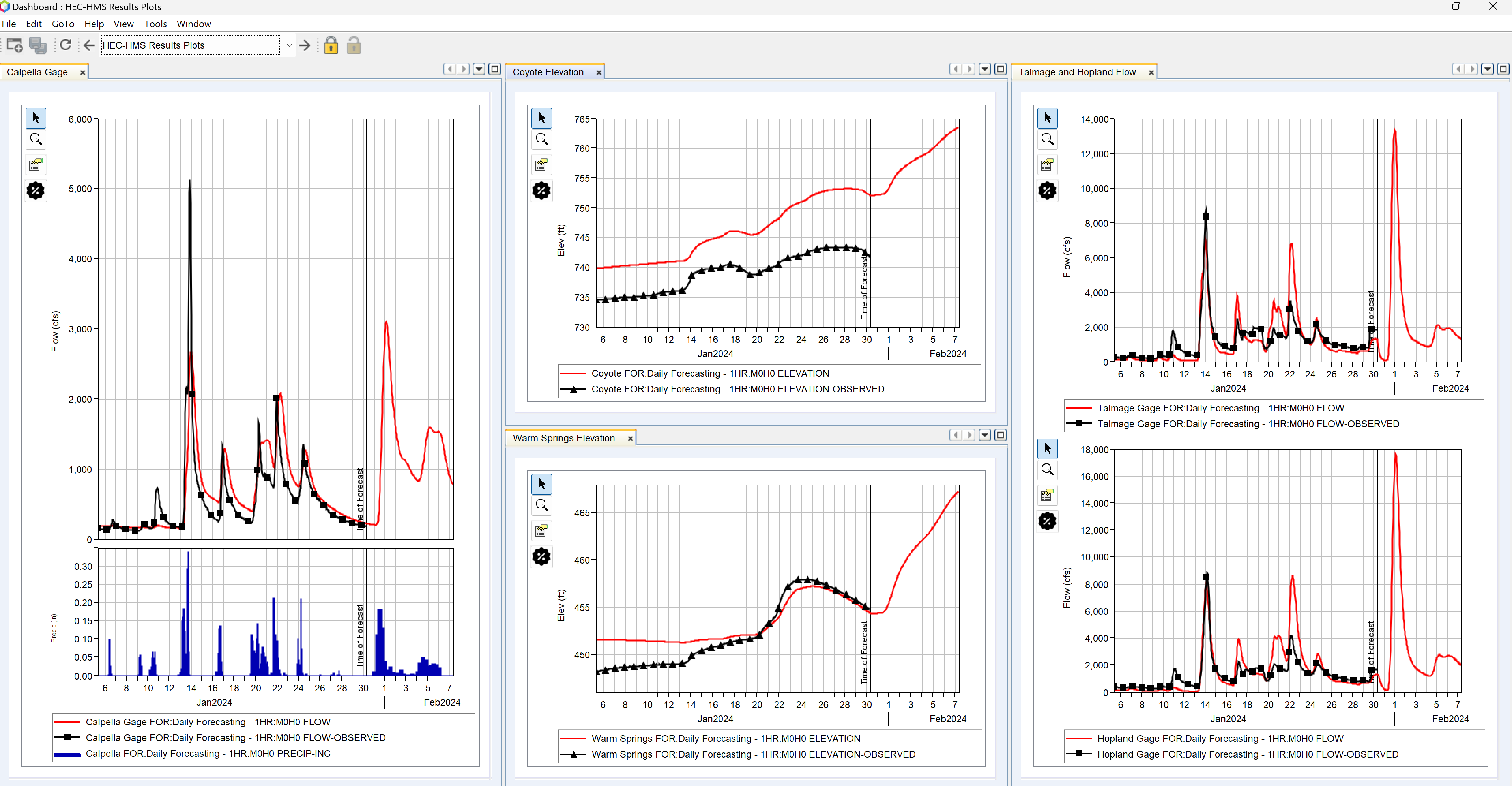
Your completed Dashboard might now look similar to the example below.
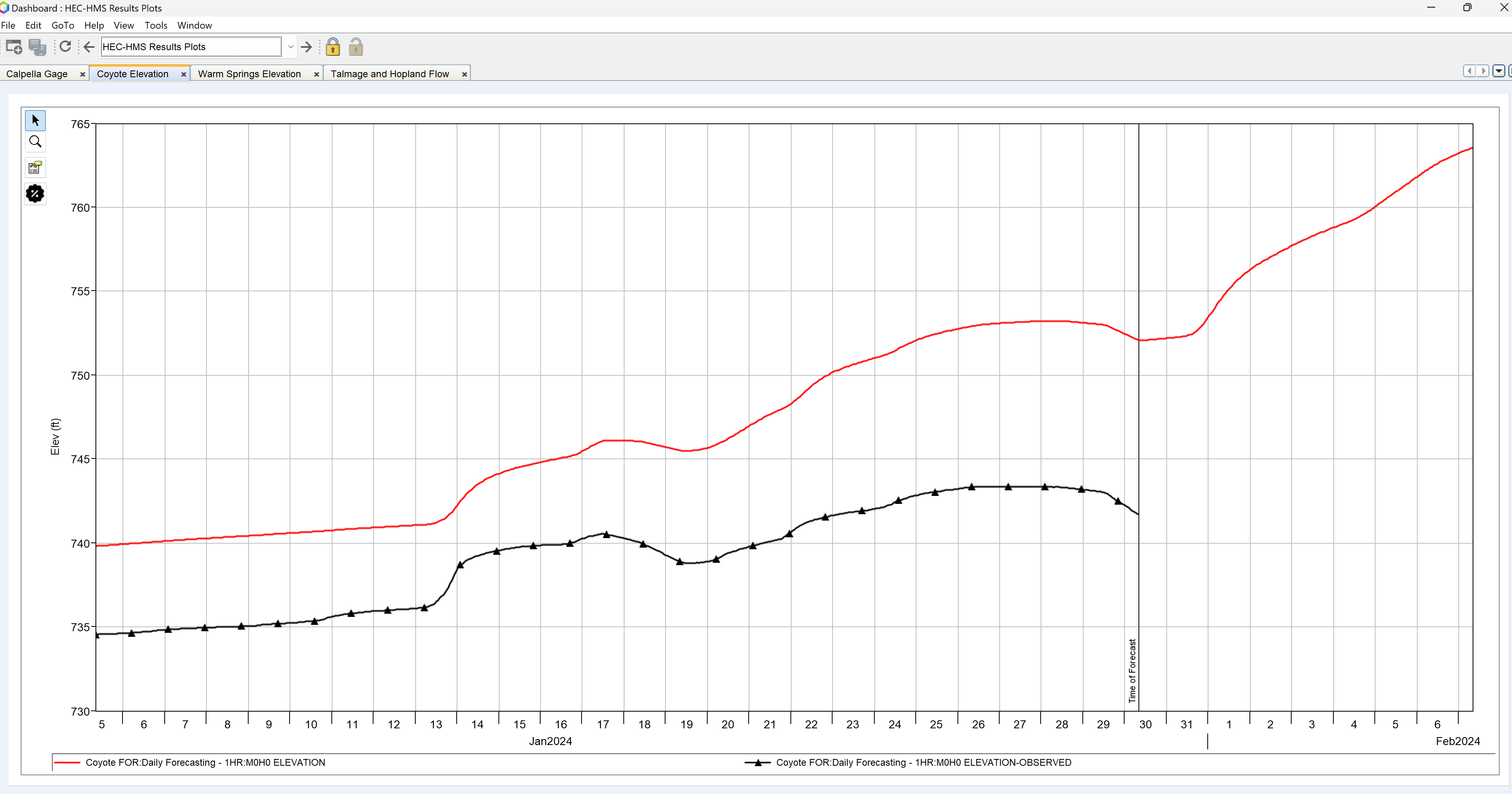
Step 8: Add Plots for Talmage and Hopland
In this step, you’ll add a new plot panel to the Dashboard that includes multiple components—specifically, simulated and observed flows for both the Talmage and Hopland gage locations.
To add the new plot panel:
- Go to the File menu, click Add Widget and select Plot Panel.
- Rename the new tab to Talmage and Hopland Flow.
- In the Components section, rename Plot 1 to Talmage.

- From the same DSS file used in Step 5, select the FLOW and FLOW-OBSERVED time-series for the Talmage Gage.
- When prompted to use % for model F Parts, click Yes to ensure compatibility across forecasts.
To add the second component to the plot:
- In the Components section, click the plus (+) icon to add a new plot component.
- Rename this new plot to Hopland.
- Again using the same DSS file, select the FLOW and FLOW-OBSERVED time-series for the Hopland Gage
- When prompted to use % for model F Parts, click Yes to ensure compatibility across forecasts.
You should now see a combined plot panel with two vertically stacked flow plots—one for each gage—showing both simulated and observed data.
Step 9: Arrange the Dashboard Layout
To improve visibility and efficiency, you can rearrange plot panels and other widgets so that multiple plots are visible at once—removing the need to switch between tabs.
To customize the layout:
- Click and drag the Coyote Elevation tab downward and to the left, as shown in the example below.
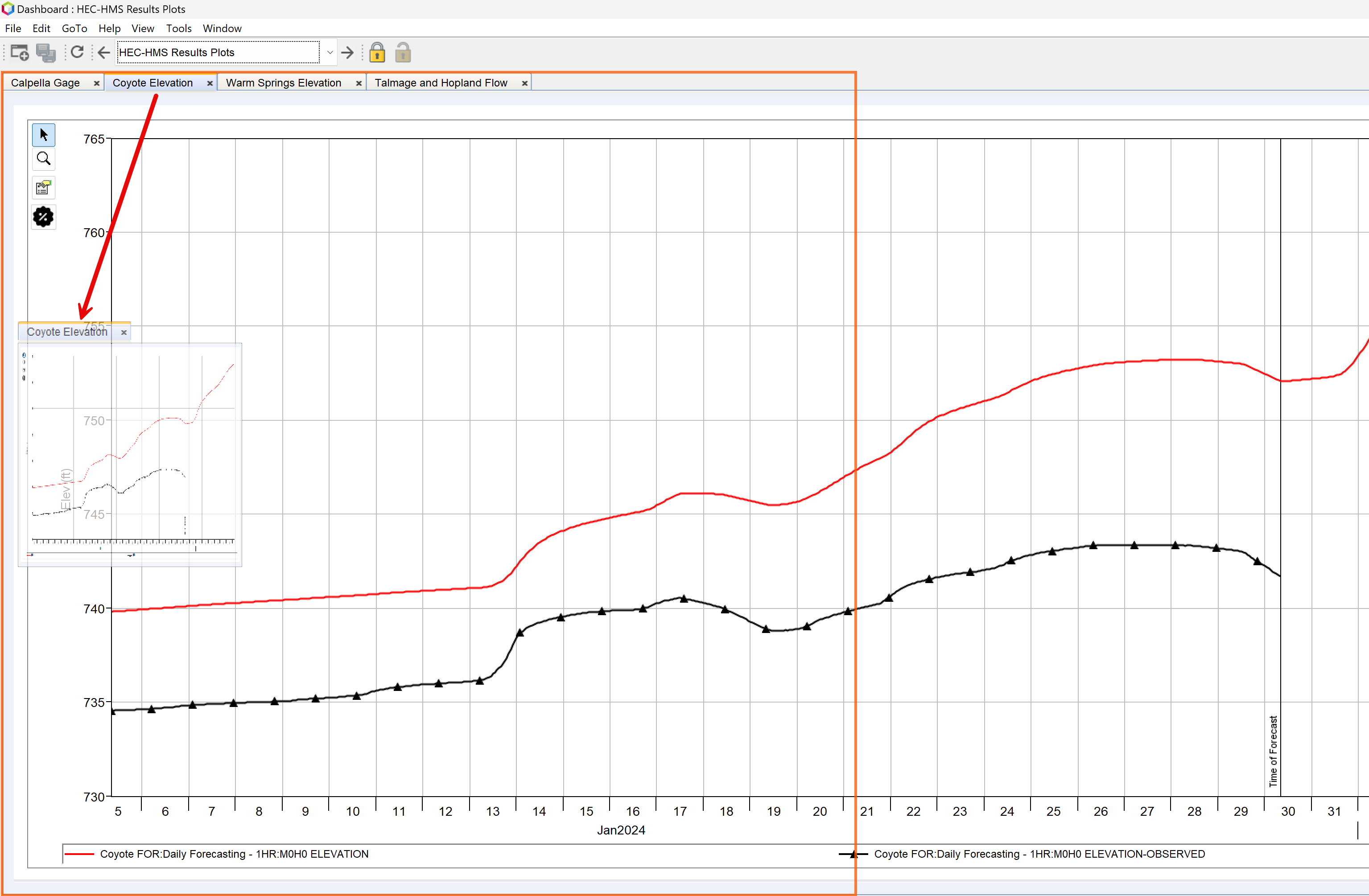
- Release the mouse to dock the panel side-by-side with the other plots. The Dashboard will automatically adjust the layout.
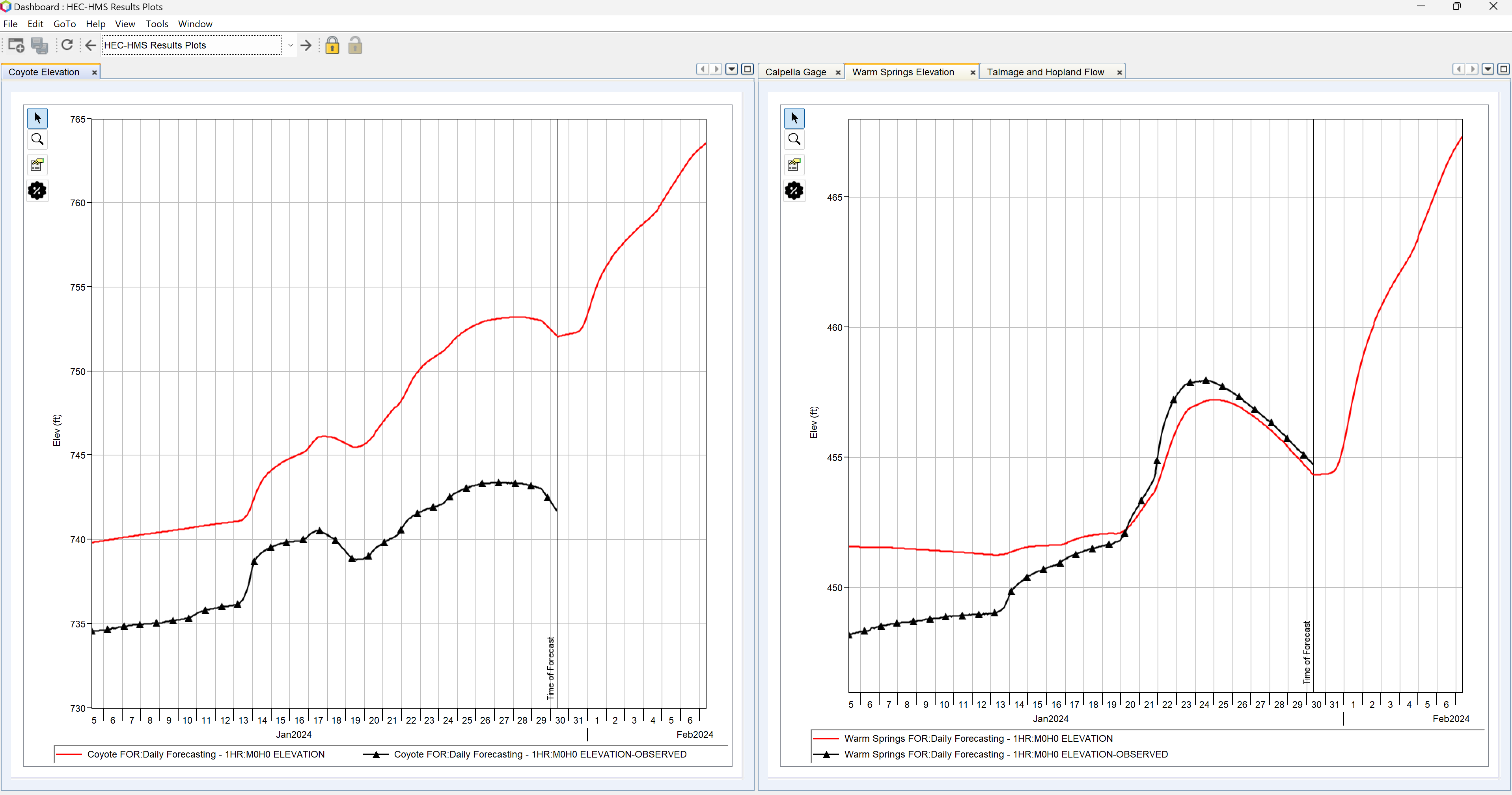
- Continue moving other tabs to create a layout similar to the example below.
- Adjust individual plot panel properties as needed:
- Modify font sizes for legends and axis labels.
- Refine line styles, colors, or legend positions.
Your final Dashboard layout should now provide a clear, organized view of all relevant data.
Step 10: Calibrate the HEC-HMS Model (Optional)
If you're experienced with HEC-HMS model calibration and familiar with the tools in the Combined Parameter Editor, you can now begin the calibration process.
Keep the Dashboard open while calibrating. Plots will automatically update each time you recompute the HEC-HMS model, allowing you to immediately assess the impact of your parameter adjustments.
To calibrate the HEC-HMS model:
- From the Modeling tab, open the Combined Parameter Editor.
- In the Reservoirs tab, set the initial elevations for the reservoirs.
- Adjust key model parameters for the Coyote, Upper, and Warm Springs zones to improve simulated results.
- Use the plots in the Dashboard to review your progress and continue refining the parameters until you are satisfied with the model's performance.
Your results should resemble those shown in the figure below.
Step 11: Save the Dashboard Configuration
- From the File menu, select Save Configuration.
- Close the Dashboard.
- Save your watershed.
Final Review
The Dashboard you configured is now ready to use with any new forecast you create. If set up correctly (refer to Step 5), the Dashboard will ignore the F Parts in the pathnames, allowing it to work seamlessly across different forecast alternatives.
Zip File with Full Solution
You can download a zip file containing the fully configured watershed and Dashboard as described in this tutorial.