Configuring Time Series Icon Properties
After you have defined time series icons, you must configure the properties of each time series icon individually in the Time Series Icon Editor dialog. Properties include the name of the icon, the location of the data, and the appearance of the time series icon in the different modules. Here, you also set up images, web pages, webcams, documents, and scripting information associated the time series icon.
Name a Time Series Icon
To give a time series icon a name, description, and icon symbol:
- Using the Time Series Icon Tool, right-click the time series icon you want to name. From the shortcut menu, click Rename, the Rename dialog opens.
- Enter the new name in the Name field, and click OK.
Associate Data with a Time Series Icon
Within HEC-RTS, time series data can be accessed from an HEC-DSS file. You can either type in the Time Series Identifiers or pathnames associated with the data, or use the data browser available from the Time Series Icon Editor dialog.
To associate data from an HEC-DSS file:
- Before associating data from a DSS file, you need to make sure that you have a DSS file available. A good choice is the DSS file from a CWMS forecast run (forecast.dss).
- From the Time Series Icon Editor, from the Data menu, click Browse. The DSS-VUE dialog opens, from the File menu, click Open Local DSS File. The Open HEC-DSS File dialog opens.
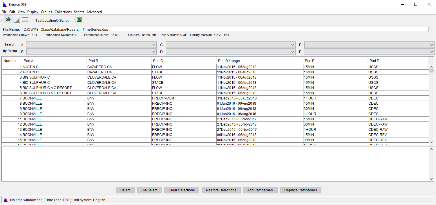
- Browse to the location of the appropriate DSS file, click on the DSS file, click Open, the Open HEC-DSS File dialog will close. Once the file has been opened, the table in the DSS-Vue dialog displays the pathnames available.
- Find the pathname(s) you wish to add to your time series icon, and select it (them) using the Select button. The pathname displays in the selection area below the table (Figure 3). Repeat this step until you have selected all of the pathnames that are needed.

- Once you are finished selecting pathnames, click Set Selected Identifiers. If the pathnames are from modeling output, a message box will appear asking "Do you want model F parts set to %'s (to correspond to the alternatives selected)?". Click Yes. This will replace the F parts with percent sign wild characters that will be substituted with the forecast key when displaying modeling results. A single percent sign represents one model output in sequence, so "%%" will correspond to HEC-HMS output, and "%%%" will correspond to output from HEC-ResSim. Pathnames with an F part of OBS will not have their F parts replaced with percent signs.
- From the File menu, click Close. The selected pathnames will display in the Associated Data Sets Table of the Time Series Icon Editor dialog. Click OK.
Remove Data from a Time Series Icon
To remove data from a time series icon:
- From the Time Series Icon Editor, select a row(s) on the Associated Data Sets Table that contains the data you no longer want associated with the time series icon.
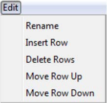
- From the Edit menu (Figure 4), click Delete Rows. The selected rows will be deleted from the Associated Data Sets table, and the data will no longer be associated with the time series icon.

Map Window Attributes for Data
If you wish to organize the display of time series icons, before you proceed with the next steps, define Time Series Icon Layers. Time Series Icon Layers provide the ability to choose which time series icons appear in the Map window. Layers make refining the display data faster by allowing you to select the displayed layers by their data types. For example, a gage may report stage, precipitation, and compute flow from stage. If time series layers are created for each one, "Stage", "Flow", and "Precipitation", then the appropriate data sets for that location can be placed in the corresponding layer.
The following steps describe how you would assign data sets to a time series layer and associate the data sets to CWMS modules:
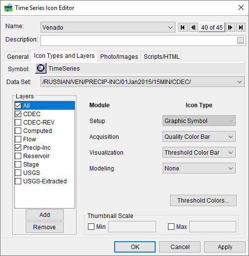
- From the Time Series Icon Editor, click the Icon Types and Layers tab (Figure 5).

- From the Data Set list, select the data set you wish to assign to a time series icon sub-layer. From the Layers field, select or clear the appropriate sub-layers for the selected data set.
- Once you have established the layers for the data set, you now need to set the display attributes of the time series icon for the individual CWMS modules.
- There are six icon types to choose from or the option of none. Following is a description of each of the available types:
 Graphic Symbol - Graphic symbols provide an at-a-glance reference to the type of location represented and allow direct access to data associated with a location (such as model results). Selecting this option displays the graphic symbol as it was defined for the time series icon in the Setup module.
 Dot - Dots allow you to mark gages and time series locations without cluttering the map display. Selecting this option displays a small red dot along with the icon label () in the display area.
  Thumbnail Plot - Thumbnail plots are miniature versions of the full-size plots available in CWMS, showing data for the duration of the time window. As the time window updates, CWMS refreshes the data and updates the plot. Thumbnail plots offer a quick overview of current data for the selected time window.
  Quality Color Bar - Quality color bars are linear histograms that offer a quick view of the quality of incoming data within the time window you have set. A CWMS database process (DATCHK) evaluates incoming data and assigns a flag to the data. Color bars reflect this quality check by displaying bands of color that display quality information for data sets that are configured for the icon. Color schemes can be configured for the quality colors in the Data Acquisition Module.
  Threshold Color Bar - Threshold color bars are linear histograms that compare incoming data against threshold values set for a location. For example, at a FLOW location, green might be assigned to flow values less than 5,000, which represent normal flow conditions. Yellow may represent values greater than 5,000, but less than 7,000 to indicate flows in a flood warning level, and red may represent values greater than 7,000 to indicate flows above flood stage. Because threshold color bars are location dependent, you must set the values for each time series icon individually. See Configuring Threshold Color Bars on how to configure your threshold color bars.
  Cumulative Threshold Color Bar - Cumulative threshold color bars are color bars that display accumulated values. For example, display precipitation over time or the sum of volumes of inflows to a lake are accumulated values.
None - By selecting None, you can configure the icon not to display in a specific module. This is useful when you only use an icon in a specific module, as it keeps the map display uncluttered with unnecessary icons. - To assign a data set to a HEC-RTS module and give it an icon type, from the Icon Type list for each individual module, select an icon type for the data set. If you do not want the data set to appear in a particular module, choose the icon type None. The selected data set will appear in the Data Acquisition module as a quality color bar, in the Data Visualization module as a thumbnail plot, and will not display in the Modeling module.
- For example, Figure 5 indicates that the selected data set will appear in the Setup module as a graphic symbol, in the Acquisition module as a quality color bar, in the Visualization module as a thumbnail plot, and will not appear in the Modeling module.
- Once you are finished with the setup of the time series icon, click OK, which closes the Time Series Icon Editor dialog (Figure 5). To save the changes to the watershed, from the File menu, click Save Watershed.