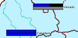
Quality color bars (Figure 1) allow you to view the quality of incoming data. Quality is defined as being one of the following: valid, questionable, rejected, missing, no report, or not checked. You must have quality flags associated with the data sets. The following information describes how to configure a time series icon as a quality color bar.
Assigning quality color bars to specific HEC-RTS modules:
- From the CWMS CAVI main window, open a watershed, click the Setup tab, from the Map Window, click the Time Series Icon Tool.
- Right-click a time series icon, from the shortcut menu, click Edit, the Time Series Icon Editor dialog opens.

- Click the Icon Types and Layers tab.
- From the Data Set list, select the data set that you want to display a quality color bar in a module.
- For each module that you would like to see a quality color bar displayed in the map window, from the Icon Type list for each module, select Quality Color Bar.
- Click OK, and the Icon Data Set Editor dialog closes, and the assignment will be saved. Each data set assigned as a quality color bar will be assigned a color. However, these colors can be changed, which is described in the following section.