HEC-RAS Mapper has the option for user to draw a line on the map, give that line a name, then use that line to plot whatever results are turned on underneath the line. To create or modify Profile Lines, expand the Features Layer at the top of the tree and turn on the Profile Lines. Right click on the Profile Lines layer and select Edit Layer to begin editing. The HEC-RAS Mapper editing tools will show up allowing you to select the Add New or Edit Feature tool. If you select "Add New Feature" tool you can draw a new Profile Line. If you select "Edit Feature" tool, you can edit existing Profile Lines. Another way to add new Profile Lines is by selecting the Profile Lines tab at the bottom left of the HEC-RAS Mapper window. Once this Tab is selected there is a container for the user defined profile lines, to add a profile line select the + (add a profile line) button, and to delete a profile line select the X (delete profile line) button. The line can be drawn as a multi-point line anywhere on the map. Once the line is drawn you will be asked to give it a unique name. You can change the name by right clicking on the name and selecting Rename.
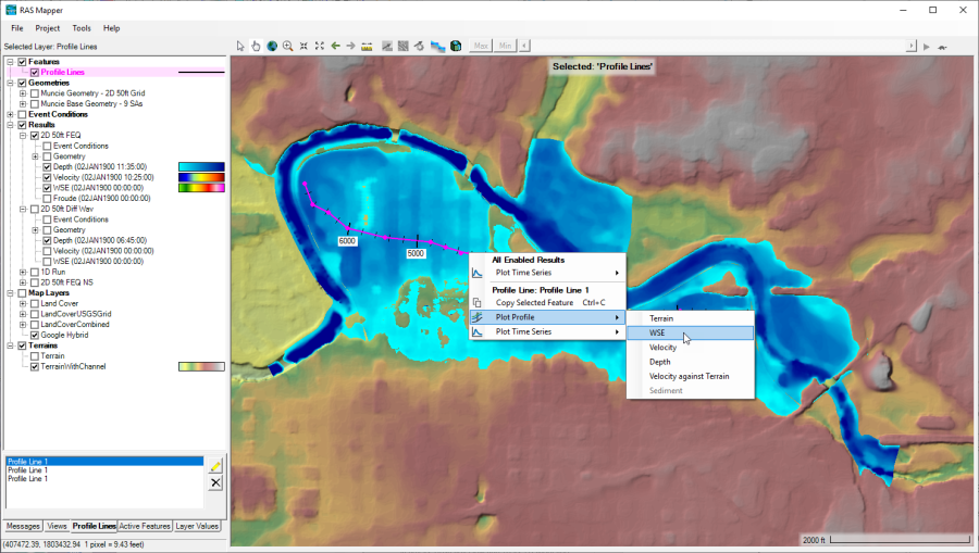
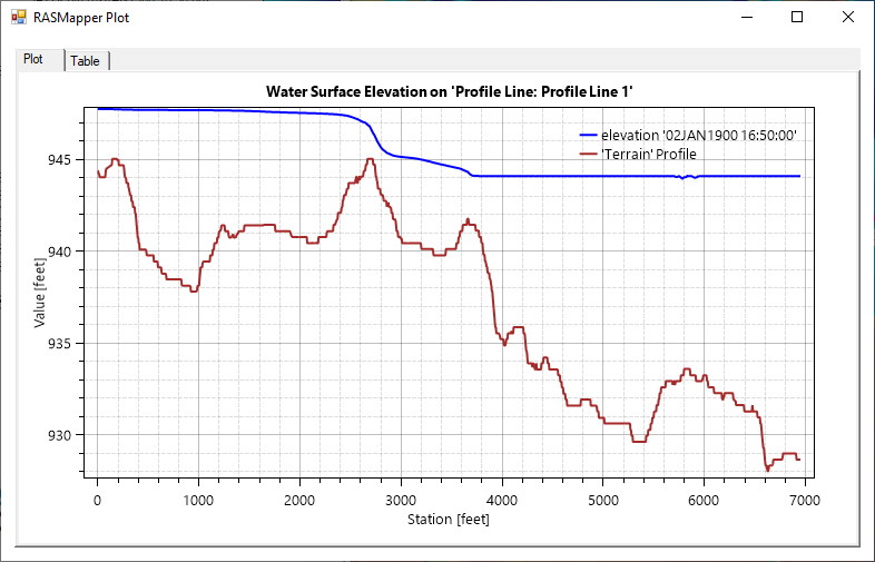
To plot computed results underneath a user defined profile line, first click on the profile line name in the container box on the lower left hand side of HEC-RAS Mapper (See Figure 6-20). This will activate that line. Next, right click on the line, this will bring up a popup menu, of which one of the options will be labeled "Profile Line: Profile line 1". Below that will be an option called "Unsteady Profile Plots", then a sub menu of that will contain all of the available data layers that can be plotted as a profile plot. Select the layer you want, for example WSE (Water Surface Elevation). Once a data layer is selected then the profile plot for that data layer will show up in a separate window (Figure 6-21).


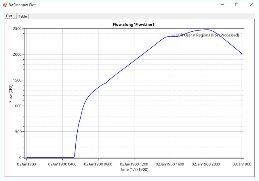
Additionally, Profile Lines can be used to plot Time Series Output. For the Example shown in Figure 6-20, there is a second Profile line called "FlowLine1". This line was drawn perpendicular to the direction of flow, for the purpose of plotting time series data for the flow crossing that line. If the user right clicks on a profile line, there is an option called Plot Time Series. Sub menu options of this menu include: Flow; Volume Accumulation; and Rating Curve. An example Flow time series is shown in Figure 6-22.
