Download PDF
Download page Model Comparison Tool.
Model Comparison Tool
The Model Comparison Tool in HEC-RAS in intended to allow users to evaluate the components of an HEC-RAS project to identify differences in the primary modeling objects. The purpose of the comparison tools is to assist the user to identify subtle differences between HEC-RAS plans. If the model differences are significant and excessive Differences in the project files, geometry, flow, and results can be visualized through tables and spatial plots. The focus of the Model Comparison tools are for unsteady-flow models (comparison capabilities for steady-flow models is not as robust as for unsteady models).
This feature is new for HEC-RAS 6.5.
This tool is dependent on datasets stored in the HDF5 file format and, therefore, only works for model data in HEC-RAS 6. To compare geometry from older HEC-RAS models, open the project in HEC-RAS 6.0 or newer and save the geometry. To compare results, the models will need to be re-run in the newer version of HEC-RAS.
When comparing datasets, the Model Comparison tool can compare data using the geometry file or the plan file (which will have Flow, Geometry, and may include Results).
Project
Access to the Model Comparison tools is available from the File | Compare Model Data menu item. The tool is primarily intended to compare data within a single project; however, you can compare data from multiple projects. Show in the figure below is the Project summary. Each project will be listed by name with the unit system.

The Project tab shows a diagram view of the HEC-RAS project with components represented by an element box. The Contents List on the left side of the window will indicate what data was used in the project and allow you to turn on those data layers available. The Flow, Plan/Result, and Geometry data will always be available. If the project contains Terrain, Landcover, Infiltration, or a Sediment Bed Material layer they will be available to turn on/off to customize the project view.
For the Flow, Plan/Result, and Geometry the Short ID is listed along with the file extension plan number (e.g. .p##). If a Plan has not been run, and therefore a Result does not exist, the Plan/Result name will be grayed out (indicating results are not available).
Each layer that is used for a given Plan will be connected by a line trace. To more clearly identify file dependencies, click on an element. The elements and dependency trace will be highlighted. An example of trace is shown in the figure below.

The Project compare functionality allow for you to compare both Geometry and Plan/Result information.
Comparing a Plan will have a link to a Geometry file (which may or may not have been edited after a simulation). However, a Result will have a copy of the Geometry used for the simulation.
To compare plans or geometries double-click on the element to add it to the comparison list. (You can also right-click on the element and choose Add to List.) As the data are added to the comparison list, the element names will be added to the top of the Model Comparison window, as shown in the figure below. If data are different the the tabs for Flow, Plan, Geometry, and Results will become active (if the data are not different the tabs will be gray.)

The data will be added with by name and with colors to identify one piece of data from another. In the example shown above one Plan is Orange, while the other is Blue. Data visualization will be enhanced by these colors throughout the model comparison tabs (Flow, Plan, Geometry, and Results). To change the Name or Color, right-click on the data you are comparing and choose Change Alias or Change Color menu item. (You can also access these properties via the Tools | File Aliases and Tools | Color Palettes menu items.)
If you wish to change the file names, the Change Alias menu item allows you to change the name that is shown throughout the comparison tools. This is convenient if the previously used name is very long or you are new to a project and need to simplify the names. Provide the "Alias" and hit the OK button in the dialog provided.

Multiple Projects
Files from multiple projects can be achieved using the File | Add Project menu item. Once a second project is added Plan/Results and Geometry files can be compared as if they were from the same project. The project is added with the name in the upper left had corner. To remove the project, click the Remove button (X) next to the project name.

Differences vs All
The Model Comparison Tool is intended to provided users access and identification to differences in model data. However, if you want to see specific data within the construct of all data, choose the view All option rather than the default Differences option. As you navigate through the model data, all features associated with the file will be listed.
As you peruse the model data, you will find visual cues (through color and fonts) to assist in identifying information.
| Visual Cue | Description |
|---|---|
| Black | Differences exists for identical features |
| Bold | Differences exists for identical features |
| Gray | No differences for identical features |
| Color 1 | This feature only exists in Dataset 1 |
| Color 2 | This feature only exists in Dataset 1 |
Changing the default colors is available from the Tools | Color Palettes menu item.

Flow
The Flow tab provides a spatial view of the locations and a table of pertinent flow hydrograph information (Location Name, Minimum, Maximum, and Volume information). The contents list will organize data on the left and allow you to identify the features of interest. (Note: Steady Flow data are not available to compare.) As shown in the figure below, this model only has one location where flow differs.

To highlight a location in the in the map, click on a row in the table. Conversely, when selecting a location in the map, the corresponding row in the table will be highlighted. For flow data, an the Hydrograph icon will allow you to plot a comparison plot showing the hydrographs and the difference(see below). Differences are computed based on the reverse order listed at the top of the Model Comparison window (second plan minus first plan).

To see a plot of the difference between hydrographs, turn on the Options | Plot Differences menu item.

Plan
Plan information for basic information such as the Geometry and Flow file names and more detailed computation parameters are provided through tabular data. The tables easily allow you identify model differences.
In the figure below, basic Plan Information is shown (note that it is all different).

In the figure below, Plan Parameters are shown with the different calculation parameter shown in black/bold text and all others shown in gray.

Geometry
When accessing the Geometry tab, you will first need click the Compute Geometry Differences button, shown below.

Geometry data are not automatically computed, as there may be a noticeable delay when comparing geometry files. As the geometry data are compared a progress bar will provide updates. Once the data have been compared, the Summary and Detailed tabs will allow you to investigate the data.
Summary
The Summary tab is intended to give you a information at a glance (as shown in the figure below) for feature layers. As you select a feature from the contents list in the left pane, the upper panels with indicate the number of unique, different, and identical (same) features in each Geometry. Color bars quickly show quantity and relationship. The lower panel shows the different attributes and a table of features (Differences being the default table).

The upper portion of the window (shown below) provides a quick feature summary. For this example, one file has 3 Unique features, the other file has 4 Unique features, and the geometry shares 5 Features that have the same name but are different and 53 features that are identical. The color bar is able to provide a visual summary by color.
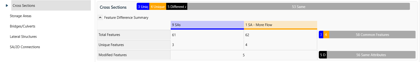
The feature differences are identified by the Differences attribute list (shown below).

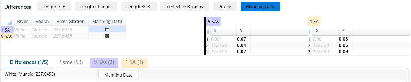
If you wish to sort the table by attribute difference, select the attribute element. For instance, you want to see which cross sections have difference n values, select the Manning Data attribute element. As shown below, the list of cross sections is filtered to just the cross section having different n values. The data can then be plotted either in a table or a plot, depending on the datatype. If the data are tabular data (such as Ineffective Flow Areas, Blocked Obstructions, Manning's n values) a table button will allow you to tabulate the data differences in a side pane.
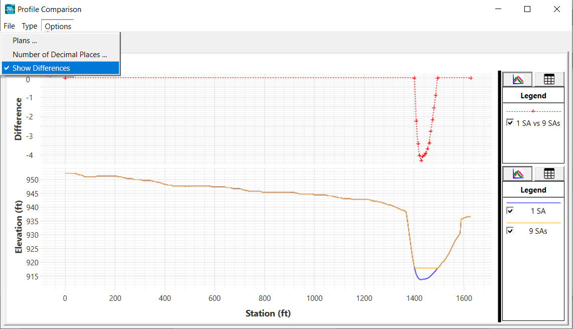
If the data can be shown through a plot (such a cross section profile) a plot button will invoke a separate plotting window. The plot will color code the profile and show a difference in elevation values in the upper portion of the window.

To see a plot of the difference between profiles, turn on the Options | Plot Differences menu item.
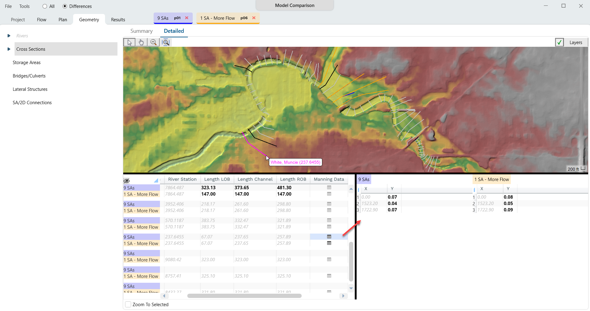
Detailed
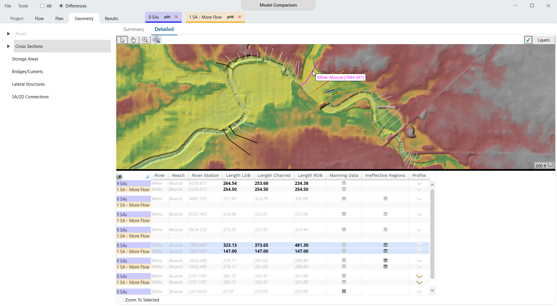
The Detailed tab provides an integrated spatial mapping of data along with tabular data. Similar to how you interact with RAS Mapper, there is a toolbar with Select, Pan, Zoom, and Zoom to Layer Extent buttons. Features can be displayed with or without a background layers by clicking on the Layers button and selecting from available layers (the Check button will allow for toggling on/off the background layers). A layer list will allow you to select background layers and set their symbology similar to RAS Mapper. Colors are used to indicate model differences in the mapping window and bold values in the the table indicate differences in table values (this is also true for plot functions where Bold icons have different data and gray icons do not.)
As shown in figure below, Cross Section features shown in Black are the same cross section but have an attribute difference, Gray cross sections are identical, Blue cross sections are in Geometry 1, and Orange cross sections are in Geometry 2.
Cross Sections
The Cross Section layer is a good example of feature layer. Each feature has a geospatial location, but is identified by it's River, Reach, and River Station. Each cross section feature can also be described by the attributes associated with it such as reach lengths and profile information.

Features can be selected in either the table or the map and are linked so that the selection in one place highlights the feature in the other. As shown in the figure below, the selected feature is shown in Magenta when selected in the map or the table. (To select a feature in the map, the Select Tool must be active.)
Icons will be provide for each attribute on the feature in the attribute table visualize data. Tabular data will be shown in a panel to the right, while plotted data will invoke it's own plotting window. Manning's n value data plotted for the selected cross section in the figure below.
If you want to work through the table one feature at a time, you can choose the Zoom to Selected feature option and the map window will recenter to show the feature.
The Feature Table allows for copying contents to the clipboard by right-clicking on the header and choosing Copy All.
2D Flow Areas
2D Flow Areas are unique in that they are described by both features (perimeters, breaklines, etc) that are easy to quantify and by an intricate layout of grid cells which is difficult to quantify. Differences in simple features can be easily identified through comparison and plotting. Below is an example color coded plot of of the 2D Flow Area cells. This can be done for Perimeters, Computation Points, Breaklines, and Refinement Regions.

For a more intricate plot of how cell size differs, the Model Comparison tool has a Cell Density plot. As shown in the figure below, the Cell Density plot will colorize the plot based on the relative density of 2D cell area. For the example below, Blue areas are where Geometry #1 cells are more dense, Gray is where there is no difference, and Orange is where Geometry #2 cells are more dense. The legend is fully customizable, if the default color ramp does not meet your needs. A tool tip is provided at the location of the cursor for more information.

Results
If you are comparing a Plan with Results, the Result tab will be available. At this time, the spatial results can be evaluated for differences in Inundation extent, Water Surface Elevation, Velocity, and Depth. Hydrograph results are also available, however, you will need to press the Compute Hydrograph Differences button.

The list of hydrographs mined from the output file will be available in the features list.

You can click on the Hydrograph icon in the map (with the Select tool ![]() ) or the in the table to plot the time series.
) or the in the table to plot the time series.

Selecting one of the outputs from the contents list will show the difference in computed results. A difference layer will be computed and shown in the map window, as shown in the figure below. A label is provided at the top of the map window to indicate the order of layer operations (Result #2 minus Result #1). Note that the default Legend is very specific. The Legend is a blend of colors from the 2 results in comparison. For the example shown below, the Legend goes from Blue (-1) (Result #1) to Gray (No Difference) to Orange (+1) (Result #2). This quickly indicates which hydraulic results has a higher value - orange is higher in Result #2, blue is higher in Result #1 (plan color shows which plan was higher). The legend/color are fully user-customizable (just as if you were in RAS Mapper). The cursor tool tip will update with value that is the difference in surface values.
