Download PDF
Download page Thumbnail plot.
Thumbnail plot
The thumbnail plot displays time series based on a 12-month water year, independent of calendar date. Several plot types are available via the "Plots – Predefined Plots" menu option, each focusing on a different perspective of the flow recommendations and historical data. As in the main plot, when a flow recommendation is entered, the selected thumbnail plot will display the change automatically (if the affected recommendation is part of the predefined plot option being displayed).
Predefined plots
Five types of predefined plots are available via the "Plots – Predefined Plots" menu, including 1) all states for one system, 2) one state for all systems, 3) choose systems and states, 4) multi-year traces, and 5) percentile plots (Figure 18). The selected plot will remain in view until replaced by the user with a different predefined plot.
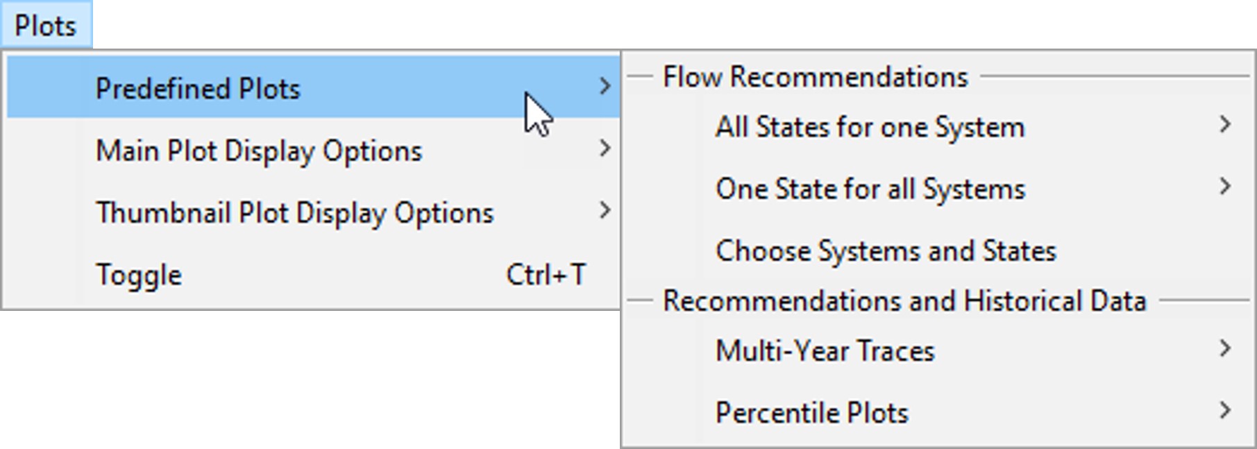
Figure 18. Menu options for the predefined plots.
All states for one system
This plot option displays recommendations for all states in a single system (Figure 19). This allows users to compare recommendations for the full range of states, which is typically a reflection of the spectrum of hydrologic conditions.
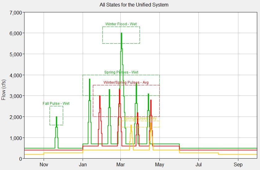
Figure 19. Display for an "All States for one System" plot.
One state for all systems
This plot option displays recommendations for a single state for all systems in the project (Figure 20). This allows users to compare state-based recommendations for different locations or guilds of creatures, which could be useful when merging or unifying different river management perspectives into a single set of recommendations.
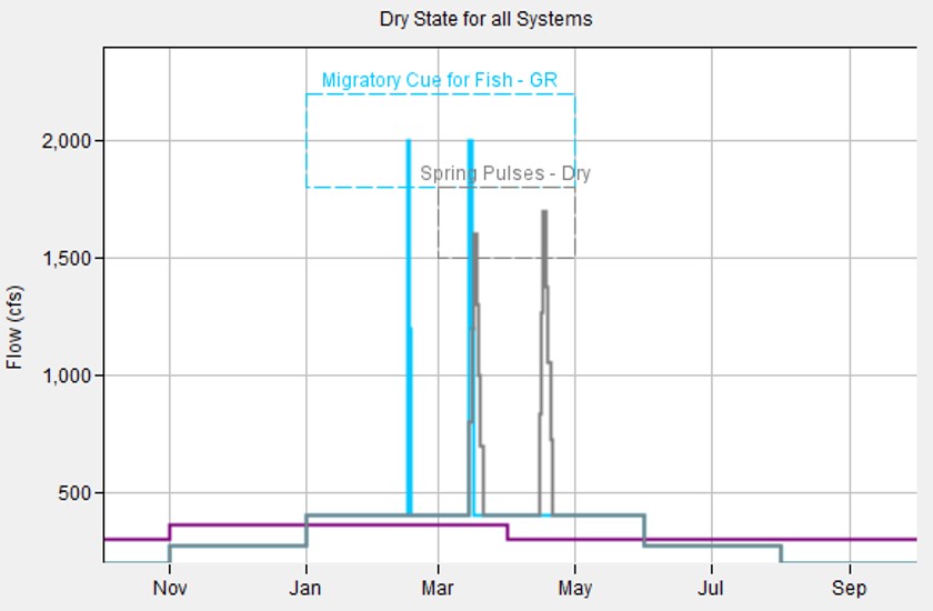
Figure 20. Display for a "One State for all Systems" plot. Wet state recommendations are plotted for three systems, Gravelly Riffles, Oxbow Flats, and Unified.
Choose systems and states
This plot option displays recommendations for user-selected pairings of systems and states (Figure 21). This allows users to create custom plots of recommendations for particular comparisons. The list of available pairings is filtered per the selected system type to assure that all selections can be plotted with the same units.
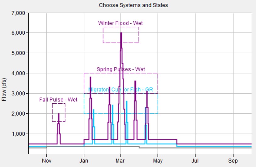
Figure 21. Display for a "Choose Systems and States" plot.
Multi-year traces
Multi-year traces display historical years of the same state over the same generic water year period. This allows users to investigate similarities and differences between years of the same state while formulating flow recommendations for that state.
The multi-year option is available only when state is defined by name and year. Plots are selected according to system and state. When selected, the user sets the time series to be plotted using the dropdown list of pathnames at the top of the options editor and has two options for displaying the plot. The first option is to plot a fixed number of historical years. The second is to plot specific historical years that are listed for the already selected state. If a fixed number of years are selected, the user will have the option to scroll through different years of that state by right clicking on the thumbnail and selecting the +1 and -1 year menu options.
Figure 22 shows the Multi-Year Options editor that appears when the user selects a multi-year trace through the “Plots - Predefined Plots” menu. Based on the settings in the figure, a multi-year trace with two historical years (fixed number of years option) of the AT DAM/FLOW-NAT time series would be plotted. The two historical years would be 1977 and 1978, which are the first two years classified as “Average” (Figure 7). Selecting +1 would change the years displayed to 1978 and 1982.
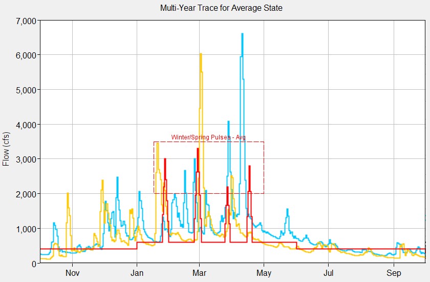
Figure 22. Options editor and plot display for a multi-year trace of two "average" years.
Percentile plots
Percentile plots show how values on any given date (day/month) are distributed. For instance, these plots can show the river flows on 01Jan that are above a certain flow rate in half of the historical years (50%). Plotting this percentile with other percentile lines helps to clarify seasonal flow patterns and show the commonality of different magnitude flows.
Plots are selected according to system and state. When selected, the user picks the time series to be analyzed using the dropdown list of pathnames at the top of the options editor and presses the Compute button located below the dropdown list. Eleven different data sets are computed. The user selects all or a subset of these data sets for viewing. Clicking OK causes the selected data sets to be plotted (Figure 23).
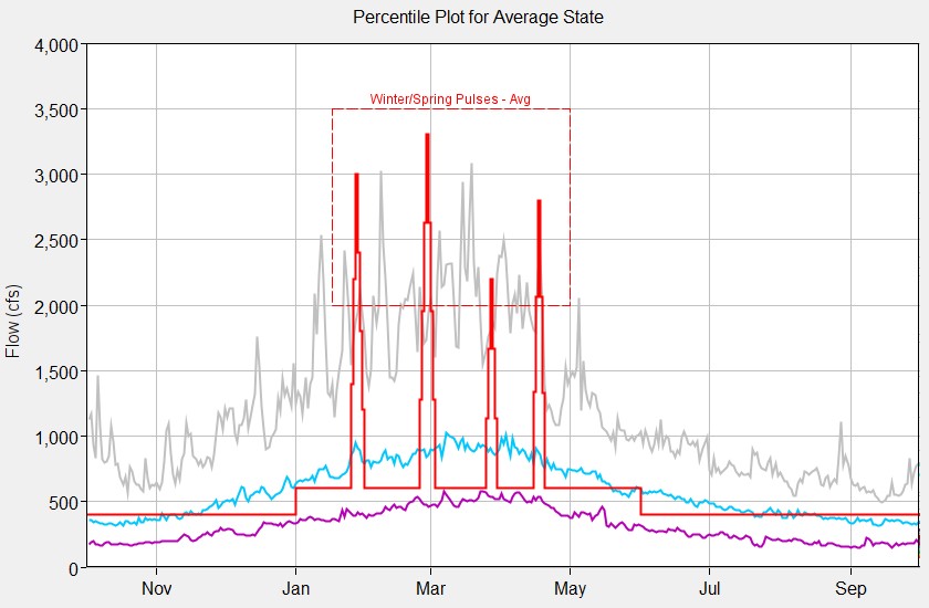
Figure 23. Options editor and display for a percentile plot. Percent non-exceedance lines are plotted for the 10, 50, and 90 percentiles.