Download PDF
Download page Example 9. General Frequency – Graphical Analysis.
Example 9. General Frequency – Graphical Analysis
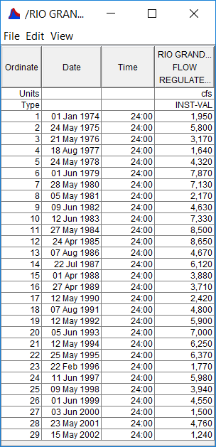
In the SSP_Examples.ssp study, the Reg Flow Rio Grande Test 9 example demonstrates how to create a Graphical Analysis within a General Frequency analysis. The data for this example is from an analysis that computed regulated flow for the Rio Grande at Albuquerque. The data includes regulated daily average flows from upstream reservoirs routed downstream to Albuquerque. The period of record used for this example is from 1974 to 2002. To view the data, right-click on the data record labeled "Rio Grande at Alb Reg Flow" in the study explorer and then select Tabulate. The data will appear as shown in Figure 1.
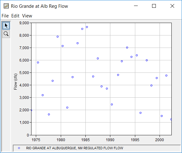
To plot the data for this example, right-click on the data record and then select Plot. A plot of the data will appear as shown in Figure 2.
A General Frequency analysis has been developed for this example. To open the General Frequency Analysis Editor for this example, either double-click on the analysis labeled Reg Flow Rio Grande Test 9 from the study explorer, or from the Analysis menu select open, then select Reg Flow Rio Grande Test 9 from the list of available analyses. When Test 9 is opened, the General Frequency Analysis Editor will appear as shown in Figure 3.
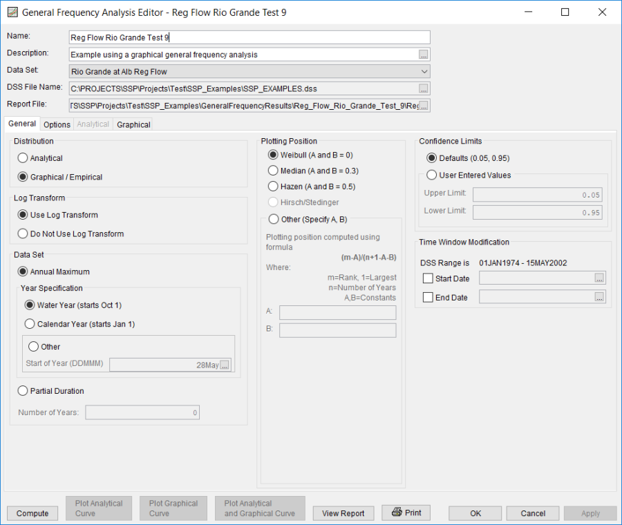
Shown in Figure 3 are the general settings that were used to perform this frequency analysis. For this analysis, the Graphical / Empirical, Use Log Transform, and Annual Maximum options were selected. Also, the Weibull plotting position method was selected, the default Confidence Limits were selected, and no modification was made to the Time Window.
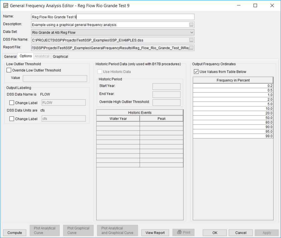
Shown in Figure 4 is the General Frequency analysis editor with the Options tab selected. Features on this tab include the Low Outlier Threshold, an option to use Historic Data, an option to override the default Frequency Ordinates, and Output Labeling. All defaults settings were selected for this example.
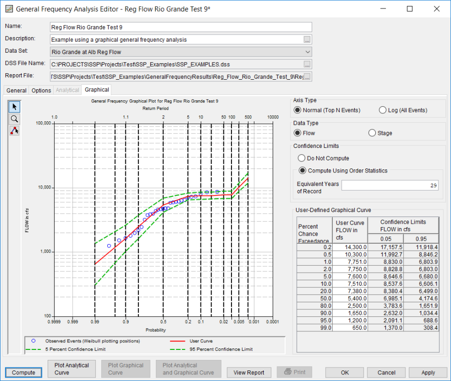
In this example, a graphical analysis was performed. Shown in Figure 5 is the Graphical tab. As shown, a graph containing the systematic data and graphical curve is on the left side and a table containing the user-entered frequency curve is on the right side of the window. The frequency curve was entered manually into the User-Defined Graphical Curve table. When the Compute button is pressed, the program plots the graphical frequency curve along with the annual maximum flow values. For this example, a reservoir model was used to route synthetic hydrographs through the reservoir network upstream of Albuquerque using current operating criteria. This was done for the 0.2, 0.5, 1.0, 2.0, 10, 20, and 50 percent events. Output from the model was input into the Frequency Ordinates table. For the more frequent events (10 year and below), the graphical curve was fit to the data visually. This example shows how a reservoir network can influence the frequency curve. Notice how the frequency curve is flat for the 20 through the 1 percent chance events. The reservoir network is able to control flooding in this range. This example also shows that as flood events become larger, the reservoir network has less influence on controlling downstream flooding.
A graphical plot of the graphical frequency curve can be obtained by pressing the Plot Graphical Curve button at the bottom of the analysis window. A plot of the results for this example is shown in Figure 6.
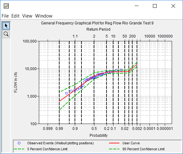
The graphical results can be sent to the printer or the windows clipboard for transfer into another piece of software. To print the graphical results, first bring up the graphical plot and then select Print from the File menu. To send the graphic to the windows clipboard, select Copy to Clipboard from the File menu.
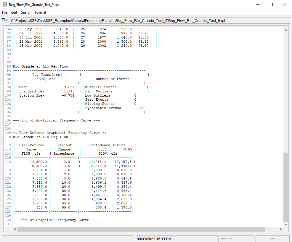
In addition to the tabular and graphical results, there is a report file that shows the order in which the calculations were performed. To review the report file, press the View Report button at the bottom of the analysis window. When this button is selected a text viewer will open the report file and display it on the screen. Shown in Figure 7 is the report file for Reg Flow Rio Grande Test 9.
The report file contains a listing of the input data, preliminary results, outlier and historical data tests, and additional calculations needed. Different types and amounts of information will show up in the report file depending on the data and the options that have been selected for the analysis.
