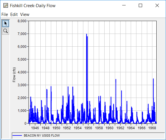
This example demonstrates how to use the Duration analysis. The data for this example is daily average flow from the Fishkill Creek (Beacon NY) USGS stream gage. The period of record used for this example is from 01 Oct, 1944 to 30 Sep, 1968. To view the data, right-click on the data record labeled "Fishkill Creek-Daily Flow" in the study explorer and then select Plot. The data will appear as shown in Figure 1.
A Duration analysis has been developed for this example. To open the analysis editor for this example, either double-click on the analysis labeled Fishkill Creek Test 12 from the study explorer, or from the Analysis menu select open, then select Fishkill Creek Test 12 from the list of available analyses. When Test 12 is opened, the duration analysis editor will appear as shown in Figure 2.
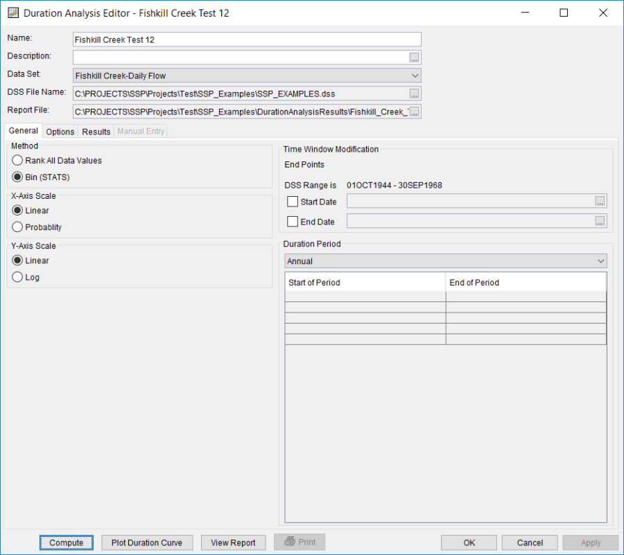
Shown in Figure 2 are the general settings that were used to perform this duration analysis. For this analysis, the Bin (STATS) method was selected, the x-axis scale was set to Linear, the y-axis scale was set to Linear, and the Annual duration period was selected.
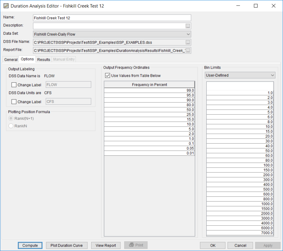
The Options Tab is shown in Figure 3. Features on this tab include Output Labeling, the Percent of Time Exceeded ordinates, and Bin Limits. The Bin Limits panel is active in this example because the Bin (STATS) method was selected on the General tab. The User-Defined bin limits method was selected and the bin limits were entered manually.
Once all of the General and Optional settings are set or selected, the user can choose to compute the analysis by pressing the Compute button. Once the computations have been completed, a message window will open stating Compute Complete. Close this window and then select the Results tab, shown in Figure 4.
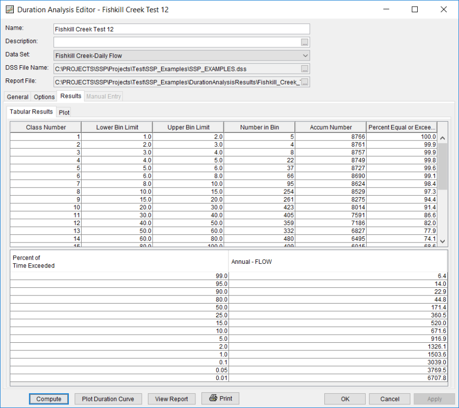
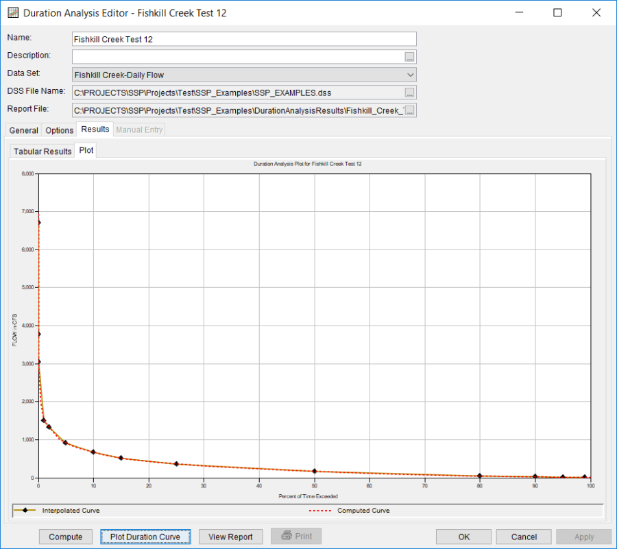
As shown in Figure 4, the Result tab contains both tabular and graphical results. The Tabular Results tab contains a table with information about the bins, like the lower bin limit, the number of values in the bin, the accumulated number of values greater than or equal to the lower bin limit, and the percent of time equaled or exceeded for each bin. Tabular results also include a table of the duration curve interpolated to the percent of time exceeded ordinates defined on the Options tab. The Plot tab contains a graph of the duration curve, shown in Figure 5. The plot includes the computed duration curve and the duration curve interpolated to the user-defined percent of time exceeded ordinates. The duration curve plot can also be opened by pressing the Plot Duration Curve button at the bottom of the analysis window.
The tabular and graphical results can be sent to the printer or the windows clipboard for transfer into another piece of software. To print the tabular results, select Print from the bottom of the analysis window. To send the tabular results to the windows clipboard, highlight the data you want to send to the clipboard and then press the Control-C key sequence. To print the graphical results, first bring up the graphical plot and then select Print from the File menu. To send the graphic to the windows clipboard, select Copy to Clipboard from the File menu.
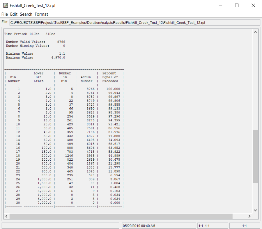
In addition to the tabular and graphical results, there is a report file that shows the input data and results for the analysis. To review the report file, press the View Report button at the bottom of the analysis window. When this button is selected a text viewer will open the report file and display it on the screen. Shown in Figure 6 is the report file for Fishkill Creek Test 12.
