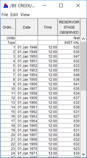
In the SSP_Examples.ssp study, the Stage Analysis Test 7 example demonstrates how to use the General Frequency analysis to analyze stage data. The data used for this example is annual maximum stage data for a reservoir. The period of record used for this example is from 1948 to 2004. To view the data, right-click on the data record labeled "Reservoir Stage" in the study explorer and then select Tabulate. The data will appear as shown in Figure 1.
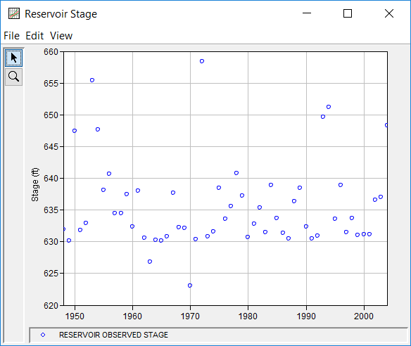
To plot the data for this example, right-click on the data record and then select Plot. A plot of the data will appear as shown in Figure 2.
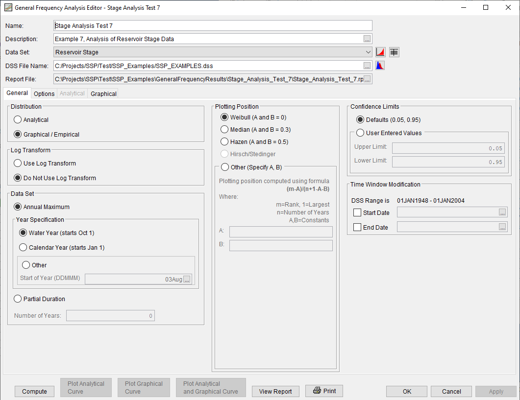
A General Frequency analysis has been developed for this example. To open the General Frequency Analysis Editor for this example, either double-click on the analysis labeled Stage Analysis Test 7 from the study explorer; alternatively, from the Analysis menu select open, then select Stage Analysis Test 7 from the list of available analyses. When Test 7 is opened, the General Frequency Analysis Editor will appear as shown in Figure 3. For this analysis, the Graphical / Empirical, Do Not Use Log Transform, and Annual Maximum options were selected. Also, the Weibull plotting position method was selected, the default Confidence Limits were selected, and no modification was made to the time window.
Shown in Figure 4 is the General Frequency analysis editor with the Options tab selected. Features on this tab include the Low Outlier Threshold, adding Historic Date to the analysis, an option to override the default Frequency Ordinates, and Output Labeling. The 0.1 percent frequency ordinate was added to the User Specified Frequency Ordinates table.
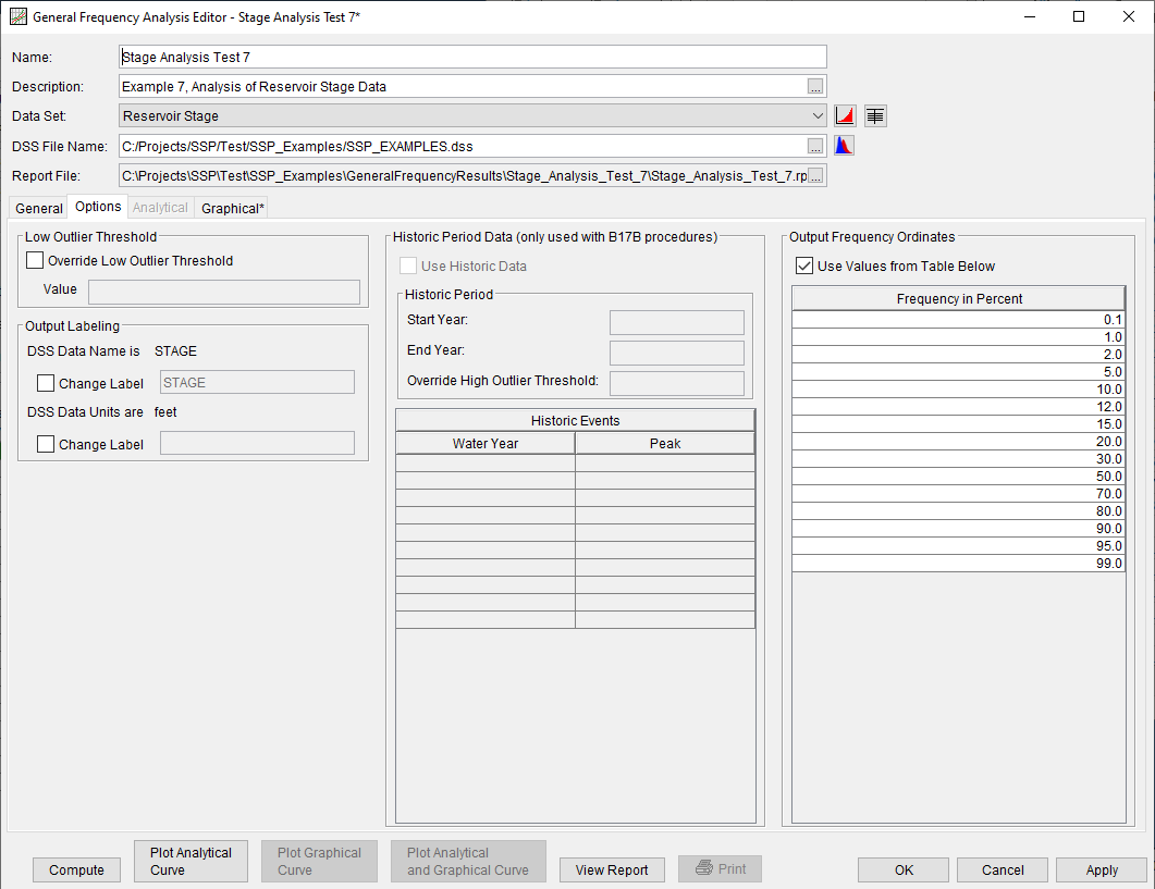
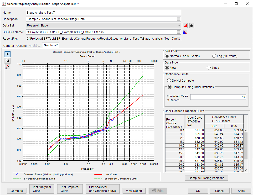
In this example, a graphical analysis was performed on the peak stage data. Shown in Figure 5 is the Graphical tab. The frequency curve was entered manually into the User-Defined Graphical Curve table. When the Compute button is pressed, the program plots the graphical frequency curve along with the annual maximum peak stage values.
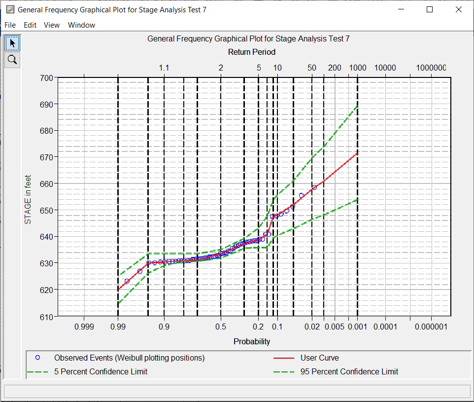
In addition to the table and plot available on the Graphical tab, a plot of the graphical frequency curves can be obtained by pressing the Plot Graphical Curve button at the bottom of the analysis window. A plot of the results for this example is shown in Figure 6.
Graphical results can be sent to the printer or the windows clipboard for transfer into another piece of software. To print the graphical results, first bring up the graphical plot and then select Print from the File menu. To send the graphic to the windows clipboard, select Copy to Clipboard from the File menu.
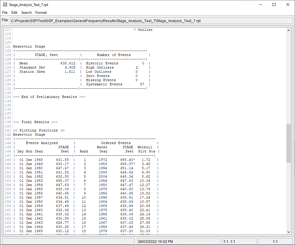
In addition to the tabular and graphical results, there is a report file that shows the order in which the calculations were performed. To review the report file, press the View Report button at the bottom of the analysis window. When this button is selected a text viewer will open the report file and display it on the screen. Shown in Figure 7 is the report file for Stage Analysis Test 7.
The report file contains a listing of the input data, preliminary results, outlier and historical data tests, additional calculations needed, the final computed frequency curve results, and the user-defined graphical frequency curve. Different types and amounts of information will show up in the report file depending on the data and the options that have been selected for the analysis.
