Download PDF
Download page Example 11. Volume Frequency Analysis, Minimum Flows.
Example 11. Volume Frequency Analysis, Minimum Flows
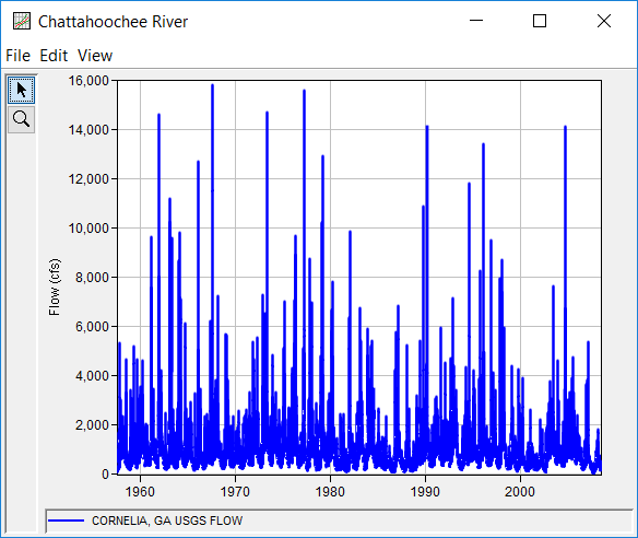
This example demonstrates how to create a low flow Volume Frequency analysis. The data for this example was downloaded from the USGS. It is comprised of daily average flow for the Chattahoochee River at Cornelia, Georgia. Drought conditions were occurring in the region at the time of this analysis. Among other things, a low flow analysis can be used to determine the severity of a drought. The period of record for this example is from 1957 to 2007. To view the data, right-click on the data record labeled "Chattahoochee River" in the study explorer and then select Plot. The data will appear as shown in Figure 1.
A Volume Frequency analysis has been developed for this example. To open the Volume Frequency Analysis editor for this example, either double-click on the analysis labeled Low Flow Analysis Test 11 from the study explorer, or from the Analysis menu select open, then select Low Flow Analysis Test 11 from the list of available analyses. When test 11 is opened, the Volume Frequency Analysis editor will appear as shown in Figure 2.
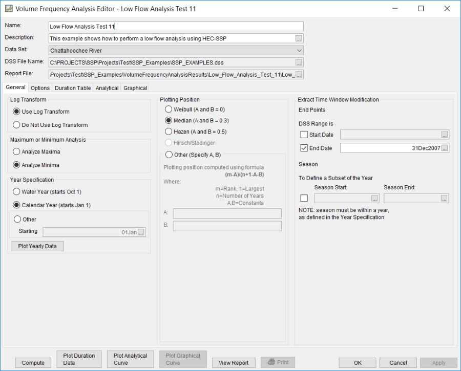
Shown in Figure 2 are the general settings that were used to perform this frequency analysis. For this analysis, the Use Log Transform option was selected, the Weibull plotting position method was selected, Analyze Minimums was selected, and the Calendar Year option was selected. The Calendar Year option was selected because low flows are possible in late September, early November. Starting the year on January 1 minimizes the possibility of using the same low flow event in multiple years. An end date of 31 December 2007 was entered in the Time Window Modification. This end date was specified because not all the data for the summer of 2008 was available at the time of the analysis.
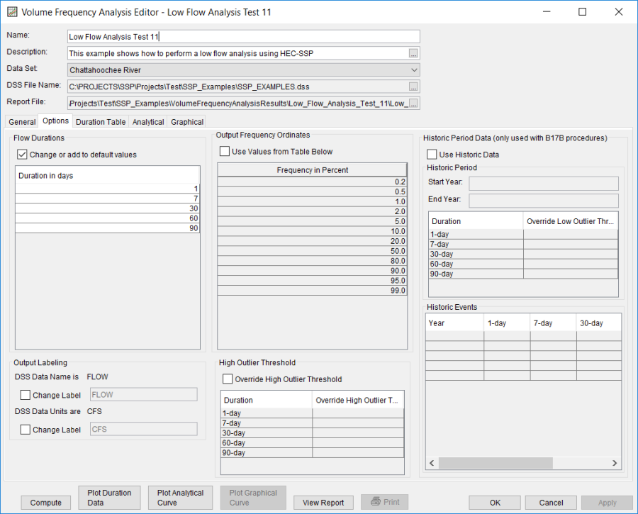
Shown in Figure 3 is the Volume Frequency Analysis editor with the Options Tab selected. Features on this tab include an option to override the default Flow Duration values, an option to override the default Frequency Ordinates, and Output Labeling.
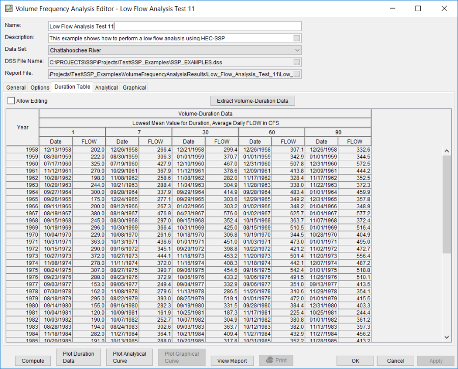
Once all of the General and Optional settings are set or selected, the user can extract the volume-duration data. Select the Duration Data tab and press the Extract Volume-Duration Data button at the bottom of the table. The table should then fill with the flow-duration values, as shown in Figure 4.
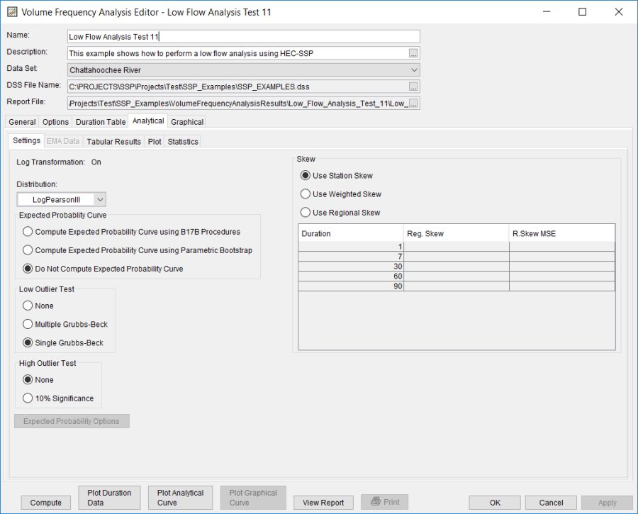
Once the data has been extracted, the user must choose to perform an Analytical or Graphical analysis. In this example, an analytical analysis was performed. Shown in Figure 5 is the Settings tab for the analytical analysis. As shown, the distribution and fitting method combination which was selected for this example is LogPearsonIII | Product Moments. The Do Not Compute Excepted Probability, Single Grubbs-Beck, no high outlier test, and Use Station Skew options were selected.
Press the Compute button to perform the analysis. A message window will open stating that a few of the annual maxima occurred near the beginning of the year. The message suggests that the user change the year/season specification to better capture independent events. You want to minimize the possibility that the same flood event is used for consecutive years. Press the OK button to finish the computation. Once the computations have been completed, a message window will open stating Compute Complete. Close this window and then select the Tabular Results tab within the analytical analysis. The results table should resemble Figure 6. The top portion of the results table contains the percent chance exceedance for all durations (the report contains confidence limits). The bottom portion of the results table contains the statistics for all durations.
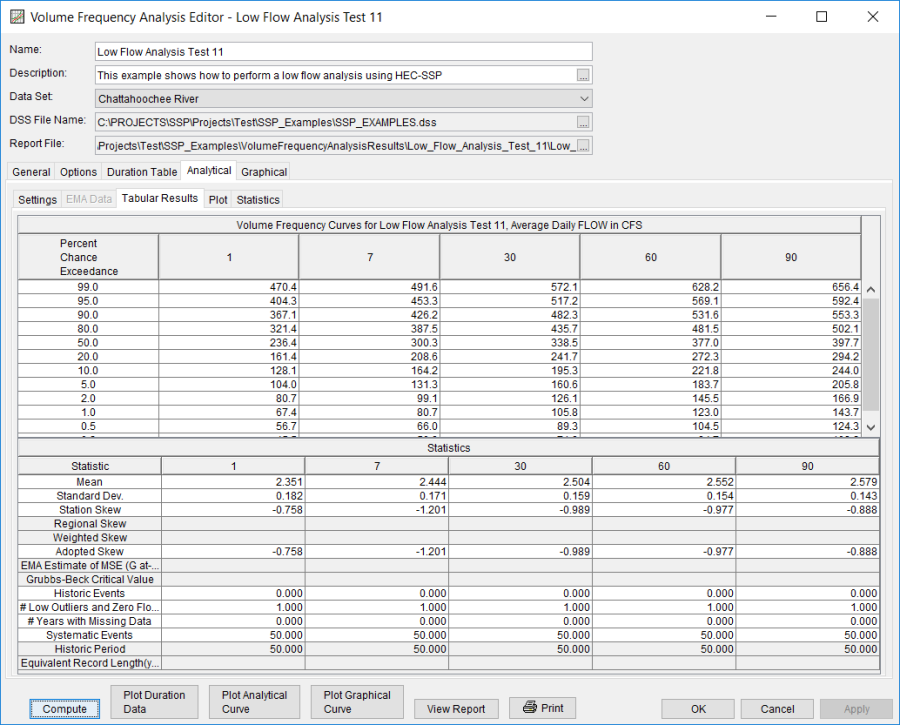
These tabular results use the default computed statistics.
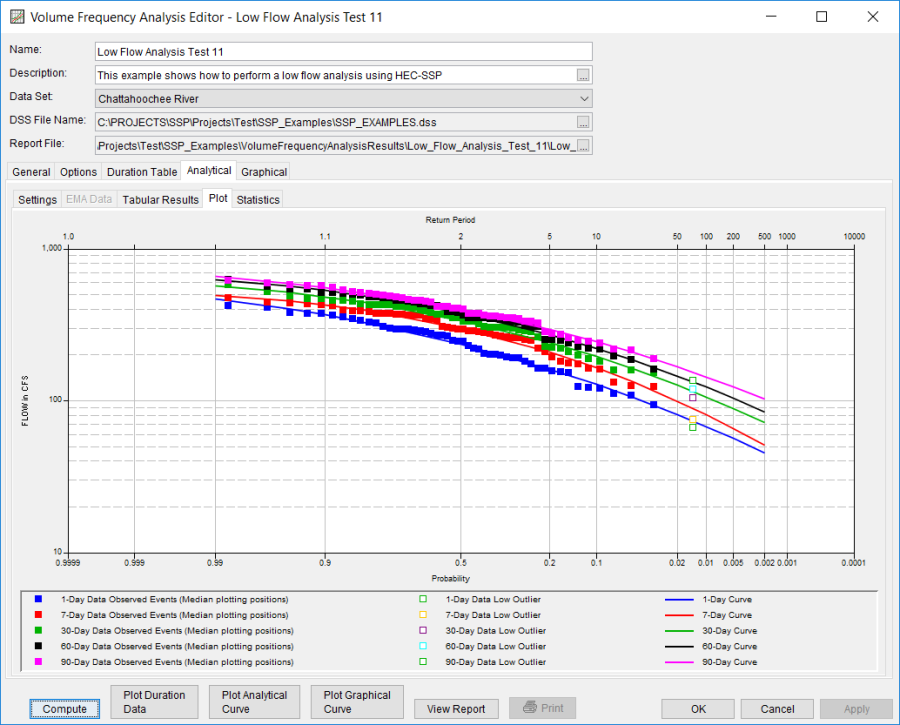
As shown in Figure 7, the Plot contains a graph of the systematic data and the computed frequency curves. Notice how some of the frequency curves look like they might cross if the lines were extended. The Statistics tab can be used to modify the computed statistics to ensure that the frequency curves are consistent.
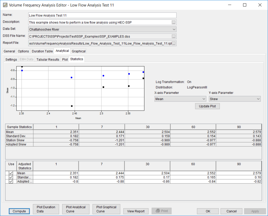
For this example, the standard deviation and the adopted skew were modified to make sure the volume frequency curves were consistent. As shown in Figure 8, the check boxes next to mean, standard deviation, and adopted skew were checked and then user-adjusted statistics were entered into the table for all durations. The Compute button must be pressed after adjusted statistics have been entered in order for the program to recompute the frequency curves using the user-adjusted statistics. Figure 9 shows the Plot tab after the user-adjusted statistics were entered on the Statistics tab. Results in the Tabular Results table will also update when user-adjusted statistics are entered on the Statistics tab.

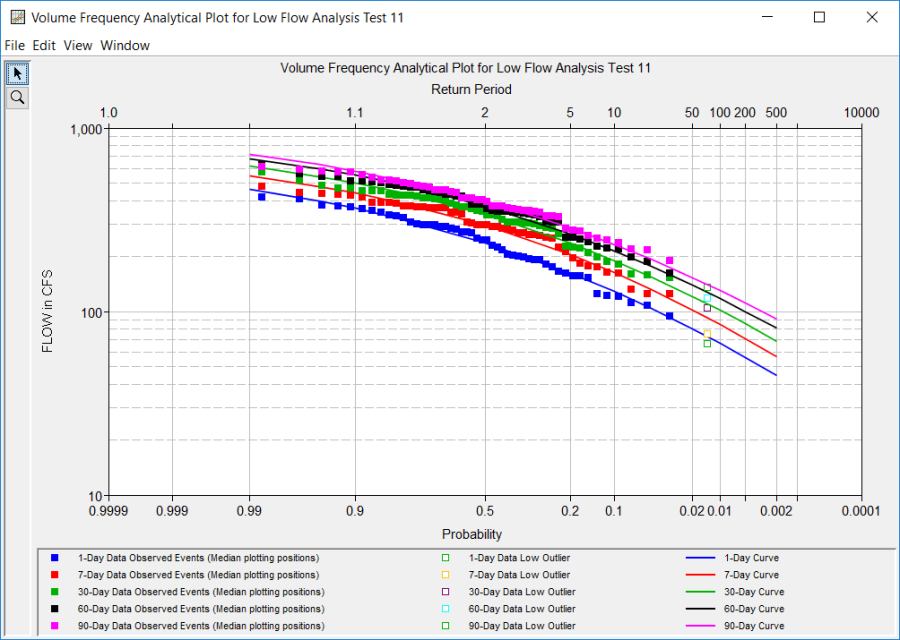
In addition to the Tabular Results and Plot tabs, graphical plots can be opened by selecting the Plot Duration Data or Plot Analytical Curve buttons at the bottom of the analysis window. A plot of the results for this example is shown in Figure 10.
The tabular and graphical results can be sent to the printer or the windows clipboard for transfer into another piece of software. To print the tabular results, select Print from the bottom of the analysis window. To send the tabular results to the windows clipboard, highlight the data you want to send to the clipboard and then press the Control-C key sequence. To print the graphical results, first bring up the graphical plot and then select Print from the File menu. To send the graphic to the windows clipboard, select Copy to Clipboard from the File menu.
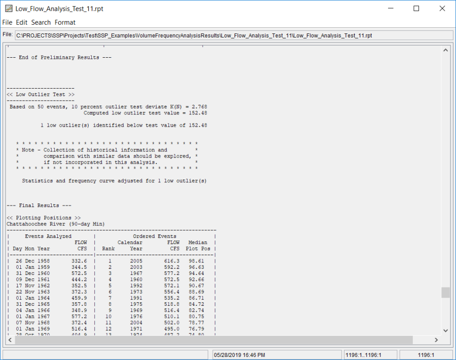
In addition to the tabular and graphical results, there is a report file that shows the order in which the calculations were performed. To review the report file, press the View Report button at the bottom of the analysis window. When this button is selected a text viewer will open the report file and display it on the screen. Shown in Figure 11 is the report file for Low Flow Analysis Test 11.
The report file contains a listing of the input data, preliminary results, outlier and historical data tests, additional calculations needed, and the final frequency curve results. Different types and amounts of information will show up in the report file depending on the data and the options that have been selected for the analysis.
