Download PDF
Download page Coincident in Time - Tar River.
Coincident in Time - Tar River
The TarRiver_Correlation example demonstrates the usage of the Correlation Analysis to determine how closely related annual maximum peak discharge within a river is with tidal stages within a receiving body of water.
Input Data
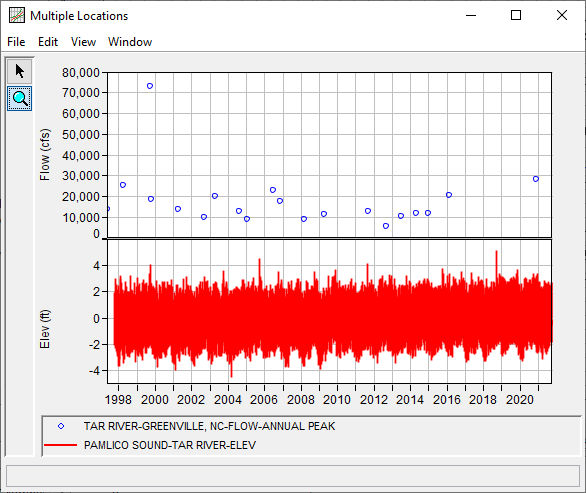
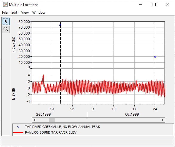
The primary time series is from the Tar River at Greenville, NC stream gage. The secondary time series represents hourly stage within the Pamlico Sound. The actual data for this time series was taken from the Beaufort, Duke Marine Lab, NC tide buoy. The time series are plotted within Figure 1.
General Tab
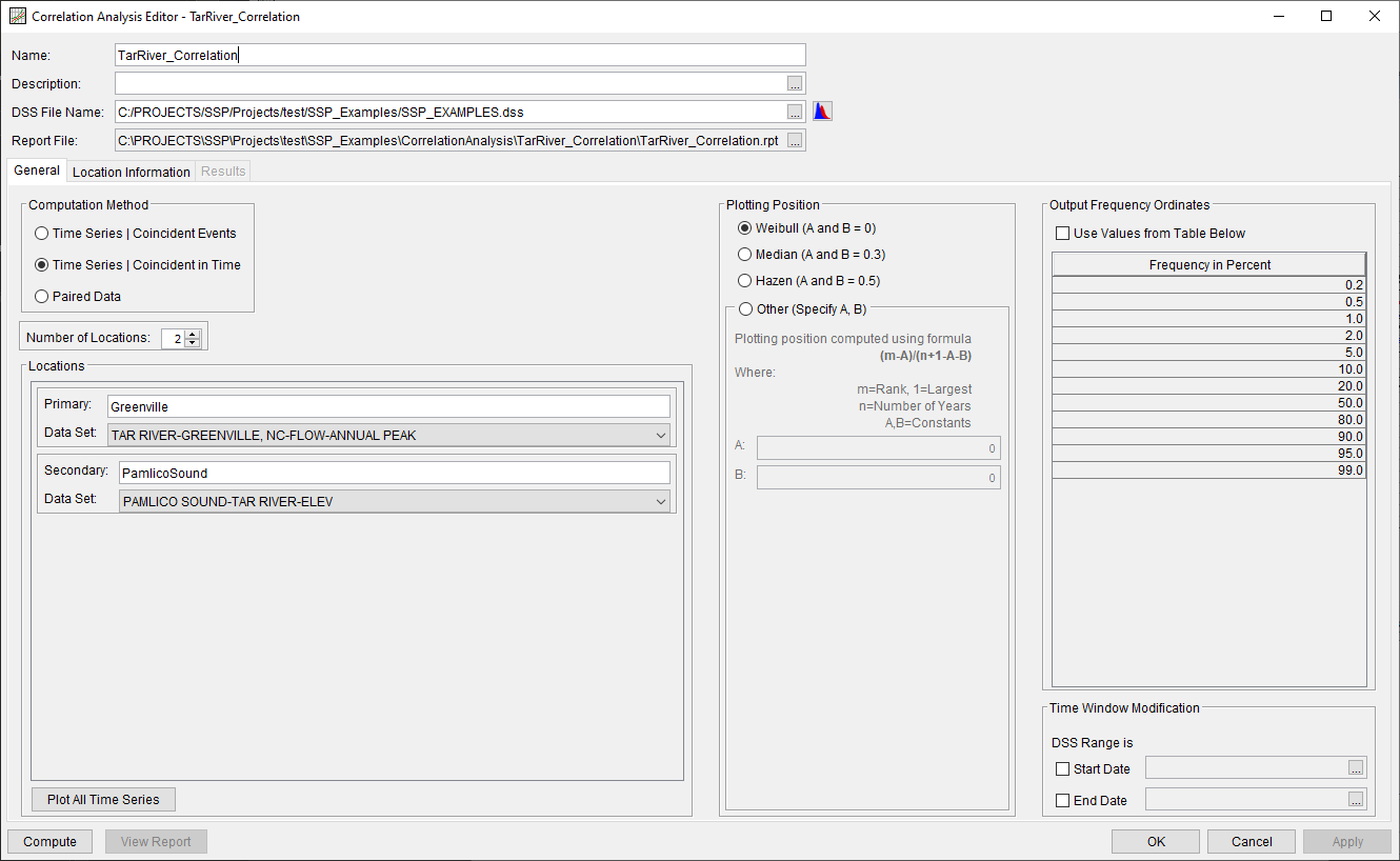
A Correlation Analysis has been developed for this example. To open the analysis, either double-click on the analysis labeled TarRiver_Correlation from the study explorer or from the Analysis menu select open, then select TarRiver_Correlation from the list of available analyses. When TarRiver_Correlation is opened, the General tab within the Correlation Analysis editor will appear as shown in Figure 2. For this analysis, the Time Series | Coincident in Time computational method was selected and two locations were defined. The default Plotting Position formula (Weibull) and Output Frequency Ordinates were left unchanged. No modifications were made to the time window.
Location Information Tab
The Location Information tab contains two sub-tabs, one for each of the previously defined locations.
Greenville
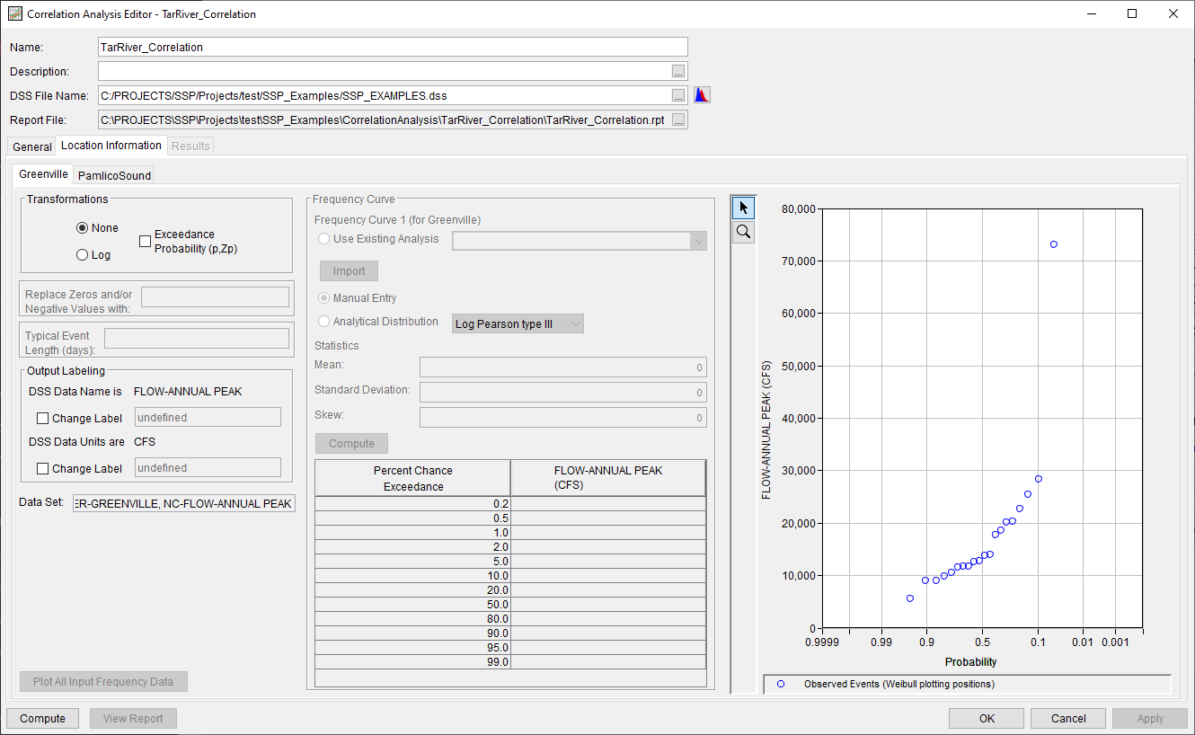
On the Greenville sub-tab, the None transformation was selected, as shown in Figure 3. All other default settings were retained.
Pamlico Sound
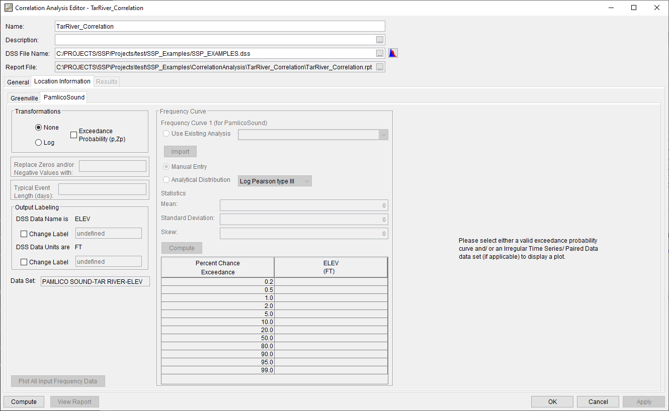
On the PamlicoSound sub-tab, the None transformation was selected, as shown in Figure 4. All other default settings were retained.
Computing the Analysis
Once all of the General and Location Information details have been selected and/or defined, the user can press the Compute button to perform the analysis. A Compute Warnings message will be shown noting that one value within the only Primary-Secondary pair was removed from consideration within the correlation calculations. This was solely due to the fact that the Greenville time series begins one year prior to the start of the PamlicoSound time series. Values from the Secondary time series (i.e. PamlicoSound) were extracted at the same time as each of the values within the Primary time series (i.e. Greenville), as shown within Figure 5. These values were then carried forward within the correlation computations.
Once the computations have been completed, a message window will open stating Compute Complete.
Results Tab
Upon a successful compute, the Results tab will become selectable. The Results tab contains a single sub-tab since the None transformation was previously selected for all locations, as shown in Figure 6. Within this sub-tab, results are presented consisting of:
- A Correlation Matrix of computed correlation coefficients,
- A plot of the selected pair,
- A Statistics table of the entire time series (all values are considered within these statistics), and
- An Events table consisting of the overlapping date range and number of values that were considered within the correlation computations for the selected pair.
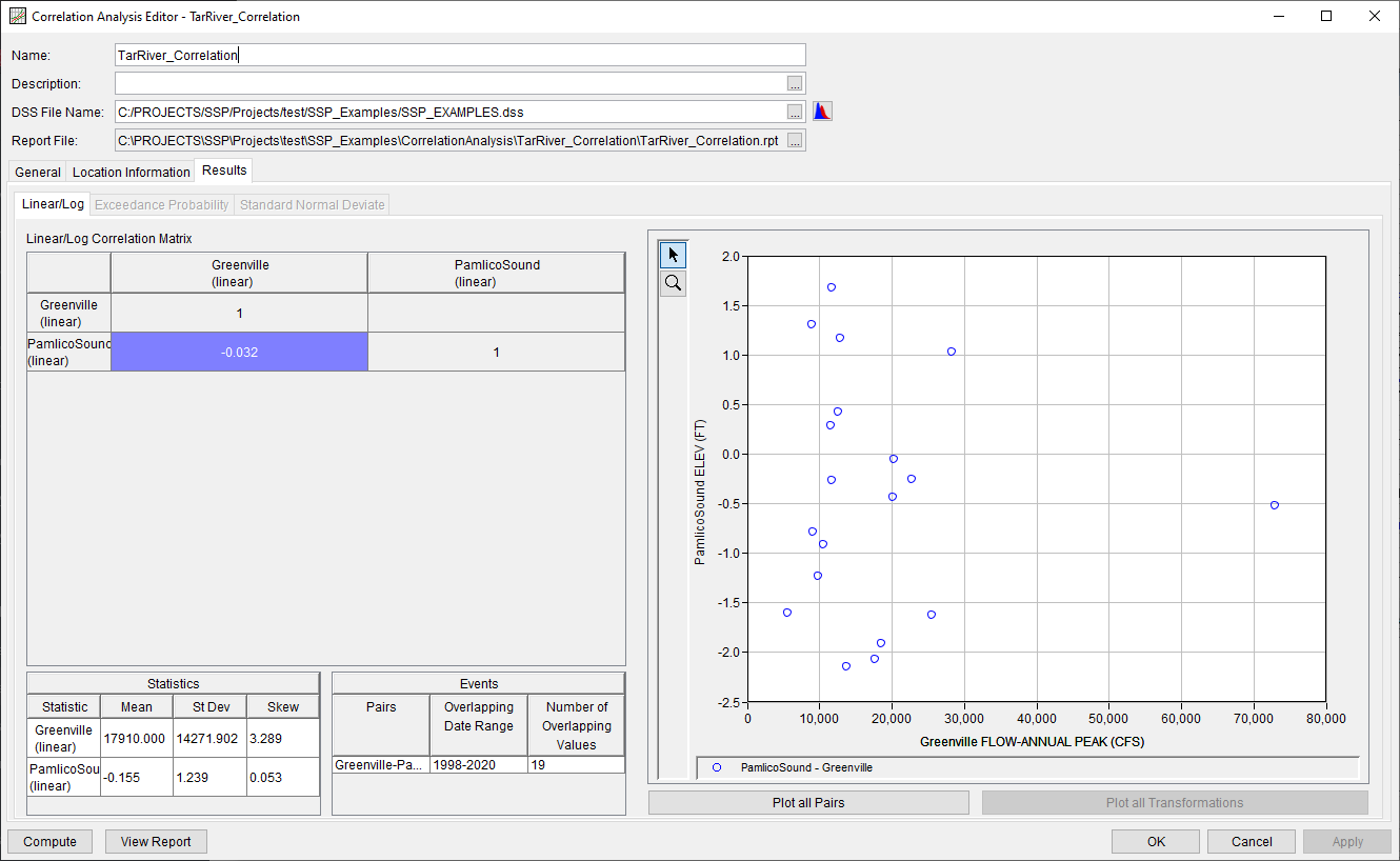
The correlation coefficient computed for this example is very weak. Per EM 1110-2-1413, datasets are often considered effectively independent when the absolute value of the correlation coefficient is less than 0.4. In this case, it appears the annual maximum peak discharge for the Tar River at Greenville, NC has no relationship to the water level within the Pamlico Sound. This makes physical sense since the Pamlico Sound is a much larger body of water, compared to the Tar River, that can drain/fill through many connections to the Atlantic Ocean. This is very valuable information for a flood risk management study, as the assumption of independence greatly simplifies a coincident frequency analysis that is likely the next step in the project.
Report File
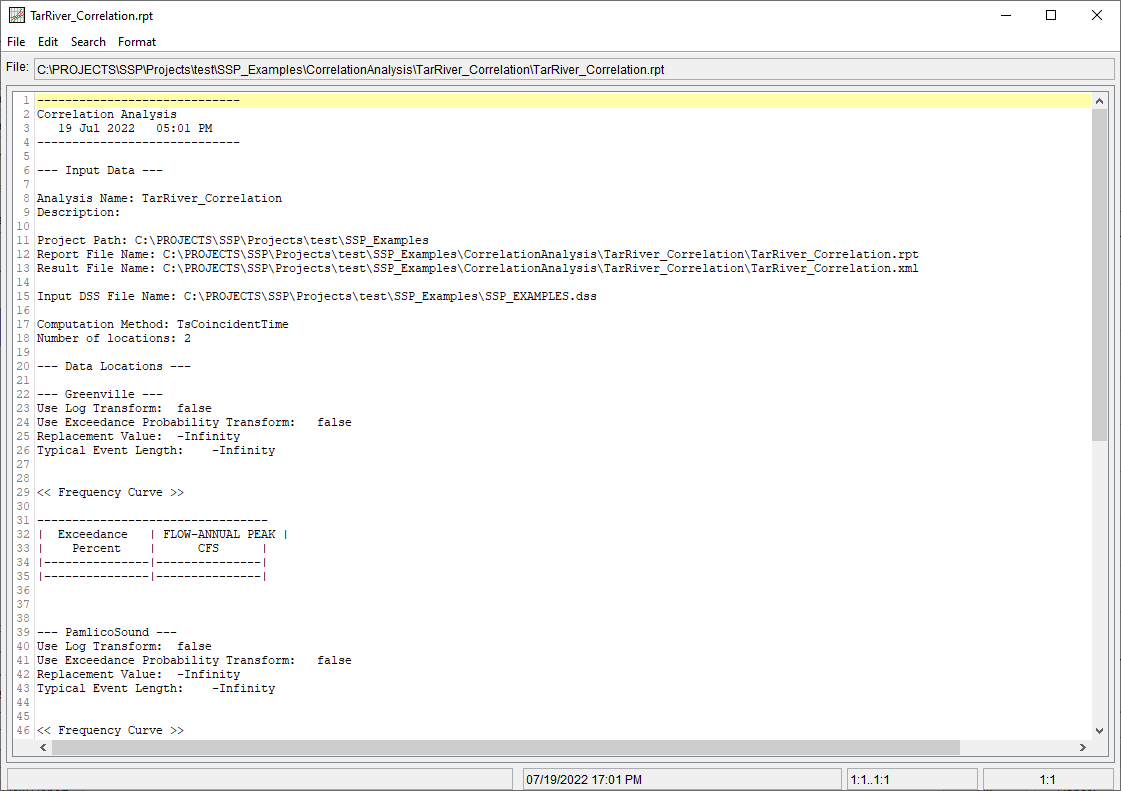
In addition to the tabular and graphical results, there is a report file that echoes the input data, selected computational options, and results. To review the report file, press the View Report button at the bottom of the analysis window. When this button is selected a text viewer will open the report file and display it on the screen, as shown in Figure 7.
Different types and amounts of information will show up in the report file depending on the data and the options that have been selected for the analysis.
