Download PDF
Download page Paired Data.
Paired Data
The PairedData_Correlation example demonstrates the usage of the Correlation Analysis to determine how closely related the values within paired data curves (i.e. curves with no date/time axis) are with one another.
Input Data
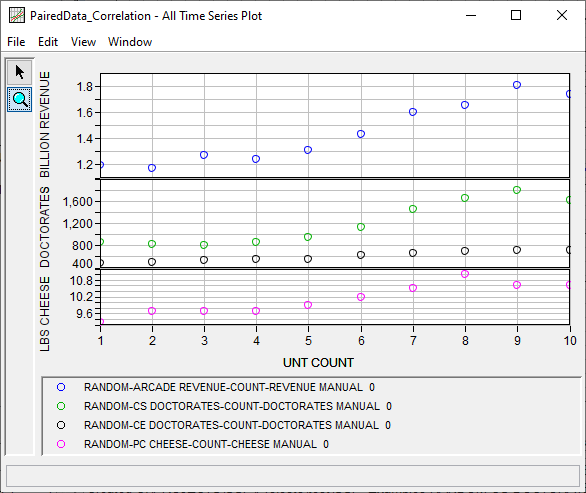
The paired data used within this example were made available by the Census Bureau and National Science Foundation. The four paired data curves represent arcade revenue ($ billion), Computer Science doctorates awarded, per capita cheese consumption, and Civil Engineering doctorates awarded (all within the U.S.). The paired data are plotted within Figure 1 and tabulated within Table 1.
| Count | Arcade Revenue ($ billion) | Computer Science Doctorates Awarded | Per Capita Consumption of Mozzarella Cheese (lbs) | Civil Engineering Doctorates Awarded |
|---|---|---|---|---|
| 1 | 1.196 | 861 | 9.3 | 480 |
| 2 | 1.176 | 830 | 9.7 | 501 |
| 3 | 1.269 | 809 | 9.7 | 540 |
| 4 | 1.24 | 867 | 9.7 | 552 |
| 5 | 1.307 | 948 | 9.9 | 547 |
| 6 | 1.435 | 1129 | 10.2 | 622 |
| 7 | 1.601 | 1453 | 10.5 | 655 |
| 8 | 1.654 | 1656 | 11 | 701 |
| 9 | 1.803 | 1787 | 10.6 | 712 |
| 10 | 1.734 | 1611 | 10.6 | 708 |
General Tab
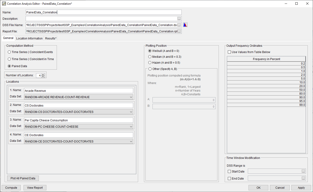
A Correlation Analysis has been developed for this example. To open the analysis, either double-click on the analysis labeled PairedData_Correlation from the study explorer or from the Analysis menu select open, then select PairedData_Correlation from the list of available analyses. When PairedData_Correlation is opened, the General tab within the Correlation Analysis editor will appear as shown in Figure 2. For this analysis, the Paired Data computational method was selected and four locations were defined. The default Plotting Position formula (Weibull) and Output Frequency Ordinates were left unchanged. No modifications were made to the time window.
Location Information Tab
The Location Information tab contains four sub-tabs, one for each of the previously defined locations.
Arcade Revenue
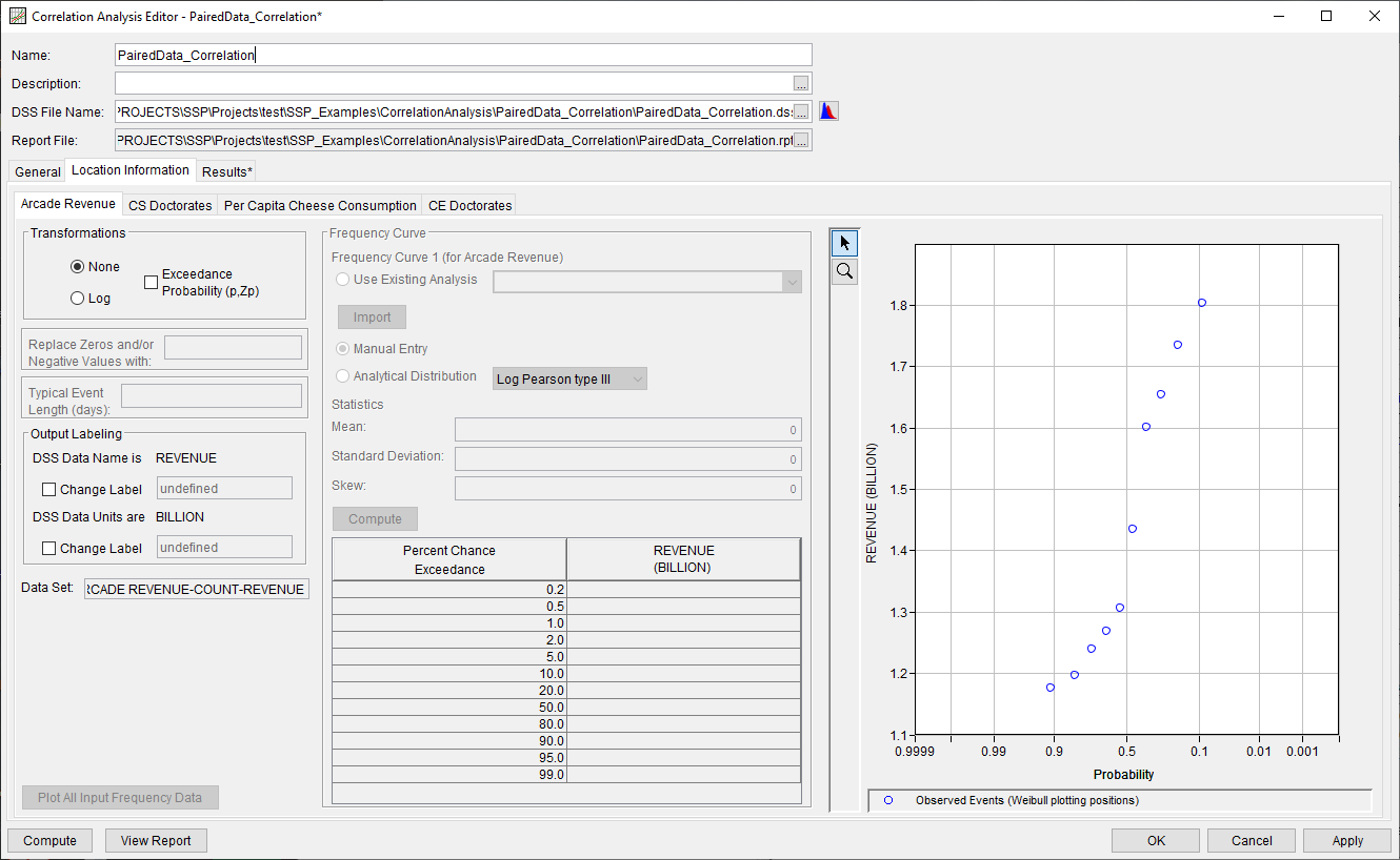
On the Arcade Revenue sub-tab, the None transformation was selected, as shown in Figure 3. All other default settings were retained.
CS Doctorates
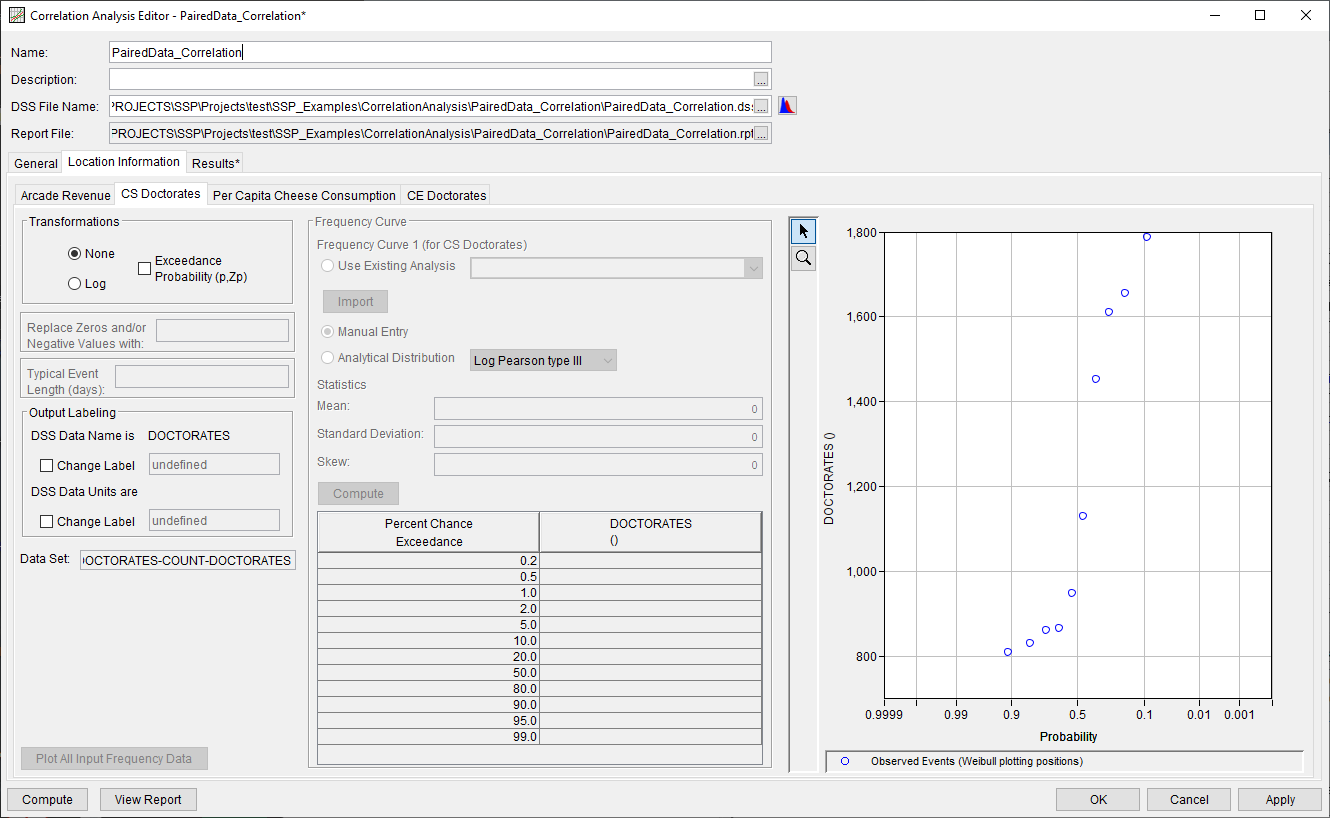
On the CS Doctorates sub-tab, the None transformation was selected, as shown in Figure 4. All other default settings were retained.
Per Capita Cheese Consumption
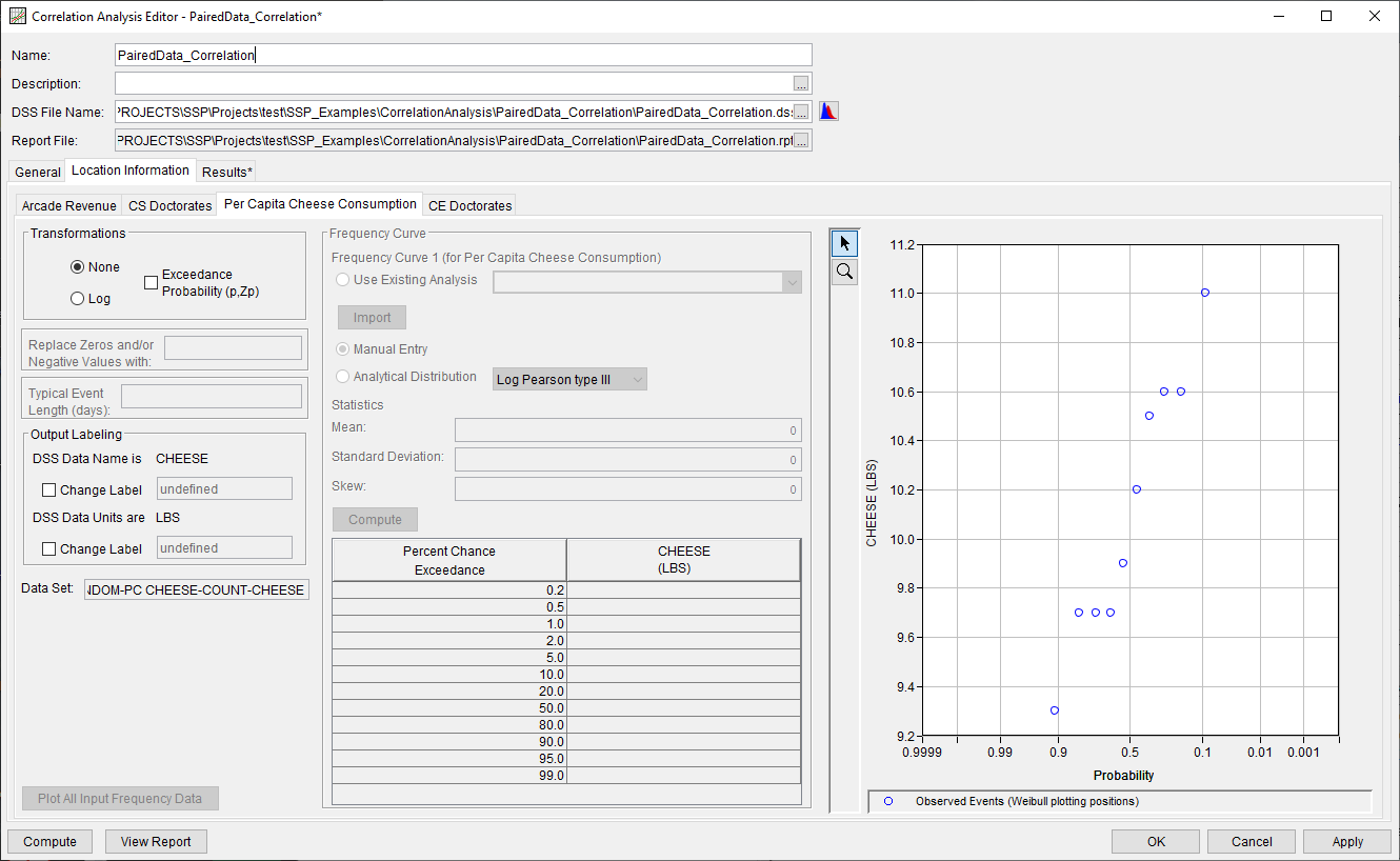
On the Per Capita Cheese Consumption sub-tab, the None transformation was selected, as shown in Figure 5. All other default settings were retained.
CE Doctorates
On the CE Doctorates sub-tab, the None transformation was selected, as shown in Figure 6. All other default settings were retained.

Computing the Analysis
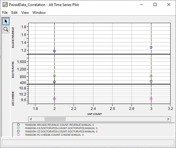
Once all of the General and Location Information details have been selected and/or defined, the user can press the Compute button to perform the analysis. Values from each paired data curve are compared against each other "1 for 1", as shown within Figure 7. These values were then carried forward within the correlation computations.
Once the computations have been completed, a message window will open stating Compute Complete.
Results Tab
Upon a successful compute, the Results tab will become selectable. The Results tab contains a single sub-tab since the None transformation was previously selected for all locations, as shown in Figure 8. Within this sub-tab, results are presented consisting of:
- A Correlation Matrix of computed correlation coefficients,
- A plot of the selected pair,
- A Statistics table of the entire time series (all values are considered within these statistics), and
- An Events table consisting of the overlapping date range and number of values that were considered within the correlation computations for the selected pair.
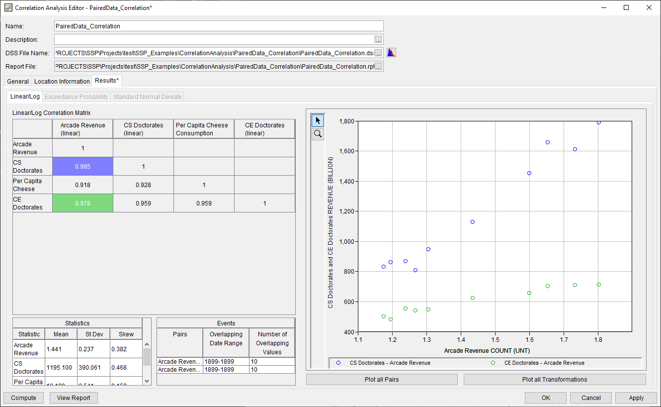
The seemingly random values considered within this example are all very well correlated with one another (r > 0.9). For example, as arcade revenue increases, the number of computer science doctorates awarded within the U.S. increase. However, the sample sizes considered in this example are all small and may not be adequately large to predict the long-term behavior of each data type.
Report File
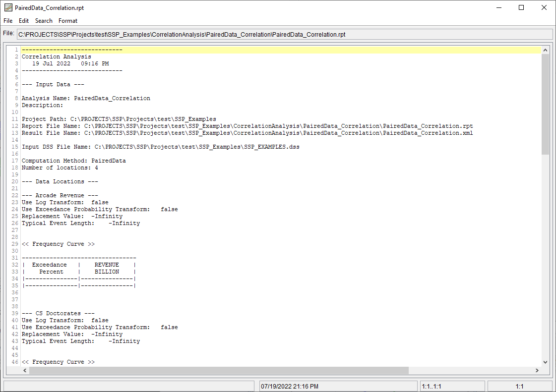
In addition to the tabular and graphical results, there is a report file that echoes the input data, selected computational options, and results. To review the report file, press the View Report button at the bottom of the analysis window. When this button is selected a text viewer will open the report file and display it on the screen, as shown in Figure 9.
Different types and amounts of information will show up in the report file depending on the data and the options that have been selected for the analysis.
