This example demonstrates how to create a Curve Combination analysis that combines multiple input frequency curves using graphical techniques. In this example, a "best-fit" empirical distribution will be created using multiple reservoir stage-frequency curves.
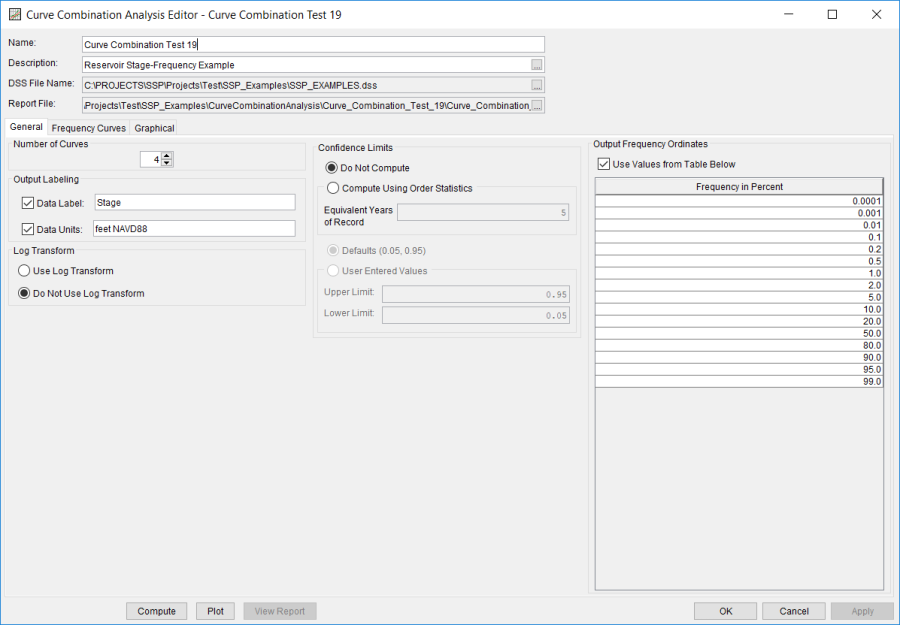
A Curve Combination analysis has been developed for this example. To open the Curve Combination analysis editor for this example, either double-click on the analysis labeled Curve Combination Test 19 from the study explorer, or from the Analysis menu select open, then select Curve Combination Test 19 from the list of available analyses. When Test 19 is opened, the Curve Combination Analysis editor will appear as shown in Figure 1.
Shown in Figure 1 are the general settings for this curve combination analysis. "Stage" and "feet NAVD88" were entered for the Data Label and Data Units, respectively. The Do Not Use Log Transform and Do Not Compute confidence limits options were selected. Finally, the 0.1-, 0.01-, 0.001, and 0.0001-percent ordinates were added to the list of Output Frequency Ordinates.
Shown in Figure 2 are the general settings for this curve combination analysis. "Stage" and "feet NAVD88" were entered for the Data Label and Data Units, respectively. The Do Not Use Log Transform and Do Not Compute confidence limits options were selected. Finally, the 0.1-, 0.01-, 0.001, and 0.0001-percent ordinates were added to the list of Output Frequency Ordinates. Shown in Figure B-135 is the Curve Combination analysis editor with the Frequency Curves tab selected. A name of "Annual Peak Stages" was entered for Frequency Curve 1, a name of "Frequency Precipitation" was entered for Frequency Curve 2, a name of "Historical Event BH Routings" was entered for Frequency Curve 3, and a name of "PMF BH Routings" was entered for Frequency Curve 4. All four frequency curves were set to utilize manually-entered empirical distributions. However, each frequency curve utilized different probability ordinates and stages.
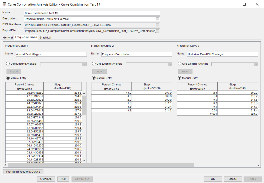
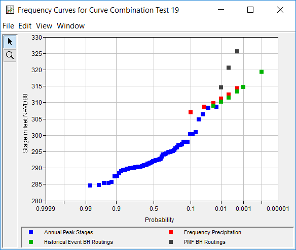
Figure 3 shows the plotted frequency curves for this analysis.
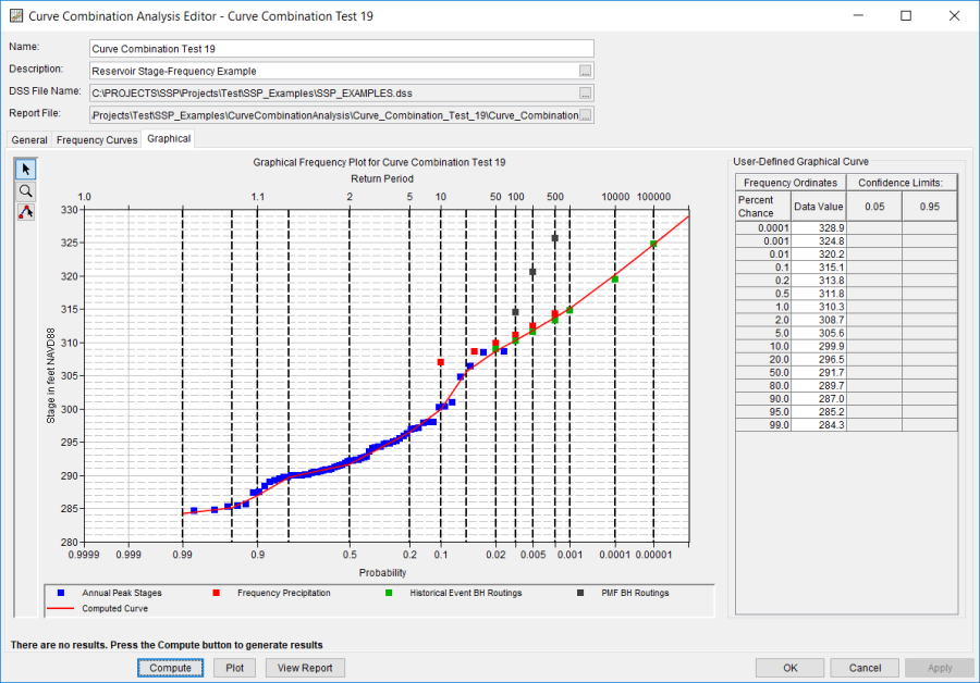
Once all of the options and frequency curve inputs are set or selected, the user can graphically fit an empirical distribution. Shown in Figure 4 is the Graphical tab. As shown, a graph containing the input frequency curves along with a graphical curve is on the left side and a table containing the user-entered frequency curve is on the right side of the window. The frequency curve was entered using the multi-point edit tool, values were extracted at the specified output frequency ordinates (signified with vertical dashed marker lines), and placed within the User-Defined Graphical Curve table. When the Compute button is pressed, a message window will open stating Compute Complete. The program will then plot the graphical frequency curve (and computes the confidence limits, if specified). Within this example, the best fit pool stage-frequency curve was defined to closely follow the Frequency Precipitation and Historical Event BH Routings frequency curves. To view the graphical curve in a separate window, either click the Plot button or double click on the plot within the Graphical tab.
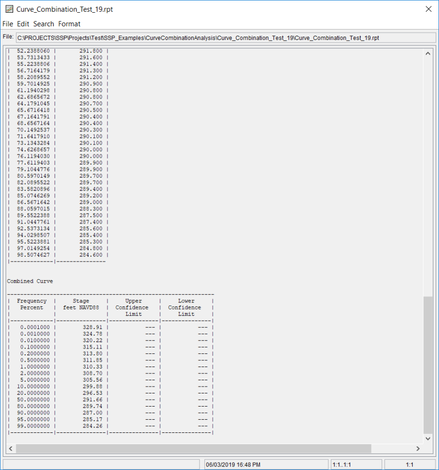
In addition to the tabular and graphical results, there is a report file that shows input data and results. To review the report file, press the View Report button at the bottom of the analysis window. When this button is selected a text viewer will open the report file and display it on the screen. Shown in Figure 5 is the report file for Curve Combination Test 19.
