Download PDF
Download page Example 29. General Frequency, Fitting a Log Pearson Type III Distribution using the Expected Moments Algorithm.
Example 29. General Frequency, Fitting a Log Pearson Type III Distribution using the Expected Moments Algorithm
This example demonstrates how to use the Expected Moments Algorithm (EMA) to fit the Log Pearson Type III distribution to an annual maximum series of streamflow within the General Frequency analysis. The data for this example consists of an instantaneous peak annual maximum series of streamflow for a location along the South Fork Shoshone River River near Valley, WY. This stream gage is operated by the USGS (gage ID: 06280300). The period of record used for this example is from 1957 to 2016. To view the data from HEC-SSP, right-click on the data record labeled "South Fork Shoshone River-Flow-Annual Peak" in the study explorer and then select Plot. A plot of the data will appear as shown in Figure 1.
A General Frequency analysis has been developed for this example. To open the General Frequency analysis editor for this example, either double-click on the analysis labeled General Frequency EMA Test from the study explorer, or from the Analysis menu, select open, then select General Frequency EMA Test from the list of available analyses. When this analysis is opened, the General Frequency editor will appear as shown in Figure 2. Shown in Figure 2 are the general settings that were used to perform this frequency analysis. As shown, the Analytical, Use Log Transform, and Annual Maximum options were selected. Also, the Hirsch/Stedinger option was selected within the Plotting Position panel (which is only available once the LogPearsonIII | EMA distribution and fitting method combination is selected on the Analytical | Settings tab). Finally, the default confidence limits options were left unchanged.
Shown in Figure 3 is the General Frequency analysis editor with the Options Tab selected. Features on this tab include the Low Outlier Threshold, an option to use Historic Data, an option to override the default Frequency Ordinates, and Output Labeling. All default settings were selected for this example.
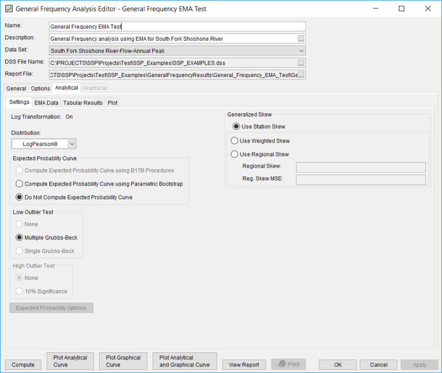
In this example, an analytical analysis was performed. Shown in Figure 4 is the Settings tab for the analytical analysis. As shown, the distribution and fitting method combination which was selected for this example is LogPearsonIII | EMA. The Do Not Compute Excepted Probability, Multiple Grubbs-Beck, and no high outlier test options were selected. Also, the Skew option was set to Use Station Skew.
The Analytical | EMA Data tab for this example is shown in Figure 5. Data required for the EMA computations is entered on this tab. Specifically, flow ranges, perception thresholds, and data types are entered here. The data for this record contains a missing period spanning a single water year (1959). 17C EMA requires a non zero – inf perception threshold for all periods of missing data. In this case, the largest observed event (which occurred in 1981) was used to inform the perception threshold for water year 1959. The use of a perception threshold of 10000 – inf implies that had a flood event occurred with a peak flow greater than 10,000 cfs, someone would have measured and recorded it. Once the perception threshold has been entered, click the Apply Thresholds button to assign a complementary flow range for the period of missing data. No modifications to the default flow ranges and data types are necessary.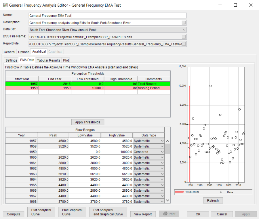
Once all of the General and EMA Data tab settings are set or selected, the user can press the Compute button to perform the analysis. Once the computations have been completed, a message window will open stating Analytical Compute Complete. Close this window and then select the Analytical | Tabular Results tab. This window should resemble Figure 6. Within this tab is a tabular listing of the computed frequency curve and confidence limits that were specified as part of the analysis. Tables containing Distribution Parameters in addition to Events is shown along the bottom of the window. Finally, the lower right hand panel displays the selected distribution and whether or not the log transform was selected.
In addition to the tabular results, the Analytical | Plot tab contains a graph of the input data and the computed frequency curves, as specified within the analysis. The right side of the plot tab contains a table of Sample Statistics and Adjusted Statistics. The user has the option to enter one or more adjusted statistics within in the Adjusted Statistics table. The Compute button must be pressed after adjusted statistics have been entered in order for the program to compute a frequency curve using the user statistics. A graphical plot of the input and computed results can be obtained by pressing the Plot Analytical Curve button at the bottom of the analysis window. A plot of the results for this example is shown in Figure 7.
In addition to the tabular and graphical results, there is a report file that shows the input data, summary statistics, and the computed results. Different types and amounts of information will be contained within the report file depending upon the data and the options that have been selected for the analysis. To review the report file, press the View Report button at the bottom of the analysis window. When this button is selected a text viewer will open the report file and display it on the screen, as shown in Figure 8.