Download PDF
Download page Example 30. General Frequency, Fitting an Analytical Distribution to a Precipitation Time Series.
Example 30. General Frequency, Fitting an Analytical Distribution to a Precipitation Time Series
This example demonstrates how to fit an analytical distribution to an annual maximum series of precipitation depths within the General Frequency analysis. The data for this example consists of an annual maximum series of 3-day duration precipitation depths for a precipitation gage located near Hawley, Pennsylvania. This precipitation gage is operated by the NWS. Daily precipitation data was downloaded from the NWS website ("https://www.ncdc.noaa.gov/") as a .csv file, ingested to the study using an HEC-DSSVue plugin, accumulated to a 3-day duration, and an annual maximum series was extracted using tools contained within HEC-SSP. The period of record used for this example is from 1921 to 2016. To view the data from HEC-SSP, right-click on the data record labeled "Hawley 1E PA-3DAY-Precip-AMS" in the study explorer and then select Plot. A plot of the data will appear as shown in Figure 1.
A General Frequency analysis has been developed for this example. To open the General Frequency analysis editor for this example, either double-click on the analysis labeled General Frequency Precip Test from the study explorer, or from the Analysis menu, select open, then select General Frequency Precip Test from the list of available analyses. When this analysis is opened, the General Frequency editor will appear as shown in Figure 2. Shown in Figure 2 are the general settings that were used to perform this frequency analysis. As shown, the Analytical, Do Not Use Log Transform, and Annual Maximum options were selected. Also, the Median option was selected within the Plotting Position panel. Finally, the default confidence limits options were left unchanged.
Shown in Figure 3 is the General Frequency analysis editor with the Options Tab selected. Features on this tab include the Low Outlier Threshold, an option to use Historic Data, an option to override the default Frequency Ordinates, and Output Labeling. All defaults settings were selected for this example.
In this example, an analytical analysis was performed. Shown in Figure 4 is the Settings tab for the analytical analysis. As shown, the distribution and fitting method combination which was selected for this example is Generalized Extreme Value | L-Moments. The Do Not Compute Excepted Probability and Single Grubbs-Beck options were selected.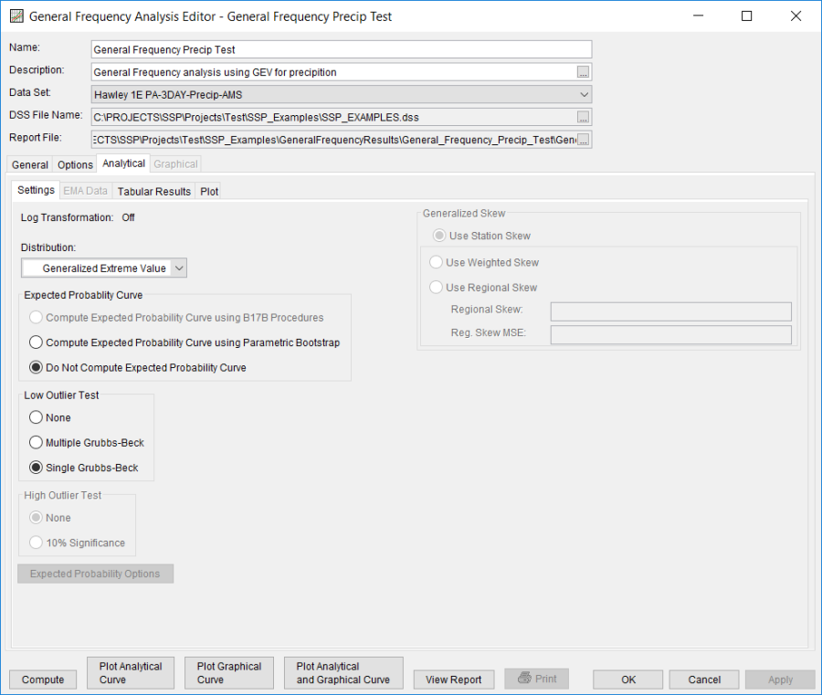
Press the Compute button to perform the analysis. Once the computations have been completed, a message window will open stating Analytical Compute Complete. Close this window and then select the Analytical | Tabular Results tab. This window should resemble Figure 5. Within this tab is a tabular listing of the computed results that were specified as part of the analysis. Also, a table of Distribution Parameters is shown along the bottom of the window. Also on the bottom is an Events table showing values pertinent to the number of different types of events used within the analysis. Finally, the lower right hand panel displays the selected distribution and whether or not the log transform was selected.
In addition to the tabular results, the Analytical | Plot tab contains a graph of the input data and the computed frequency curves, as specified within the analysis. The right side of the plot tab contains a table of Sample Statistics and Adjusted Statistics. The user has the option to enter one or more adjusted statistics within in the Adjusted Statistics table. The Compute button must be pressed after adjusted statistics have been entered in order for the program to compute a frequency curve using the user statistics.
A graphical plot of the input and computed results can be obtained by pressing the Plot Analytical Curve button at the bottom of the analysis window. A plot of the results for this example is shown in Figure 6.
In addition to the tabular and graphical results, there is a report file that shows the input data, summary statistics, and the computed results. Different types and amounts of information will be contained within the report file depending upon the data and the options that have been selected for the analysis. To review the report file, press the View Report button at the bottom of the analysis window. When this button is selected a text viewer will open the report file and display it on the screen, as shown in Figure 7.
