Download PDF
Download page Example 8. Using User-Adjusted Statistics.
Example 8. Using User-Adjusted Statistics
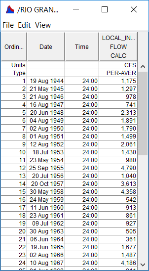
In the SSP_Examples.ssp study, the Local Runoff at Alb Test 8 example demonstrates how to use the General Frequency analysis and enter user-adjusted statistics. The data for this example is from an analysis that computed local runoff for the Rio Grande at Albuquerque. The data includes unregulated daily average flows generated by rainfall-runoff from areas downstream of upstream reservoirs. The period of record used for this example is from 1944 to 2000. To view the data, right-click on the data record labeled "Rio Grande at Alb Local Runoff" in the study explorer and then select Tabulate. The data will appear as shown in Figure 1.
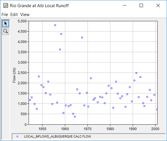
To plot the data for this example, right-click on the data record and then select Plot. A plot of the data will appear as shown in Figure 2.
A General Frequency analysis has been developed for this example. To open the General Frequency Analysis Editor for this example, either double-click on the analysis labeled Local Runoff at Alb Test 8 from the study explorer, or from the Analysis menu select open, then select Local Runoff at Alb Test 8 from the list of available analyses. When Test 8 is opened, the General Frequency Analysis Editor will appear as shown in Figure 3.

Shown in Figure 3 are the general settings that were used to perform this frequency analysis. For this analysis, the Analytical, Use Log Transform, and Annual Maximum options were selected. Also, the Median plotting position method was selected, the default Confidence Limits were selected, and no modification was made to the Time Window. Finally, the Calendar Year option was selected within the Year Specification panel.
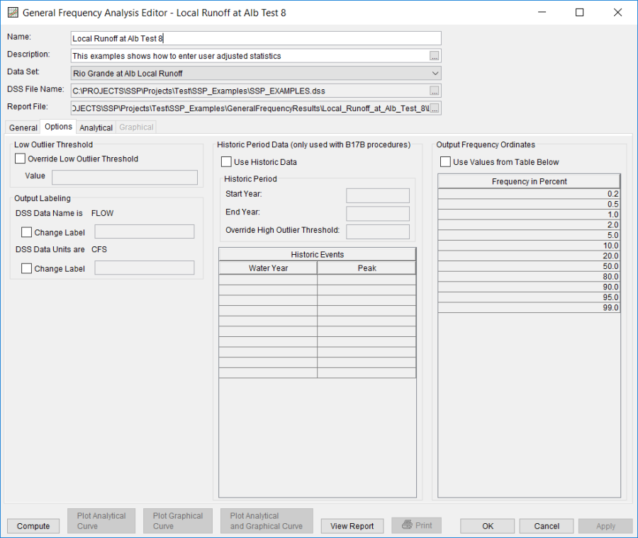
Shown in Figure 4 is the General Frequency Analysis Editor with the Options tab selected. Features on this tab include the Low Outlier Threshold, an option to use Historic Data, an option to override the default Frequency Ordinates, and Output Labeling. All defaults settings were selected for this example.
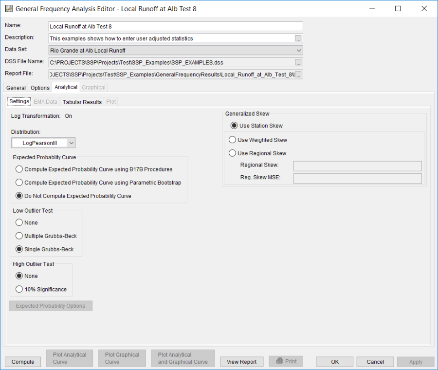
In this example, an analytical analysis was performed. Shown in Figure 5 is the Settings tab for the analytical analysis. As shown, the distribution and fitting method combination which was selected for this example is LogPearsonIII | Product Moments. The Do Not Compute Excepted Probability, Single Grubbs-Beck, and no high outlier test options were selected. Also, the Skew option was set to Use Station Skew.
Press the Compute button to perform the analysis. Once the computations have been completed, a message window will open stating Analytical Compute Complete. Close this window and then select the Plot tab within the analytical analysis. The analytical plot window should resemble Figure 6.
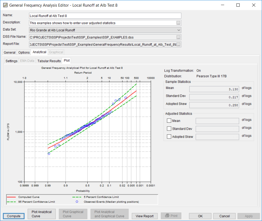
As shown in Figure 6, the Plot tab contains a graph of the systematic data, the computed frequency curve, and the confidence limits. The right side of the plot tab contains a table of Sample Statistics and Adjusted Statistics. The user has the option to enter one or more adjusted statistics within in the Adjusted Statistics table. The Compute button must be pressed after adjusted statistics have been entered in order for the program to compute a frequency curve using the user statistics.
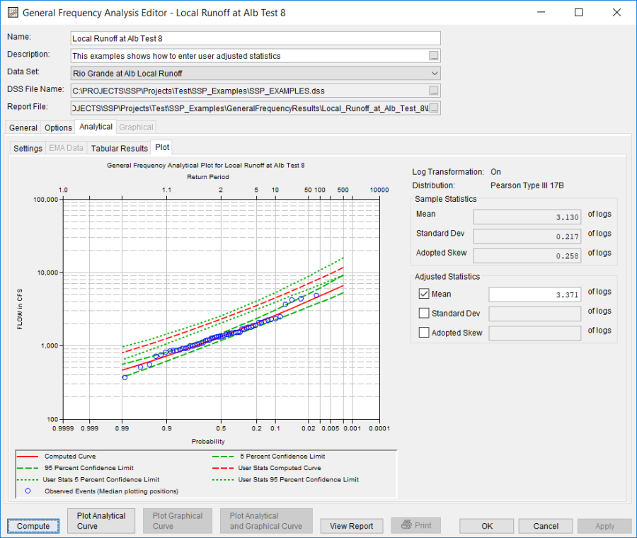
As mentioned at the beginning of this example, the annual peak flows were based on daily averaged flows. In order to compute an instantaneous peak flow frequency curve, a relationship between daily averaged flows and the corresponding instantaneous peak flows was developed. This was done by plotting daily averaged flow and the corresponding instantaneous peak flow for selected flood events. Using this relationship, a Mean of 3.371 was computed and entered in the User Statistics table and the analytical analysis was recomputed.
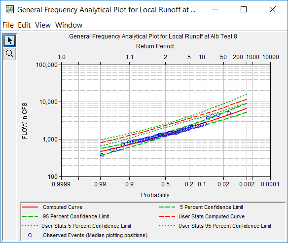
Figure 7 shows that the frequency curve computed from the user-adjusted statistics is added to the graph. This figure also shows that the user does not have to enter values for all statistics in order for the program to compute a user-adjusted frequency curve. The program will use statistics computed from the systematic and historic data if the statistics are not defined in the User Statistics table. In this example, the program used the computed statistics for standard deviation, adopted skew, equivalent years of record and the user-defined mean of 3.371 when computing the user-adjusted frequency curve.
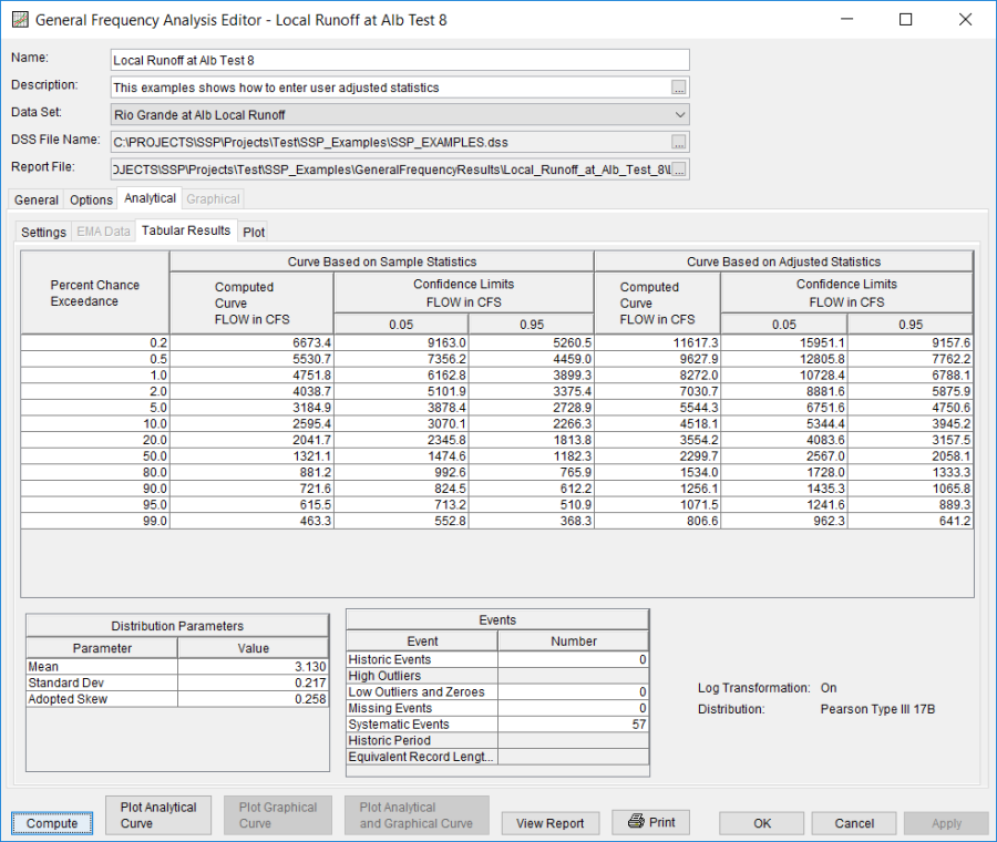
Select the Tabular Results tab to see information for both the computed and user-adjusted frequency curves. As shown in Figure 8, the Frequency Curve table contains the percent chance exceedance, computed curves (Log-Pearson III results), and the Confidence Limits (5% and 95% chance exceedance curves) for both the computed and user-adjusted statistics.
On the bottom left-hand side of the results tab is a Distribution Parameters table of Statistics for the observed station data (mean, standard deviation, station skew) and regional adjustment (regional skew, weighted skew, and adopted skew). Also on the bottom right-hand side of the results tab is a table of Number of Events table showing the number of historic events used in the analysis, number of high outliers found, number of low outliers, number of zero or missing data years, number of systematic events in the gage record, and the historic record length (if historic data was entered).
In addition to the tabular results, a graphical plot of the computed frequency curves can be obtained by pressing the Plot Analytical Curve button at the bottom of the analysis window. A plot of the results for this example is shown in Figure 9.
The tabular and graphical results can be sent to the printer or the windows clipboard for transfer into another piece of software. To print the tabular results, select Print from the bottom of the analysis window. To send the tabular results to the windows clipboard, highlight the data you want to send to the clipboard and then press the Control-C key sequence. To print the graphical results, first bring up the graphical plot and then select Print from the File menu. To send the graphic to the windows clipboard, select Copy to Clipboard from the File menu.
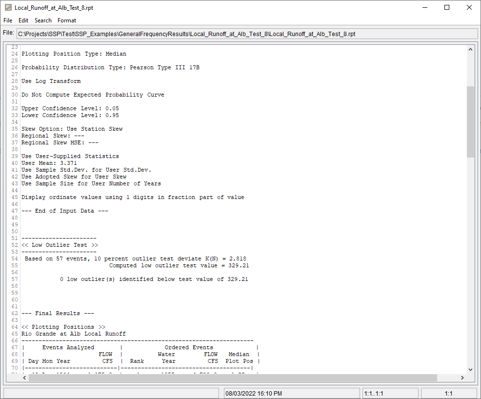
In addition to the tabular and graphical results, there is a report file that shows the order in which the calculations were performed. To review the report file, press the View Report button at the bottom of the analysis window. When this button is selected a text viewer will open the report file and display it on the screen. Shown in Figure 10 is the report file for Local Runoff at Alb Test 8.
The report file contains a listing of the input data, preliminary results, outlier and historical data tests, additional calculations needed, and the final frequency curve results. Different types and amounts of information will show up in the report file depending on the data and the options that have been selected for the analysis.
