Download PDF
Download page Example 31. Volume Frequency, Fitting a Family of Log Pearson Type III Distributions to Volume-Duration Data using the Expected Moments Algorithm.
Example 31. Volume Frequency, Fitting a Family of Log Pearson Type III Distributions to Volume-Duration Data using the Expected Moments Algorithm
This example demonstrates how to use EMA to fit a family of Log Pearson Type III distributions to volume-duration data within the Volume Frequency analysis. The data for this example consists of daily average streamflow for a location along the Sinnemahoning Creek near Sinnemahoning, PA. This stream gage is operated by the USGS (gage ID: 01543500). The period of record used for this example is from 1938 to 2016. To view the data from HEC-SSP, right-click on the data record labeled "Sinnemahoning Creek-Daily" in the study explorer and then select Plot. A plot of the data will appear as shown in Figure 1.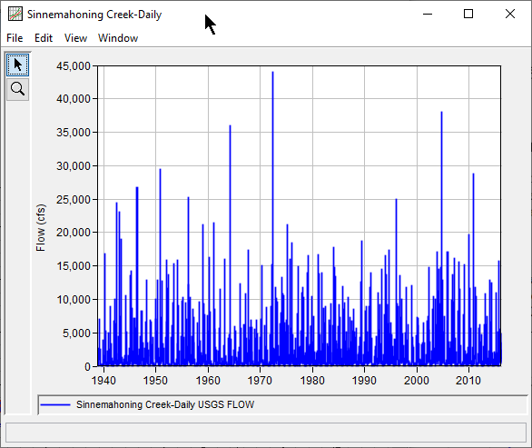
A Volume Frequency analysis has been developed for this example. To open the Volume Frequency Analysis editor for this example, either double-click on the analysis labeled Sinnemahoning_VolumeFrequency from the study explorer, or from the Analysis menu select open, then select Sinnemahoning_VolumeFrequency from the list of available analyses. When the analysis is opened, the Volume Frequency Analysis editor will appear as shown in Figure 2. Shown in Figure 2 are the general settings that were used to perform this frequency analysis. For this analysis, the Use Log Transform, Analyze Maxima, and Water Year options were selected. Also, the Hirsch/Stedinger plotting position method was selected within the Plotting Position panel (which is only available once the LogPearsonIII | EMA distribution and fitting method combination is selected on the Analytical | Settings tab). Finally, no modifications were made within the Extract Time Window Modification panel.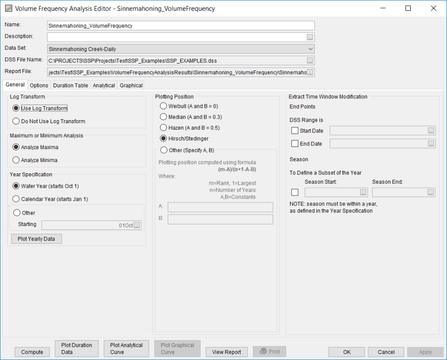
Shown in Figure 3 is the Volume Frequency Analysis editor with the Options Tab selected. Features on this tab include an option to override the default Flow Duration values, an option to override the default Frequency Ordinates, and Output Labeling. Both the flow-duration and frequency ordinate tables were modified. Specifically, the 1-, 2-, 3-, 5-, and 10-day durations were defined within the Flow Durations panel, in addition to the 0.1-percent ordinate being added within the Output Frequency Ordinates panel.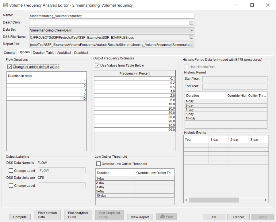
Once all of the General and Optional settings are set or selected, the user can extract the volume-duration data from the time-series of daily flows. Select the Duration Data tab and press the Extract Volume-Duration Data button at the bottom of the table. The table should then fill with the flow-duration values, as shown in Figure 4.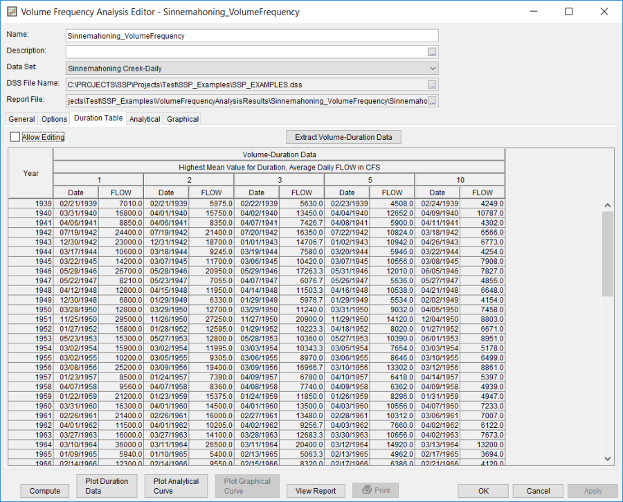
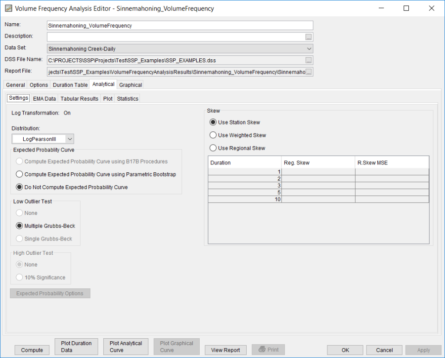
Once the data has been extracted, the user must choose to perform an Analytical or Graphical analysis. In this example, an analytical analysis was performed. Shown in Figure 5 is the Settings tab for the analytical analysis. As shown, the distribution selected for this example is LogPearsonIII | EMA. The Do Not Compute Excepted Probability, Multiple Grubbs-Beck and Use Station Skew options were selected.
The 1-day duration EMA Data tab for this example is shown in Figure 6. An EMA Data tab will be created for each duration. Flow ranges, perception thresholds, and data types must be entered, as required for the analysis and data set, within each tab. For this example, the data set is comprised entirely of systematic data with a no gaps. Therefore, a single zero – inf perception threshold is adequate for each duration. Additionally, no modifications to the default flow ranges and data types are necessary.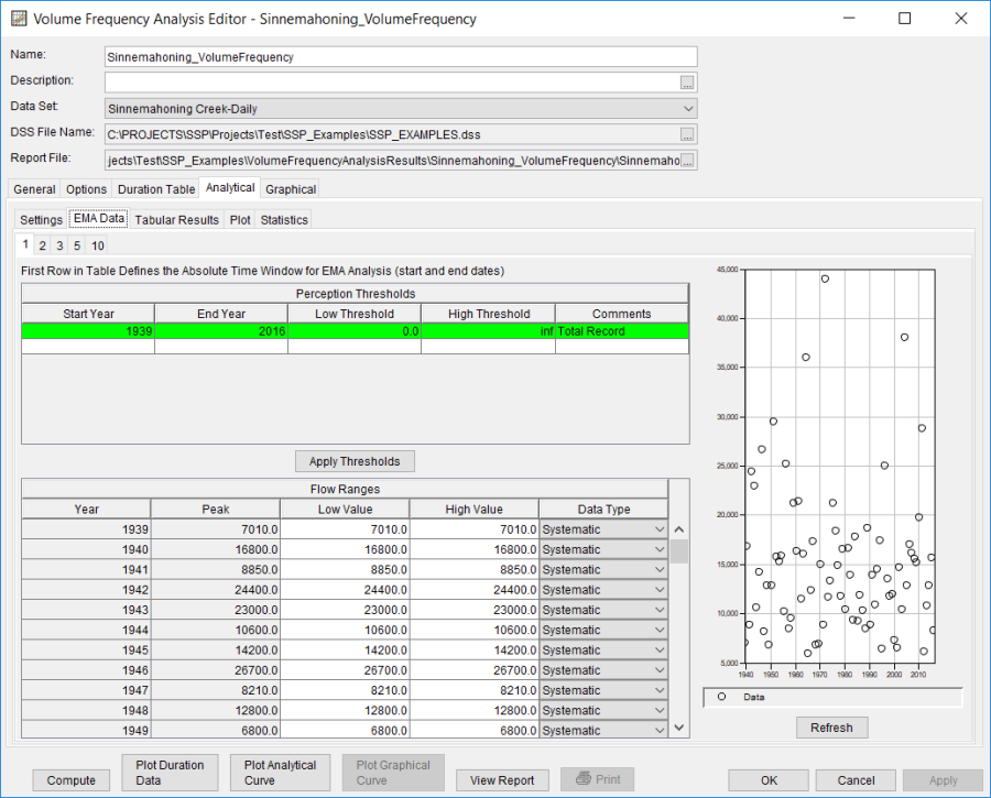
Once all of the General and EMA Data tab settings are set or selected, the user can press the Compute button to perform the analysis. Message windows will open stating the flow value for longer durations are greater than shorter durations for specific water years in addition to a few of the annual maxima occurring near the beginning of the year. The messages suggests that the user change the year/season specification to better capture independent events. You want to minimize the possibility that the same flood event is used for consecutive years or that a flood is divided between years. Press the OK button to finish the compute. Once the computations have been completed, a message window will open stating Compute Complete. Close this window and then select the Tabular Results tab within the analytical analysis. The results table should resemble Figure 7. The top portion of the results table contains the frequency curve for each duration. The confidence limits for each duration can be found within the Report file. The bottom portion of the results table contains the statistics for each duration.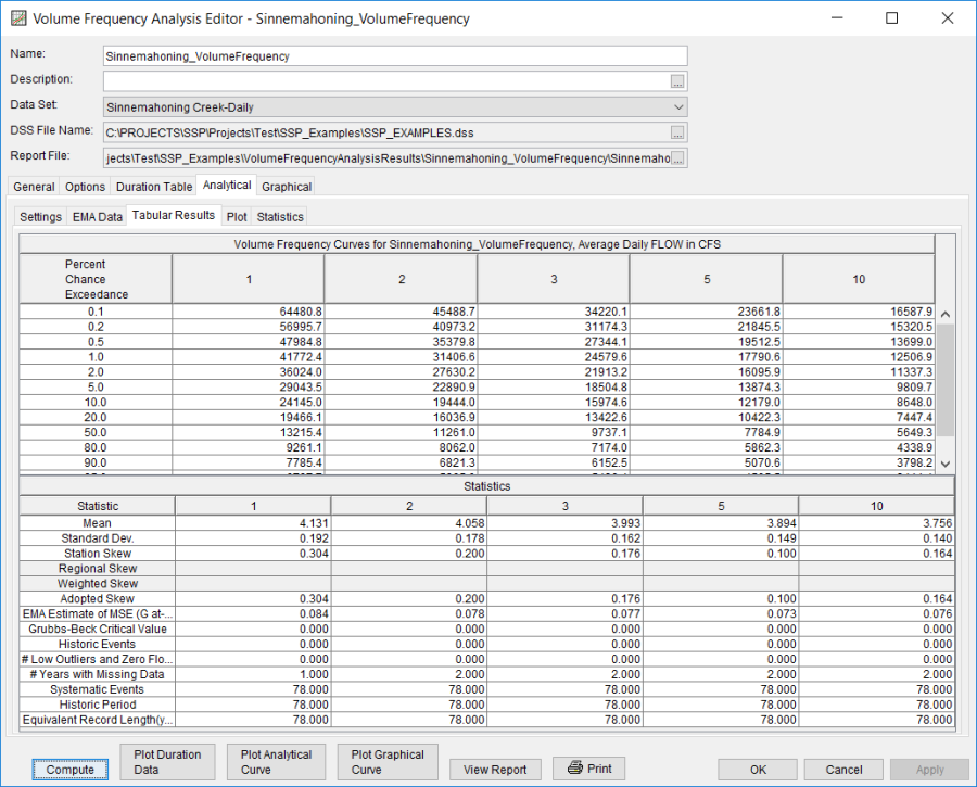
Note: These tabular results use the default computed statistics.
On the Statistics tab, the user can modify the computed statistics to ensure that the frequency curves are consistent with each other. For this example, the adopted skew coefficients were modified. As shown in Figure 8, plots of mean, standard deviation, and skew versus duration and each other can be viewed to ensure smooth relationships. The check boxes next to mean, standard deviation, and adopted skew were checked and then user-adjusted statistics were entered into the table for all durations. The Compute button must be pressed after adjusted statistics have been entered in order for the program to recompute the frequency curves using the user-adjusted statistics. 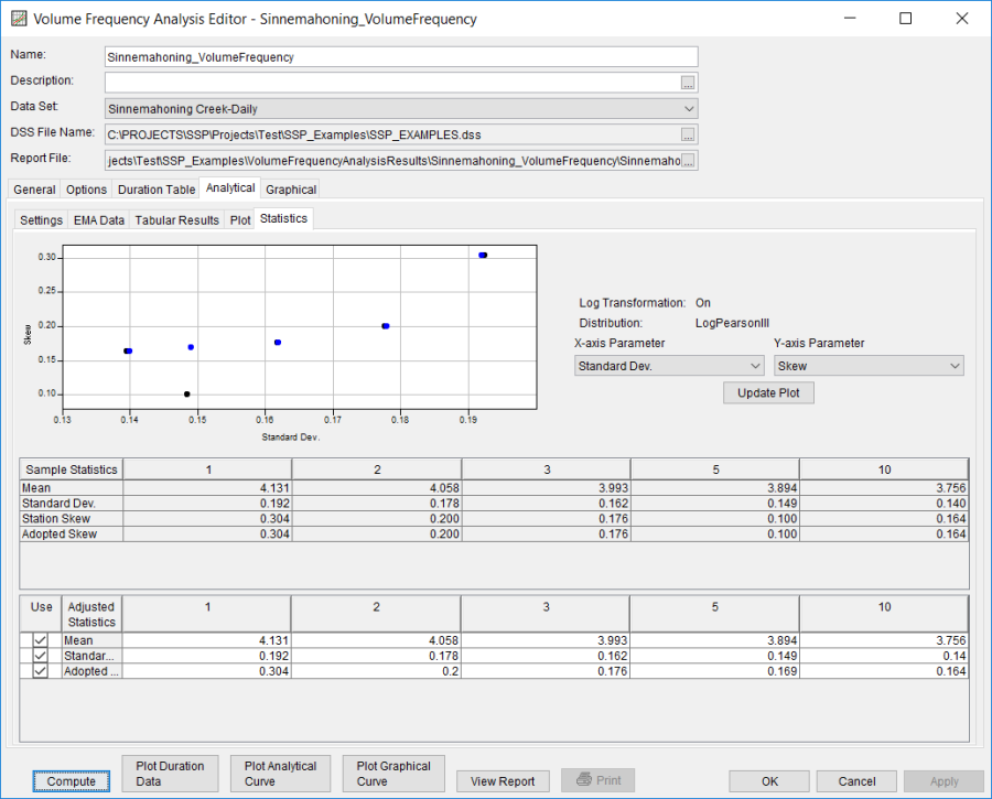
Figure 9 shows the Plot tab after the user-adjusted statistics were entered on the Statistics tab. Results on the Tabular Results tab will also update when user-adjusted statistics are entered on the Statistics tab.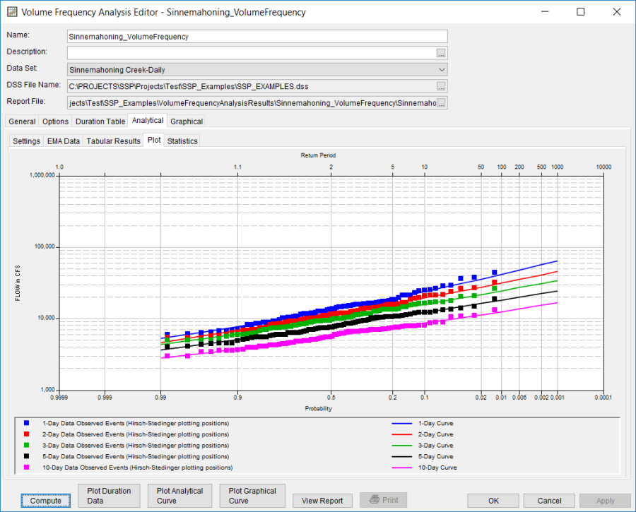
In addition to the Tabular Results and Plot tabs, graphical plots can be opened by selecting the Plot Duration Data or Plot Analytical Curve buttons at the bottom of the analysis window. A plot of the results for this example is shown in Figure 10.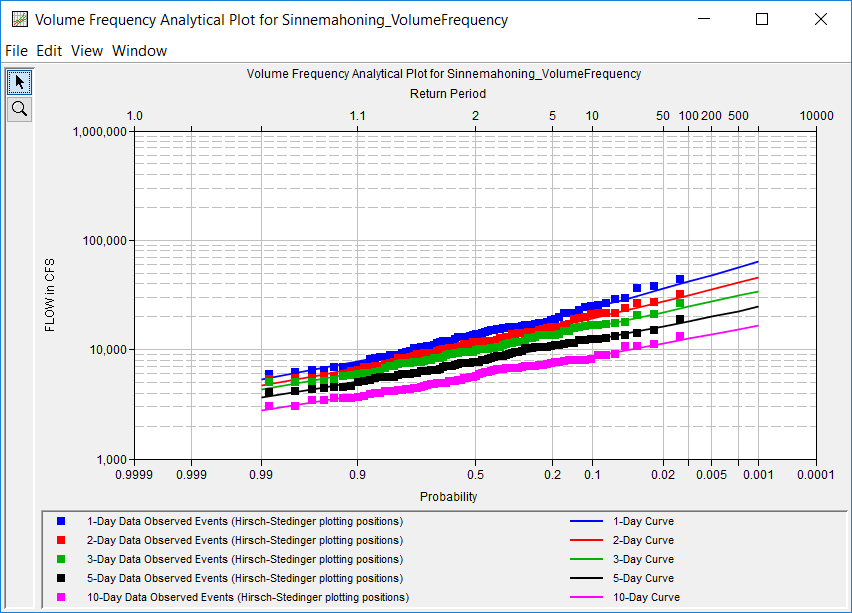
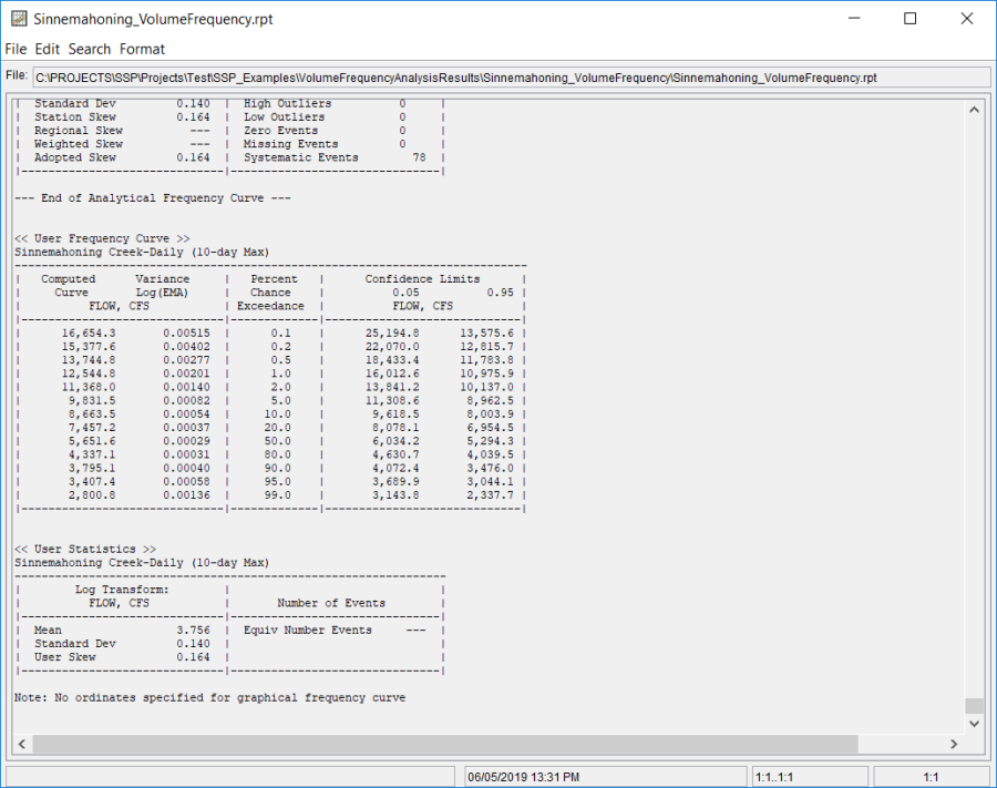
In addition to the tabular and graphical results, there is a report file that shows the order in which the calculations were performed. To review the report file, press the View Report button at the bottom of the analysis window. When this button is selected a text viewer will open the report file and display it on the screen, as shown in Figure 11. The report file contains a listing of the input data, preliminary results, outliers, and the final frequency curve results. Different types and amounts of information will show up in the report file depending on the data and the options that have been selected for the analysis.