Download PDF
Download page Part 2. Distribution Fitting.
Part 2. Distribution Fitting
Download Excel File:  distribution fitting 2025.xlsm
Fitting probability distributions to flow data
In this section, we’ll look at fitting a probability distribution to data. We’ll fit several distributions to the same data set, and decide visually which choice is the best.
Open spreadsheet
Open spreadsheet called “distribution fitting.xlsm” distribution fitting 2025.xlsm
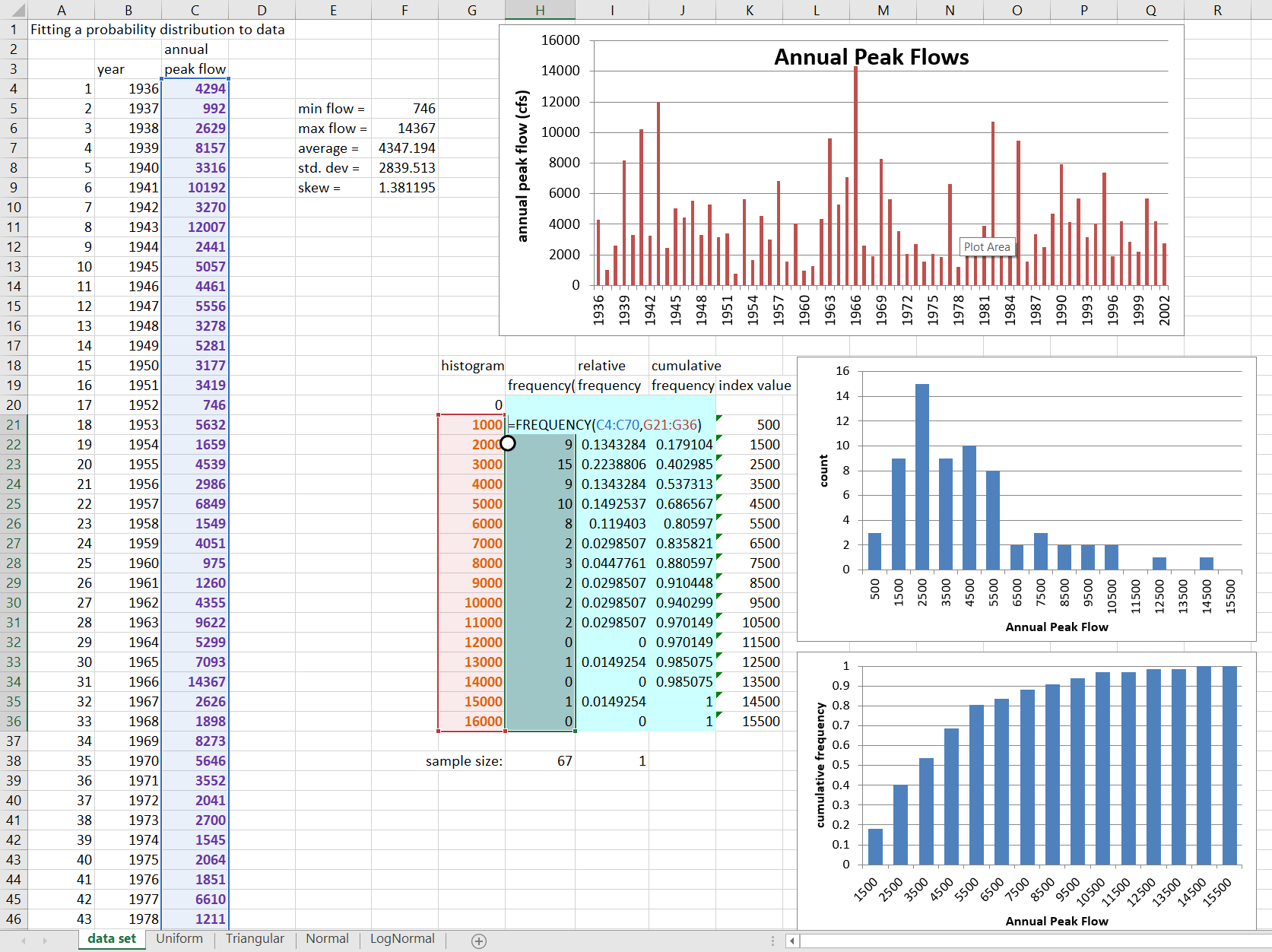
You should find yourself in the tab labeled “data set”. Look at the 67 member data set of annual peak flows in column C. Examine the computed statistics, and the chart showing the time-series of flows.
Create Histogram.
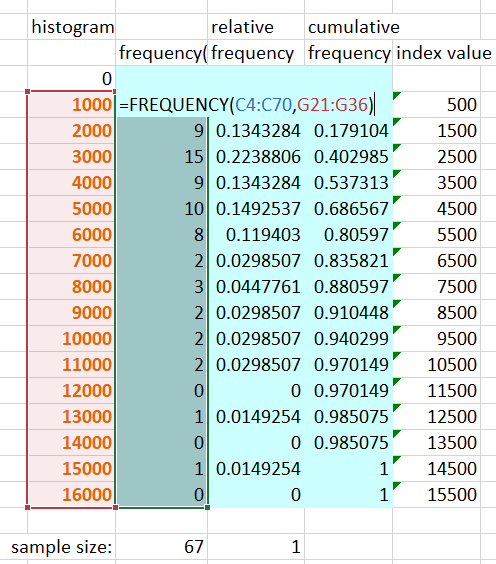
With the instructions below, you’ll be using the frequency(range,bins) array function to create a histogram of the data set. You saw the equation used in the dice spreadsheet.
Select the first column of blue cells (H21:H36). Enter the frequency equation as follows:
- Type = frequency(
- select the cell-range that holds the time-series of flows (purple numbers)
- type a comma ,
- select the cell-range that holds the bin values (orange numbers)
- type )
At this point, the equation should look like =FREQUENCY(C4:C70,G21:G36)
- Then hold the control and shift keys while you press ENTER.
Now the equation should look like: {=FREQUENCY(C4:C70,G21:G36)}
Note that when using the array function with a continuous variable, the value reported is the number of values between the bin value and the bin value in the row above.
Notice that the chart to the right shows the histogram of the data.
Create Histogram.
Question 1: From the probability distributions you have seen, which do you suppose might best fit this data?
The data is somewhat bell-shaped, so is not uniform. It is positively skewed (more high values), rather than symmetrical, so triangular or logNormal are most likely.
Relative and Cumulative Frequency.
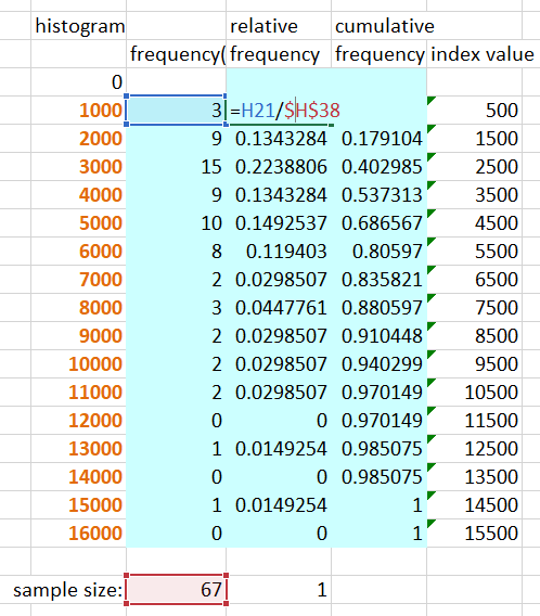
Verify that you have an accurate count of the data. Fill in the relative frequency column to the right. Individual cell equations can be based on an array function, so the relative frequency equation should be the count from the cell to the left, divided by the total number of values, summed below. Make sure you use an absolute cell reference for the number of values, with $ before rows and columns.
Copy your relative frequency function to the entire column. Verify the relative frequencies add to 1.
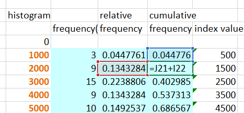
Fill in the cumulative frequency column. Use an equation that adds the relative frequency value to the sum of values up to that point. The highest value should be 1. Note that the cumulative frequency you computed is plotted in the next graph.
Relative and Cumulative Frequency.
Review probability plots.
Move to the right in the spreadsheet, and scroll up, to see the data plotted as a frequency plot. Look at the equations to the left that compute plotting position, standard normal deviate of plotting position, and the ranked flow series. The probability plot is also shown with a log-flow axis.
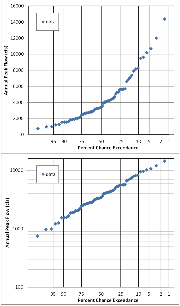
Question 2: Do the probability plots affect your supposition of which distribution might fit?
The fact that the points plot in a straight line on the plot which has a Normal probability axis and a log flow axis means that the data is logNormally distributed.
Uniform Distribution.
Move to the tab titled “Uniform”
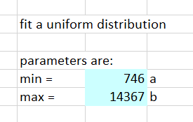
Fill in the parameters of the Uniform distribution in the blue cells (G9 and G10), either by determining them yourself, or using statistics or functions from the “data set” tab.
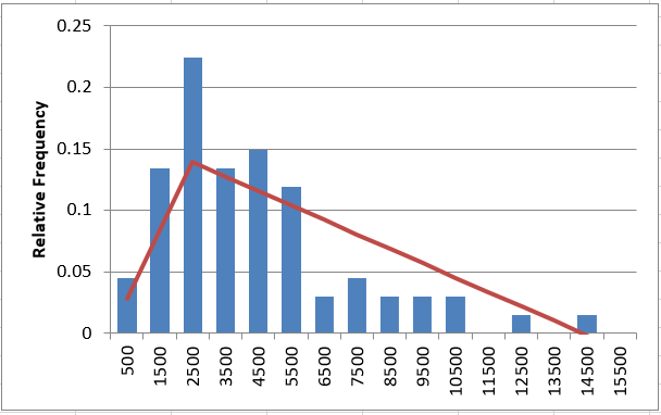
The red lines that appear on the histogram and probability plots represent the PDF of the Uniform distribution fitted to this data. Take some time to study the red lines on the histograms, and on the probability plot to the right.

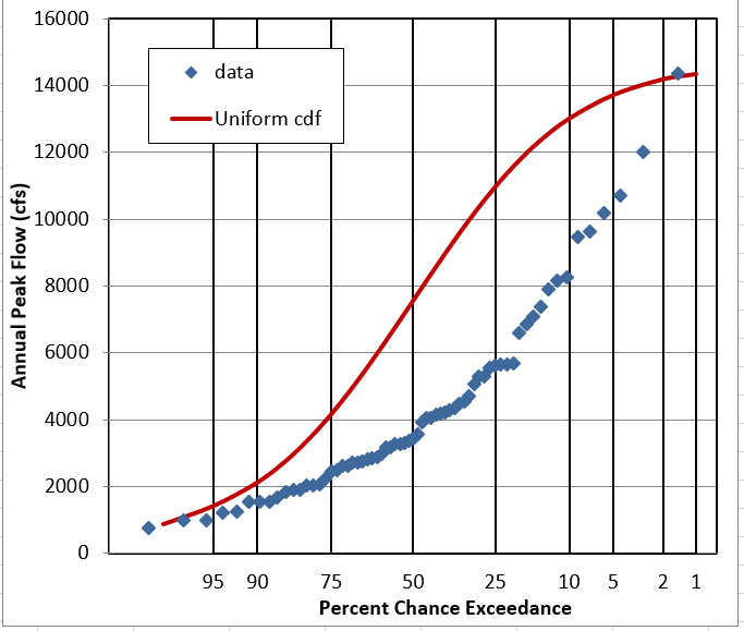
Question 3: Does it look like this data follows a Uniform Distribution?
NO. It is peaked or bell-shaped, rather than flat.
Triangular Distribution.
Move to the tab titled “Triangular”
Fill in the parameters of the Triangular distribution. Note, min and max can be the same as for Uniform, but you’ll need to determine the mode from the histogram (not the Excel mode equation). The mode is the value that occurs most frequently.
Study the 3 plots.

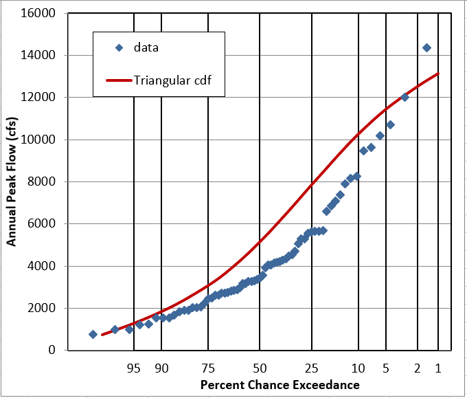
Question 4: Does it look like this data follows a Triangular Distribution?
It’s better than Uniform, and looks OK as a PDF, but the cumulative plots show it’s pretty off.
Normal Distribution.
Move to the tab titled “Normal”
Fill in the parameters of the Normal distribution, either by determining them yourself, or using statistics or functions from the “data set” tab.
Study the 3 plots.
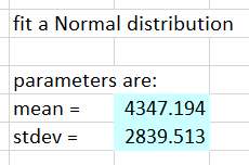
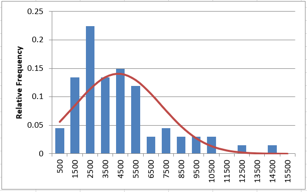
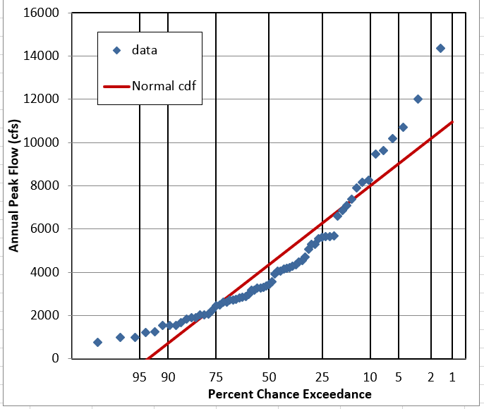
Question 5: Does it look like this data follows a Normal Distribution?
It gets the bell-shape pretty well, but assumes symmetry. On the probability plot it’s clearly wrong.
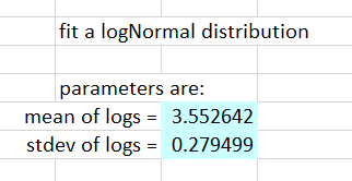
LogNormal Distribution.
Move to the tab titled “LogNormal”
The LogNormal distribution is simply the Normal distribution fit to the logarithms of the flow data. With flow, we generally use base 10 logs. Fill in the blue column labeled “log flow” using the equation =log() and referencing the flow value to the left.
The equation for cell D4 should look like: =LOG(C4)
Based on the values in the blue log flow column, fill in the parameters of the LogNormal distribution by computing mean and standard deviation of the logs. (Use functions average() and stdev() to compute these values).
Study the plots. Note that there are 2 additional histogram plots, showing the histogram of the logs of flow. The frequency plot to the right is also shown with a log axis.

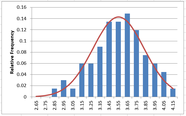
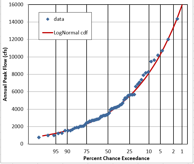
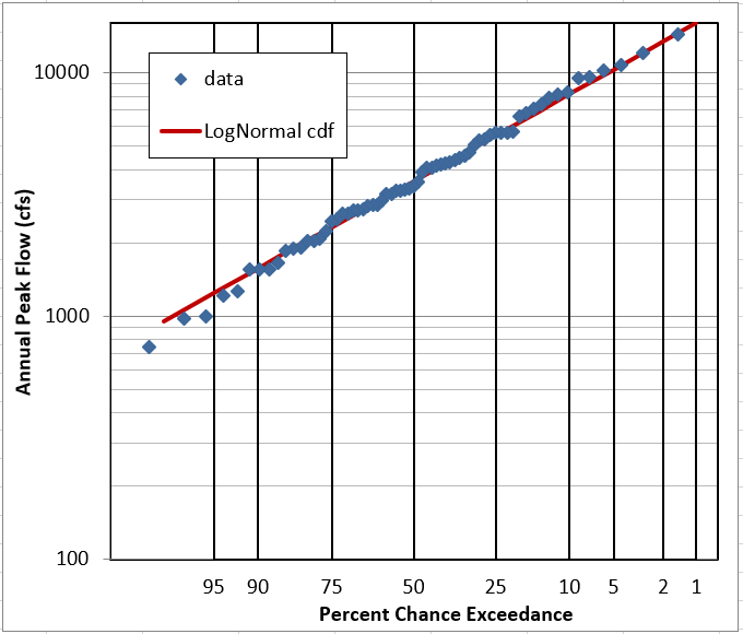
Question 6: Does it look like this data follows a LogNormal Distribution?
YES. The linear-flow PDF is not very obvious, but the log-flow PDF and CDF look good. The probability plots are pretty definite on the fit being good.
Question 7: What other distribution(s) might you like to try for annual peak flow data?
We generally use the logPearson type III distribution for unregulated annual peak flow data in the United States. In other places, GEV and Gumbel are sometimes used.
Save the spreadsheet and close it.
Excel Solution File: distribution fitting 2023 solution.xlsm