Download PDF
Download page Task 3: Mixed Population Analysis.
Task 3: Mixed Population Analysis
The initial sample using all storm observations is known to be created by a mixture of samples taken from two different populations (thunderstorms and non-thunderstorms). This means that the series of observations may not be identically distributed (the -ID part of IID) which has consequences when a model for the population is fit to the data. In this last task, you will examine the difference between fitting an annual maximum series (AMS) model to the “all storms” dataset, and to fitting an AMS model to each of the sub-samples for a specific type of storm and combining them back into a single model using the Mixed Population Analysis (MPA) in HEC-SSP.
About the Mixed Population Analysis
The Mixed Population Analysis allows you to compute what the population frequency curve would be when you know what the frequency curve of each part of the mixture is. The computation is performed by taking a sequence of values of the random variable (for this example, wind speeds) and computing the CDF for each of the mixture curves at that value. Then, using the probability of union, we are able to compute the cumulative probability for that wind speed due to each of the parts of the mixture. For our example, it computes the cumulative probability for a wind speed by computing the cumulative probability from non-thunderstorm OR thunderstorm causes, which increases the probability from either of the individual curves. For two curves, the computation works like this: F_{NT \cup T}(X) = F_{NT}(X) + F_{T}(X) - F_{NT}(X)*F_{T}(X)
Additional information on the Mixed Population Analysis can be found in the HEC-SSP User's Manual.
Create a new Mixed Population Analysis using the menu bar and title it “AMS Combined”.


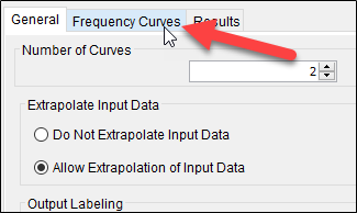
Set the number of curves to combine to 2 (which should be the default value). Under Extrapolate Input Data, select Allow Extrapolation of Input Data. Under Output Labeling, check both boxes for Data Label and Data Units, entering “WIND-SPEED” and “MPH,” respectively. Under Log Transform, select Do Not Use Log Transform. For Data Type, use the drop-down menu to select Other. Under Confidence Limits select Compute Using Order Statistics and enter the number of equivalent years of record equal to the smaller of the sample size from the non-thunderstorm and thunderstorm AMS analyses (29 years). Click Apply in the lower right corner. Switch to the Frequency Curves tab, shown below.

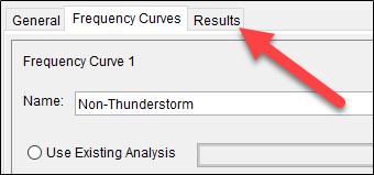
For Frequency Curve 1, enter “Non-Thunderstorm” in the Name box, and check that the Analytical Distribution radio button is selected. In the drop-down menu for Analytical Distribution, select GEV. For the parameters, enter the location (ξ), scale (α) and shape (κ) that you recorded in the results for non-thunderstorm type, annual maximum series (Question 2). Then, click the Compute button that is just below the shape statistic.
Repeat the procedure for Frequency Curve 2, entering “Thunderstorm” in the Name box, selecting Analytical Distribution | GEV, and entering the parameters you recorded in the results for thunderstorm type, annual maximum series (Question 5). Click the Compute button that is just below the shape statistic.
Click the Plot Input Frequency Curves button in the lower left corner.
Question 1: Based on the frequency curves plotted over each other, which storm type causes extremely high winds more frequently? Which storm type controls the lower portion of the frequency curve? Which of the two storm types displays more variance?
Thunderstorms seem to control the extreme high winds, while the non-thunderstorm events generally do not influence much of the frequency curve at all. The storms are similar on the low end and neither particularly controls that range of wind speeds. Thunderstorms seem to have a higher variance (slope of the frequency curves). Thunderstorms also have more upward curvature on this plot, indicating the distribution is more skewed than for non-thunderstorms.

Click the Compute button in the lower left corner, and then switch to the Results tab.

Question 2: What is the effect of combining the two curves on a) the less-frequent end of the curve and b) the more frequent end of the curve?

The less-frequent end of the curve is increased by ~5 mi hr-1 over either of the input curves. The upper end of the curve approaches the curve for the storm that controls the highest events (thunderstorms).
Open up the “result_plotter.xlsx” Excel workbook, located in the workshop directory. There is a table for the results of the MPA frequency curve, as well as the AMS model fit to all wind speed data. Copy the resulting wind speed frequency curve from the MPA analysis into the table, and then the median curve results from the “AMS All” Distribution Fitting Analysis. The plot will update with the results (which are plotted on “extreme value type I” paper).
Question 3: If you only performed an analysis on the “All Storms” dataset instead of modeling the individual extreme wind causal mechanisms separately, what assumption typically made when fitting a model is being violated?

The major assumption is that the samples are “IID” – independent and identically distributed. Using annual maxima helps with the “independent” part, but we know that the events were not drawn from an “identical distribution” because we saw the different behavior of the two storm types that created the sample. The AMS curves for the individual storm types are much more likely to be identically-distributed than the AMS curve for all storms. This means that the models used for the individual storm types is likely to be better. However, we are interested in the exceedance probability of a wind speed from ANY storm, which means we need a mechanism to combine the individual curves back up. This is why the Mixed Population Analysis is used.
Question 4: How does the result differ between the “All Storms” AMS analysis and the combination of the Thunderstorm and Non-Thunderstorm AMS analyses using a Mixed Population Analysis? If an analysis of extreme wind speeds was a critical piece of a risk assessment, what is the potential consequence of violating the assumption you identified in Question 3?
In this case, the lower and upper end frequency curve is under-estimated when using a model on a sample that contains a mixture. The difference is more pronounced the farther you go into the extremes. By modelling the mixture explicitly, the results change enough that it could potentially change the outcome of a risk assessment because the magnitude of the high winds is higher.
Return to the bottom of Introduction to the Extreme Value Theory Workshop for the final workshop files.