Download PDF
Download page Annualization Workshop.
Annualization Workshop

Software
The following software was used to create this example:
CRAN R version 4.2.2 or newer
RStudio version 2023.03.0+386 or newer
Workshop Overview
In this workshop you will apply annualization methods to be able to compute annual exceedance probabilities using the peaks-over-threshold approach.
This workshop has four tasks and will use R to compute the results.
- Empirical annualization of partial duration series (PDS)
- Fitting partial duration series model to instantaneous data
- Fitting annual maximum series (AMS) model to instantaneous data
- Annualizing partial duration series model and comparing to annual maximum model
Site Information
We will be using instantaneous flow data from Arroyo Seco near Pasadena, CA: https://waterdata.usgs.gov/nwis/inventory/?site_no=11098000&agency_cd=USGS
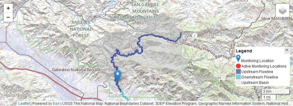
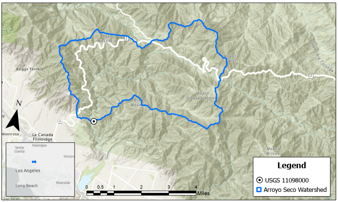
Arroyo Seco is a famous stream. In its headwaters it is very steep and erosion-prone, and can produce extremely hazardous flash floods. The drainage area at the Pasadena gage is about 16 mi2. Annual maximum discharges range from 12 cfs to the 1938 flood of record at 8,620 cfs. In some years there are no remarkable flows, and in some years there are multiple hazardous floods. Below are two maps of the watershed. Note how hilly the terrain is.
Data and Tools
You will be using R in RStudio to complete this workshop. Download both of the files at the start of this workshop to the same folder on your computer.
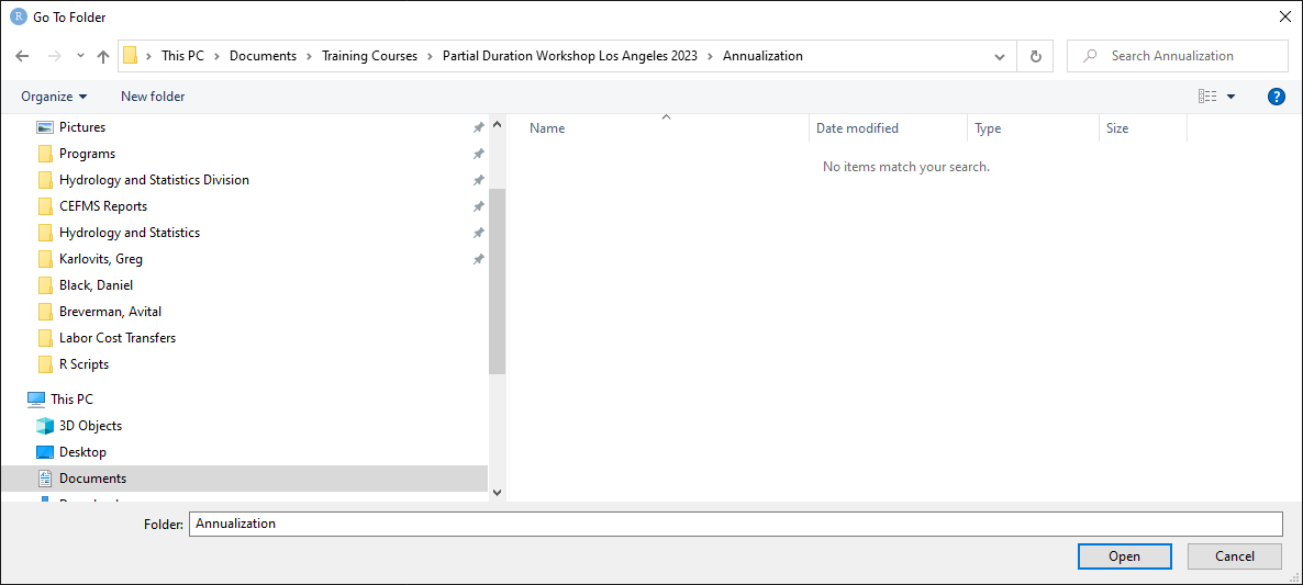
Start up RStudio and open the Annualization Workshop.R script. In the lower right part of RStudio, select the Files tab. Use the ... button to navigate to the folder where the script and data live.

Select "Open" when you get to that folder.
Then, in the Files tab, select the gear icon that says "More" and choose "Set as Working Directory".

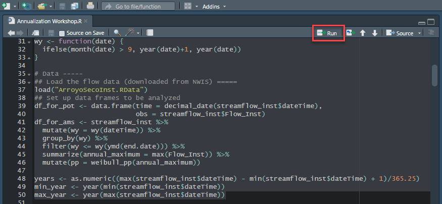
Next, highlight all lines 1-50 of the script and run it by pressing the "Run" button in the upper right of the script:
This will:
- Load up all the necessary libraries for the workshop
- Define some extra functions necessary for the workshop
- Load up the instantaneous flow data stored in the .RData file
- Set up data frames for doing a peaks-over-threshold (POT) and AMS analysis
- Extract some date ranges from the data
The code is heavily commented so you can follow along and see what everything does.
Task 1: Empirical Annualization of PDS
In this task, you will decide on a threshold and extract a partial duration series based on the diagnostic plots. You will also extract an annual maximum series from the same data. Then, you will plot the annual maximum series using plotting positions, and the partial duration series on the annual maximum plot using the Langbein adjustment for the PDS plotting positions.
Step 1: Compute and Display Diagnostic Plots
The code from lines 54-103 will generate three plots related to thresholds - the threshold-event count tradeoff plot, the Pareto shape plot, and the mean excess plot. To compute each of these things, the code needs a few values. Line 54 lets you set what flow threshold value to start the plots at, and line 55 is the highest flow value it tests. The values in lines 54 and 55 were estimated using the values in the annual maximum series. In the Environment tab in the upper right, click on the df_for_ams object to open the viewer. The viewer can be sorted by clicking on the column names.
QUESTION 1. What is the smallest annual maximum event that occurred? In what water year did it happen? What about for the largest annual maximum?
The smallest annual maximum is 12 cfs in WY 2007, and the largest is 4,620 cfs in WY 2010.
Line 57 is the drainage area of the watershed at the gage in mi2, and line 58 computes the minimum number of days between events based on the \lceil 5+\ln(DA) \rceil method.
Highlight lines 54-104 and run the code using the "Run" button like you did before. It may take a second, but eventually a plot will appear in the lower right. The displayed plot is the last one to be rendered (the mean excess plot). To navigate between plots in RStudio, use the arrow buttons above the plot to cycle between them, and the Zoom button to expand them.

If you go back one plot, you get the Pareto shape parameter plot, and clicking the back arrow once more gives you the threshold-event count tradeoff plot.
QUESTION 2. Based on the code, what is the significance of the horizontal line (drawn using the geom_hline() function)? What is the line's y-intercept?
The line is at a value where the number of events equals the number of years, i.e. the mean rate is equal to 1 event per year. It crosses the y-axis at y=34, which is equal to the number of years in the instantaneous data (and can be seen in the years variable in the Environment in the upper right).
Go to the Pareto shape plot (the second of the three plots).
QUESTION 3. Based on what you see in this plot, what is a reasonable range to check for thresholds? How did you decide?
This plot isn't exceptionally well behaved, but the least variable behavior is between about 300 and 600 cfs, which might be a good place to start.
Go to the mean excess plot (the third of the three plots).
QUESTION 4. Based on what you see in this plot, what is a reasonable range to check for thresholds? How did you decide?
There is a modest flat spot between about 300 and 500 cfs, which might be a reasonable range to check.
Step 2: Select Threshold and Extract Partial Duration Series
On line 107, enter a value for your chosen threshold. Then, highlight the code between lines 107-132 and run it to extract the partial duration series and compute the number of events in each year.
Place your cursor anywhere on line 134 and press the run button. This will generate a histogram of the number of events per year in the partial duration series.
QUESTION 5. What is the most common number of events per year? What is the maximum? About what percent of the time is there one event per year?
For a threshold of 300 cfs, zero is the most common number of events per year, accounting for more than 35% of years in the record - more than a third of the years at this gage do not have significant floods. The largest is 5 events in a year (which was calendar year 2010). One event per year happens a little more than 20% of the time.
Highlight lines 141-150 and run them. This will produce a histogram of the flows above the threshold. Note that most values are clustered up against the threshold value, and that the distribution has a number of values much larger than the major grouping of data on the left.
Place your cursor anywhere on line 152 and run the code to read the R documentation on the fpds2f function from the lmomco package.
QUESTION 6. Based on what you see in the documentation, what is this formula called?
This is the Langbein adjustment.
Highlight the code from lines 154-167 and run them to draw the annual maximum series frequency plot. Notice how many orders of magnitude these events span.
Finally, highlight the code from lines 170-176 and run them. This will re-draw the plot with the partial duration series plotted at annual exceedance probabilities. The grey points are the AMS and the red points the PDS.
QUESTION 7. What differences do you see between the values in the AMS and the PDS? Press the "Zoom" button to make the plot bigger to see the points more easily. You can also compare values in the PDS and AMS by clicking on the "final_clust" variable in the Environment for the PDS, and "df_for_ams" for AMS.
The top two events are the same magnitude in both series, but the third and fifth largest events in the PDS are not in the AMS (in fact, the third and second largest events in the PDS were the second and third largest peaks in WY 2010). Generally, the PDS is higher than the AMS because there are secondary peaks in the PDS that are larger than a lot of values in the AMS.
Task 2: Fitting Partial Duration Series Model to Instantaneous Data
In this task you will fit a generalized Pareto (GPA) distribution to your partial duration series data.
Step 3: Fit and Plot Generalized Pareto Distribution
Highlight the code on lines 179-181 and run it. The code on line 179 nests a couple of functions: first, it computes the unbiased sample L-moments of the PDS using the function samlmu, and then estimates the parameters of the GPA distribution using the pelgpa function, using your chosen threshold. The code on lines 180 and 181 estimates the values (quantiles) of the fitted distribution at the plotting positions of the PDS data using the quagpa function.
Highlight and run the code on lines 184-194. This will produce a plot of the partial duration series against the fitted distribution.
QUESTION 8. How do you feel about the goodness of fit of the distribution to the data?
The distribution generally agrees well with the plotted points through the range of the data, including the largest value. The second, third, and fourth points seem to depart from the line the most. Overall, not bad.
QUESTION 9. What is the label of the x-axis on this plot? Can this plot and/or model be used to estimate the 100-year flow?
Cumulative Probability - so no, these are not AEPs.
Task 3: Fitting Annual Maximum Series Model to Instantaneous Data
In this task you will fit a generalized extreme value (GEV) distribution to your annual maximum series data.
Step 4: Fit and Plot Generalized Extreme Value Distribution
Highlight and run the code from lines 197-211. Just like the PDS fit, this uses the method of L-moments to estimate the parameters of the model, except instead of using the generalized Pareto distribution, it uses the generalized extreme value distribution.
QUESTION 10. What theorems give us the models (distributions) for annual maximum series and partial duration series data?
The extreme value theorems; the first extreme value theorem (the Fisher-Tippett-Gnedenko theorem) tells us that asymptotically the GEV describes AMS, and the second extreme value theorem (Pickands-Balkema-de Haan) tells us that asymptotically the GPA describes PDS.
QUESTION 11. How do you feel about the goodness of fit of the distribution to the data?
Generally there is good agreement between the points and the data, except really the second and third largest events which plot well away from the line. The left tail does not look right, and the GEV distribution goes very negative in this range, an indication of poor fit to these data. This can happen when there are a large number of insignificant flows in the annual maximum series (recall that for a threshold of 300 cfs about 1/3 annual maximum events are not in the PDS).
Task 4: Annualize the PDS Model and Compare to the AMS Model
In this task you will convert the PDS model in two ways, using empirical and analytical annualization.
Step 5: Compare Empirical Annualization to AMS Model
Place your cursor anywhere on line 214 and run it to read the documentation for the f2fpds function. This runs the Langbein adjustment in reverse, converting an annual nonexceedance value to the cumulative probability of a PDS. Highlight lines 216-218 and run them. This has functions nested a couple layers deep. On the inside, it computes the reverse of the Langbein adjustment using f2fpds to convert the AMS plotting positions to PDS cumulative probabilities, then computes the corresponding quantiles from the PDS-GPA model using the quagpa function.
Highlight lines 220-236 and run them to plot the following against annual exceedance probability: AMS and AMS-GEV model (in grey) and the PDS-empirical annualization and PDS-GPA-empirical annualization model (in red).
QUESTION 12. What are some key differences between these two results?
Overall the PDS result after annualization is higher than the AMS model. This is largely driven by the fact that there are second and third peaks in some years that are larger than most of the AMS (for example the second and third peaks in 2010). This increases the magnitude of estimates for the same frequencies since we are rejecting small flows that appear in the AMS and replacing them with other, larger peaks. However, based on the shape of these curves, the AMS-GEV curve may cross the PDS-GPA curve at some rarer frequencies.
Also, the results for the PDS model stop at the selected threshold.
Step 6: Compare Analytical Annualization to AMS Model
Place your cursor anywhere on line 239 and run it. This uses the equation_15 function defined way back on line 18 to compute the PDS-GPA quantiles for the AMS plotting positions. If you go back to the function definition on line 18, you can see that the function takes three arguments: the generalized Pareto distribution parameters, the mean rate, and a reduced Gumbel variate (see how those are computed starting on line 26). Equation 15 combines two steps into one for computing annual maximum quantiles. It uses a shortcut to convert the generalized Pareto distribution parameters into an equivalent generalized extreme value distribution, and then inserts it into the GEV quantile function.
Equation 15 Source
Madsen, H., Rasmussen, P.F., and Rosbjerg, D. (1997). Comparison of annual maximum series and partial duration series methods for modeling extreme hydrologic events 1. At-site modeling. Water Resources Research (33) 4, 747-757.
Return back to line 242, and highlight lines 242-258 and run them. This will produce a plot of the AMS and AMS-GEV model (in grey) against the PDS-empirical annualization points and PDS-GPA-analytical annualization model (in red).
QUESTION 13. What is the difference in the results for the PDS-GPA models?
The analytical model does not stop at the threshold where the empirical annualization does. The analytical model uses the implied GEV model to estimate the behavior of the left tail of the distribution. Often this result isn't great, especially here in the situation where it is trying to estimate the frequency of insignificant floods.
Step 7: Extrapolate the Models
Select and run the code on lines 261-278. This will estimate the CDF of flow values between your selected threshold and 10,000 cfs for both the AMS-GEV model and the PDS-GPA model annualized using the Langbein adjustment, and then plot it. You can use the Zoom button above the plot to get a bigger view of it.
QUESTION 14. What is the difference in the results for the AMS-GEV and PDS-GPA models out at the right tail?
Throughout the range of the data the PDS model is higher than the AMS data, but when extrapolated, the AMS model crosses higher than the PDS model at an AEP a little more than 1/100 and continues to be higher. The shape of this distribution is heavily influenced by trying to capture the low annual maxima, and has a smaller sample size than the PDS. Although the AMS winds up higher in this range, it can be challenging to trust it in this range.