Download PDF
Download page Phase 1: Data Exploration Using R.
Phase 1: Data Exploration Using R
Loading Data
First, we need to get the project data into our R session. Start up RStudio. Then, create a new R script by pressing Ctrl+Shift+N while inside RStudio. A blank document should open in the upper left. Save the file using the save button in the document pane and name the file multiple_linear_regression.R. We start by activating some of the libraries we are going to use, and then loading the data out of the Excel files, which the readxl library can do directly.
Using the Files pane in the lower right part of RStudio, use the triple dot button on the far right side to navigate to the folder where you saved the workshop input data spreadsheet. Select "Open" on that folder. Then, back in RStudio, use the More menu (with the gear icon) and choose Set As Working Directory.
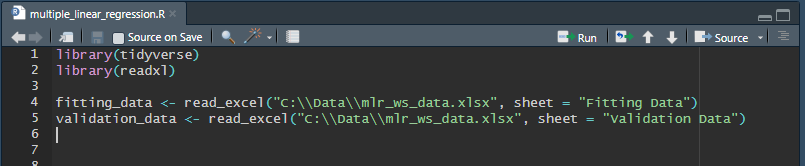
Use the code below at the top of your new R script to load the data from Excel into R data frames.
Loading Project Data
library(tidyverse)
library(readxl)

fitting_data <- read_excel("mlr_ws_data.xlsx", sheet = "Fitting Data")
validation_data <- read_excel("mlr_ws_data.xlsx", sheet = "Validation Data")If you do not set the folder that contains the input spreadsheet as the working directory, you can specify the full file path to the file instead.
To specify a directory path in R, you have two options:
- Use two backslashes:
setwd("C:\\Projects\\ILoveR") - Use a forward slash:
setwd("C:/Projects/ILoveR")
Using a single backslash will result in an error since a single backslash is used to denote an escape character (e.g. \n is the escape character for a new line).
To run code in R, there are a couple options.
To run only a selected region of code, highlight the code in the script, and press Ctrl+Enter.
To run all code in the script, press the Source button in the upper right of the script window. This code will load the libraries tidyverse and readxl, and then read data from our input spreadsheet into two separate data frames.
You should notice two new variables in the Environment tab in the upper right corner of RStudio: fitting_data and validation_data. These are data frames that represent the data in our Excel workbook. If you click on fitting_data in this pane, a data viewer that looks a lot like a spreadsheet will pop up, and you can view the data.
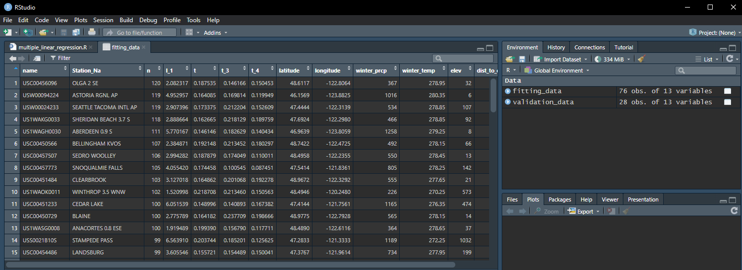
We will be working with the fitting_data data frame for building our model, and validating the model fit with the validation_data data frame.
Visualizing the Data
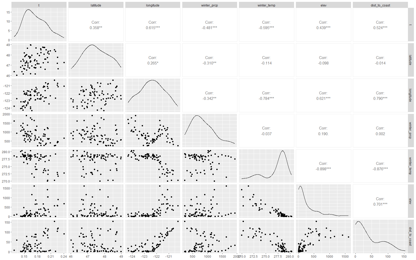
We can automatically generate a "scatterplot matrix" that gives us a wealth of information about our most important variables, all in one plot. The function ggpairs from the GGally library will produce this plot with very little input. However, our input spreadsheet contains a lot of variables that we are not interested in. We will use some of the tools out of the dplyr package to make the data more manageable before visualizing them. The following code will load the GGally library, select the data frame we want, filter it down to the 7 columns we care about, and feed that filtered data frame into the plotting function. The select function does not affect the original data frame, so we are not losing data by doing this filtering operation, and we don't have to create a new data frame with only the data we want.
Note: the %>% operator is called a "pipe" and is used to take the result of one operation and send that result to another.
Scatterplot Matrix
library(GGally)
fitting_data %>%
  select(t, latitude, longitude, winter_prcp, winter_temp, elev, dist_to_coast) %>%
ggpairs(.)Run only this code by selecting the lines and pressing Ctrl+Enter. It takes a moment to process, but then a complex plot should appear in the Plots pane in the lower right. To see it better, select the Zoom button (![]() ) above the plot, and it will pop the plot out into a separate window.
) above the plot, and it will pop the plot out into a separate window.
In the lower left part of this matrix is a scatter plot for each pair of variables. The variable name at the top of the plot is the x-variable for the scatter plot, and the variable on the right side of the plot is the y-variable. You can see how each combination of pairs of the 7 variables creates a scatter plot.
Along the diagonal of this matrix is a density plot for the variable (note that the x- and y-variables are the same). This should give you an idea how how often some values of this variable come up.
In the upper right part of this matrix is a correlation coefficient for each pair of variables. This measures the strength of linear relation between the pair of variables, and quantifies what you're seeing in the scatter plot in the lower left part of the matrix. The dot or asterisks to the right of the value indicate level of significance.
Questions
Question 1: Which predictors show the strongest correlation with t? Remember that ±r has the same magnitude, but the sign of r indicates the direction of the trend.
Question 2: Which predictors are most strongly correlated with each other? Would you expect these variables to be highly correlated?
Go to the Next Step: Phase 2: Predictor Selection Using R