Download PDF
Download page Data Manipulation and Visualization.
Data Manipulation and Visualization
Once the analysis name has been entered and a data set selected, the user can begin to analyze and manipulate the data. Contained on the Distribution Fitting Analysis editor are three tabs. The tabs are labeled Data, Analysis, and Results.
The first tab contains settings, information, and options related to the data that will be used within the analysis and to generate the results. These settings include:
- Parameter Type
- Data Filtering
- Data Table
- Data Summary Statistics
- Plots
- Plot Options
Parameter Type
This option, shown in Figure 1, allows the user to change the default distributions that will be available on the Analysis tab, axis labels, and precision for which results will be displayed. Parameter types that are available for use include:
- Precipitation
- Flow
- Stage
- Flood Season
- Other
![]()
By default, the Distribution Fitting Analysis editor will look within the Data Set to determine if a typical C-part pathname has been used (i.e. FLOW, PRECIP-INC, STAGE, ELEV, etc.). If the C-part of the Data Set contains one of these commonly used strings, the Parameter Type will be automatically selected. However, the user has the option to override the default selection. In addition, if a commonly used C-part is not used, the "Other" Parameter Type designation will be made for the user. If the Flood Season parameter type is selected, the x-axis values used within the CDF and PDF plots as well as output shown within the Results tab will be replaced with dates.
Data Filtering
Data filtering allows the user to interact with, modify, exclude, or include certain input data values for use within the subsequent analysis. The means and methods by which data can be filtered were previously described in the Filtering Data section. Filters that are available for use within the Distribution Fitting Analysis include:
- Time Window
- Season
- Min / Max Threshold
- Annual Maxima
- Peaks Over Threshold (Partial Duration)
- Starting Pool Stage / Elevation
To begin filtering an existing data set, click on the Filter Data… button. Within the Filter editor, use the check boxes to enable any desired filters
Data Table
The data table contains the original and filtered data that will be used throughout the analysis. When time series data is selected, the first column will contain dates. However, when paired data is selected, the first column will contain "index" values.
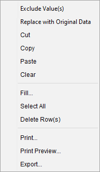
The user can also interact with data in the Filtered column by selecting and manually defining a value as well as right-clicking. Upon a right-click option, the user is provided with numerous options including Include Value(s), Replace with Original Data, Cut, Copy, Paste, Clear, Fill, Select All, Delete Row(s) as shown in Figure 2. When data is excluded from the analysis, it will be shown in red text. Conversely, when data is included, it will be shown in blue text. Tool tips explaining why a certain value was excluded (i.e. which selected Data Filter caused the data to be excluded) can be accessed by hovering the mouse over the value within the Filtered column.
Data Summary Statistics
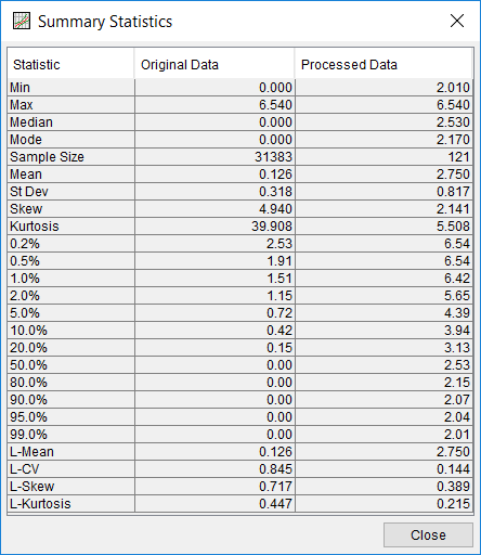
This option allows the user to summarize both the original and processed data. The processed data is determined by applying all filters and user-defined criteria. Statistical metrics that are available include: Min, Max, Median, Mode, Sample Size, Mean, Standard Deviation, Skew, Kurtosis, 0.2- … 99.0-percent values, L-Mean, L-CV, L-Skew, and L-Kurtosis. To access the data summary statistics, click the Data Summary Statistics button near the bottom of the Distribution Fitting Analysis editor. The Data Summary Statistics window is shown in Figure 3.
Plots
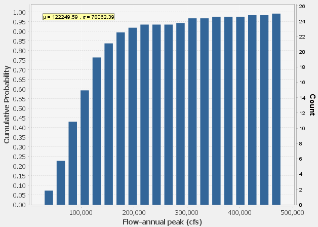
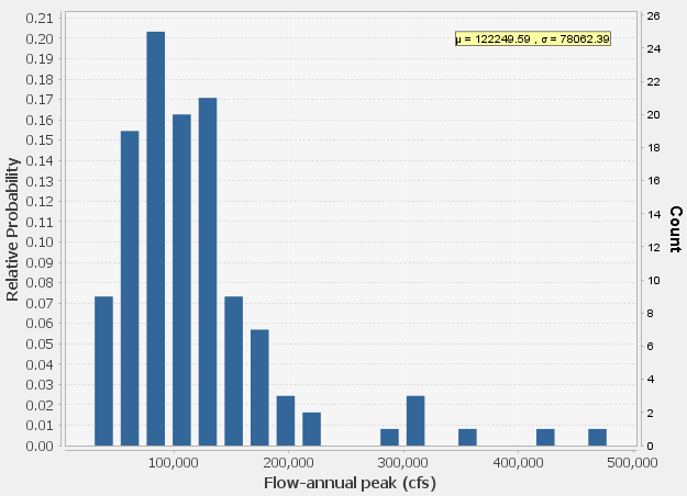
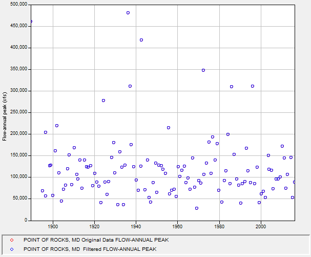
Three different plot types are available for use within the Data tab: CDF, PDF, and XY. The CDF plot displays the cumulative distribution function while the PDF plot displays the probability density function of the data. Within both the CDF and PDF plots, a legend will display the sample mean (μ) and standard deviation (σ) of the processed data. Finally, the XY plot displays the contents of the Data Table. When time series data is being used, the x-axis will contain dates. When paired data is selected, the x-axis will contain "index" values. Original data will be shown in red while the processed (i.e. filtered) data will be shown in blue. Examples of all three plot types are shown in Figure 4, Figure 5, and Figure 6.
Plot Options
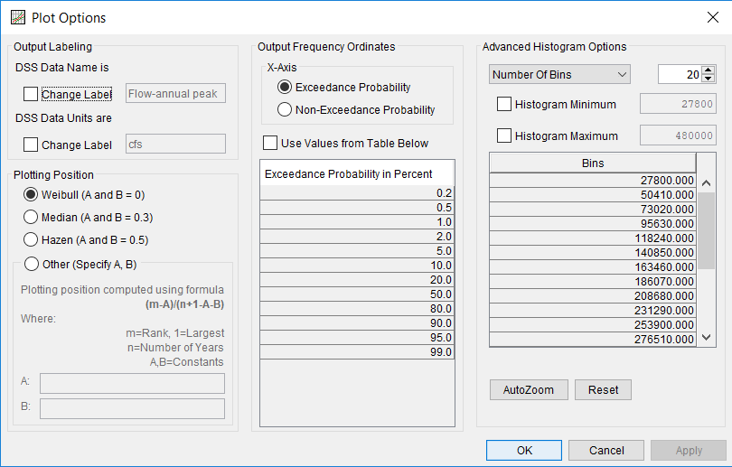
The selections contained within the Plot Options window allow the user to modify the way in which data is visualized within the accompanying plots. These options can be accessed by clicking the Plot Options button near the bottom of the Distribution Fitting Analysis editor. The Plot Options window is shown in Figure 7.
Plot option settings that are available include:
- Output Labeling
- Plotting Position
- Output Frequency Ordinates
- Advanced Histogram Options
Output Labeling
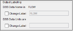
This option, shown in Figure 8, allows the user to change the default labels for data contained in the output tables and plots. The user can change both the name of the data as well as the units of the data. The output labeling does not result in the conversion of data from one unit system to another; it only affects what is displayed on table headings and the y-axis of the results plot.
Plotting Position
Plotting positions are used for plotting the original and/or processed data set on a probability scale. There are four options for computing plotting positions within the Distribution Fitting Analysis as shown in Figure 9: Weibull, Median, Hazen, and user entered coefficients. The default method within the Distribution Fitting Analysis is the Median plotting position formula.
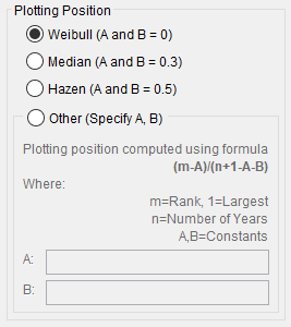
The generalized plotting position equation is:
P=\frac{(m-A)}{(n+1-A-B)}
where: m= rank of flood values with the largest equal to 1.
n= number of flood peaks in the data set.
A & B= constants dependent on which equation is used (Weibull A and B = 0; Median A and B = 0.3; and Hazen A and B = 0.5).
Plotting positions represent estimates of the exceedance (or non-exceedance) probability of each data point. The probabilities of the highest and lowest points in the data set are the most sensitive to choice of plotting position estimator. When fitting an analytical distribution, the plotting of data on the graph by a plotting position method is only done as a guide to assist in evaluating the computed curve. The plotting position method selected does not have any impact on the computed curve.
Output Frequency Ordinates
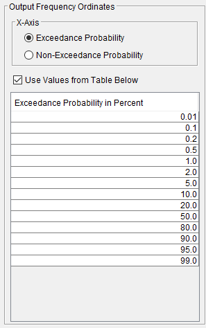
The options contained within the Output Frequency Ordinates panel allow the user to modify the way in which the data is represented in probability space. Two x-axis options are presented for use as seen in Figure 10: Exceedance Probability or Non-Exceedance Probability. Depending upon the selection, the x-axis within the plots on each tab will change to display exceedance (i.e. probability of equaling or exceeding a defined value) or non-exceedance probability. In addition, the choice in this panel results in the table below displaying either percent exceedance or non-exceedance probability. Exceedance probability, which is the complement of non-exceedance probability (i.e. Exc. Prob. = 1 – [Non-Exc. Prob.]) is the default option.
The user can change or add to the frequency ordinates for which the resulting frequency curves are computed. The default values listed in percent chance exceedance are 0.2, 0.5, 1, 2, 5, 10, 20, 50, 80, 90, 95, and 99. Check the box next to Use Values from Table Below to change or add additional values. Once this box is checked, the user can add/remove rows and edit the frequency values. To add or remove a row from the table, select the row(s), place the mouse over the highlighted row(s) and click the right mouse button. The shortcut menu contains options to Insert Row(s), Append a Row, and Delete Row(s). The program will use the default values, even if they are not contained in the table, when the Use Values from Table below option is not checked. Finally, all values in the table must be between 0 and 100. Note that these values have no impact on the computed frequency curve, but rather only the values of the curve that are reported.
Advanced Histogram Options
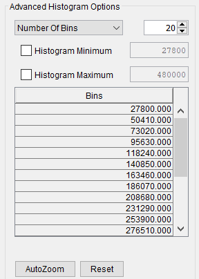
The choices contained within the Advanced Histogram Options panel (Figure 11) affect the number and size of bins used within the Cumulative Distribution Function (CDF) and Probability Density Function (PDF) plots. Normally, the bins will be displayed using the range of values contained within the Filtered Data. However, if the Parameter Type was previously defined as Flood Season, the bin values will change to display dates (DDMMM). The user can choose to demarcate bins automatically using the Number of Bins option, define a Bin Size, and automatically determine the number of bins, or manually define the bins using the User-Defined option. Histogram Minimum and/or Histogram Maximum can be used to constrain the bins to a minimum and/or maximum value(s). Clicking the Reset button will remove all changes and return each selection/value to the default entry.
