Download PDF
Download page Graphical Frequency Analysis.
Graphical Frequency Analysis
In addition to an analytical frequency analysis, the user has the option to graphically fit an empirical distribution to the selected data set. A graphical fit can be very useful when the available analytical distributions do not provide an adequate or appropriate fit to the data. One example of when a graphical frequency analysis is most appropriate is when plotting a frequency curve for flow data that is downstream of a flood control reservoir. Analytical frequency distributions are often not appropriate for describing flow data that is significantly regulated. In general, a portion of the flow frequency data for a highly regulated stream will be very flat in the zone in which upstream regulation can control the flows for a range of frequencies. This type of data lends itself to a graphical analysis rather than the use of an analytical distribution. Another example of when a graphical fit may be more appropriate is when trying to compute a frequency curve for annual peak stage data at a point on a river. Often, annual peak stages, when plotted on a normal probability axis, will flatten as exceedance probability decreases due to the presence of overbank/floodplain storage, which is not adequately described with an analytical distribution.
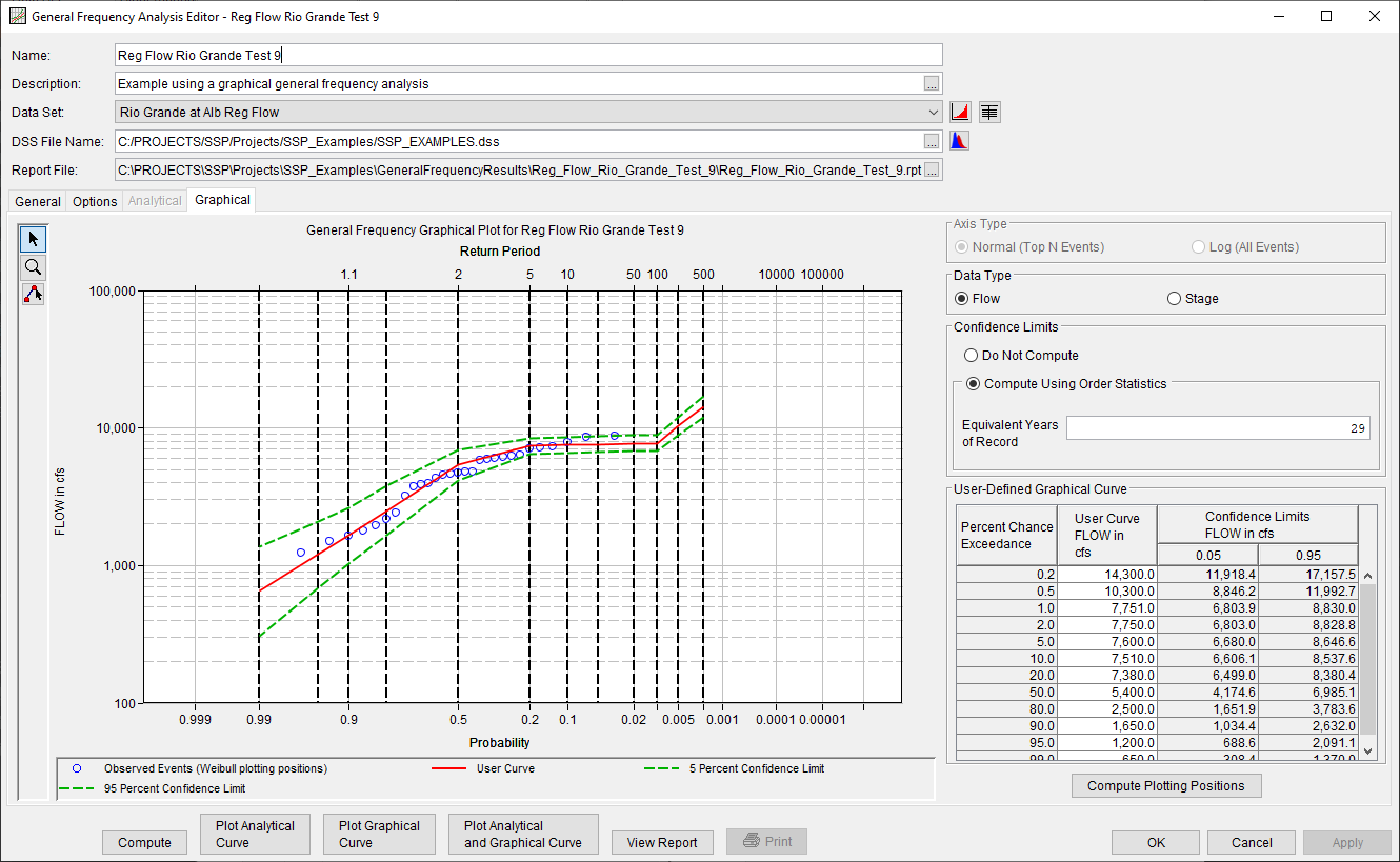
When the Graphical tab is selected, the editor will display a plot and table as shown in Figure 1. A minimum of three points are required to define a graphical frequency curve. In the plot, the data will be plotted using the user selected plotting position method. The table to the right of the plot allows the user to enter data values for the frequency ordinates defined on the Options tab.

A Compute Plotting Positions button is included within the table to the right of the plot. Upon clicking this button, only the plotting positions of the selected Data Set will be computed and updated within the plot. Additionally, the Multi-Point Edit tool ![]() can be used to define the frequency ordinates by drawing a curve. To use this tool, begin by selecting the tool on the left side of the editor. Then, define the curve by left clicking within the plot window at the desired locations. To finish defining the curve, right click.
can be used to define the frequency ordinates by drawing a curve. To use this tool, begin by selecting the tool on the left side of the editor. Then, define the curve by left clicking within the plot window at the desired locations. To finish defining the curve, right click.
The Multi-Point Edit tool will not extrapolate frequency information; it will only interpolate to the user-defined frequency ordinates specified on the Options tab. Bold, dashed lines will be displayed on the plot that correspond to the output frequency ordinates defined on the Options tab. These vertical lines help to visually identify the locations where frequency information will be extracted from the drawn curve.
The Data Type and Equivalent Years of Record options are required to compute confidence limits using the order statistics method that is discussed in ETL 1110-2-537. If the data is not flow or stage (i.e. precipitation), select the Flow data type when the graphical frequency curve is approximately analytic for extreme probabilities (frequency curve is not relatively flat for extreme probabilities). Select the Stage data type when the graphical frequency curve is relatively flat for extreme probabilities (U.S. Army Corps of Engineers, 1997). The Equivalent Years of Record will be estimated based upon the number of years spanned by the selected data set. This value can be modified by the user.
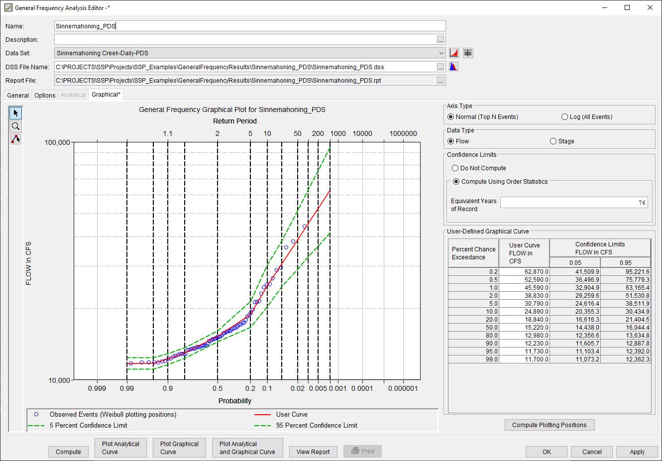
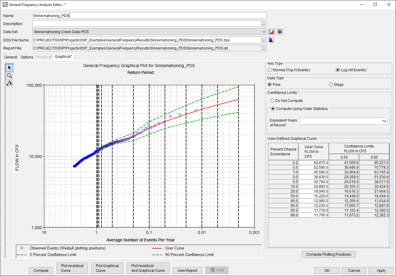
When using a partial duration series, the Axis Type options will become enabled. By default, the Normal (Top N Events) will be set as the default. The Normal (Top N Events) option will use the Period of Record Years that was defined on the General Tab to extract and plot the top N events. For instance, if the user defined a Period of Record Years of 79 on the Graphical Tab, the top 79 events within the associated partial duration series will be plotted using the Plotting Position defined on the General tab. When using the Log (All Events) axis option, all events will be plotted using the average number of events per year to define the x-axis. The two different plotting options are shown in Figures 2a and 2b. 
