Download PDF
Download page Viewing and Printing General Frequency Analysis Results.
Viewing and Printing General Frequency Analysis Results
The user can view output for the frequency analysis directly from the General Frequency Analysis editor (Tabular and Graphical output) or by using the plot and view buttons at the bottom of the editor. The output consists of tabular results, an analytical frequency curve plot, a graphical frequency curve plot, and a report documenting the data and computations performed.
Tabular Output
Once the computations for the analytical frequency analysis are completed, the user can view tabular output by selecting the Tabular Results tab under the Analytical analysis tab. The details of this table were discussed under the analytical analysis option above.
The tabular results can be printed by using the Print button at the bottom of the General Frequency Analysis editor. When the print button is pressed, a window will appear giving the user options for how they would like the table to be printed.
Graphical Output
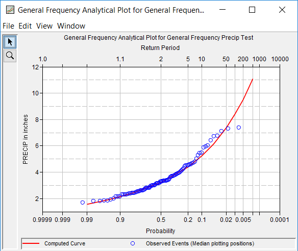
Graphical output of the analytical frequency curve can be obtained on the Analytical | Plot tab or by pressing the button labeled Plot Analytical Curve at the bottom of the general frequency editor. When the Plot Analytical Curve button is pressed, a frequency curve plot will appear in a separate window as shown in Figure 1.

The analytical frequency curve plot can be sent to the printer by selecting the Print option from the File menu at the top of the window. Additional printing options available from the File menu are Page Setup, Print Preview, and Print Multiple (used for printing multiple graphs on the same page). The graphic can also be sent to the Windows Clipboard by selecting Copy to Clipboard from the File menu. Additionally, the plot can be saved to a file by selecting the Save As option from the File menu. When the Save As option is selected, a window will appear allowing the user to select a directory, enter a filename, and select the format for saving the file. Currently, four file formats are available for saving the graphic to disk: windows metafile, postscript, JPEG, and portable network graphic.
The data contained within the plot can also be tabulated by selecting Tabulate from the File menu. When this option is selected, a separate window will appear with the data tabulated. Additional options are available from the File menu for saving the plot options as a template (Save Template) and applying previously saved templates to the current plot (Apply Template).
The Edit menu contains several options for customizing the graphic. These options include Plot Properties, Configure Plot Layout, Default Line Styles, and Default Plot Properties. Also, a shortcut menu will appear with further customizing options when the user right-clicks on a line on the graph or the legend. Both the Y and X-axis properties can be edited by placing the mouse on top of axis and clicking the right mouse button. Then select the Edit Properties menu option in the shortcut menu. For example, the user can turn on minor tic marks for the y-axis and modify the minimum and maximum scale for the x-axis. The graphic customizing capabilities within HEC-SSP are very powerful, but are also somewhat complex to use. The code used in developing the plots in HEC-SSP is the same code that is used for developing plots in HEC-DSSVue and several other HEC software programs. Please refer to the HEC-DSSVue User's Manual for details on customizing plots.
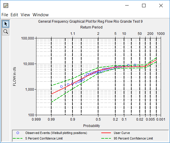
A plot of the graphical frequency curve can be obtained on the Graphical tab or by pressing the button labeled Plot Graphical Curve at the bottom of the general frequency editor. When the Plot Graphical Curve button is pressed, a frequency curve plot will appear in a separate window as shown in Figure 2. All of the same options for tabulating, printing, and sending results to the windows clipboard are available for this plot as they are for the analytical frequency curve plot.

Viewing the Report File
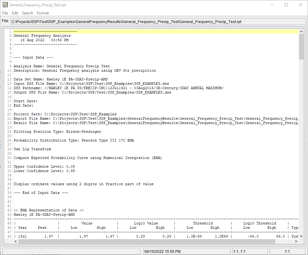
When the General Frequency Analysis computations are performed, a report file of the statistical computations is created. The report file lists all of the input data and user settings, plotting positions of the data points, intermediate results, each of the various statistical tests performed (i.e. high and low outliers, historical data, etc…), and the final results. This file is often useful for understanding and describing how the software arrived at the final frequency curve.
Press the View Report button at the bottom of the General Frequency Analysis editor to view the report file. When this button is pressed, a window will appear containing the report as shown in Figure 3.

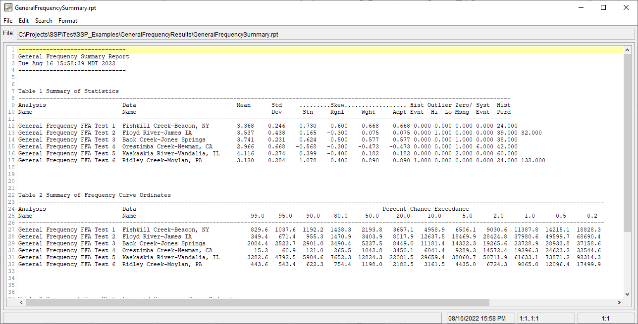
Plots, tables, and reports can also be created by selecting menu options from the Results menu. At least one General Frequency Analysis must be selected in the study explorer before selecting one of the menu options on the Results menu. Results from multiple analyses are combined in one graph if they are selected in the study explorer when the Graph menu option is selected. The Results | Summary Report menu option will create a summary table of statistics and frequency curve ordinates for the selected analyses as shown in Figure 4.
