Download PDF
Download page User Interface Components.
User Interface Components
By now, most computer users recognize the various components or widgets that make up a graphical user interface and how to interact with them. For those who are uncertain of the terminology or what to expect when using a graphical user interface, the table below lists the various widgets that are used in the ResSim user interface and describes how to interact with them.
Table: User Interface Widgets
Name | Description |
|---|---|
Pointer | The object that moves around on your monitor when you move your mouse. |
Button | By positioning your pointer on a button and pressing then releasing (a.k.a. "clicking") your left mouse button, the function indicated by the label or image on the button is executed. |
Text Box | Usually, a data entry field. Position your pointer in the box and click. A blinking vertical bar (cursor) will appear. Type in an appropriate value. Some text boxes are used to display information and are not editable. |
Selection (or Drop-down) List | A selection list looks like a text box with a down-pointing triangle or "V" in it. When you click in the text box, a list of options will appear below it. If the list of possible options is long, a scrollbar may appear to the right of the list. You can select one of the options by clicking on it in the list with your pointer. The list will disappear, and your selection will be displayed in the text box. |
Radio Buttons | A set of options that are mutually exclusive — pick one and only one. The buttons are open circles. The selected option appears with a black circle inside. |
Check boxes | A check box is used to identify an option that is or isn't activated, on, or selected. A check box is an open square. An "activated" checkbox has a checkmark inside the box. The checkmark is added or removed by simply positioning your pointer in the box and clicking. |
Table, Function, Relationship | A table is a set of columns and rows that allow input and/or output of related data. For data entry, almost all data entry tables must be entered in monotonically increasing order, especially for the independent variable — the first column. |
Trees | Trees are used to reflect a hierarchy or order of data objects or elements. The tree structure should be familiar to a Windows user since the same basic structure is used in the standard file explorer. |
Tabs | Tabs are used to organize editors/windows so that they can be less "busy" — to collect similar data into subpanels of the editor. Click on the tab to make that tab "current" or bring it "forward"; to view it. |
Slider Bar | Slider bars are used to allow quick selection of a value from an allowable range. The bar usually appears as a horizontal bar representing the range with a small vertical bar as the marker on the range. The selected value appears in a textbox to the side of the slider. |
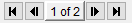
Navigation Buttons | These buttons provide forward and backward navigation through a list. They are typically used in the ResSim editors to move quickly through the various elements that can be edited by the editor. The four buttons shown from left to right are go to the first element, go to the previous element, go to the next element, and go to the last element. The box in the middle indicates which element of the full set is the current element shown in the editor. |
Context Menu
A context menu, also commonly called a pop-up or shortcut menu, is a menu that appears when you right-click on a schematic element in the map display or on many other ResSim GUI components such as plots, tables, and tree nodes. Context menus offer a variety of context-specific commands and options that allow you to access data editors, plot and tabulate data, view reports, compute simulations, and more. Specific context menus and their options are described throughout this manual.
Lots of good stuff may be hiding in a context menu. So, when in doubt… right-click!
Tooltips
Tooltips are small text boxes that appear when you position (and hover) your cursor over an icon, label, button, map element, tree node, or other widget for which a tooltip has been defined. The text that is displayed will relate to the object you hovered over. Although it is usually informative, the text may be instructional. But, read quickly, most tooltips don't hang around long.