The OSI user interface was designed to allow you to group Variables for viewing and editing in Tabs. Once you add your first tab to the OSI, you will see what the OSI's user interface is going to look like ("Figure: Operation Support Interface with a New Tab Added - Annotated").
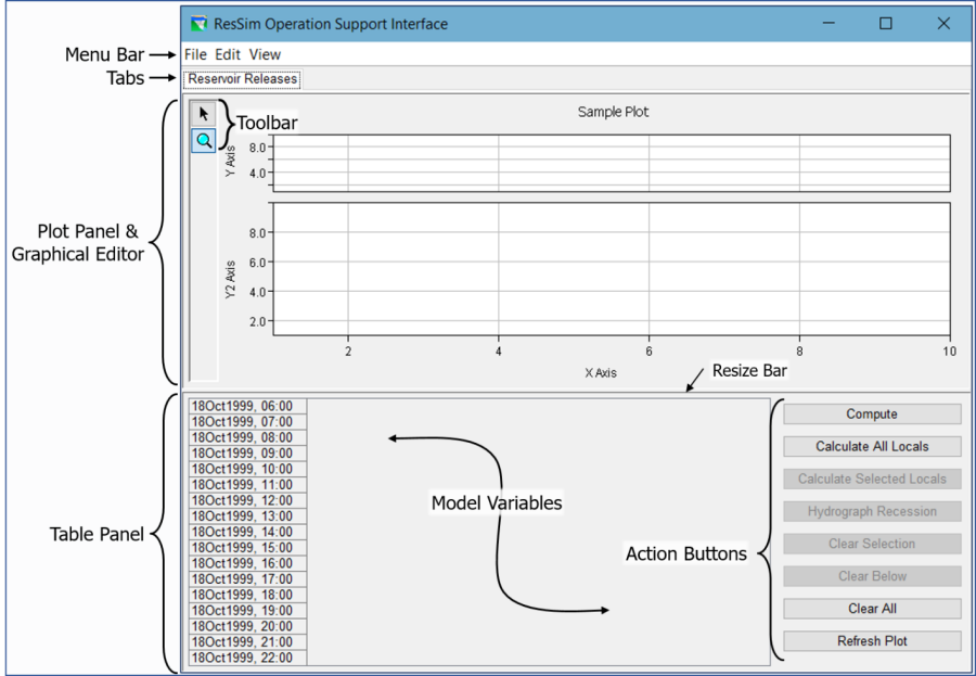
The top portion of each tab is a Plot Panel (and/or Graphical Editor). A Table Panel takes up most of the bottom portion of the tab with a stack of Action Buttons taking up the rest. As you add Variables to the tab, they will appear as columns in the Table Panel. A barely-noticeable Resize bar separates the top and bottom portions of the tab; you can "grab" this bar with your mouse and drag it up or down to resize the two panels.
The Plot Panel and the Action Buttons are context-sensitive. That means that how they appear and the functionality they provide are related to the active variable's type or category. To make a variable active, you only need to click on the data in that variable's column in the Table Panel (clicking in the header won't do it).
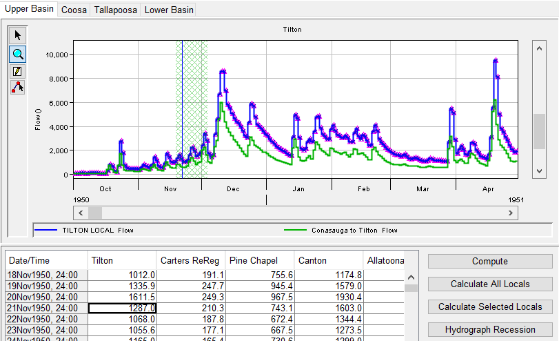
For example, "Figure: OSI Tab—Plot Panel Showing Active Dataset" shows the Plot Panel displaying time-series data for the selected (active) variable as well as another time-series dataset that was selected to be plotted with it. The plot also shows a green cross-hatched vertical bar indicating the range of the data currently displayed in the table and a blue vertical line indicating the point in time of the selected cell in the table.