Download PDF
Download page Monitoring Incoming Data Quality.
Monitoring Incoming Data Quality
Monitoring the quality of incoming data is the primary task during the data acquisition process. There are four primary ways for you to assess the quality of incoming data, to ascertain that your data streams are operational, and to identify specific locations with data problems.
- Use of quality color bars and thumbnail plots. CWMS can display time series icons as quality color bars or thumbnail plots representing gages where data is being collected. Quality color bars are color coded according to the quality of data at a location. This allows you to a quick, visual overview of data acquisition processes in the watershed during the specified time window.
- Use of plots and tabular data. When you have identified locations where issues exist in data acquisition, plots and tables provide detailed views of incoming data, helping you determine the nature of the issue.
- Use of Data Summary Lists. Data summary lists allow you to view gages in groups (such as all precipitation or all flow gages) and see details for more or fewer gages than display in the geo-referenced map window (Monitoring and Validating Incoming Data).
Quality Color Bars
Quality color bars (Figure 1) offer a quick overview of data acquisition processes in the watershed, dynamically reflecting the status of incoming data at each location as being acceptable, missing, or questionable. CWMS attaches quality flags to the incoming data based upon thresholds that you set (see the CWMS Installation and Setup Manual).
A quality color bar (Figure 1) is a thick, segmented line representing the history of the data quality at a specific location within the time window you have established. The name of the location appears adjacent to the color bar, and the length of the color bar represents a time line equal to the duration of the time window. Segments along the color bar reflect time intervals, with colors corresponding to the data quality legend you have defined. The quality color bars are updated dynamically at the time interval that you entered in the Time Window (Time Window).
As part of your daily routine, you should review quality color bars to determine if the incoming data is good and which data needs to be validated. To view the legend for quality color bars:
- Right-click on a time series icon in the Map Window, from the shortcut menu, click Icon Legend, the Quality Color Bar Legend dialog (Figure 2) will open.

- The legend displays the quality flags for the incoming data and the colors that represent each quality flag. You can change the color associated with the quality flags.
- From the CWMS CAVI main window, from the Acquisition tab, from the Edit menu, click Icon Quality Colors, the Quality Color Bar Editor (Figure 3) will open.

- To change the color of a quality flag, in the Color column of the table click the drop-down list and a list of available colors appears.
- Click the color you wish to change and the color appears in the cell of the Color column.
- The Show no report after flag (Figure 3) is a quality check for irregular time series data sets only. The default is that if more than one hour goes by without data being received, then a No Report quality flag is triggered. If you receive most of your irregular data in three-hour chunks, you may wish to increase this quality flag to three (3) hours.
- Click Show no report after, and in the field type the number of hours you wish to use.
- Click OK, the Quality Color Bar Editor (Figure 3) closes and the Map Window refreshes all of the quality color bars.
Thumbnail Plots
In some cases, you may wish to use thumbnail plots to represent gages and time series locations. Thumbnail plots (Figure 4) provide a miniature plot of the actual data values, and allow the data manager to quickly see which gages are reacting to a hydrometeorological event. The name of the location appears adjacent to the thumbnail plot. As the time window updates, CWMS refreshes the data and updates the thumbnail plot. The thumbnail plots are updated dynamically at the time interval that you entered in the Time Window (Time Window).
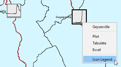
To view the legend for thumbnail plots:
- From the Map Window, right-click a thumbnail plot, from the shortcut menu (Figure 4), click Icon Legend. The Thumbnail Plot Legend dialog (Figure 5) will open.

- The legend displays the pathname, the color of the curve, and the minimum and maximum values of the curve. The Thumbnail Plot Legend dialog (Figure 5) provides you with information, to edit the color of the curve shown in the thumbnail plot (Time Series Icons).