Download PDF
Download page Plotting Results.
Plotting Results
ResSim has many standard plots for viewing output, and you can customize and create your own, as well. This chapter describes some of the main plotting features available in ResSim.
Viewing Plots and Tables
Plots and tables in the Simulation Module offer detailed views of data and model results.
You can access plots using context menus in the Simulation Module's display area.
To access a Plot from the display area, right-click on a model element in the map display. The context menu will provide a list of one or more plot options, as illustrated in "Figure: Reservoir Context menu - Plot Simulation Results".
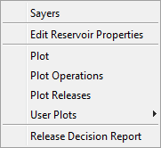
Figure: Reservoir Context menu - Plot Simulation Results
Once you have opened a plot, you can also tabulate values by selecting Tabulate from the plot's File menu.
Features of Plots
ResSim plots offer a variety of information that will assist you with reviewing the results of a Simulation. Included in the information available from the default plots are reservoir elevation, storage, and release values as well as regulated and unregulated flow values. "Figure: Sample Plot of Reservoir Results" shows a default plot style illustrating reservoir results from a Simulation.
The plot window displays the location name in the title bar. Axis labels and a color-coded legend identify the data contained in the plot.
When a plot depicts the results of an Alternative, as in "Figure: Sample Plot of Reservoir Results", a dashed vertical line represents the start time of the Simulation. The Lookback (historic/observed) period occurs prior to the start time.
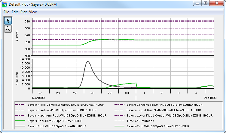
Figure: Sample Plot of Reservoir Results
The Zoom Tool ![]() allows you to view data closely at a specific time. To zoom in, hold the left mouse button down and outline the area you want to enlarge. To zoom out, click the right mouse button. To resize a plot, use the mouse to drag the edges of the window. It is possible to zoom in on one section of the entire plot (both the x and y variables simultaneously) or a range for either variable. To zoom in on a section of the plot, outline that area on the plot. To zoom in on a range (for either x or y variable), outline the desired range on the respective axis.
allows you to view data closely at a specific time. To zoom in, hold the left mouse button down and outline the area you want to enlarge. To zoom out, click the right mouse button. To resize a plot, use the mouse to drag the edges of the window. It is possible to zoom in on one section of the entire plot (both the x and y variables simultaneously) or a range for either variable. To zoom in on a section of the plot, outline that area on the plot. To zoom in on a range (for either x or y variable), outline the desired range on the respective axis.
From a plot window, the View menu provides additional controls for the display of results such as quickly displaying the entire plot after zooming in (Zoom to All), reposition or hide the legend (Legend Placement/Hide Legend), refresh the plot after modifying the alternative and recomputing (Refresh), and refresh the plot on the fly after recomputing (Live Display…).
Customizing Plots
You can customize the appearance of plots by using several properties editors that you can access from context menus:
- Line Properties: Right-clicking on a plot line or point will allow you to open a Curve Properties Editor to edit line colors, styles, and weights, as well as labels and quality symbols.
- Background Properties: Right-clicking on the background of a plot will allow you to add Markers on the X- or Y-Axis. Also, you can open a Viewport Editor where you can customize the border, background, and gridlines of the plot.
- Axis Properties: Right-clicking on a plot axis will allow you to set the Axis Type to "Log Axis" (or "Linear Axis"). Also, you can open an Axis Properties Editor where you can customize the axis scale and tic marks.
- Label Properties: Right-clicking on an axis label or plot legend will allow you to open a Label Properties Editor where you can add backgrounds and borders to the labels.
- Legend Properties: Right-clicking in an empty area in the legend region will allow you to open a Legend Properties Editor where you have a variety of options for determining the appearance of the legend. Or, you can select Hide Legend from the right-click menu (to show the legend, select Show Legend from the View menu).
Creating User-Defined Plots
Since everyone has their own preferences regarding which variables to include in the context menu location plot selections, the User Defined Plot capability offers flexibility.
To create a User Defined Plot:
Right-click on the element where you want the plot to appear, and select Plot from the context menu ("Figure: Context Menu for an Element"). The default plot for that location will appear.
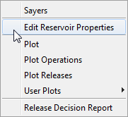
Figure: Context Menu for an Element
Choose Select Variables from the Plot Menu. The Select Plot Variables dialog will appear ("Figure: Select Plot Variables").
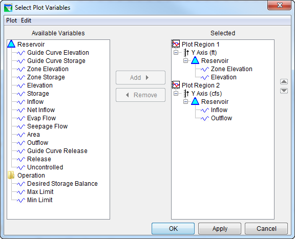
Figure: Select Plot Variables
The Available Variables list shows the variables you can choose for your User Defined Plot. The Selected list shows variables you have selected.
To add variables to your User Defined Plot:
- Click on the variable in the Available Variables list, then click on the appropriate Plot Region or component in the Selected list. This allows you to specify where you want variables to appear in your plot.
- Click Add to add the variable you have chosen to the Selected list. If the added variable reflects different units, a separate Y-axis will be automatically added.
To remove a variable, click on its name in the Selected list then click Remove.
You can also Move a Plot Region up or down or Remove it by right-clicking on the plot region name and choosing the action desired from the context menu, as illustrated in "Figure: Select Plot Variables - Plot Region Context Menu".
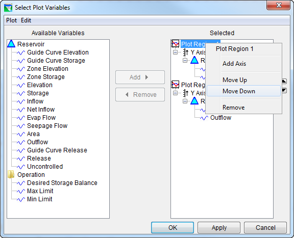
Figure: Select Plot Variables - Plot Region Context Menu
- Click OK. The Select Plot Variables dialog will close, and your User Defined Plot will open.
To save your User Defined Plot:
From the Plot menu on the plot that appears, select Save Plot Type... The Save Plot Type dialog will appear ("Figure: Save Plot Type"). You can specify whether you want this User Defined Plot to be available to All Applications or to just This Watershed only. Enter a Name for the plot.

Figure: Save Plot Type
- Click Save. The Save Plot Type... dialog will close.
The new User Defined Plot will now be available when you select User Plots from the right-click context menu in the Display Area ("Figure: Context menu - User Plots").
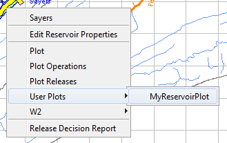
Figure: Context menu - User Plots
Viewing Data in Tabular Form
You can view plotted data in tabular form by selecting Tabulate from the File menu of the plot. "Figure: Data in Tabular Form" shows an example.
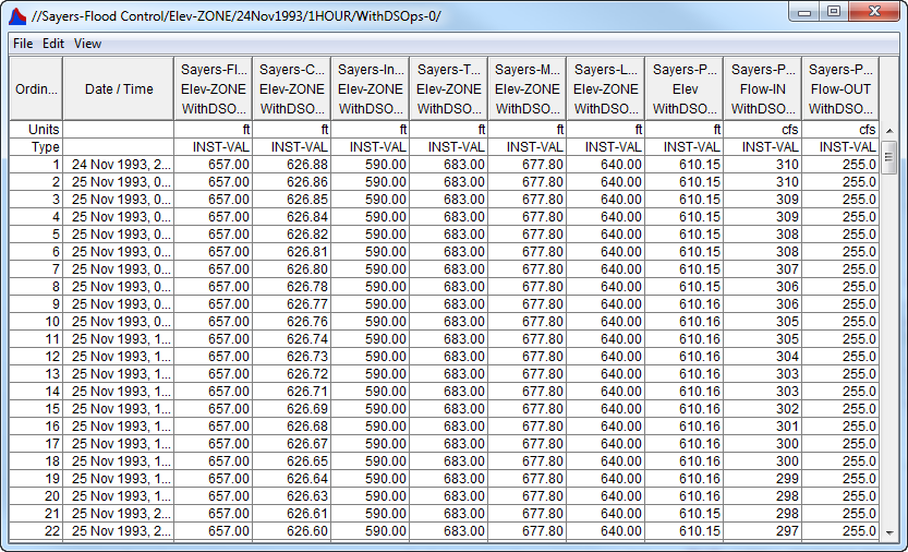
Figure: Data in Tabular Form
To sort the data in most report tables:
Click on the column header. Each click will toggle the sort between ascending and descending order.
The View menu of the Tabular Data window offers six display options. The Commas option displays commas in numbers greater than one thousand. The Reverse Order shows the table starting with the last time period and ending with the first time period. The Date and Time Separately option splits the date and time into two separate columns. The Date with 4 Digit Years option displays the year with four digits instead of the default two. You can set the decimal place for viewing the data by using the Show Decimal Places option. Lastly, you can indicate how you want missing data displayed by using the Show Missing As option. You can also resize table columns by dragging their borders to the desired position with your mouse.
Printing and Exporting Plots and Tables
You can print ResSim plots and tables, copy and paste them into other applications, and specify export options for plots. See "Printing and Exporting ResSim Data" for details.