Visualizing Data
The Visualization module provides tools for evaluating the current state of the watershed. The module's main display has several visualization tools that help to identify whether critical conditions exist. Time series icons, plots and graphs, and animated background images can all be used for reviewing observed data for a watershed.
Time series icons in the Visualization module provide a flexible set of tools to facilitate evaluating the current state of the watershed. To view current conditions at a glance, you can use thumbnail plots and threshold color bars that change color to reflect the status of various parameters at a particular location.
Threshold Color Bars
A Threshold Color Bar (Figure 1) is a thick, segmented line representing a linear histogram that compares current data against threshold values set for a location. Because threshold color bars are location dependent, you must set the values for each time series icon individually (Time Series Icon Editor). The name of the location appears adjacent to the threshold color bar, and the length of the Threshold Color Bar represents a timeline equal to the duration of the time window. Segments along the color bar reflect time intervals, with colors corresponding to the limits you have defined. The threshold color bars are updated dynamically at the time interval that you entered in for the time window (Visualization Tab – Time Window Setup). 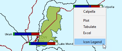
As part of your daily routine, you should review threshold color bars to determine if the current data is good and which data needs to be validated. To view the legend for threshold color bars:
- From the Map Window, right-click a thumbnail plot, from the shortcut menu, click Icon Legend. The Thumbnail Plot Legend dialog (Figure 2) will open.
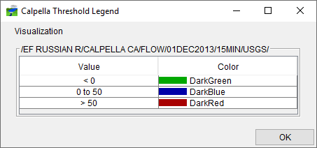
- The legend shows the threshold values for the current data and the colors that represent each threshold value.
As conditions change at a location, the threshold color bar automatically changes colors. For example, at a precipitation location, DarkGreen might represent precipitation between .01 to .11 inches, corresponding to normal conditions. DarkBlue might represent values greater than .51 inches, but less than 1.0 inch, which indicate a flood warning level. DarkRed would represent values above 1.0 inch, signaling flows above flood stage.
Thumbnail Plots
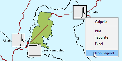
In some cases, you may wish to use thumbnail plots to represent gages and time series locations. Thumbnail Plots (Figure 3) are miniature versions of the full-size plots available in HEC-RTS, showing data for the set time window. The name of the location appears adjacent to the thumbnail plot. As the time window updates, HEC-RTS refreshes the data and updates the thumbnail plot.
To view the legend for thumbnail plots:
- From the Map Window, right-click on a thumbnail plot, from the shortcut menu (Figure 3), click Icon Legend. The Thumbnail Plot Legend dialog (Figure 4) will open.
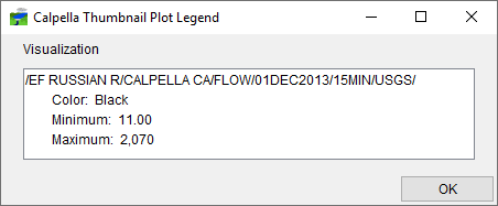
- The legend displays the pathname, the color of the curve, and the minimum and maximum values of the curve. The Thumbnail Plot Legend dialog (Figure 4) provides you with information, to edit the color of the curve shown in the thumbnail plot (Time Series Icons).
Using Plots
If the threshold color bar or thumbnail plot for a location indicates that data is questionable or bad, viewing the data in a plot can help you to determine the nature of the problem.
To access plots of incoming data:
- From the Map Window, right-click a time series icon, from the shortcut menu (Figure 3), click Plot.
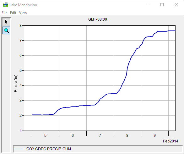
- This opens a two-dimensional plot (Figure 5) that contains the data for that location for the current time window. Figure 5 shows a sample plot for a precipitation gage. Use the Zoom Tool to zoom in on a specific portion of the plot. See Map Window for a more detailed description of the Zoom Tool. In addition, a more detailed description on the plots can be found in Viewing HEC-RTS Data and Results.
Using Tables
If the threshold color bar or thumbnail plot for a location indicates that data is atypical or unexpected, viewing the data in a table can help you to determine the nature of the problem.
To access tables of incoming data:
- From the Map Window, right-click a time series icon, from the shortcut menu (Figure 3), click Tabulate.
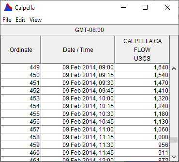
- This opens a table that contains data for that location for the current time window. Figure 6 shows a sample table of the data for a flow gage.
- If you have already opened a plot, you can also tabulate the data displayed in the plot from the Plot dialog (Figure 5). From the File menu, click Tabulate. For more details on tabular data in HEC-RTS, see .Visualizing Data v3.1.1. For printing and exporting tabular data, see Printing and Copying HEC-RTS Data.
