Time Series Icon Editor
After you have defined a new time series icon, you need to configure/edit the properties of the time series icon. From the Time Series Icon Editor dialog (Figure 1), properties include the name of the time series icon (view only), description, type of time series icon, position of the time series icon label, the location and the data associated with the time series icon, and the appearance of the time series icon in the different HEC-RTS modules. In addition, you can associate images, websites, webcams, documents, and scripting information with a time series icon.
![]()
Associate Data with a Time Series Icon
Within HEC-RTS, time series data can be accessed from DSS files. You can either enter the pathnames (time series identifiers) associated with the data or select the time series identifiers from a DSS file. Before selecting time series identifiers from a DSS file, you need to make sure that you have a DSS file available. A recommended choice would be the DSS file that is created when an HEC-RTS forecast is computed (forecast.dss).
To select time series identifiers from a DSS file:
- From the Time Series Icon Editor (Figure 1), be sure the General tab is selected, click Browse, or from the Data menu, click Browse. Either way, an HEC-DSSVue dialog (Figure 2) will open.
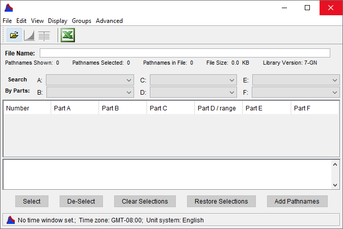
- From the File menu, click Open, the Open HEC-DSS File browser (Figure 3) will open.
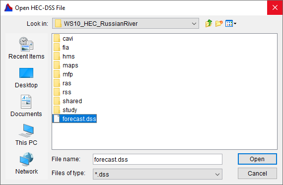
- Browse to the location of the appropriate DSS file, click on the DSS file, click Open, the Open HEC-DSS File browser (Figure 3) will close. The table on the HEC-DSSVue dialog (Figure 4) will now contain the time series identifiers that are available from the selected DSS file.
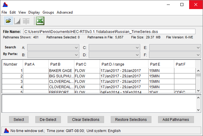
- Click on a time series identifier in the table that contains data that you want to associate with the time series icon. Click Select (Figure 4), the time series identifier will display in the selection list at the bottom of the HEC-DSSVue dialog. Continue adding time series identifiers by selecting them in the table and clicking Select. You can also double-click on a time series identifier to add it from the selection list. Another way is to hold down the CTRL key and select multiple time series identifiers from the table.
- You might want to use the Search By Parts (Figure 4) lists to aide in searching for specific time series identifiers. There are six lists that are available, that will aid you in the filtering of time series identifiers. Refer to DSS Pathnames for further details on this feature of HEC-DSSVue.
- Once you have chosen your time series identifiers, click Add Pathnames (Figure 4), the Time Series Icon Editor dialog (Figure 1) will display the time series identifiers you have selected in the Associated Data Sets box (Figure 1). The Source column of the table (Figure 1) will display information about the selected DSS file. When you are finished selecting time series identifiers, from the HEC-DSSVue dialog (Figure 4), from the File menu, click Close, the HEC-DSSVue dialog will close.
- The Time Series Icon Editor (Figure 1) now displays what data has been associated with the selected time series icon.
Remove Data from a Time Series Icon
To remove data from a time series icon:
- From the Time Series Icon Editor dialog (Figure 5), be sure the General tab is selected. Select a row(s) in the Associated Data Sets table (Figure 5), that should no longer be associated with the selected time series icon.
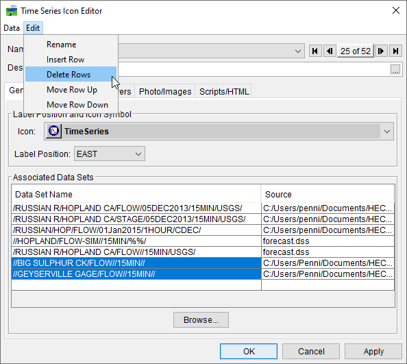
- From the Edit menu (Figure 5), click Delete Rows. The selected rows will be deleted from the Associated Data Sets table, and the data will no longer be associated with the time series icon.
Icon Types and Layers Tab
Now that you have created time series icons, HEC-RTS provides you with two ways to organize time series icon, for display purposes. The first is the concept of time series icon layers. By default, HEC-RTS creates an "All" time series icon layer, and by default, time series icons are assigned to the "All" time series icon layer when created. Time series icon layers make refining the display of data faster by allowing selection of the displayed layers by their data types. From HEC-RTS, you can create your own time series icon layers. For example, a gage may report stage, precipitation, and compute flow from stage. If time series layers are created for each one, "Stage", "Flow", and "Precipitation", then the appropriate datasets for that location can be placed in a corresponding time series icon layer. The procedure to create time series icon layers is described in Time Series Icons Layers.
The following steps describe how to assign datasets to time series icon layers:
- From the Time Series Icon Editor, click the Icon Types and Layers tab (Figure 6). From the Data Set list, for the selected time series icon (Hopland), select a dataset (/RUSSIAN R/HOPLAND CA/FLOW/05DEC2013/15MIN/USGS/).
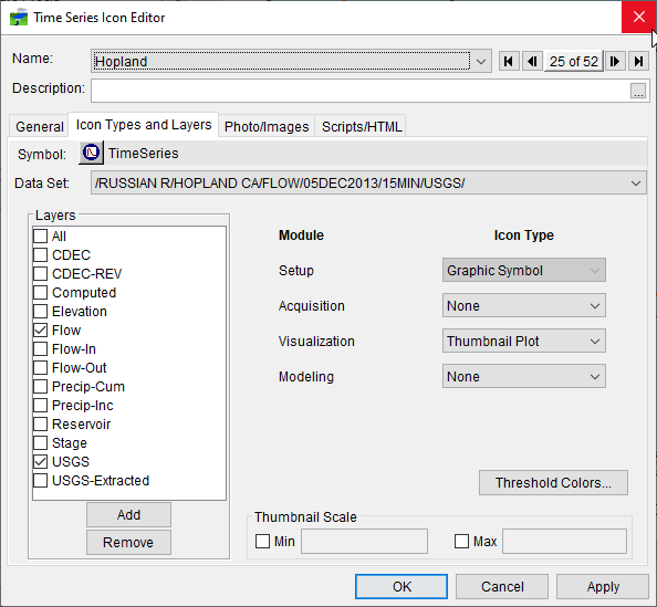
- From the Layers box (Figure 6), is a list of time series icon layers. Select and de-select times series icon layers for the selected dataset (/RUSSIAN R/HOPLAND CA/FLOW/05DEC2013/15MIN/USGS/) by clicking on the check boxes. Repeat this step for all datasets, that you want assigned to time series icon layers.
Now that you are finished with assigning time series icon layers, you now need to setup how the time series icon will be display in the individual HEC-RTS modules (Acquisition, Visualization, Modeling). There are seven available icon types:
![]() Graphic Symbol - provides an at-a-glance reference to the type of location represented and allow direct access to data associated with a location (such as model results). This is the only icon type for the Setup module.
Graphic Symbol - provides an at-a-glance reference to the type of location represented and allow direct access to data associated with a location (such as model results). This is the only icon type for the Setup module.
![]() Dot - allows you to mark gages and time series locations without cluttering the map window. Selecting this option displays a small red dot along with the icon label ( ) in the map window.
Dot - allows you to mark gages and time series locations without cluttering the map window. Selecting this option displays a small red dot along with the icon label ( ) in the map window.
![]() Thumbnail Plot – is a miniature version of the full-size plots available in HEC-RTS, showing data for the duration of the time window. As the time window updates, HEC-RTS refreshes the data and updates the plot. Thumbnail plots offer a quick overview of current data for the selected time window.
Thumbnail Plot – is a miniature version of the full-size plots available in HEC-RTS, showing data for the duration of the time window. As the time window updates, HEC-RTS refreshes the data and updates the plot. Thumbnail plots offer a quick overview of current data for the selected time window.
![]() Quality Color Bar - are linear histogram that offers a quick view of the quality of data within a set time window. Quality color bars reflect the quality of data by displaying bands of color that display quality information for datasets that are configured for this icon type. Refer to Reviewing Data Quality for additional information regarding quality color bar configuration.
Quality Color Bar - are linear histogram that offers a quick view of the quality of data within a set time window. Quality color bars reflect the quality of data by displaying bands of color that display quality information for datasets that are configured for this icon type. Refer to Reviewing Data Quality for additional information regarding quality color bar configuration.
![]() Threshold Color Bar - are linear histograms that compare data against threshold values set for a location. For example, at a "Flow" location, green might be assigned to flow values less than 5,000, which represent normal flow conditions. Yellow may represent values greater than 5,000, but less than 7,000 to indicate flows in a flood warning level, and red may represent values greater than 7,000 to indicate flows above flood stage. Because threshold color bars are location dependent, you must set the values for each time series icon individually. See Visualizing Data on how to configure your threshold color bars.
Threshold Color Bar - are linear histograms that compare data against threshold values set for a location. For example, at a "Flow" location, green might be assigned to flow values less than 5,000, which represent normal flow conditions. Yellow may represent values greater than 5,000, but less than 7,000 to indicate flows in a flood warning level, and red may represent values greater than 7,000 to indicate flows above flood stage. Because threshold color bars are location dependent, you must set the values for each time series icon individually. See Visualizing Data on how to configure your threshold color bars.
![]() Cumulative Threshold Color Bar - are color bars that display accumulated values. For example, display precipitation over time or the sum of volumes of inflows to a lake are accumulated values.
Cumulative Threshold Color Bar - are color bars that display accumulated values. For example, display precipitation over time or the sum of volumes of inflows to a lake are accumulated values.
None - by selecting None, you can configure the time series icon not to display in a specific HEC-RTS module (Acquisition, Visualization, Modeling). This is useful when you only use a time series icon in a specific module, as it keeps the map window uncluttered with unnecessary time series icons.
To assign a dataset to an HEC-RTS module (Acquisition, Visualization, Modeling) and select an icon type:
- From the Time Series Icon Editor, click the Icon Types and Layers tab (Figure 6). From the Data Set list, for the selected time series icon (Hopland), select a dataset (/RUSSIAN R/HOPLAND CA/FLOW/05DEC2013/15MIN/USGS/).
- From the module and icon type assignment section (Figure 7), for the selected dataset you need to determine if you wish to view the time series icon in that module. In addition, if you want the time series icon displayed how you want that time series icon displayed.
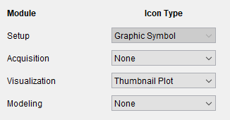
- For example, in Figure 7, for the selected time series icon and dataset, for the Acquisition module, the time series icon will not be displayed, as you have selected an icon type of None. For the Visualization module, the time series icon will be display as a Thumbnail plot. Finally, for the Modeling module, the time series icon will not be displayed, as you have selected an icon type of None.
Configuring a Threshold Color Bar for a Dataset
Threshold color bars (Figure 8) are linear histograms that compare incoming data against threshold values set for a location. Because a threshold color bar dataset is dependent, you typically set the color values for the dataset of a time series icon. The length of the threshold color bar represents a timeline equal to the duration of the time window. Segments along the color bar reflect time intervals, with colors corresponding to the data quality legend you have defined. The threshold color bars are updated dynamically at the time interval that has been set for the time window.

To set the thresholds and colors a threshold color bar associated with a dataset:
- From the Time Series Icon Editor, click the Icon Types and Layers tab (Figure 6). From the Data Set list, for the selected time series icon (Hopland), select a dataset (/RUSSIAN R/HOPLAND CA/FLOW/05DEC2013/15MIN/USGS/).
- Click Threshold Colors, the Threshold Color Bar Editor for Time Series will open (Figure 9).
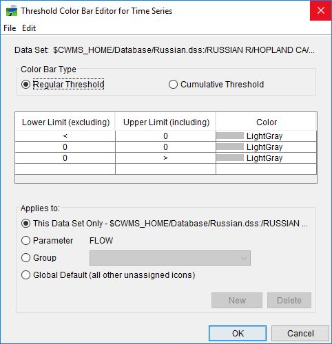
- The dataset's name is displayed on the Threshold Color Bar Editor for Time Series. The default threshold color type is Regular Threshold (Figure 9), for Cumulative Threshold color bars you would use the Threshold Color Bar Editor for Time Series to create your threshold color bar.
- HEC-RTS creates a default threshold for you. For example, the selected dataset is a flow location, you need to set DarkGreen (Figure 9) to flow values less than 5000 (normal flow conditions). From the table, for the DarkGreen row, under the Upper Limit column, double-click on the cell, enter 5000 (do not enter a comma).The entered value is displayed for the DarkGreen row, and for the DarkBlue row 5000 is now displayed in the LowerLimit column of the table.
- Now you need to set your next threshold limit for the dataset. For the DarkBlue (Figure 9) row, we want the color to be yellow. Click on DarkBlue, from the list select Yellow. For the Yellow row, in the UpperLimit cell, enter 7000. Values greater than 5000 but less than 7000 indicate flows that are in a flood warning level.
- For the DarkRow (Figure 10), you have a threshold of flow values greater than 7000 indicating that flows for this dataset are above flood stage.

- By default, HEC-RTS will use this as the threshold color scheme (Figure 10) for datasets with the parameter of flow (Parameter). You can apply this threshold color scheme to the selected dataset only, to a group, or to all other unassigned time series icon (Global Default).
- Click OK, the Threshold Color Bar Editor for Time Series will close (Figure 9).
Configuring Thumbnail Plots – Thumbnail Scale
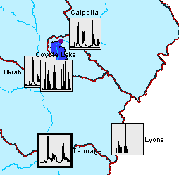
A thumbnail plot (Figure 11) is a miniature version of the full-size plots available in HEC-RTS, showing data for the duration of the time window. You can adjust the size of the thumbnail plot.
To set the scale of a thumbnail plot:
- From the Time Series Icon Editor, click the Icon Types and Layers tab (Figure 6). From the Data Set list, for the selected time series icon (Hopland), select a dataset (/RUSSIAN R/HOPLAND CA/FLOW/05DEC2013/15MIN/USGS/).
- The Thumbnail Scale box (Figure 12) represents the minimum and maximum values displayed with in a thumbnail plot. To set these values, first check the checkbox next to Min or Max, and the fields next to the labels will become enabled. Once the fields are enabled, enter the numeric values for the items you selected.

- Click OK, the Time Series Icon Editor dialog (Figure 1) will close. To save the changes to the watershed, from the HEC-RTS main window, from the File menu, click Save Watershed.
Photo/Images Tab
Photos, webcam images, web pages, or documents can be assigned to time series icons. By adding them to a time series icon in the Setup module, you can access them in the Visualization, Acquisition, and Modeling modules through the icon shortcut menu. Images and webcams can be viewed in their own separate dialog or as icons on the map window. For more information on how to set these features up see Time Series Icons.
Scripts/HTML Tab
Scripts can be assigned to individual time series icons. The scripts can be used to update the data at given intervals, compute other information from the data, or complete other tasks. Scripts are assigned to the icons in the Setup module, through the Time Series Icon Editor. For more detailed information on assigning and using scripts, see Scripting.