Customizing Curves
You can customize line and point styles, add labels, and specify symbols to indicate data quality in your plots. Additionally, you can specify the parameter-based default curve styles used across all plots.
There are three different ways to edit plot curves, depending on whether you wish to customize one or more curves in an individual plot or specify defaults for all plots.
Customizing Curves in Individual Plots
To customize all curves in an individual plot, from the Edit menu, choose Plot Properties. Once the Plot Properties editor opens, select the Curves tab.
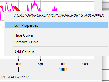
To customize a specific curve in an individual plot, right-click on the line or curve you wish to edit using the Pointer Tool , then select Edit Properties from the shortcut menu (see below). The Edit Curve Properties editor will open.
The Curves tab of the Plot Properties editor and the Edit Curve Properties editor are nearly identical with one exception. At the top of the Curves tab of the Plot Properties editor, there is a list of all curves contained in the plot. In contrast, when you open the Edit Curve Properties editor, only the selected curve's DSS Path is displayed. Both the Edit Curve Properties editor and the Curves tab of the Plot Properties editor allow you to edit Style, Label, Legend Item, and Quality Symbols (you can edit Quality Symbols only if the plot has quality defined data).
Specifying Parameter-Based Default Curve Styles
To specify parameter-based default curve styles for all of your plots, from the Edit menu, click Default Line Styles. The Default Line Styles options editor will open.
The Default Line Styles options editor gives you a way to edit line styles from the Line Styles box (below). You can specify the default, parameter-based curve styles used for all plots. 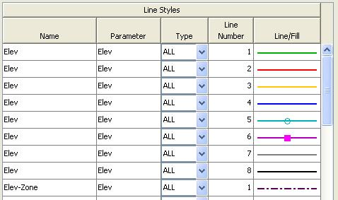
The Line Styles table displays typical data types with default line and fill styles predefined.
You can edit all of these fields, change default line and fill styles for existing types, and add new data types to the list (currently, there is no delete option).
The Line Styles table columns are described below in detail:
- Name The Name corresponds to the "C" part of HEC-DSS pathnames. To edit an existing name, highlight it, and then type in the new Name.
- Parameter The Parameter is what distinguishes data sets and groups them together in the same viewport. For example, FLOW-IN and FLOW-OUT have different Names or "C" parts, but both are Parameter "FLOW" data sets, so they will be plotted in the same viewport.
- Type The Type describes the regular and irregular interval time series record data, either INST-CUM (instantaneous cumulative), INST-VAL (instantaneous value), PER-AVER (period average), PER-CUM (period cumulative), or ALL. To change the data Type associated with a Name and Parameter, click the down-arrow and select from the preexisting list.
- Line Number The Line Number column indicates the number of lines/curves displayed in the viewport and what style will be associated with that data. For example, if you have three curves in a viewport each with the same Name, Parameter, and Type, the first line will be assigned the Line/Fill associated with Line Number 1; the second will use Line Number 2, the third Line Number 3, and so on. If there is only one line displayed in the viewport for that data set, it will use the Line Number 1 line style. See Adding New Data Styles below to add more Line Numbers to a particular data set.
- Line/Fill The Line/Fill property determines how curves associated with a particular Name/Parameter/Type combination will appear in all plots. To specify the Line/Fill, select the row, and then customize the Line and Point properties.
Adding New Data Styles
To add a new data type (i.e. insert a row in the Line Style table):
1. From the File menu of the Default Line Styles options editor, choose New Parameter. The New Data Type dialog box will open.

2. Select a parameter from the Parameter list.
3. Enter a name in the Name box.
4. From the Type list, select the data type.
5. In the Number of Lines box, enter the number of curves you want to add for this new data type.
6. If you want to reverse the Y-axis, select Y Axis Reversed.
7. Click OK to save and close the dialog box.
The Line Styles table will display the new data type you have added, repeated as many times as you specified in the Number of Lines box (reflected in the Line Number column). You can customize the new data types as described above.
To save your changes, from the File menu, click Save. To close the Default Line Styles options editor, from the File menu, click Close.
Specifying Line and Point Styles of Curves
The curve Line and Point Style worksheet is shown in below. This worksheet is available from the Curves tabs of the Edit Curve Properties editor, the Plot Properties editor, and the Default Line Styles options editor.
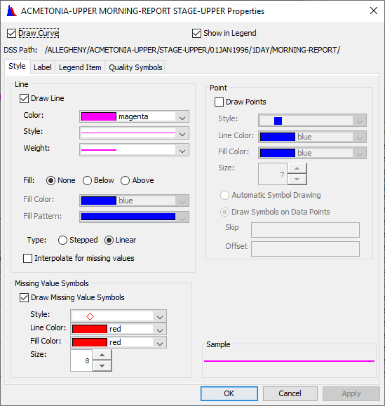
The Style tab has three main groups, Line, Point, and Missing Value Symbols which allow you to customize line and point styles, and a separate symbol that can be shown for missing values. Beneath the Point group, the Sample box provides a preview of how your line and point choices will look.
To define line styles for curves:
1. In the Line group, click Draw Line.
2. Select a Color, Style, and Weight for the line.
3. You can display lines with fill above or below, or without fill. A plot with line fill below looks like this:

The same plot without line fill looks like this:

To set this feature use the Fill selections; None, Below, or Above. Then choose the Fill Color and Fill Pattern for the fill using the color and pattern dropdown lists located below the Fill section.
4.In the Type section, select if you want the curve drawn Stepped, in a stair-stepped style, or Linear, with a line drawn directly between each point.
5. If you would like to see missing values, check Draw Missing Value Symbols and select a Style, Line Color, Fill Color, and Size for the missing value points.
To define Point styles for curves:
1. In the Point group, click Draw Points.
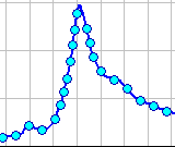
2. Choose the Style, Line Color, and Fill Color you want. The Line Color is the "border" around the point symbol. The Fill Color is the color inside the point symbol. An example of a dark blue Line Color and a light blue Fill Color is illustrated below.
3. In the Size box, specify the size of the point (in pixels) either by selecting a size from the list or by typing in a number from 1- 45.
4. Automatic Symbol Drawing allows the program to determine the number of points to display on a curve. The program will automatically calculate how many data points can display on the curve before they start to overlap one another. Not all points will be displayed. If the points overlap at the zoom level you view the plot at, the program will determine how many points can display
separately on the curve and only display those points. As you zoom in, the plot will draw more and more points, as long as they do not touch.
5. Draw Symbols on Data Points allows you to specify how to draw the points so they don't overlap. If you set the Skip box to one (1), then it will draw one point, skip the next, then draw the third, etc. The Offset box allows you to say how many points on the curve to initially skip before drawing points.
To define missing value symbols for curves:
1. In the Missing Value Symbols group, click Draw Missing Value Symbols.
2. Choose the Style, Line Color, and Fill Color you want. The Line Color is the "border" around the point symbol, whereas the Fill Color is the color inside the point symbol. See the example above where of a dark blue Line Color and a light blue Fill Color.
3. In the Size box, specify the size of the point (in pixels) either by selecting a size from the list or by typing in a number from 1- 45.
4. This will place the selected symbol on each missing value.
Customizing Curve Labels
The curve Label worksheet, available from the Curves tabs of the Edit Curve Properties editor, the Plot Properties editor, and the Default Line Styles options editor are shown below. This worksheet allows you to customize curve labels.
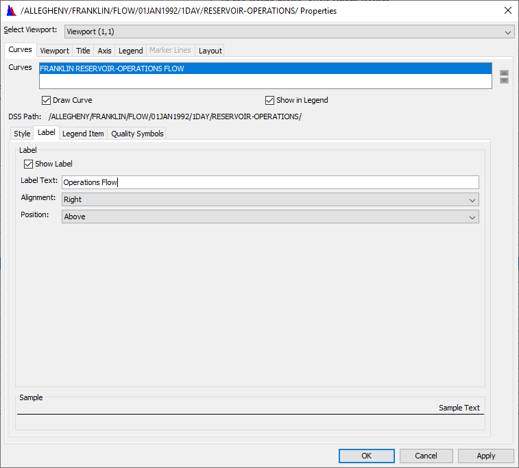
To customize curve labels:
1. Check the Show Label checkbox.
2. Enter the text you want to appear in the curve label in the Label Text box. You can also use text substitution for a curve label.
3. Using the Alignment list to select the horizontal position of the label on the curve; Left, Center, or Right.
4. To set the vertical position of the label on the curve, from the Position list, click Above, Center, or Below.
The Sample box at the bottom of the editor provides a preview of how your label will display.
Customizing Curve Quality Symbols
The curve Quality Symbols worksheet, available from the Curves tabs of the Edit Curve Properties editor, the Plot Properties editor, and the Default Line Styles options editor are shown below. This worksheet allows you to customize curves for plots that have quality set for their data.
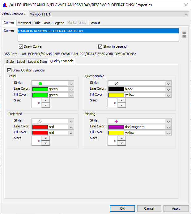
To customize quality symbols:
1.Check the Draw Quality Symbols checkbox.
2. Select a symbol Style, Line Color, Fill Color, and Size for each quality of data; Valid, Questionable, Rejected, and Missing.