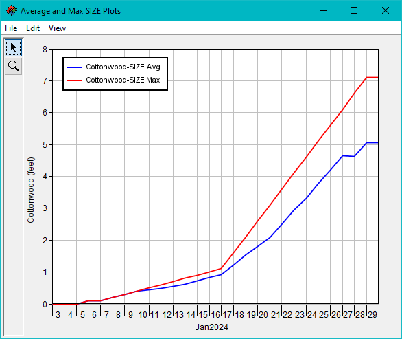
Plots for count, density, and size are available via right click options per Alternative in the simulation – alternative tree (Figure). Plots can also be called directly from the simulation map interface via its right click menu. Importantly, plots are done for the area selected in the corresponding simulation map window. Areas can be selected using the cursor tool to lasso, frame, or individually select elements for plotting. If no area is selected, plots are made for the whole study area.

Figure. Plots for count, density, and size are available for computed alternatives.
Plots also include menu options that allow users to tabulate displayed data, save plots as images, print plots, manage symbology and presentation of data, and several other options. The Plots – File – Tabulate menu option provides quick access to results and is one of several ways to access time series outputs generated by EFMSim.
Detailed simulation reports are available that summarize the rules that affected simulated communities and community-classes in each simulation time step (Figure). It is easiest to understand and perhaps best used when generated for individual elements. Reports generated for multiple elements are still useful but can be confusing and tricky to interpret. For example, reported sizes are the sum of sizes in all selected elements per community and community-class.

Figure. Detailed simulation reports provide insights into simulation results, time step by time step.