Download PDF
Download page Coincident Events - West Branch Susquehanna River.
Coincident Events - West Branch Susquehanna River
The WBSusquehanna_Correlation example demonstrates the usage of the Correlation Analysis in order to determine how closely related annual maximum peak discharges at several stream gages are to one another.
Input Data
In this example, time series representing annual maximum inflow to four multi-purpose reservoir projects within the West Branch Susquehanna River watershed are analyzed. The first time series is from the West Branch Susquehanna River at Bower, PA stream gage, which is located just upstream of Curwensville Dam. The second time series is from the First Fork Sinnemahoning Creek at Wharton, PA stream gage, which is located just upstream of George B. Stevenson Dam. The third time series is from the Kettle Creek at Cross Fork, PA stream gage, which is located just upstream of Alvin R. Bush Dam. The fourth time series is from the Bald Eagle Creek bl Spring Creek at Milesburg, PA stream gage, which is located just upstream of Foster Joseph Sayers Dam. The location of these stream gages is shown in Figure 1. The time series are plotted within Figure 2 and tabulated within Table 1.
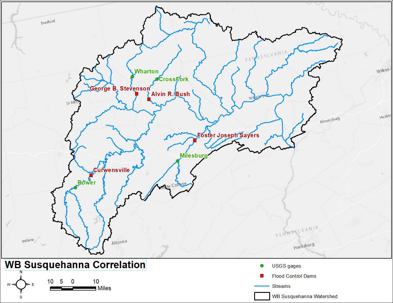
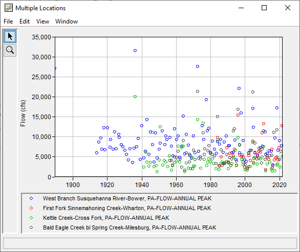
Table 1. Input Time Series for WBSusquehanna_Correlation Example
| Date | Flow (cfs) | |||
|---|---|---|---|---|
| Bower | Wharton | Cross Fork | Milesburg | |
| 31 May 1889 | 27000 | |||
| 09 Nov 1913 | 5900 | |||
| 07 Jan 1915 | 8640 | |||
| 03 Jun 1916 | 9600 | |||
| 22 Jan 1917 | 6800 | |||
| 20 Feb 1918 | 12200 | |||
| 31 Oct 1918 | 6680 | |||
| 12 Mar 1920 | 12200 | |||
| 08 Aug 1921 | 7300 | |||
| 29 Nov 1921 | 9320 | |||
| 13 May 1923 | 6850 | |||
| 29 Jun 1924 | 11200 | |||
| 09 Feb 1925 | 6960 | |||
| 05 Sep 1926 | 10500 | |||
| 22 Jan 1927 | 9810 | |||
| 30 Mar 1928 | 7940 | |||
| 26 Feb 1929 | 7440 | |||
| 26 Feb 1930 | 6550 | |||
| 04 Apr 1931 | 5500 | |||
| 01 Apr 1932 | 4160 | |||
| 15 Mar 1933 | 6930 | |||
| 30 Sep 1934 | 3540 | |||
| 25 Jul 1935 | 7120 | |||
| 18 Mar 1936 | 31500 | 20000 | ||
| 22 Jan 1937 | 7520 | |||
| 18 Dec 1937 | 9490 | |||
| 15 Feb 1939 | 4320 | |||
| 31 Mar 1940 | 12700 | |||
| 06 Apr 1941 | 2370 | |||
| 05 Jun 1941 | 4600 | |||
| 09 Mar 1942 | 6320 | |||
| 22 May 1942 | 6100 | |||
| 30 Dec 1942 | 14300 | 3660 | ||
| 17 Mar 1944 | 5500 | |||
| 08 May 1944 | 2580 | |||
| 07 Mar 1945 | 11200 | |||
| 18 Mar 1945 | 3520 | |||
| 28 May 1946 | 11000 | |||
| 13 Jun 1946 | 8000 | |||
| 06 Apr 1947 | 2470 | |||
| 26 Apr 1947 | 3660 | |||
| 14 Apr 1948 | 10900 | |||
| 15 Apr 1948 | 2800 | |||
| 27 Jan 1949 | 4600 | |||
| 16 Feb 1949 | 1260 | |||
| 28 Mar 1950 | 6850 | |||
| 05 Apr 1950 | 4180 | |||
| 05 Nov 1950 | 8410 | |||
| 25 Nov 1950 | 12400 | |||
| 27 Jan 1952 | 11400 | |||
| 06 Apr 1952 | 2850 | |||
| 24 Mar 1953 | 4050 | |||
| 31 May 1953 | 8000 | |||
| 02 Mar 1954 | 10200 | 3670 | ||
| 16 Oct 1954 | 9270 | |||
| 05 Mar 1955 | 2460 | |||
| 08 Mar 1956 | 5140 | |||
| 03 Jul 1956 | 9720 | |||
| 06 Aug 1956 | 4000 | |||
| 06 Apr 1957 | 7600 | 1620 | ||
| 09 Apr 1957 | 4000 | |||
| 21 Dec 1957 | 2850 | |||
| 26 Dec 1957 | 2810 | |||
| 08 May 1958 | 5190 | |||
| 22 Jan 1959 | 11900 | 3550 | ||
| 10 Feb 1959 | 4880 | |||
| 31 Mar 1960 | 9270 | 3920 | ||
| 23 May 1960 | 4770 | |||
| 25 Feb 1961 | 10200 | |||
| 26 Feb 1961 | 7600 | 6340 | ||
| 28 Feb 1962 | 4740 | |||
| 31 Mar 1962 | 3670 | |||
| 07 Apr 1962 | 4400 | |||
| 17 Mar 1963 | 2410 | |||
| 18 Mar 1963 | 7600 | |||
| 27 Mar 1963 | 7200 | |||
| 10 Mar 1964 | 15200 | 7600 | 8950 | |
| 03 Jan 1965 | 5720 | |||
| 13 Feb 1965 | 1240 | |||
| 24 Mar 1965 | 1640 | |||
| 13 Feb 1966 | 5910 | |||
| 14 Feb 1966 | 10600 | 3400 | ||
| 06 Mar 1967 | 7800 | |||
| 29 Mar 1967 | 2080 | |||
| 29 Sep 1967 | 5620 | |||
| 25 Oct 1967 | 3630 | |||
| 31 Jan 1968 | 5250 | |||
| 23 Mar 1968 | 1960 | |||
| 30 Jan 1969 | 4590 | |||
| 20 May 1969 | 4770 | |||
| 23 Jul 1969 | 1990 | |||
| 02 Apr 1970 | 10100 | 2610 | 6530 | |
| 16 Nov 1970 | 2600 | |||
| 21 Feb 1971 | 5920 | |||
| 27 Feb 1971 | 4330 | |||
| 23 Jun 1972 | 27500 | 14300 | 21300 | |
| 02 Feb 1973 | 6270 | 4540 | 6290 | |
| 19 Jan 1974 | 4950 | |||
| 04 Apr 1974 | 2090 | 4400 | ||
| 24 Feb 1975 | 12700 | |||
| 26 Sep 1975 | 13400 | |||
| 27 Sep 1975 | 10900 | |||
| 17 Feb 1976 | 9270 | |||
| 20 Jun 1976 | 4230 | |||
| 21 Jun 1976 | 5620 | |||
| 09 Oct 1976 | 6920 | |||
| 20 Jul 1977 | 19200 | |||
| 25 Sep 1977 | 2700 | |||
| 15 Mar 1978 | 11400 | |||
| 14 May 1978 | 3590 | |||
| 15 May 1978 | 6500 | |||
| 05 Mar 1979 | 12100 | |||
| 06 Mar 1979 | 4430 | 7760 | ||
| 26 Nov 1979 | 6020 | 3640 | 5780 | |
| 20 Feb 1981 | 4360 | |||
| 21 Feb 1981 | 8820 | |||
| 23 Feb 1981 | 5500 | |||
| 28 Oct 1981 | 3210 | |||
| 13 Mar 1982 | 6820 | |||
| 05 Jun 1982 | 5180 | |||
| 21 Mar 1983 | 3310 | |||
| 22 Mar 1983 | 1990 | |||
| 21 Jun 1983 | 5790 | |||
| 14 Feb 1984 | 9810 | 9080 | 15000 | |
| 15 Feb 1984 | 8790 | |||
| 25 Feb 1985 | 2790 | 1730 | ||
| 29 Mar 1985 | 8140 | |||
| 01 Apr 1985 | 2630 | |||
| 16 Nov 1985 | 9210 | |||
| 20 Jan 1986 | 4880 | |||
| 15 Mar 1986 | 3280 | 6730 | ||
| 27 Nov 1986 | 2770 | 3680 | ||
| 05 Apr 1987 | 6120 | 3210 | ||
| 02 Feb 1988 | 8620 | 3200 | ||
| 19 May 1988 | 3510 | 3220 | ||
| 31 Mar 1989 | 10100 | |||
| 21 Jun 1989 | 7190 | 3770 | 5590 | |
| 11 Apr 1990 | 3620 | 2010 | ||
| 09 Jun 1990 | 3450 | |||
| 12 Jul 1990 | 7690 | |||
| 11 Oct 1990 | 3370 | |||
| 30 Dec 1990 | 7730 | |||
| 04 Mar 1991 | 5830 | 4740 | ||
| 03 Dec 1991 | 2790 | |||
| 14 Jul 1992 | 5920 | |||
| 15 Jul 1992 | 4390 | |||
| 17 Jul 1992 | 3240 | |||
| 28 Mar 1993 | 6020 | |||
| 01 Apr 1993 | 5160 | 4760 | ||
| 16 Apr 1993 | 11400 | |||
| 28 Nov 1993 | 6870 | 11900 | ||
| 25 Mar 1994 | 9150 | |||
| 18 Aug 1994 | 6530 | |||
| 28 Nov 1994 | 4320 | |||
| 20 Jan 1995 | 3880 | |||
| 21 Jan 1995 | 2860 | 2740 | ||
| 19 Jan 1996 | 15400 | 9820 | 16800 | |
| 19 Jul 1996 | 22000 | |||
| 08 Nov 1996 | 6000 | 7960 | 7870 | |
| 09 Nov 1996 | 5400 | |||
| 08 Nov 1997 | 15900 | |||
| 08 Jan 1998 | 5100 | 4280 | ||
| 09 Apr 1998 | 5380 | |||
| 24 Jan 1999 | 8960 | 4890 | 3000 | 3650 |
| 26 Nov 1999 | 4100 | 2420 | ||
| 04 Apr 2000 | 1730 | |||
| 17 Apr 2000 | 3060 | |||
| 18 Oct 2000 | 3730 | |||
| 22 Mar 2001 | 2000 | |||
| 10 Apr 2001 | 2240 | 1640 | ||
| 26 Mar 2002 | 5880 | 5840 | ||
| 13 May 2002 | 5340 | 2480 | ||
| 02 Jan 2003 | 6640 | |||
| 21 Mar 2003 | 2550 | |||
| 22 Mar 2003 | 3980 | |||
| 28 Sep 2003 | 6630 | |||
| 18 Sep 2004 | 17100 | 8590 | 8880 | 21100 |
| 06 Jan 2005 | 12300 | |||
| 14 Jan 2005 | 3500 | |||
| 29 Mar 2005 | 4490 | |||
| 03 Apr 2005 | 3280 | |||
| 29 Nov 2005 | 5990 | |||
| 30 Nov 2005 | 6080 | 4750 | 8380 | |
| 16 Nov 2006 | 4370 | |||
| 15 Mar 2007 | 5480 | 5230 | 3070 | |
| 06 Feb 2008 | 6330 | 4570 | ||
| 05 Mar 2008 | 6310 | 7070 | ||
| 25 Dec 2008 | 7260 | |||
| 09 Mar 2009 | 6020 | 4380 | ||
| 31 Jul 2009 | 3340 | |||
| 25 Jan 2010 | 10900 | 4940 | 6830 | |
| 14 Mar 2010 | 7600 | |||
| 01 Dec 2010 | 13200 | 7410 | 11400 | |
| 10 Sep 2011 | 11200 | |||
| 23 Nov 2011 | 4280 | |||
| 23 Dec 2011 | 1770 | 1530 | ||
| 27 Jan 2012 | 5540 | |||
| 31 Jan 2013 | 5770 | 4770 | 3120 | 5190 |
| 22 Dec 2013 | 4250 | |||
| 13 Mar 2014 | 6450 | |||
| 16 May 2014 | 5140 | |||
| 16 May 2014 | 3650 | |||
| 15 Mar 2015 | 6310 | |||
| 10 Apr 2015 | 1840 | |||
| 18 Jul 2015 | 5300 | |||
| 30 Sep 2015 | 6860 | |||
| 29 Oct 2015 | 2080 | |||
| 11 Nov 2015 | 1350 | |||
| 03 Feb 2016 | 3040 | |||
| 03 Feb 2016 | 2750 | |||
| 21 Oct 2016 | 11100 | |||
| 13 Jan 2017 | 4140 | |||
| 06 May 2017 | 1500 | |||
| 29 May 2017 | 9590 | |||
| 13 Jan 2018 | 4630 | |||
| 10 Sep 2018 | 17200 | |||
| 10 Sep 2018 | 11700 | |||
| 11 Sep 2018 | 2830 | |||
| 03 Oct 2018 | 4950 | |||
| 22 Dec 2018 | 3150 | |||
| 08 Feb 2019 | 6550 | |||
| 08 Feb 2019 | 4140 | |||
| 01 Nov 2019 | 7220 | |||
| 28 Mar 2020 | 8990 | |||
| 29 Mar 2020 | 4270 | |||
| 01 May 2020 | 2420 | |||
| 25 Dec 2020 | 6370 | |||
| 10 May 2021 | 7790 | |||
| 19 Aug 2021 | 12700 | |||
| 23 Sep 2021 | 5100 | |||
General Tab
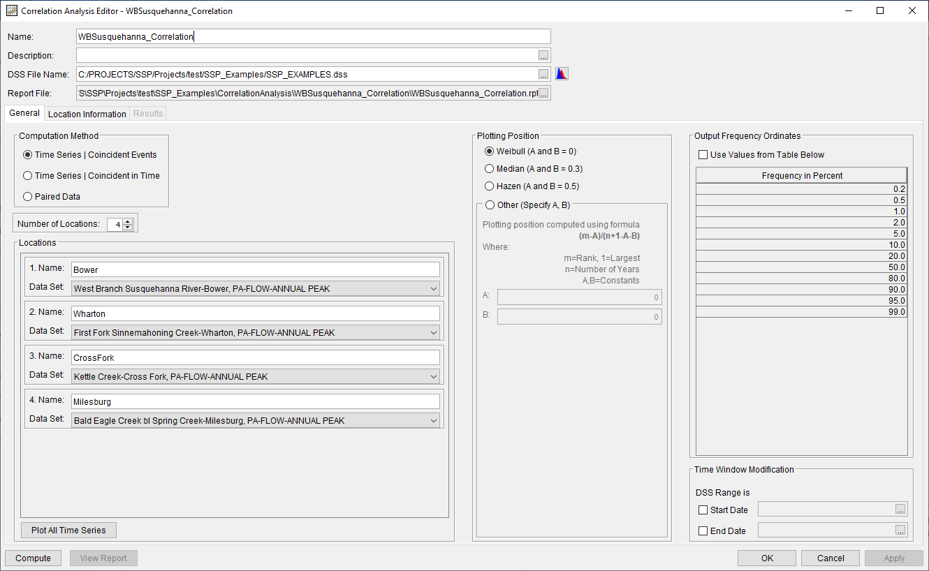
A Correlation Analysis has been developed for this example. To open the analysis, either double-click on the analysis labeled WBSusquehanna_Correlation from the study explorer or from the Analysis menu select open, then select WBSusquehanna_Correlation from the list of available analyses. When WBSusquehanna_Correlation is opened, the General tab within the Correlation Analysis editor will appear as shown in Figure 3. For this analysis, the Time Series | Coincident Events computational method was selected and four locations were defined. The default Plotting Position formula (Weibull) and Output Frequency Ordinates were left unchanged. No modifications were made to the time window.
Location Information Tab
The Location Information tab contains four sub-tabs, one for each of the previously defined locations.
Bower
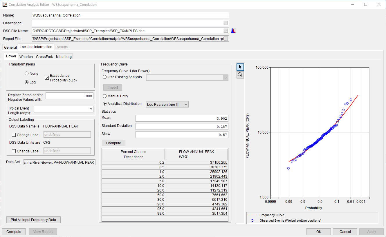
On the Bower sub-tab, the Log and Exceedance Probability (p, Zp) transformations were selected, as shown in Figure 4. 1000 cfs was entered as the replacement value if/when zeroes or negatives were encountered. A typical event length of 7 days was also defined. The default Output Labeling was left unchanged. Finally, a frequency curve that was fit to the Bower time series was defined using a Log Pearson Type III (LPIII) distribution and the flow-frequency curve was computed.
Wharton
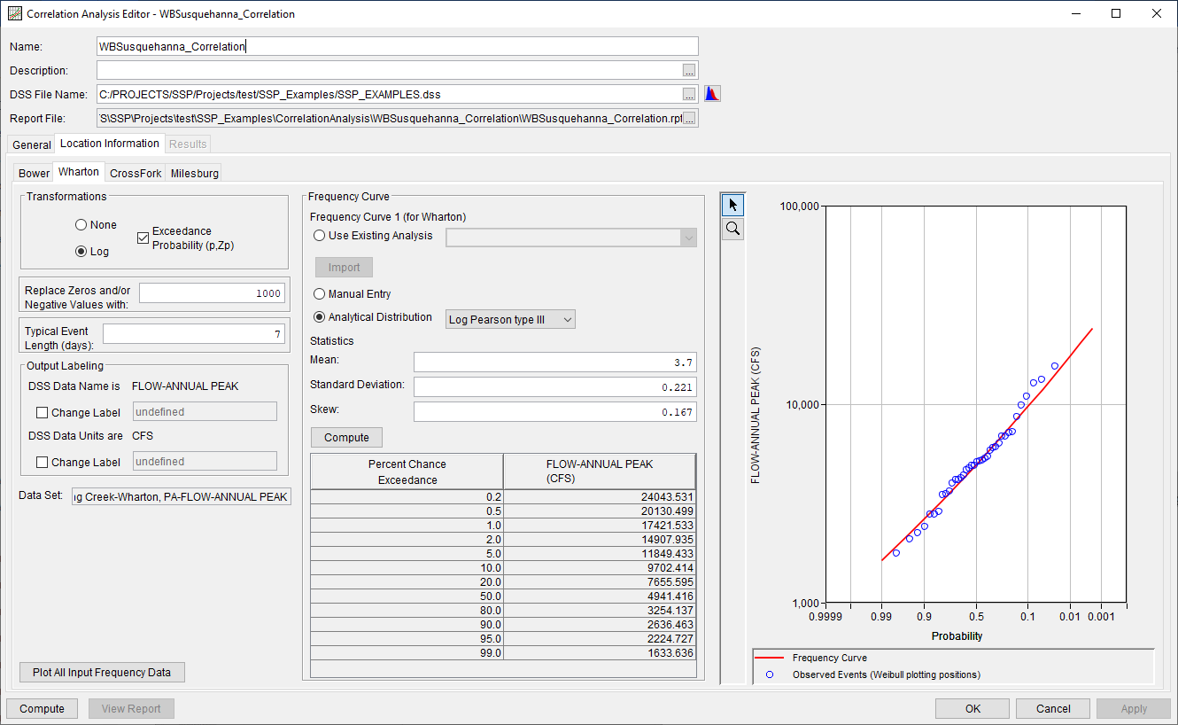
On the Wharton sub-tab, the Log and Exceedance Probability (p, Zp) transformations were selected, as shown in Figure 5. 1000 cfs was entered as the replacement value if/when zeroes or negatives were encountered. A typical event length of 7 days was also defined. The default Output Labeling was left unchanged. Finally, a frequency curve that was fit to the Wharton time series was defined using a Log Pearson Type III (LPIII) distribution and the flow-frequency curve was computed.
Cross Fork
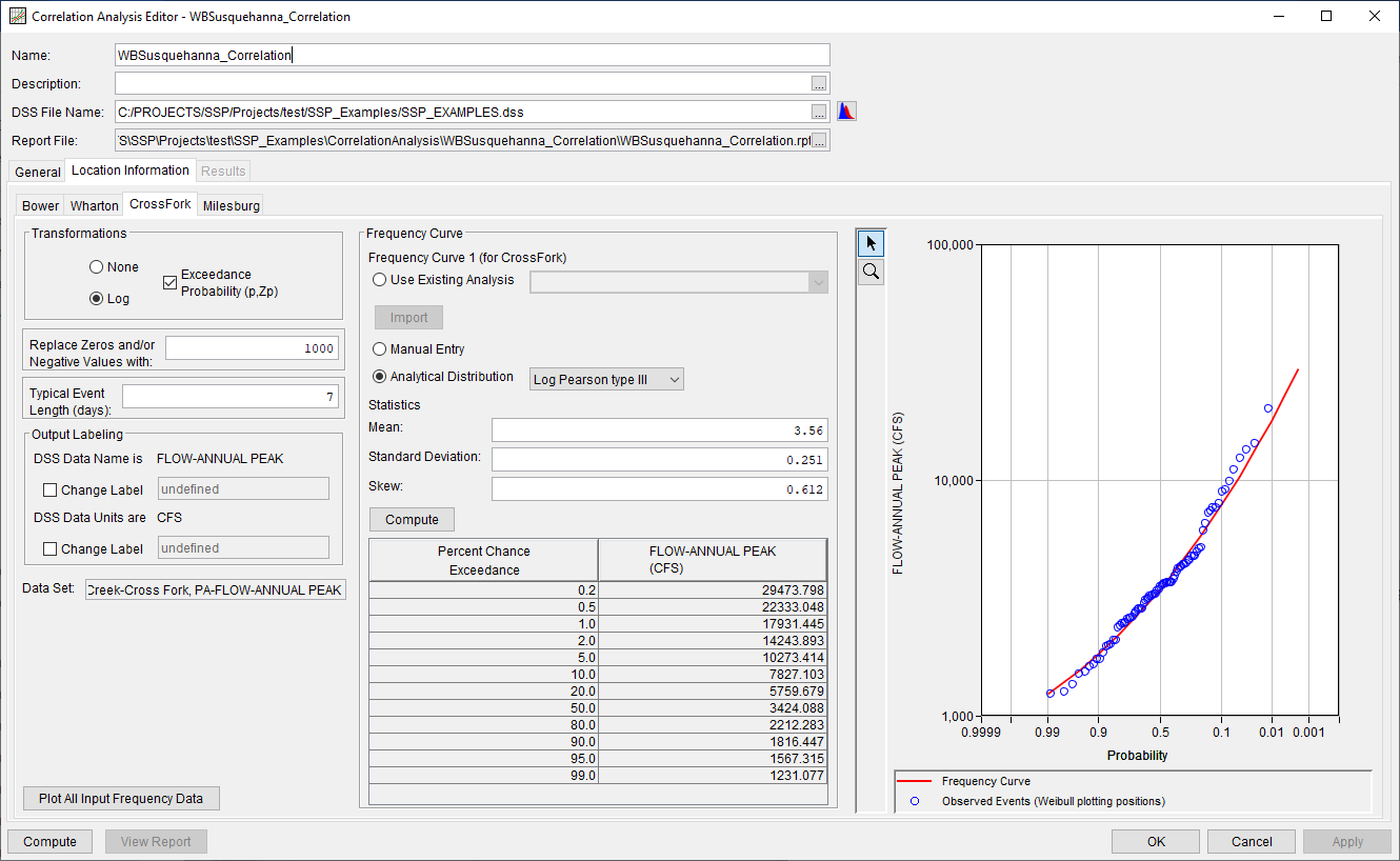
On the Cross Fork sub-tab, the Log and Exceedance Probability (p, Zp) transformations were selected, as shown in Figure 6. 1000 cfs was entered as the replacement value if/when zeroes or negatives were encountered. A typical event length of 7 days was also defined. The default Output Labeling was left unchanged. Finally, a frequency curve that was fit to the Cross Fork time series was defined using a Log Pearson Type III (LPIII) distribution and the flow-frequency curve was computed.
Milesburg
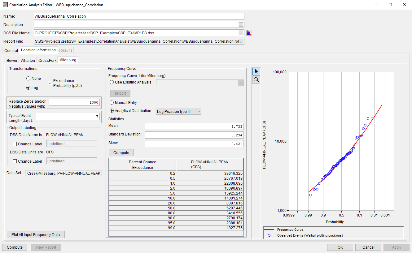
On the Milesburg sub-tab, the Log and Exceedance Probability (p, Zp) transformations were selected, as shown in Figure 7. 1000 cfs was entered as the replacement value if/when zeroes or negatives were encountered. A typical event length of 7 days was also defined. The default Output Labeling was left unchanged. Finally, a frequency curve that was fit to the Milesburg time series was defined using a Log Pearson Type III (LPIII) distribution and the flow-frequency curve was computed.
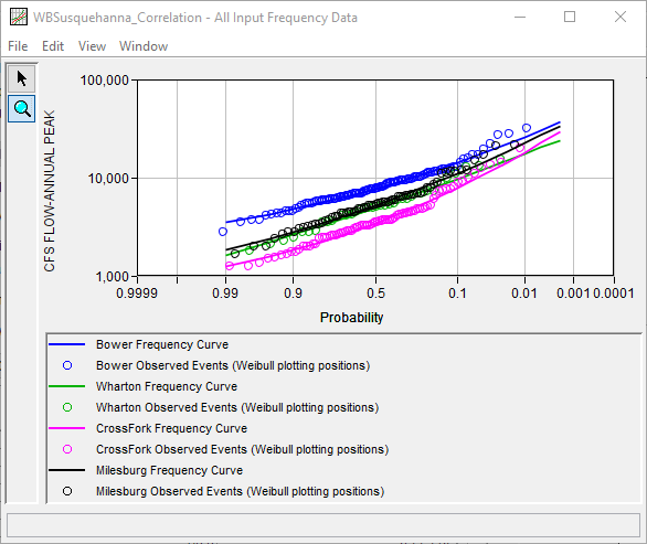
Each of the previously mentioned time series and frequency curves can be plotted by pressing the Plot All Input Frequency Data button, as shown in Figure 8.
Computing the Analysis
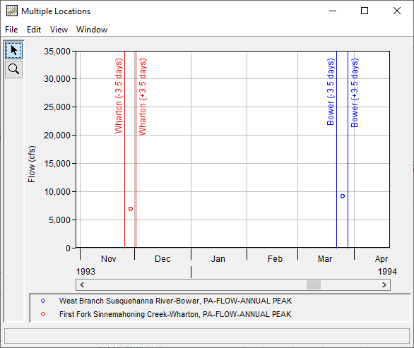
Once all of the General and Location Information details have been selected and/or defined, the user can press the Compute button to perform the analysis. A Compute Warnings message will be shown noting that some values for each pair of time series were removed from consideration within the correlation calculations. For instance, when comparing the Bower and Wharton time series, 98 values were removed from consideration. This was partly due to the fact that the Bower time series begins in 1889 while the Wharton time series begins in 1984. However, several values within the Bower time series could not be found within the Typical Event Length of 7 days, which was defined on the Location Information sub-tab, when compared against the Wharton time series. This is visualized within Figure 9, these values for the 1994 water year were removed from the analysis since the measurements were not recorded within 7 days of one another.
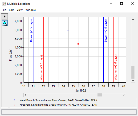
Only events like those shown within Figure 10, which both fell within the Typical Event Length of 7 days were used within the correlation computations.
Once the computations have been completed, a message window will open stating Compute Complete.
Results Tab
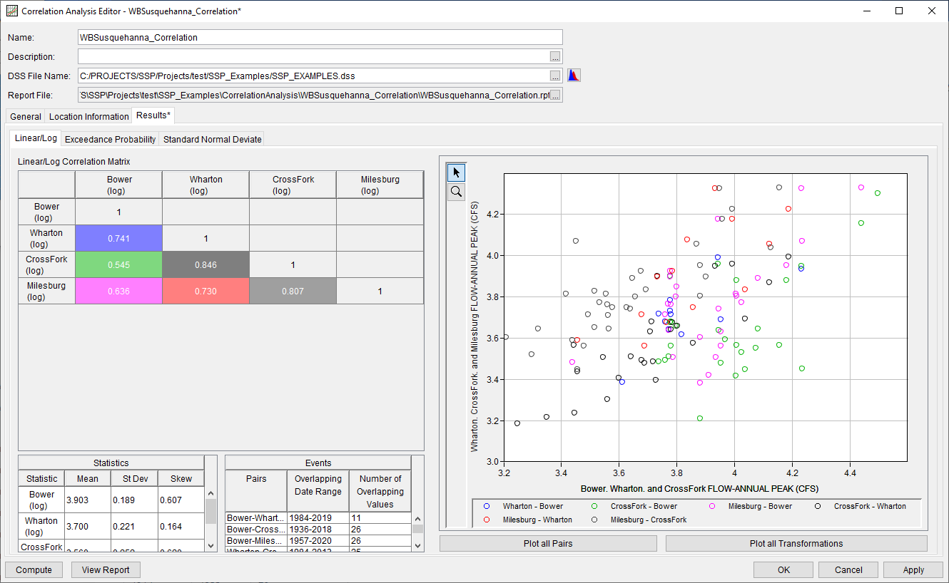
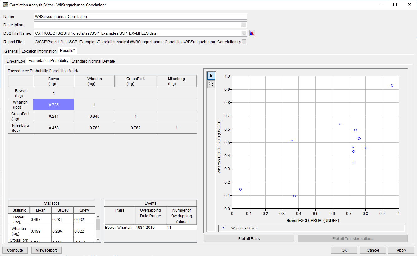
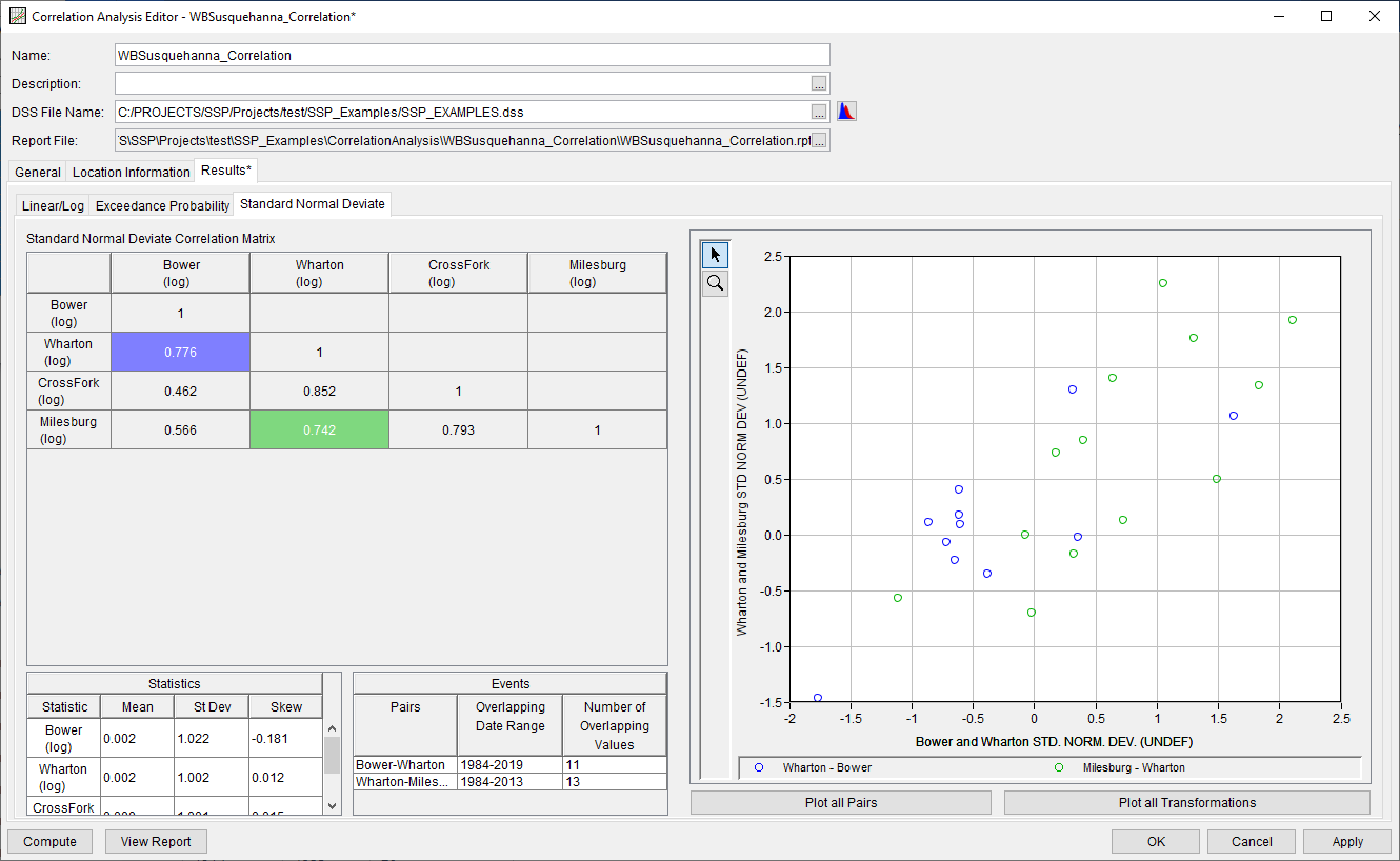
Upon a successful compute, the Results tab will become selectable. The Results tab contains three sub-tabs, one for each of the previously defined transformations. Within each transformation sub-tab, results will be presented consisting of:
- A Correlation Matrix of computed correlation coefficients,
- A plot of the selected pair(s),
- A Statistics table of the entire time series (all values are considered within these statistics), and
- An Events table consisting of the overlapping date range and number of values that were considered within the correlation computations for the selected pair(s).
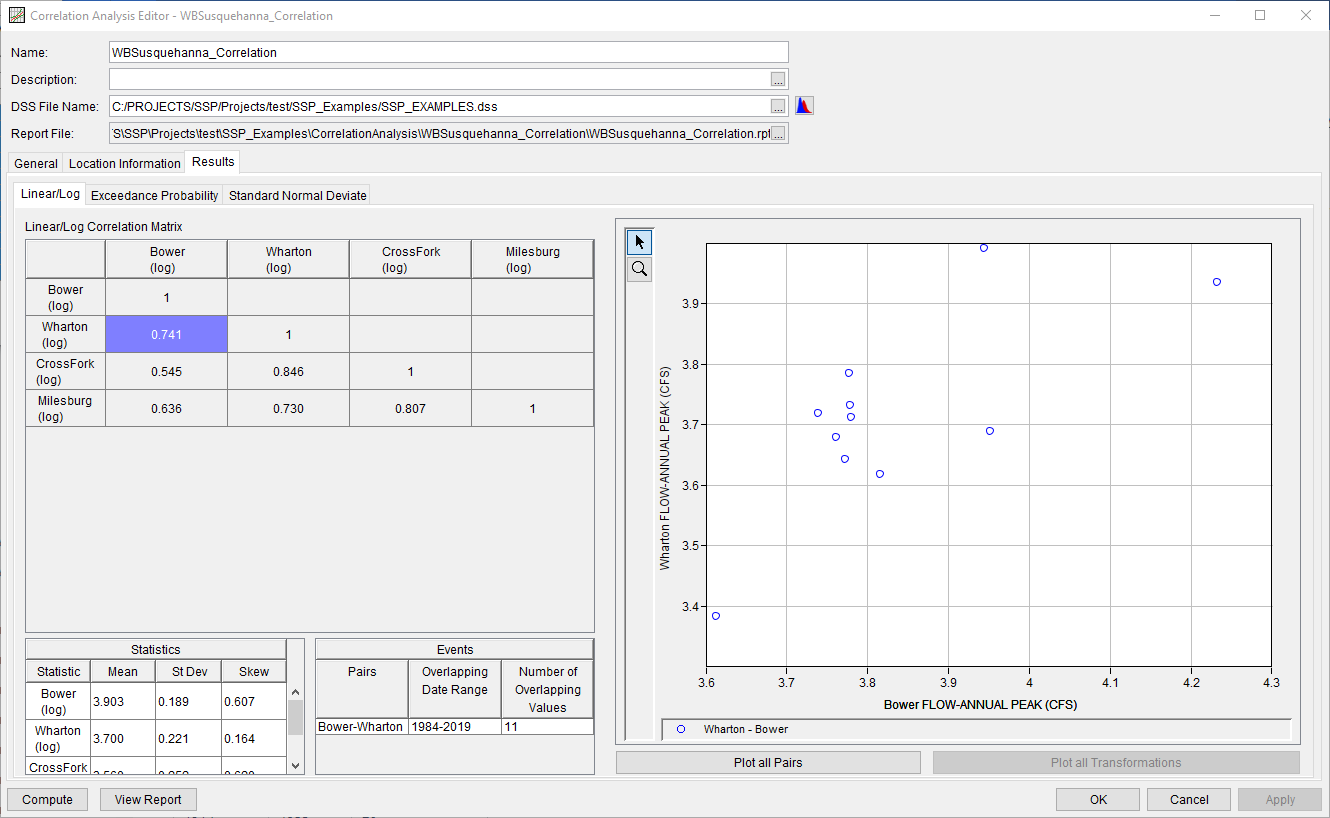
One or more pairs within the correlation matrix can be selected. By default, the upper-left most cell will be selected upon navigating to these sub-tabs for the first time, as shown in Figure 11. However, if more than one cell is selected, additional information will be shown within the plot as well as the Events table, as shown in Figure 12.
Log
The results using the Linear or Log transformation will be shown on this sub-tab, as shown within Figure 11.
Exceedance Probability
The results using the Exceedance Probability transformation will be shown on this sub-tab, as shown within Figure 13.
Standard Normal Deviate
The results using the Standard Normal Deviate transformation will be shown on this sub-tab, as shown within Figure 14.
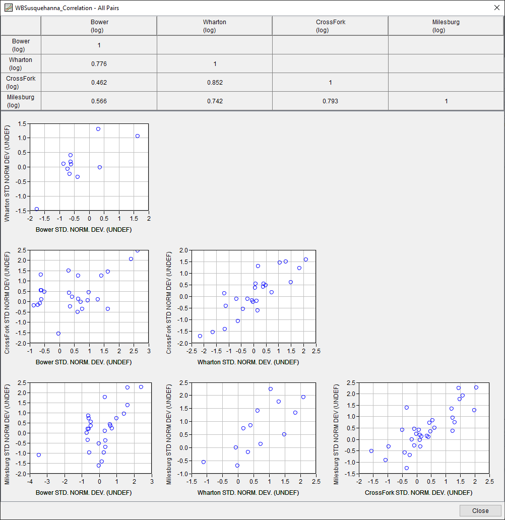
In addition to the tables and plots on each sub-tab, two buttons are available to create summary plots for all data and transformations: Plot all Pairs and Plot all Transformations. When the Plot all Pairs is clicked, a figure is created that shows the correlation matrix at the top with multiple plots below, one for every pair of time series, as shown in Figure 15. The results for this plot will be shown for the currently-selected tab.
When the Plot all Transformations button is pressed, a figure will be created that has the correlation matrix and one plot containing the data pairs for all the currently selected cells in the correlation matrix for every selected transform. For example, when the Bower-Wharton and Milesburg-Wharton pairs are selected for this study, the Plot all Transformations button will generate a plot that resembles Figure 16.
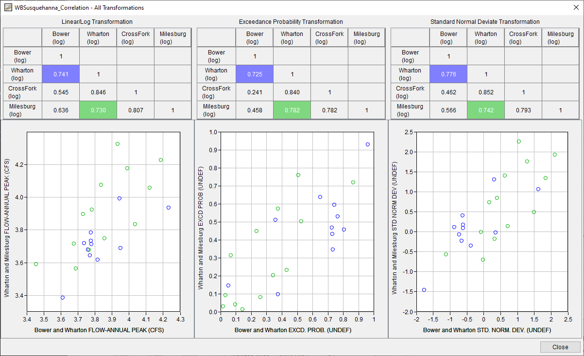
The Plot all Transformations button will only be active when the Exceedance Probability transform has been selected for at least 2 time series on the Location Information tab and a compute has been successfully completed.
The correlation coefficients computed for this example are very strong. Per EM 1110-2-1415, datasets are often considered well correlated when the absolute value of the correlation coefficient is greater than 0.4. Also, Bulletin 17C recommends the usage of data with high cross correlation when performing record extension, an example of which can be found here.
Report File
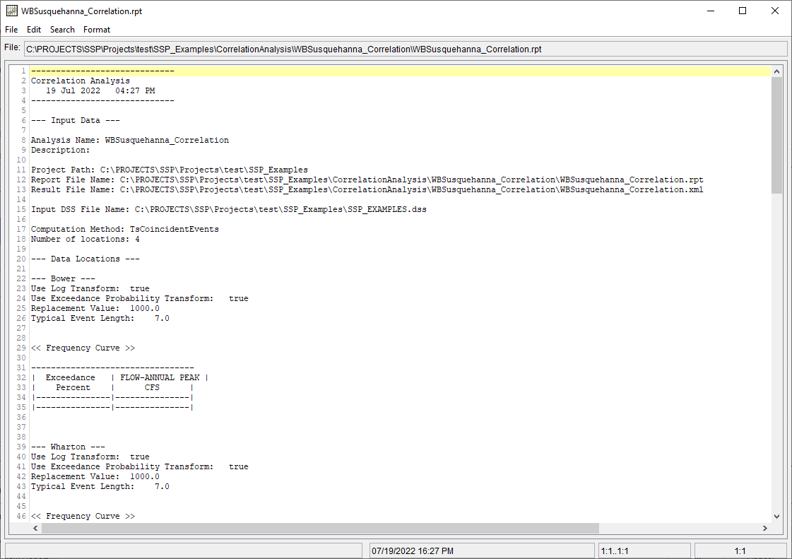
In addition to the tabular and graphical results, there is a report file that echoes the input data, selected computational options, and results. To review the report file, press the View Report button at the bottom of the analysis window. When this button is selected a text viewer will open the report file and display it on the screen, as shown in Figure 17.
Different types and amounts of information will show up in the report file depending on the data and the options that have been selected for the analysis.
