Download Excel file:  distribution fitting 2023 solution.xlsm
Create Histogram.
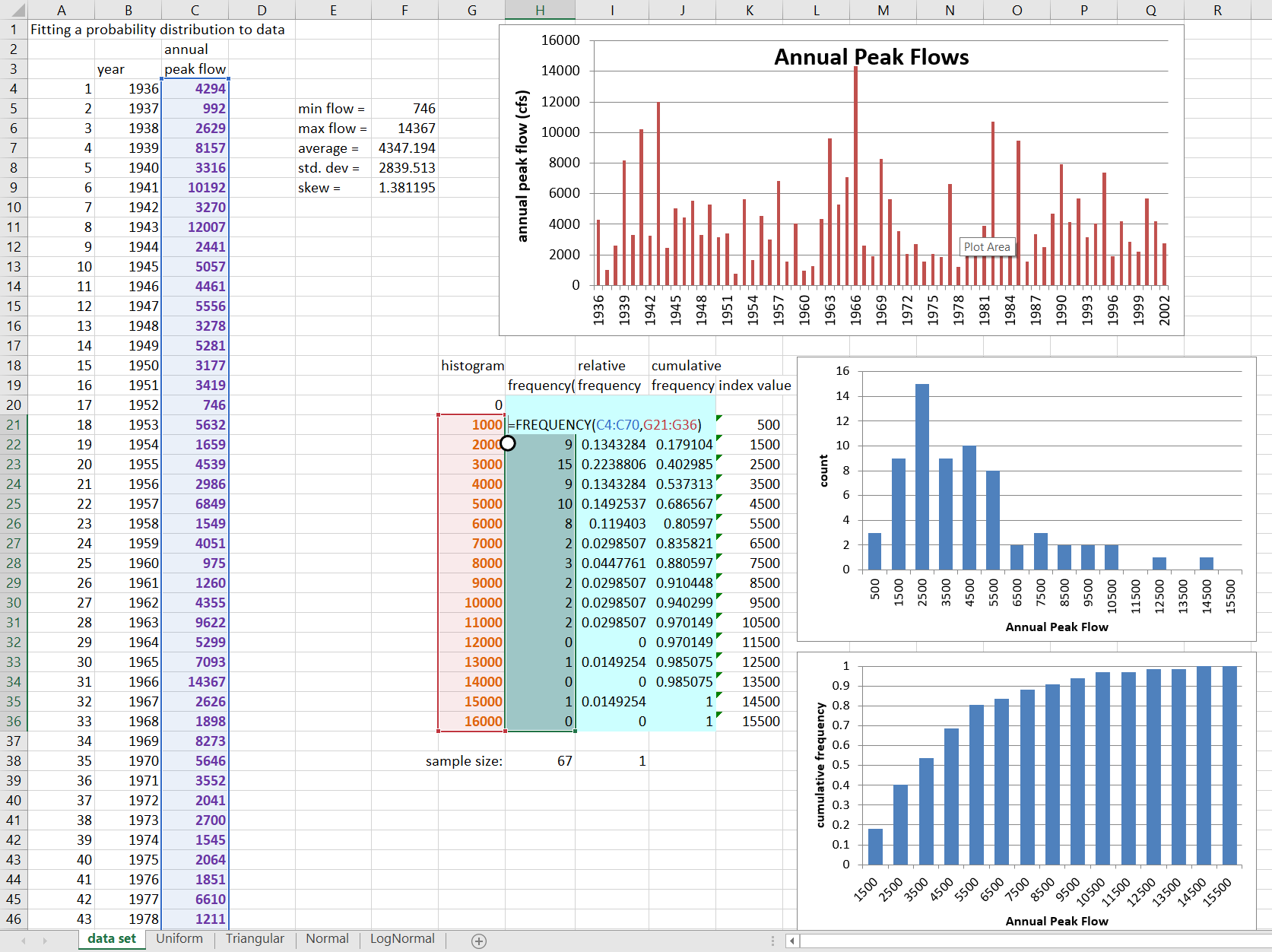
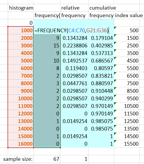
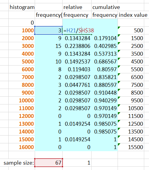
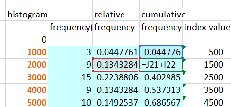
Relative and Cumulative Frequency.
Question 1: From the probability distributions you have seen, which do you suppose might best fit this data?
The data is somewhat bell-shaped, so is not uniform. It is positively skewed (more high values), rather than symmetrical, so triangular or logNormal are most likely.
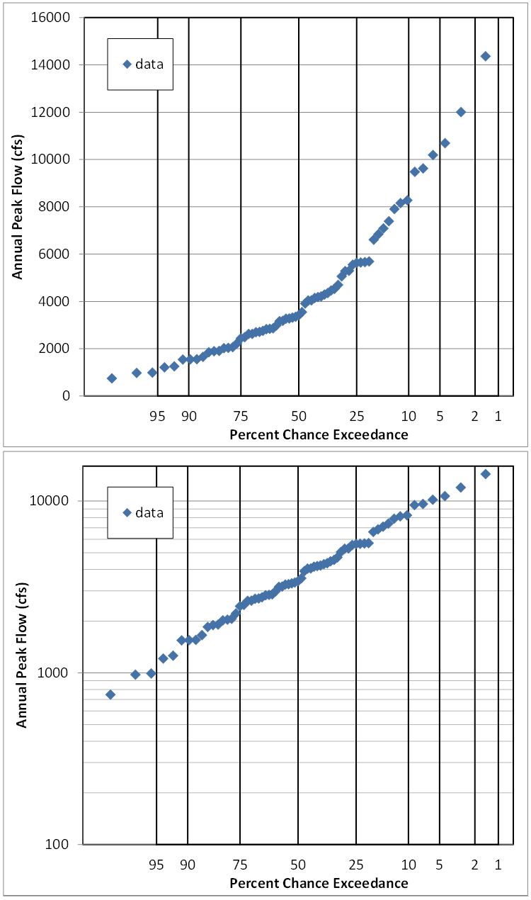
Review probability plots.
Question 2: Do the probability plots affect your supposition of which distribution might fit?
The fact that the points plot in a straight line on the plot which has a Normal probability axis and a log flow axis means that the data is logNormally distributued.
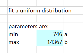
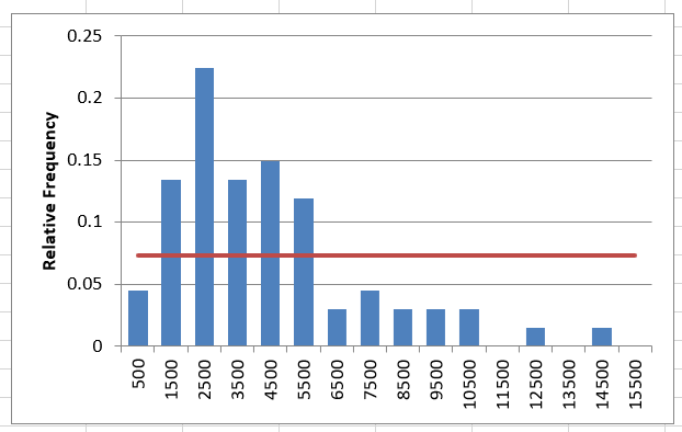
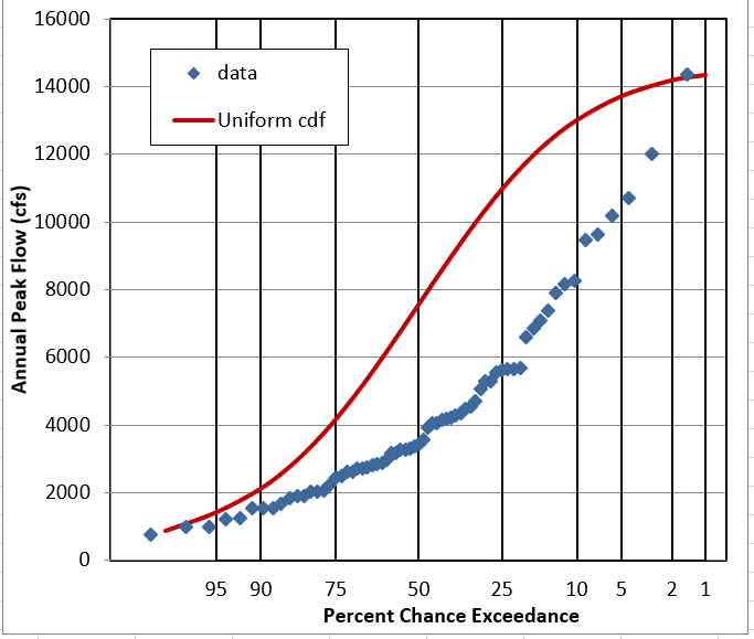
Question 3: Does it look like this data follows a Uniform Distribution?
NO. It is peaked or bell-shaped, rather than flat.
Triangular Distribution.
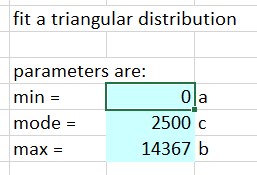

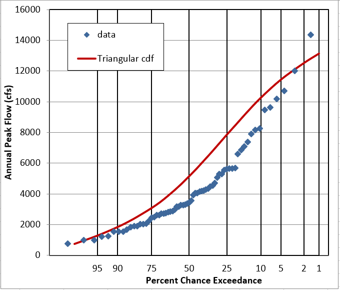
Question 4: Does it look like this data follows a Triangular Distribution?
It’s better than Uniform, and looks OK as a PDF, but the cumulative plots show it’s pretty off.
Normal Distribution.
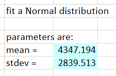
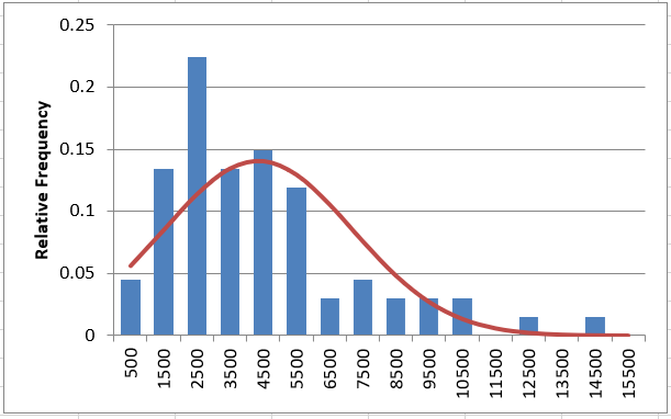
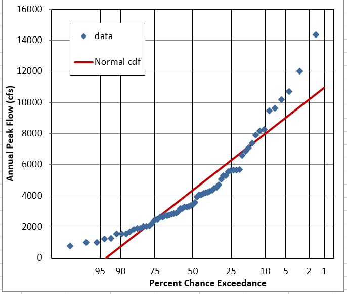
Question 5: Does it look like this data follows a Normal Distribution?
It gets the bell-shape pretty well, but assumes symmetry. On the probability plot it’s clearly wrong.
LogNormal Distribution.
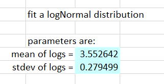

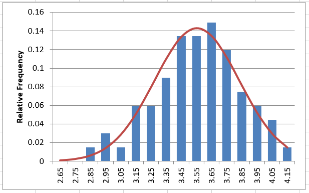
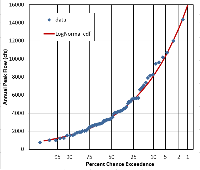
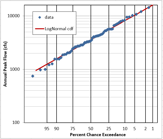
Question 6: Does it look like this data follows a LogNormal Distribution?
YES. The linear-flow PDF is not very obvious, but the log-flow PDF and CDF look good. The probability plots are pretty definite on the fit being good.
Question 7: What other distribution(s) might you like to try for annual peak flow data?
We generally use the logPearson type III distribution for unregulated annual peak flow data in the United States. In other places, GEV and Gumbel are sometimes used.