Here is how your final script should look. Note that line 3 (setting the working directory) will look different on your machine depending on which directory you selected. The last four lines are included in case you added the optional prediction interval lines.
Final Script
library(readr)
setwd("C:/Projects/2025_Stats_Class/Workshops/LinearRegression") # change this to your working directory
stations <- read_csv("stations.csv")
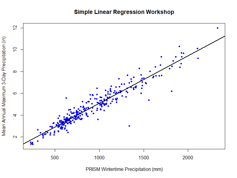
plot(l_1 ~ pm_wnt_ppt,
data = stations,
type = "p",
pch = 20,
col = "blue",
xlab = "PRISM Wintertime Precipitation (mm)",
ylab = "Mean Annual Maximum 3-Day Precipitation (in)",
main = "Simple Linear Regression Workshop")
model1 <- lm(l_1 ~ pm_wnt_ppt,
data = stations)
summary(model1)
abline(model1,
col = "black",
lwd = 2)
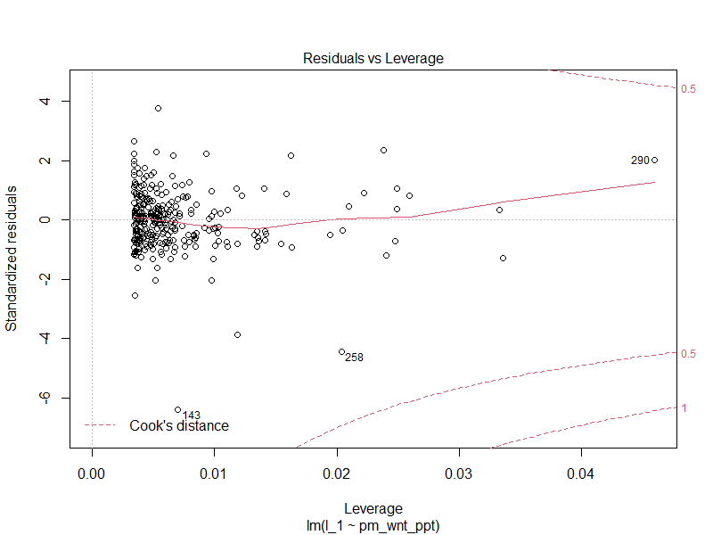
plot(model1)
predict(model1,
data.frame(pm_wnt_ppt = 2000),
interval = "confidence")
predict(model1,
data.frame(pm_wnt_ppt = 2000),
interval = "prediction")
predict_x <- seq(min(stations$pm_wnt_ppt), max(stations$pm_wnt_ppt), length.out = 100)
prediction_df <- predict(model1, data.frame(pm_wnt_ppt = predict_x), interval = "prediction")
lines(x = predict_x, prediction_df[,2], lty = 2)
lines(x = predict_x, prediction_df[,3], lty = 2)
CODE
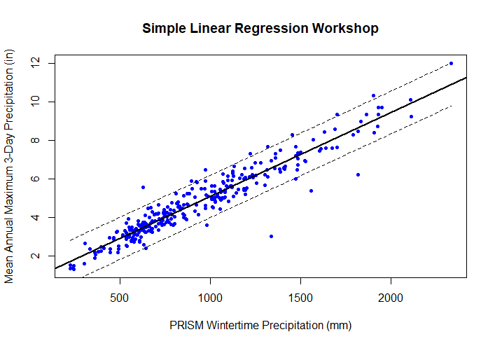
Step 2: Plot Data
Here is how your initial data plot should look:

Step 4: View Model Summary
Here is how your model summary output should look:
Model Summary
Call:
lm(formula = l_1 ~ pm_wnt_ppt, data = stations)

Residuals:
    Min      1Q  Median      3Q     Max
-3.5414 -0.3310  0.0015  0.2888  2.0889

Coefficients:
             Estimate Std. Error t value Pr(>|t|)
(Intercept) 7.379e-01  8.263e-02   8.931   <2e-16 ***
pm_wnt_ppt  4.357e-03  8.177e-05  53.275   <2e-16 ***
---
Signif. codes:  0 ‘***’ 0.001 ‘**’ 0.01 ‘*’ 0.05 ‘.’ 0.1 ‘ ’ 1

Residual standard error: 0.5558 on 293 degrees of freedom
Multiple R-squared:  0.9064,	Adjusted R-squared:  0.9061
F-statistic:  2838 on 1 and 293 DF,  p-value: < 2.2e-16
CODE
Here is how your initial data plot should look after adding the fitted regression line:
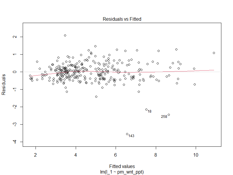
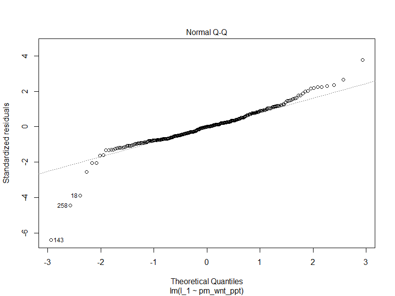
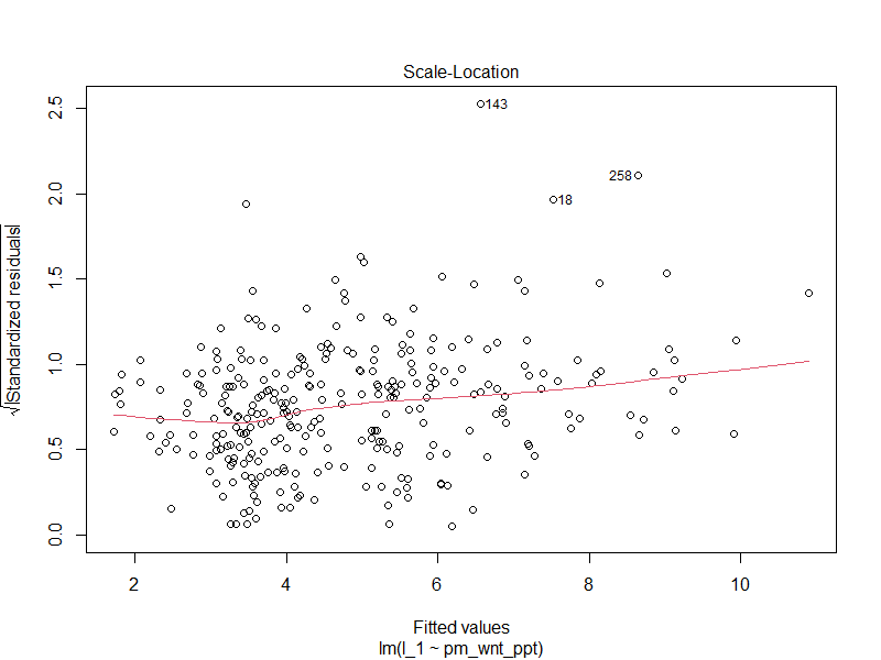
Step 5: View Model Diagnostics
Here is how your four diagnostic plots should look:
Here is how your plot should look if you add the prediction interval lines: