Download PDF
Download page Linear Regression Using R.
Linear Regression Using R
Disclaimer: The United States Army Corps of Engineers has granted access to these data for instructional purposes only. Do not copy, forward, or release the information without United States Army Corps of Engineers approval.
In this part of the workshop, you will load a data file into a data frame, perform a regression analysis, and look at some of the diagnostics that you can produce in R for linear regression.
If at any time you need a refresher on working with R commands or on how to use RStudio, feel free to look back at the R Introduction or the RStudio introduction pages.

Background
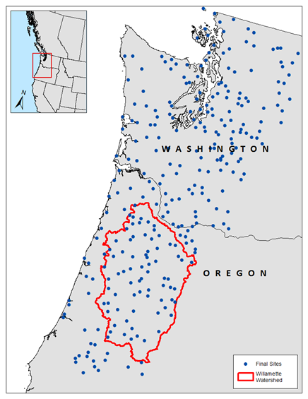
The data you have been provided in "stations.csv" are from a precipitation-frequency analysis for 3-day maximum wintertime precipitation in the Pacific Northwest. 295 stations were analyzed and properties of their annual maximum precipitation as well as characteristics of the location of the station were placed in a data file.
In regional precipitation-frequency analysis, it is common to try to predict the mean annual maximum precipitation at the study sites using annual or seasonal total precipitation as a predictor. This allows for estimation of the mean annual maximum precipitation anywhere the seasonal total precipitation can be estimated. PRISM climate normals provide a spatially-continuous map of long-term averages of meteorological variables such as temperature, precipitation, etc. Using PRISM as the basis for the regression means that the predicted variable can be estimated almost anywhere. The fifteen variables contained in this comma-separated value file are shown in the table below. For this workshop we will be working with two variables, which are in bold.
| Variable | Description |
|---|---|
| name | Station identification code |
| n | Total record length, years |
| l_1 | Mean annual maximum 3-day wintertime precipitation (L-mean), in |
| t | Coefficient of L-variation for annual maximum 3-day wintertime precipitation |
| t_3 | Coefficient of L-skewness for annual maximum 3-day wintertime precipitation |
| t_4 | Coefficient of L-kurtosis for annual maximum 3-day wintertime precipitation |
| Latitude | Site latitude, decimal degrees |
| Longitude | Site longitude, decimal degrees |
| Station_Na | Station name |
| pm_wnt_ppt | Normal total wintertime precipitation from PRISM, mm |
| pm_wnt_tmp | Normal average wintertime temperature from PRISM, °C |
| pm_elev | Site elevation from PRISM elevation data, m |
| DISTCOAST | Distance from the nearest coastline, km |
| RFA_Region | Final region assignment for the site in the regional frequency analysis |
| orig_reg | Initial region assignment for the site in the regional frequency analysis |
Step 0: Set Up Project
- Start RStudio and create a new script. Save the newly created script. Name it "linear_regression_workshop.R".
- Using the file browser in the Files tab of RStudio (lower right part of the UI), navigate to the folder containing the starting data for this workshop.
- Set the working directory to this folder in the Files tab by choosing the More menu (with the gear icon) and choosing "Set As Working Directory" (near the middle of the list). You will notice that a command ("setwd") will go to the terminal (lower left). This sets the working directory to the directory noted inside the function.
- On the History tab in the upper right, go to the last entry in the list and select the last command ("setwd") then press the "To Source" button to add it to your script.
- Save the script.

Step 1: Load Data
- On the Environment tab (upper right), choose the Import Dataset menu, and select "From Text (readr)..." A wizard will pop up.
- Note: this step might require a couple of updated R packages. If you receive an "Install Required Packages" popup, click Yes to install the necessary packages.
- Once packages finish installing, an Import Text Data window will appear. In the upper right corner, select the Browse... button. If you correctly set up your working directory, the browser should open in the folder where the starting data for this workshop lives.
- Select "stations.csv" and then Open. You will see a preview of the data. Examine the rows and columns in the preview and make sure there aren't any obvious mistakes in loading the data.
- In the Import Options panel at the bottom, you can leave the default name "stations". Make sure Skip is set to 0. Check that "First Row as Names" and "Trim Spaces" are selected, and un-select "Open Data Viewer". Check that the Delimiter is set to "Comma", and the Comment and NA are set to Default.
- Click the Import button in the lower right.
- Switch to the Environment tab on the upper right. You should now see a Data object called stations in there, with 295 observations of 15 variables.
- Switch to the History tab. At the very bottom, you will notice that two commands were executed: "library" and "read_csv". In your script, move the "setwd" command you added earlier to the second line by placing the cursor just before the "s" and then pressing "enter". In the script, click on line 1, then click on the "library(readr)" command in the History, and then hit the "To Source" button. This will move this command to the first line.
- Move the "read_csv("stations.csv")" command from the History over to the fifth line of the script.
- Save the script.
R Coding Practices: Organization
In general it is good practice to organize your script so that others can easily follow and read it.
Using white space to break up groups of related commands makes the code easier to read. I tend to place extra blank lines between groupings like library calls, setting the working directory, loading data, etc.
Placing library calls at the beginning of the script ensures that when the script is run, all of the commands have the necessary functions loaded. It also instructs someone that they might have to install packages if they don't have them already.
Placing the setwd directory at the beginning of the script lets someone else running the script know that they will need to change that directory to make it run on their machine.
Loading all of the necessary data near the beginning of the script ensures it is always available and ready to go after that.
Lines of R code can be broken up so that they don't get so long that they can't be read. Some functions take a large number of parameters so it can make a function call easier to read to break up the parameters after commas.
Step 2: Plot Data
Create a plot of pm_wnt_ppt (PRISM wintertime precipitation for the precipitation gage in millimeters) vs l_1 (L-mean, the mean annual maximum precipitation for the gage, using L-moments, in inches). Add the following code to your script beginning on line 7 (you can copy and paste to save time):
Plot Code
plot(l_1 ~ pm_wnt_ppt,
    data = stations,
    type = "p",
    pch = 20,
    col = "blue",
    xlab = "PRISM Wintertime Precipitation (mm)",
    ylab = "Mean Annual Maximum 3-Day Precipitation (in)",
main = "Simple Linear Regression Workshop")The plot command can use formula notation, which is shown as the first argument. The "squiggle" divides the response variable from the predictor variables, with the response variable on the left. For more information on formula notation, see here. We will see formula notation again when we build the regression model.
The data parameter tells the plot which dataframe contains the variables to be plotted.
The type parameter tells the plot what symbol to use for the plot. "p" provides points.
The pch parameter tells the plot what symbol to use for the points. 20 creates a small circle.
The col parameter tells the plot what color to use.
The xlab and ylab parameters tell the plot how to label the x and y axis.
The main parameter gives the plot a title.
This plot is generated using the "base graphics" engine inside R, which includes basic plotting capabilities. More advanced plotting capabilities are included in the ggplot2 library, and a limited example of its use is available in the Multiple Linear Regression Using R tutorial.
Place your cursor just after the last parenthesis on line 14, and either press Ctrl+Enter or go to the toolbar above the script and press the Run button.
You should see a new plot appear in the Plots tab in the lower right part of the RStudio window.
Question 1. Based on the scatter plot you just created, how do you feel about the relationship between these data? Do they seem reasonable to model with a linear model?
There is a tight linear clustering of these data, with only a small number of points falling off of that grouping. They do not seem to curve or have a shape that would be a better choice than a line, so a linear model seems reasonable.
Often during an analysis in R you will generate plots that you want to include in a report. In order to do so you will need to export the plot to file. Using RStudio this is simple. In the Plots tab in the lower right, click the Export menu and select Save as Image... Choose an image format (PNG is always a good choice), and then select the directory where you would like the export to go. Change the filename to something that lets you identify the file. Choose a width and height (in pixels) or leave the default values if the plot appearance is acceptable. Press Save to save the file to disk where you specified.
Save the script.
Step 3: Fit Model
First, go to the Help tab in the lower right part of the RStudio window. In the upper right part of the window there is a search bar (marked with a magnifying glass). In this box type in lm and hit enter. This will bring up the help documentation for the lm command. Take a second to browse over the help documentation for the command so you can get familiar with how to use it, and to see how R documentation is normally formatted.
For simple regression, we will only need two parameters, formula and data. The formula determines the structure of the model. For more information on formulas, see here. The data tells the regression model which data frame contains the data to be used in the fit. Add the following code to your script beginning on line 16 (copy and paste to save time):
Regression Model
model1 <- lm(l_1 ~ pm_wnt_ppt,
data = stations)Place your cursor after the last parenthesis on line 17 and either press Ctrl+Enter or go to the toolbar above the script and press the Run button. This creates a new linear regression model object called "model1" which holds all of the results of the model fit. You can see that it has been added to the R session environment in the Environment tab in the upper right.
R Session Variable Persistence
When you create a variable, either in a script or at the command line, that variable persists for the duration of your R session. You can continue to reference it by running commands at the command line or in a script. You do not have to re-run an entire script to have the variable "in scope" to use - as long as you can see it in your environment, it is available to use.
Save the script.
Question 2. Based on the input data, what are the units of the two regression coefficients going to be? What should the sign of the coefficient for the predictor be (+ or - ?)
The intercept term should be in inches, and the slope of the line (the coefficient for the predictor) should be in inches per millimeter. A technique used in multiple linear regression that eliminates units is called standardization and a discussion can be found here.
The slope of the data appear to be positive, so the coefficient of the predictor should be positive.
Question 3. If you wanted to add another predictor variable to your model to make it a multiple linear regression model, how would you change the function call you used to fit the model?
In the model formula, you could add another predictor by using a plus sign (+) and then the name of the variable in the dataframe. An example would be if you wanted to add in the Latitude variable, you could change your formula to be l_1 ~ pm_wnt_ppt + Latitude.
Step 4: View Model Summary
To view the results of the regression, we use the summary function on the regression model object. This function provides the traditional linear regression outputs, including coefficients, coefficient p-values, R2, and so on. Add the following code to line 19 of your script:
Regression Model Summary
summary(model1)Place your cursor after the last parenthesis on line 19 and either press Ctrl+Enter or go to the toolbar above the script and press the Run button. The model summary will be printed to the console. It provides a wealth of information about the model.
- It reminds you what formula and data you provided to the
lmfunction when you created it. - The residuals summary provides the five number summary for the residuals.
- The coefficients summary provides the model intercept, the coefficient for each predictor, and the significance level for each.
- The box at the bottom provides an assessment of model quality, including the residual standard error, the number of degrees of freedom in the model, R2 metrics, and the model F-statistic.
Question 4. What is the p-value of the PRISM wintertime precipitation predictor? Is that evidence for or against the hypothesis that it is a good predictor of mean annual maximum precipitation?
R shows the value as "<2e-16" which is practically zero. This is extremely strong evidence that PRISM wintertime precipitation predicts mean annual maximum precipitation well. Small p-values indicate that there is only a very small chance that a relationship this strong could have happened by chance.
Question 5. What is the model's R2? What percent of the variance in mean annual maximum precipitation does wintertime precipitation predict?
The R2 is 0.9061, which says that 90.6% of the variance in the response variable is explained by the predictor.
Question 6. What can you check in the model summary to evaluate if your model is better than a model that only contains an intercept term? Is your one-variable model better than a model with the intercept only?
You can check the p-value for the model F-statistic, which is shown at the bottom of the model summary. In this case the p-value is practically zero (< 2.2e-16) which is extremely strong evidence for the hypothesis that this one-variable model is better than an intercept-only model.
Next, add the fitted regression line to your plot. This can be done with a single function called abline which adds lines to existing plots (it adds the line to the last plot you created, or if you have one selected in the Plots tab, will add it to that one). In order to use this function you must create a plot first, and then add the line to the plot. Luckily we created a plot of the data back in step 2. Add the following code to your script beginning on line 20:
Add Regression Line to Plot
abline(model1,
       col = "black",
lwd = 2)Run this command by placing your cursor after the last parenthesis on line 22 and either press Ctrl+Enter or go to the toolbar above the script and press the Run button. You will see (in the lower right, on the Plots tab) your scatter plot from step 2 updated with a black line representing the fitted regression line.
Save the script.
Step 5: View Model Diagnostics
Several useful regression diagnostics are available by using the plot function on the regression model object. Add the following code to line 23 of your script and then run that line of code:
Plot Regression Model Diagnostics
plot(model1)In the console you will see text that says "Hit <Return> to see the next plot:" Click in the console and press Enter. A new plot will be generated.
The first plot that is generated is a plot of the fitted values vs. the residuals. This plot shows if the residuals have non-linear patterns. It includes a smoothing line in red to help see a trend. It also labels values with the row number from the source data with the data that have the largest residuals.
Question 7. Does there seem to be a trend or pattern in the residuals in the Residuals vs. Fitted plot? If our assumptions hold, should there be?
There does not seem to be any kind of trend or pattern in these residuals, which is what we are hoping for.
Click in the console again and press Enter. The second plot will be generated.
The second plot that is generated is a normal distribution quantile-quantile plot of the residuals. This plot shows if the residuals are normally-distributed or not.
Question 8. What do normally-distributed residuals look like on a normal Q-Q plot? Do these residuals seem reasonably normal?
If the residuals are normally-distributed they should fall neatly along the line on the Q-Q plot, without too much curvature of the points or departure in the tails. In this case the majority of the points are well-behaved, but there is some curling in the tails that might indicate that the residuals have a distribution that is heavier-tailed than a normal distribution. In this situation I might consider a test that checks if the residuals are normally-distributed, such as the Shapiro-Wilk test.
Click in the console again and press Enter. The third plot will be generated.
The third plot that is generated is the scale-location plot, which helps check if the residuals are spread equally along the ranges of predictors. It helps check the assumption of homoscedasticity.
Question 9. Do the residuals seem to be spread out equally through the whole range of predictors? What would the red line do if the variance in the residuals increased with an increase in the predictor?
The residuals have a pretty equal spread and there does not appear to be anything concerning here. If the residual variance was increasing the red line would be steep.
Click in the console one last time and press Enter. This will generate the fourth and final plot.
The fourth plot that is generated is the residuals vs. leverage plot, which helps identify influential observations (if any). This helps identify if any values have a disproportionate influence on the regression. The red contour lines are constant values of Cook's distance, which is a metric that measures the influence of an observation. Large values of Cook's distance indicate large influence.
Question 10. Are there any highly influential observations in this sample? What is the effect of highly influential observations on a regression?
None of the observations have a large Cook's distance. Some of the observations with large residual values have low leverage so they do not effect the regression much. The highest leverage observation still has low leverage, so it does not affect the regression much.
A highly influential observation can "swing" a regression so that the slope of the best-fit line is changed to try to get closer to it. In some cases, a single influential observation can be the difference between a model with no significance, and a model with a significant coefficient or F-statistic. Make sure to check for influential observations to ensure that your model is actually meaningful, and isn't just noise plus an influential observation that creates a significant trend line.
For more details on the diagnostic plots, see here.
Once all the plots have been generated, you can toggle between them in RStudio by using the left and right arrows in the upper left of the Plots tab.
Save the script.
Step 6: Make Predictions
Finally, using the predict function, you will compute the predicted response, the confidence interval for the population mean, and the prediction interval for the response, for an input value of 2,000 mm of annual total precipitation from PRISM.
First, compute the fitted value and the 95% confidence intervals by adding the following code starting on line 25 of your script and running it:
Predict Confidence Interval
predict(model1,
        data.frame(pm_wnt_ppt = 2000),
interval = "confidence")Question 11. What is the predicted value of the mean annual maximum 3-day winter precipitation at a location that has 2,000 mm annual total precipitation from PRISM? What is the 95% confidence interval for the mean value of the mean annual maximum precipitation for all locations that receive 2,000 mm of rainfall?
The predicted value is 9.45 inches. The 95% confidence level for the population mean given 2,000 mm is (9.27 in, 9.63 in).
Second, compute the 95% prediction interval by adding the following code to line 28 of your script and running it:
Predict Prediction Interval
predict(model1,
        data.frame(pm_wnt_ppt = 2000),
interval = "prediction")Question 12. What is the 95% prediction interval for mean annual maximum precipitation for a location that receives 2,000 mm of annual total precipitation? Which interval is wider, the confidence interval, or the prediction interval? Why is the wider interval wider than the other?
The 95% prediction interval for a location with 2,000 mm of rainfall is (8.34 in, 10.56 in). The prediction interval is wider. It is wider because it contains all of the error in the confidence interval, plus additional consideration for the residual error.
Optionally, you can add the 95% prediction interval lines to your scatter plot with regression line. First, use the arrows above the plot to go back to the scatter plot of your data (before the plot diagnostics). Then, the prediction interval lines can be plotted by adding the following lines of code to the bottom of your script starting on line 32, saving your script, and then running each line sequentially:
Prediction Interval Lines
predict_x <- seq(min(stations$pm_wnt_ppt), max(stations$pm_wnt_ppt), length.out = 100)
prediction_df <- predict(model1, data.frame(pm_wnt_ppt = predict_x), interval = "prediction")
lines(x = predict_x, prediction_df[,2], lty = 2)
lines(x = predict_x, prediction_df[,3], lty = 2)What is the code above doing?
The first line of the block above creates a sequence of new values where we want predictions. This lets us control how far the prediction interval lines are drawn. It uses the seq command, which creates regularly spaced observations. We set it to generate 100 values between the minimum and maximum value of pm_wnt_ppt from the data frame. The $ lets us access a variable from the data frame by name.
The second line creates a new data frame that contains the results of running the predict function on each element of predict_x. (This is a "vectorized" function - see the note on this page Introduction to R). Each row contains the fitted value, lower PI, and upper PI for each x value. The columns of the data frame are the fitted value, lower PI, and upper PI, in that order.
The third line uses the lines command to add a line to the existing plot, with x values at our new prediction values, and y values from the second column of the new data frame we created, which contains the lower PI values. It sets the linetype to "2" which is a dashed line.
The fourth line does the same thing as the third, except getting the y values from the third column of the data frame, which contains the upper PI values.
Final Workshop R Script
The final workshop R script can be found here: Linear Regression in R Solution