Download PDF
Download page Analytical Frequency Analysis.
Analytical Frequency Analysis
Once the new analysis has been defined and the user has all of the general settings and options defined, the user can choose between performing an Analytical Frequency analysis or a Graphical Frequency analysis. This section of the manual describes how to use the Analytical Frequency analysis option.
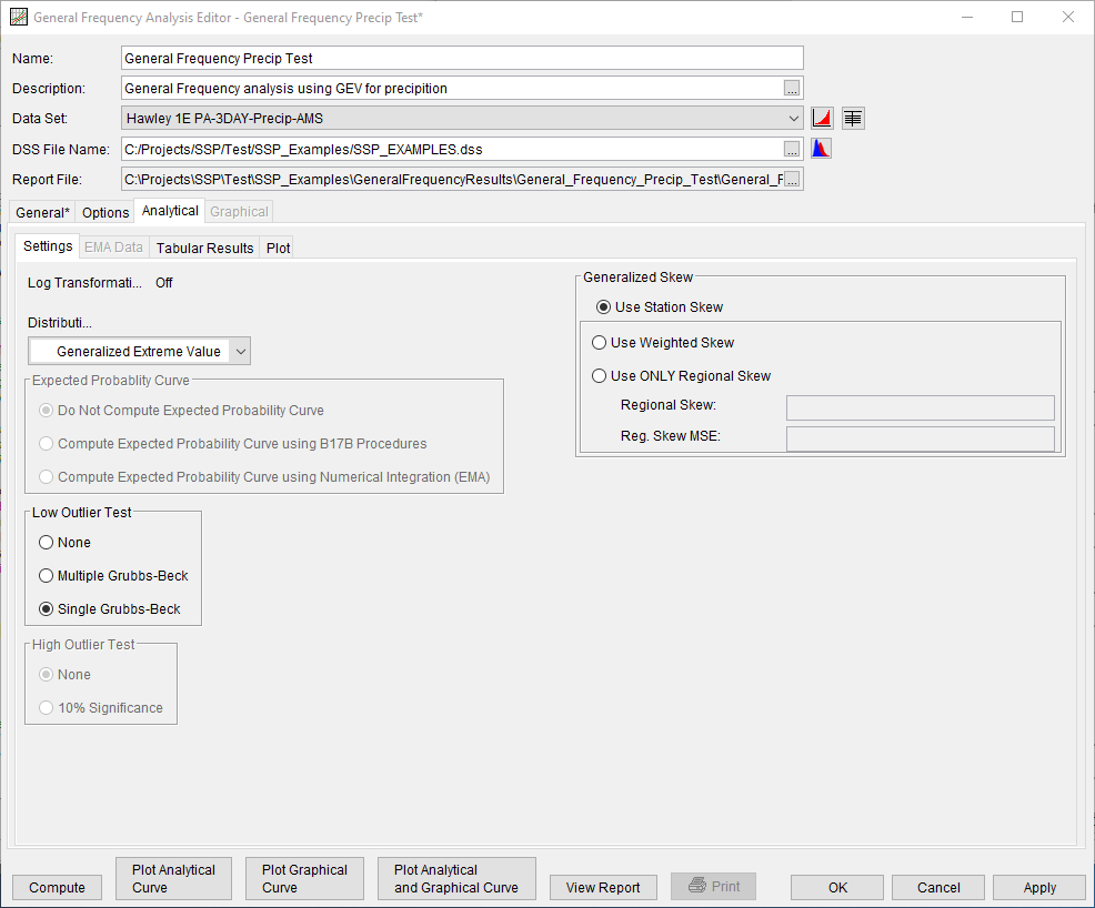
The Analytical tab will only be available if the Analytical option was selected on the General tab. When the user selects the Analytical tab on the General Frequency Analysis editor, the window will appear as shown in Figure 1. As shown, four additional tabs will appear on the screen: Settings, EMA Data, Tabular Results, and Plot.
Settings
The Settings tab contains additional settings for the analytical frequency analysis. These settings include:
- Distribution
- Expected Probability Curve
- Expected Probability Options
- Low Outlier Test
- High Outlier Test
- Generalized Skew
Distribution
This option allows the user to select from a list of available fitting methods and analytical distributions to perform the frequency analysis, as shown in Figure 2. The current version of HEC-SSP contains multiple choices, depending upon whether the Use Log Transform or Do Not Use Log Transform option was selected on the General tab.
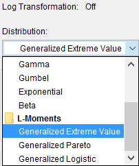
The fitting method | analytical distribution combinations available when the Use Log Transform option was selected include:
- None
- Product Moments | LogNormal
- Product Moments | LogPearsonIII
- Product Moments | LogLogistic
- EMA | LogPearsonIII
The fitting method | analytical distribution combinations available when the Do Not Use Log Transform option was selected include:
- None
- Product Moments | Normal
- Product Moments | PearsonIII
- Product Moments | Logistic
- Product Moments | Gamma
- Product Moments | Gumbel
- Product Moments | Exponential
- Product Moments | Beta
- Linear Moments | Generalized Extreme Value
- Linear Moments | Generalized Pareto
- Linear Moments | Generalized Logistic
See the Distribution Fitting and Parameter Estimation section for a description of the aforementioned fitting methods and analytical distributions.
Expected Probability Curve
This setting has three options, as seen in Figure 3: Do Not Compute Expected Probability Curve, Compute Expected Probability Curve using B17B Procedures, and Compute Expected Probability Curve using Numerical Integration (EMA).

The default setting is Do Not Compute the Expected Probability Curve. When using the B17B method to compute statistics and confidence limits, the expected probability curve can be computed using the Compute the Expected Probability Curve using B17B Procedures option. The expected probability curve will be computed using procedures described within Appendix 11 in Bulletin 17B. When using the 17C EMA method to compute statistics and confidence limits, the expected probability curve can be computed using the Compute Expected Probability Curve Using Numerical Integration (EMA) option. The expected probability curve will be computed using procedures described within Margo and Bartles (2022). When an expected probability curve is computed, this curve will be detailed within the Report file.
The expected probability adjustment is a correction for bias in the computed frequency curve. The bias is caused by uncertainty due to the shortness of the data record. The method of moments estimation of the Log Pearson III parameters produces a median estimate of each frequency curve quantile, and the adjustment changes to a mean (unbiased) estimate, which is different from the median because of the skewness of the uncertainty distribution. The use of the expected probability curve is a policy decision. The expected probability curve is most often used in establishing design flood criteria. When use of the frequency curve includes uncertainty analysis, the expected probability adjustment is made implicitly. Therefore, the computed flood frequency curve without the expected probability adjustment is the curve used in computation of confidence limits, risk analysis, and in obtaining weighted averages of independent estimates of flood frequency discharge (Interagency Advisory Committee on Water Data, 1982).
Low Outlier Test
This option allows the user to choose the test that is performed to identify low-value data points that depart significantly from the trend of the remaining data and inappropriately affect the extreme quantiles in the upper tail of the frequency curve. There are three options for testing low outliers within this analysis, as seen on Figure 6: None, Multiple Grubbs-Beck, Single Grubbs-Beck.
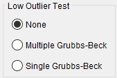
When using Product Moments | LogPearsonIII, the default test is the Single Grubbs-Beck test. When using EMA | LogPearsonIII, the default (and only) test is the Multiple Grubbs-Beck test. When using any other fitting method | distribution choice, the default selection is None.
High Outlier Test
This option allows the user to choose whether a high outlier test will be performed to identify high outliers, as shown on Figure 7. The None option is the default (and only) test available with any fitting method | analytical distribution except Product Moments | LogPearsonIII. The 10% Significance test is only available for use when using Product Moments | LogPearsonIII and is outlined within Bulletin 17B (Interagency Advisory Committee on Water Data, 1982). If a high outlier is identified in the data set, the user should try to incorporate historical period information to extend the time period for which the high outlier(s) is considered to be the maximum value(s).

Generalized Skew
This option allows the user to incorporate regional skew information when the PearsonIII or LogPearsonIII distribution will be used. This panel will be disabled when any other distribution is selected for use.
When using the PearsonIII or LogPearsonIII distribution, there are three options contained within the generalized skew setting, as shown on Figure 8: Use Station Skew, Use Weighted Skew, and Use Regional Skew. The default skew setting is Use Station Skew. With this setting, the skew of the computed curve will be based solely on computing a skew from the data points.
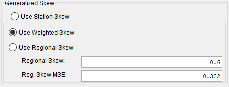
The Use Weighted Skew option requires the user to enter a generalized regional skew and a Mean-Square Error (MSE) of the generalized regional skew. This option weights the computed station skew with the generalized regional skew. The equation for performing this weighting can be found in Bulletin 17B (Equation 6). If a regional skew is taken from Plate I of Bulletin 17B (the skew map of the United States), the value of MSE = 0.302.
The last generalized skew option is Use Regional Skew. When this option is selected, the user must enter a generalized regional skew and an MSE for that skew. The program will ignore the computed station skew and use only the generalized regional skew.
EMA Data
When using the EMA | LogPearsonIII fitting method | distribution choice, additional data is required. This additional information includes perception thresholds and flow ranges. Every year in the analysis period must have perception thresholds and a flow range specified. The additional data that is required for use is accessed/input within the EMA Data tab. For further detail, see the EMA Data section within the Bulletin 17 Analysis chapter.
Tabular Results
The Tabular Results tab contains tables of results for the Analytical Frequency analysis. An example of the results tab is shown in Figure 9. Output on the Tabular Results tab consists of three tables: Frequency Curves, Distribution Parameters, and Events.
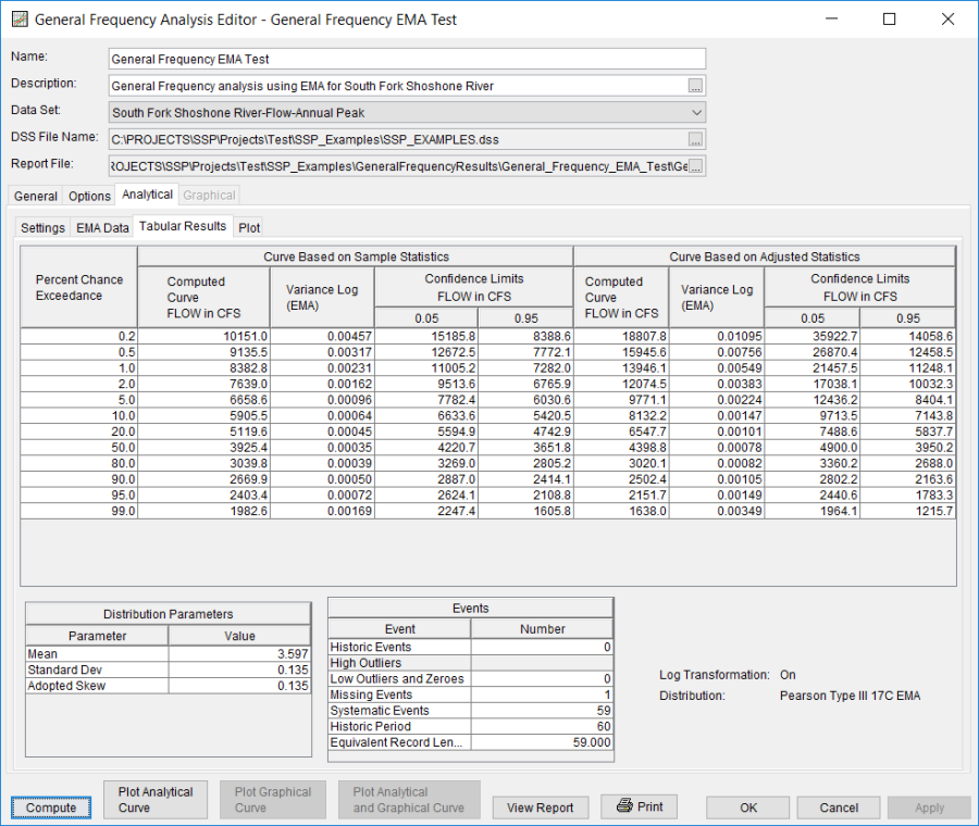
The Frequency Curve output table contains multiple columns. The left-most column contains the percent chance exceedance ordinates specified on the Options tab. Moving right, the next columns contain the computed frequency curve quantiles, and other information, if computed (i.e. expected probability curve, variance of each quantile, and the confidence limits). The right-most columns of the Frequency Curve output table contain a computed frequency curve (and other data) for an analysis based on user-adjusted statistics. User entered adjusted statistics are an option that the user can set on the Plot tab, which is discussed in detail in the next section of this manual. If the user has not entered adjusted statistics, then these columns will be empty. Data in the Frequency Curve table can be sorted in either ascending or descending order by clicking in the column header (two mouse clicks are required the first time). The percent chance exceedance ordinates and frequency curves will sort so that the lowest values are on top or the highest values are on top.
The Distribution Parameters table contains the parameters of the selected distribution achieved using the selected fitting method. For instance, if using the EMA | LogPearsonIII fitting method | distribution, the (in log space) mean, standard deviation, and station skew of the data, the user entered regional skew (if entered), weighted skew (weighted between station skew and regional skew), and the adopted skew for the analysis. Additionally, when using the EMA | LogPearsonIII fitting method | distribution, this table will also contain the EMA Estimate of MSE (G at site) and Grubbs-Beck Critical Value.
The Events table tabulates the number of historic events, high outliers (if using Product Moments | LogPearsonIII or Product Moments | PearsonIII), low outliers and zeroes, missing events, systematic events, the number of years in the historic period, and an equivalent record length in years (if using EMA | LogPearsonIII). Additionally, the lower right portion of the table will show if Log Transform is On or Off and which fitting method and analytical distribution was selected for the analysis.
The tabular results can be printed by using the Print button at the bottom of the Bulletin 17 Editor. When the print button is pressed, a window will appear giving the user options for how they would like the table to be printed.
Plot
In addition to tabular results, a Plot tab is available for viewing a graphical plot of both the computed frequency curve as well as a computed curve based on any user-adjusted statistics. When the Plot tab is selected the window will change to resemble Figure 10.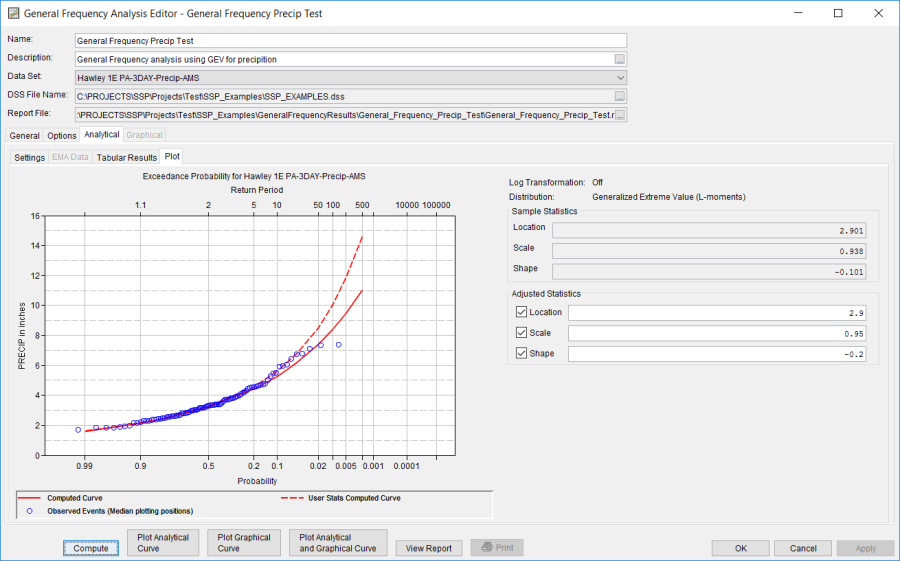
As shown in Figure 10, the plot contains the computed frequency curve, confidence limits (if computed), expected probability curve (if computed), and events plotted with the user selected plotting position. The computed statistics for the selected fitting method | distribution are shown in a table on the right side of the window. Below the computed statistics is a table labeled "Adjusted Statistics". There is a check box and a data entry field for the parameters of the distribution. The user can enter values into any or all of these fields. Turning on the check box then enables that field to be used in computing a curve with the user entered statistic overriding the computed value. The user statistics option allows the user to see how the curve would change if any or all of the statistics were different. When one or more check box is enabled and data is entered into the user statistics fields, the user must press the compute button again in order for the computations to be performed with the user entered statistics. After the compute button is pressed, both the plot and the table on the Tabular Results tab will be updated to reflect any user entered statistics.