In addition to an analytical frequency analysis, the user has the option to graphically fit a frequency curve to the data. A graphical curve can be very useful when the available analytical distributions do not provide a good fit. One example of when a graphical frequency analysis is more appropriate is when plotting a frequency curve for flow data that is downstream of a flood control reservoir. Analytical frequency distributions are often not appropriate for fitting flow data that is significantly regulated by upstream reservoirs. In general, a portion of the flow frequency data for a highly regulated stream will be very flat in the zone in which upstream regulation can control the flow. This type of data lends itself to a graphical fit.
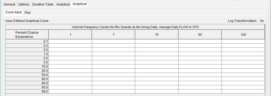
When the Graphical tab is selected on the Volume Frequency Analysis editor, the window will appear as shown in Figure 1. As indicated, two additional tabs will appear on the screen, Curve Input and Plot.

The user manually enters the frequency ordinates for all durations in the table on the Curve Input tab. As previously mentioned, the number of frequency ordinates and durations are set on the Options tab. The idea is to enter values in the table that will create a best fit line of the data, based on the user's judgment. Data entered in the graphical curve table will be plotted as a line in the graph on the Plot tab after the Compute button is pressed.
Plot
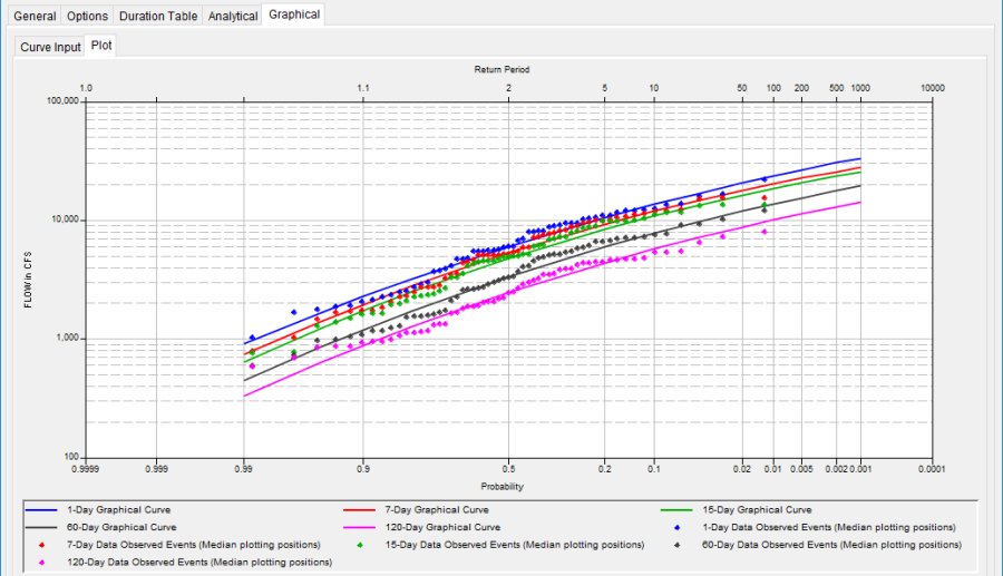
The graphical analysis Plot tab is available for viewing results, as shown in Figure 2. The results graph includes the historic annual maximum/minimum flows, plotted using the specified plotting position method, and the user-defined graphical curve, which was entered in the table on the Curve Input tab.
