Download PDF
Download page Managing Incoming CWMS Data.
Managing Incoming CWMS Data
The CWMS server is continually receiving flow, stage, reservoir, and other data at regular time intervals. Once received, the data are decoded and stored in the CWMS database on the server. The data are then transformed, validated, and stored back in the CWMS database.
Cumulus is the CWMS national gridded data service. It is a centralized web service that collects and archives real-time and forecast meteorological products (primarily precipitation, temperature, and snow) from the National Weather Service and other sources. Users can download data on-demand using the main Cumulus website and through the CAVI extract editor. Visit https://cumulus.corps.cloud/ for more information.
After configuring your Time Series Icons Layers, you can choose which data streams to monitor by selecting the appropriate layer group (flow, for example). The time series icons are available in the Acquisition, Visualization, and Setup modules in CWMS and provide access to functions related to the data streams. This includes acquiring, monitoring, validating, and editing data.
Acquiring Data
In the Acquisition tab, you can retrieve time-series data from gages. These data will typically include precipitation, river flows and stages, temperature, and reservoir releases and elevations. You can define a time window that is relative to the current time by setting look back and look ahead times (in days or hours). Or, you can view historical data by specifying a starting and ending date and time. The figure below shows an example time window being defined relative to current time.

Monitoring and Validating Data
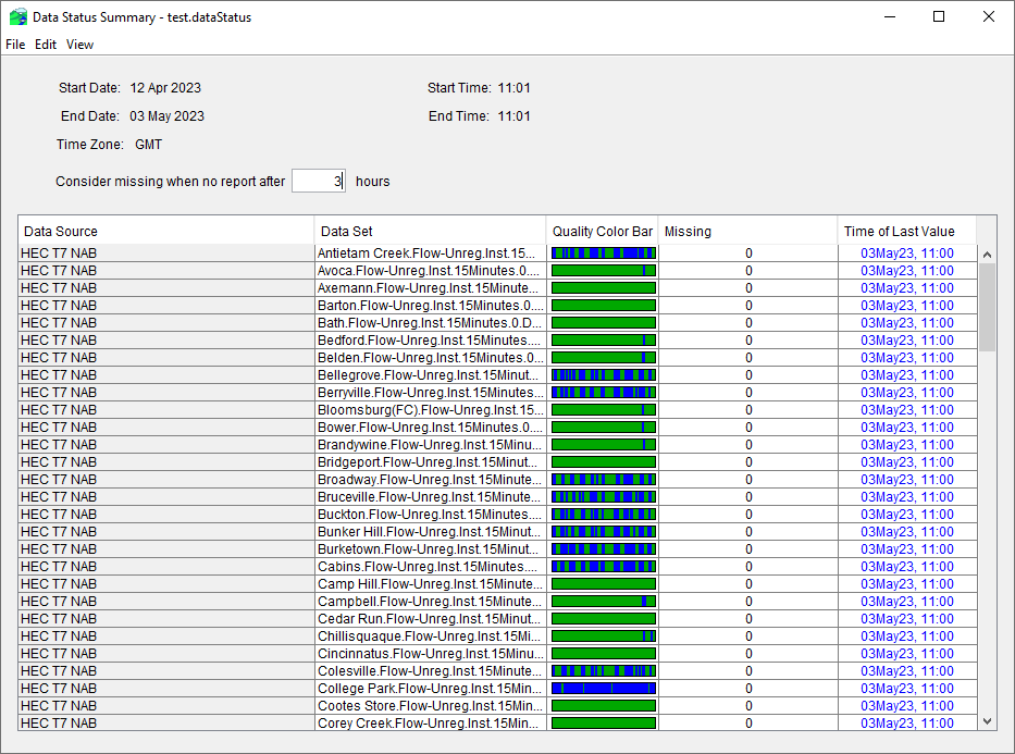
In the Acquisition tab, you can monitor and validate your time series data. Several tools are available to show the quality and quantity of the data. Quality color bars and thumbnail plots provide you with a quick overview of the acquisition processes by showing you the quality (missing values needing to be filled-in) and quantity (magnitude of data and possible data outliers) of your data.
If the quality color bar or thumbnail plot for a location indicates that the data are questionable, you can check the data using plots and tables.


You can use the Data Status Summary to view groups of data (e.g., all precipitation data or all flow data). You can also check the status of the data streams to see if they are active. Refer to Acquisition Module and Monitoring and Validating Incoming Data for more details.

Editing Data
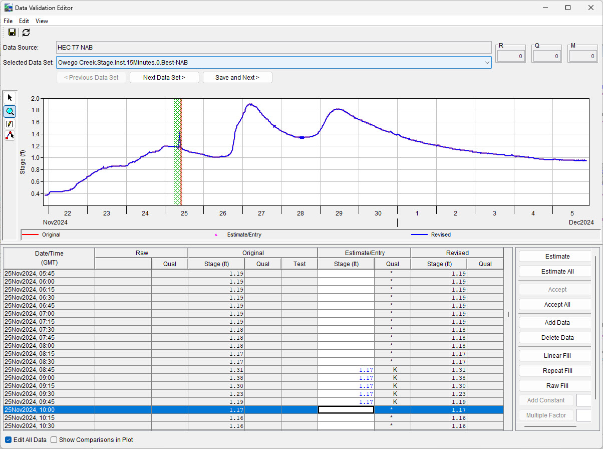
When you are checking the validity of data to verify its accuracy, you might need to edit questionable data and fill in missing data. You can use the Data Validation Editor in the Acquisition module to edit time series data.

You can use text-entry editing or graphical editing to make data revisions. This tool is also convenient for estimating values using the graphical editor or the table of data values when there are data gaps (i.e., missing data). After editing the data, you can choose to accept the changes and store the revised data values back to the CWMS database or HEC-DSS file. Refer to Data Validation Editor for additional details.
Visualizing Data
The Visualization tab allows you to view current conditions in your watershed and the associated hydrometeorological data in a georeferenced context (e.g., gridded precipitation) as shown in the figure below.

The animation controls allow you to view precipitation grids for the time window you have chosen in the Visualization module, and they function as you would expect the controls to work for a video player.

Similar to the quality color bars used in the Acquisition module, you can use threshold color bars in the Visualization module to compare current data against threshold values that you set for a location. For example, in the Acquisition module you may wish to display quality color bars to identify missing data, while in the Visualization module you may wish to use threshold color bars or thumbnail plots to understand your watershed’s hydrometeorological or operational conditions.
The upper left threshold color bar in the above figure shows red for the parts of the time window when a gage downstream of the reservoir exceeds an operational flow threshold. The other three threshold color bars display the times when key downstream gages exceed the NWS “monitor” stage (orange) or flood stage (red). You can also use thumbnail plots and tables to visualize your time-series data. The example figure above uses thumbnail plots to display hydrographs at gages upstream and downstream of the reservoir, and on a lateral branch of the river.
Refer to Visualization Module for additional details for more information.