Acquisition Module Overview
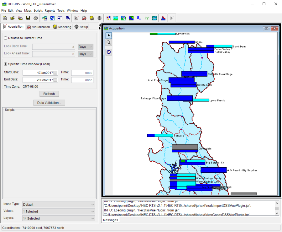
The Acquisition module (Figure 1) contains buttons that execute commands specific to data acquisition. These commands include setting up a time window, updating time series icons in the map window, and access to the Data Validation Editor. A detailed discussion of common screen components is presented in HEC-RTS Interface.

Menu Bar
The following is an overview of the menu bar (Figure 1) for the Acquisition module. The File, View, Maps, Scripts, Tools, Windows, and Help menus are discussed in HEC-RTS Interface. The commands available from the menus will facilitate the acquisition and management of time series data for a watershed.
| Edit | From this menu the user can edit color bar settings; access the Data Validation Editor; create a validation list from selected icon time series; and, delete validation lists. Available commands are: Icon Quality Colors, Data Validation, Create Validation List, and Delete Validation List. Note: For HEC-RTS, validation lists are not used, and the subject is not discussed in this User's Manual |
| Reports | From this menu the user can view the quality of data in the form of data status lists. The user can select from existing files of data status lists, or create new data status lists, and save the data status for future use. The only available command is Data Status Summary. |
Map Window
The Map Window (Figure 1) of the Acquisition module contains map layers and layers of time series icons that allow viewing of data acquisition processes in a geo-referenced context. The user can customize how time series icons appear according to the needs and objectives of the watershed being studied. For example, time series locations that need to be evaluated daily for an individual watershed may appear as quality color bars to facilitate quick review of data. On the other hand, the use of time series icons to monitor data provides space-conserving graphical images on the schematic. Customizing the time series icon layers is done in the Setup module (Time Series Icons Layers).
Quality color bars and/or thumbnail plots are normally used in the Acquisition module because these icons allow you to quickly scan the displayed gages and determine where problems may exist. Both icons can be set to update dynamically to reflect the relative quality of the data.
Time Series Icon Controls
The Time Series Icon Controls (Figure 2) allow you to select attributes for the time series icon layers that are displayed. The time series icon controls are located on the Acquisition tab near the bottom of the pane (Figure 1). There are three attributes available: Icons Type, Values, and Layers (Figure 2).
![]()
| Icons Type | forces all icons within a map window to display as the selected Icon Type in the list. Selecting the Default option in the list will display the icons as they were set originally in the Setup module (Time Series Icons). |
| Values | allows you to display the time series icon's data as labels, which display next to or on the location of their associated time series icons. For example, you can choose to display the data's total, minimum, and maximums values as labels. Multiple values can be selected at once. |
| Layers | allows you to select the sub-layers that are visible in the map window. Multiple layers can be selected at once. |
By selecting the attributes, you can change how time series icons are displayed within the Acquisition module. For more detailed information on how to configure the properties that control the threshold color bar icons displayed (Time Series Icons Layers).