Download PDF
Download page Flood Separation and Threshold Choice Workshop.
Flood Separation and Threshold Choice Workshop
Download workshop files
 Flood Separation and Threshold Choice Workshop.RPartialDurationHelper.R
Workshop Information
This workshop will explore the sensitivity of the analysis result to the choice of the threshold and the criteria for separating flood events. You will be working with daily average streamflow data for the San Lorenzo River near Big Trees, CA in Santa Cruz County. The San Lorenzo has a drainage area of 106 mi2 at this gage and drains into the Pacific Ocean at Santa Cruz. Site information including a location map is available on the USGS website: https://waterdata.usgs.gov/monitoring-location/11160500/

This workshop has three main steps and will use R to compute the results.
- Obtain the necessary streamflow data using the
dataRetrievalpackage to get the data used in fitting, and also support threshold choice - Test the sensitivity of threshold choice by comparing results for a few different techniques for estimating a threshold
- Test the sensitivity of flood separation choice by comparing results of a simple time separation, and a more advanced filter that requires a minimum recession between events
Task 1: Get Started and Obtain Data
For this workshop we will use daily-average flow data to get a long record of flows at the site. We might also consider using the same tools in R to get instantaneous flows, but that record is much shorter (and more dense, taking more time to download). We will also be downloading other supporting data to make modeling choices.
Open the Flood Separation and Threshold Choice Workshop.R script. The script contains all the tools you need to do the workshop and view results. However, you will need to specify some input values in key places to make it work. The workshop script will run the PartialDurationHelper.R script towards the beginning to add in a bunch of helpful functions but keep the main workshop script clean and organized. Save both of the scripts in the same folder.
The script is organized into sections corresponding to the steps below and should be organized in a way that you can run blocks chunk-by-chunk by highlighting them and either using the "Run" button above the script in RStudio, or by using the Ctrl+Enter combination.
Make sure you have your working directory set to the location where this script and the helper script both live.
Step 1: Install Packages
Packages can be installed using the package installation tool as described in Installing and Configuring R and RStudio. Use the package installation tool to install the following additional packages: tidyverse, dataRetrieval, POT, lmom, lmomco
If you completed the R/RStudio Crash Course Workshop, you will only need to install the POT package for this workshop since you previously installed the tidyverse and dataRetrieval packages.
Step 2: Download Daily Average Streamflow Data
On line 7, change the file directory in quotes to the location of the R scripts on your computer. In R, file paths are specified using the forward slash / (e.g. "C:/Projects/Scripts"). The source function causes R to accept input from the named file or URL provided to the function.
Execute the code on lines 1-8 first to load all the libraries that are going to be used in the code, and define some custom functions from the helper script. You can do this by highlighting all of that code and pressing CTRL+ENTER or using the Run button.
On line 10, add the site number in quotes to the right of siteNo (as shown on line 10 below). On the USGS webpage (https://waterdata.usgs.gov/monitoring-location/11160500/), check the start date and end date for the daily streamflow data. On line 12 enter the value of start.date as the beginning of the first full water year in yyyy-mm-dd format. On line 13, enter the value of end.date as the last date of the last full water year in yyyy-mm-dd format. Make sure you are bringing in only full water years.
Site Information
# Helper Script -----
source("<YOUR FILE DIRECTORY HERE>")

# Site Information -----
siteNo <- "11160500"
pCode <- "00060"
start.date <- "1936-10-01"
end.date <- "2022-09-30"
NWISSite <- readNWISsite(siteNo)The code beginning on line 19 uses the dataRetrieval::readNWISdv function to download the daily flow data directly from NWIS. Line 21 re-formats the data so it is readable. Line 23 creates a new dataframe that is formatted so that a partial duration series can be extracted using the POT package.
Execute the code on lines 11-25 to download and set up the data.
Step 3: Extract Annual Maximum Daily Flow Values
We will extract annual maximum daily flow values from the same record we will use for fitting the partial duration series. This means that the annual maximum series we create is an AMS of daily average flows, not instantaneous peaks.
Peak Flows
If we were using instantaneous flows for the partial duration series, we would download the peak flow data from USGS NWIS. This will let us get a minimum annual maximum value to use as a threshold. It is very easy to download this data using the dataRetrieval::readNWISpeak function.
The code block from lines 26-33 takes the daily flow values, computes the water year for each value, groups them by water year, and then finds the largest value in each group. Then it assigns a Weibull plotting position to each value. Select and run this code.
Step 4: Generate Diagnostic Plots
The code between lines 34-41 generates three important plots: the threshold-event tradeoff plot, the Pareto shape parameter plot, and the mean excess plot. On line 35, enter a value for low_testing_threshold that sets a lower value for starting the threshold testing. One good place to start is a number less than the minimum annual maximum value. Look at the annual maximum data in the df_for_ams data frame in RStudio by clicking on it in the Environment tab, this will open the data viewer. Columns of the data viewer can be sorted by clicking on the column header. On line 36, enter a value for high_testing_threshold that is a good high value to stop testing thresholds (something towards the high end of the annual maximum values is good). Execute the code for the block on lines 35-37.
QUESTION 1. On line 35, a default value for time separation is computed from the entered drainage area. What is the computed value, and where do you find that? Where does this formula come from?
The computed value is 10 days, and you can find that in the Environment in the upper right pane of RStudio as the variable default_days_between_events. The formula is the one that comes from the experiments in the back of Bulletin 17B as mentioned in the lecture. The function to compute this is in the PartialDurationHelper.R script.
We will use this default value of time separation for the time being and compute the diagnostic plots.
Run the code on line 38 to generate a tradeoff plot.
QUESTION 2. What is the significance of the horizontal line (drawn using the geom_hline() function)? What is the line's y-intercept? Hint: the function that draws this plot is in the PartialDurationHelper.R script and the line is drawn on line 56.
The line is at a value where the number of events equals the number of years, i.e. the mean rate is equal to 1 event per year. It crosses the y-axis at y=86, which is equal to the number of years in the instantaneous data (and can be seen in the years variable in the Environment in the upper right).

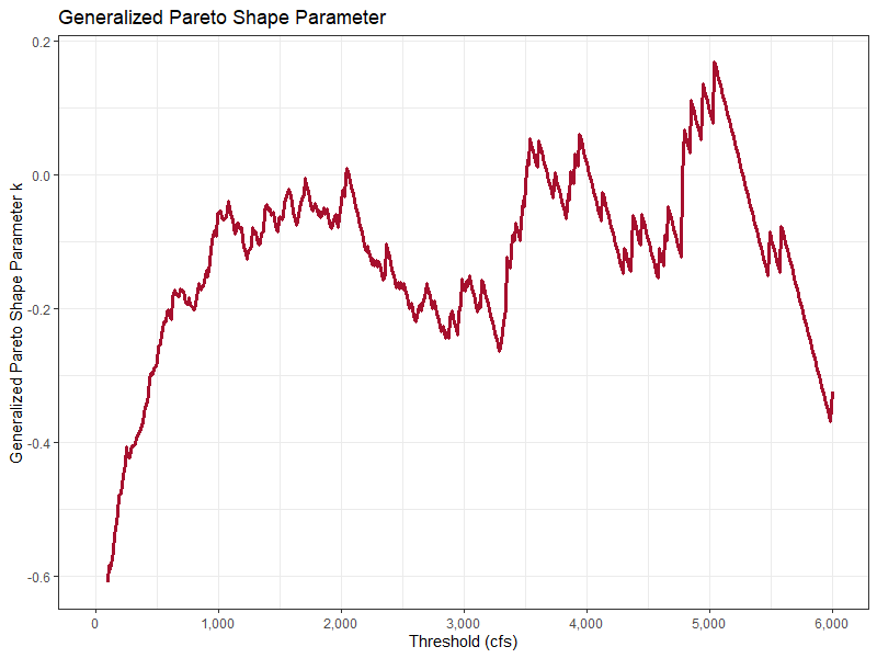
Run the code on line 39 to generate a Pareto shape parameter plot.
QUESTION 3. Based on what you see in this plot, what is a reasonable range to check for thresholds? How did you decide?
There is no consistent flat spot or trend in this plot, but the values sort of oscillate around k = -0.1 to 0 between thresholds of about 1,000 to 2,250 cfs and this might be a good place to start.
Run the code on line 40 to generate a mean excess plot.
QUESTION 4. Based on what you see in this plot, what is a reasonable range to check for thresholds? How did you decide?
The line consistently increases to a value of about 1,000 cfs threshold and then is more or less flat up to about 3,000 cfs with some noise before really taking off. This range seems reasonable, and is a little wider than what is in the shape plot but agrees fairly well.

Step 5: Download Flow Measurement Data
Another method to select a flow threshold is bankfull discharge. Often the easiest way to identify bankfull discharge is to look at a flow-stage curve (a rating curve) at a site and see where the relationship "breaks over," such as in the plot below:

Fortunately, it is easy to download USGS flow measurements using the dataRetrieval package and the readNWISmeas function. Measurements at the site go back to 1937 but the channel has changed significantly over time. We will limit the measurements to the last 10 years of data to look at the most recent conditions at the site. The code on lines 42-46 downloads the measurement data for the site number we entered earlier, and the specified time window (provided here for you to get the last 10 full water years worth of measurements). Run these lines to download the flow measurements, which we will use later.
Task 2: Test Threshold Sensitivity
For each of these steps, we will choose a simple flood separation criteria based on the \lceil 5+\ln(DA) \rceil rule.
Where does 5 + ln(DA) come from?
The \lceil 5+\ln(DA) \rceil computation is included in Appendix 14 of Bulletin 17 (1976) and Bulletin 17B (1982) to ensure independence between events.
Then, we will extract a partial duration series with various threshold choices, and compare the following properties of the partial duration series:
- Number of events
- Mean rate of events
- Mean excess (which expresses the average amount your PDS exceeds the threshold by)
- Generalized Pareto Distribution parameters
- Estimate of the 0.99 AEP event (using empirical annualization; see the Annualization Workshop for more details)
The code will also produce a plot of the fitted POT model against the PDS, and a timeseries plot comparing the daily average flows, the annual maximum series, and the PDS.
Step 6: Threshold from Diagnostic Plots
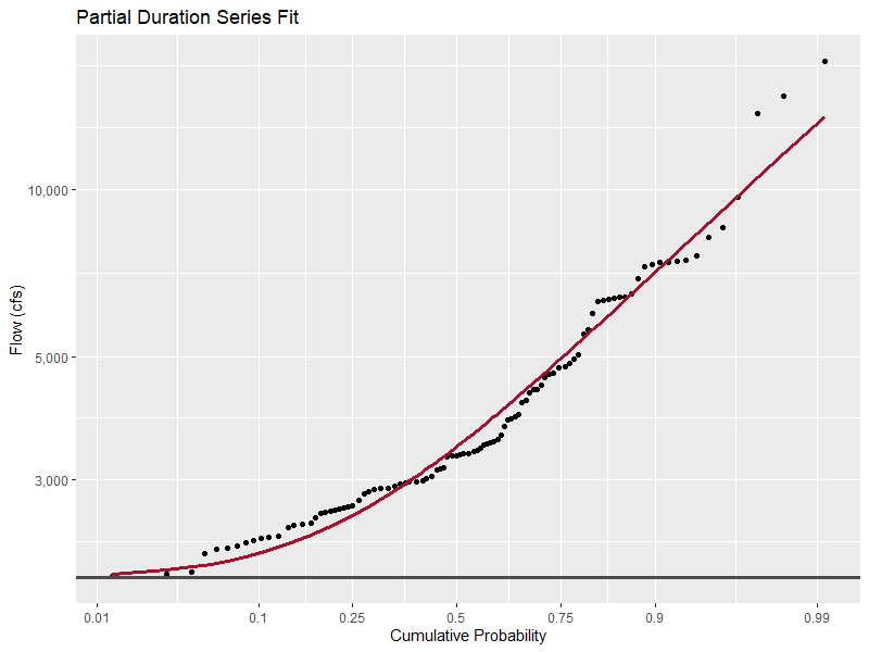
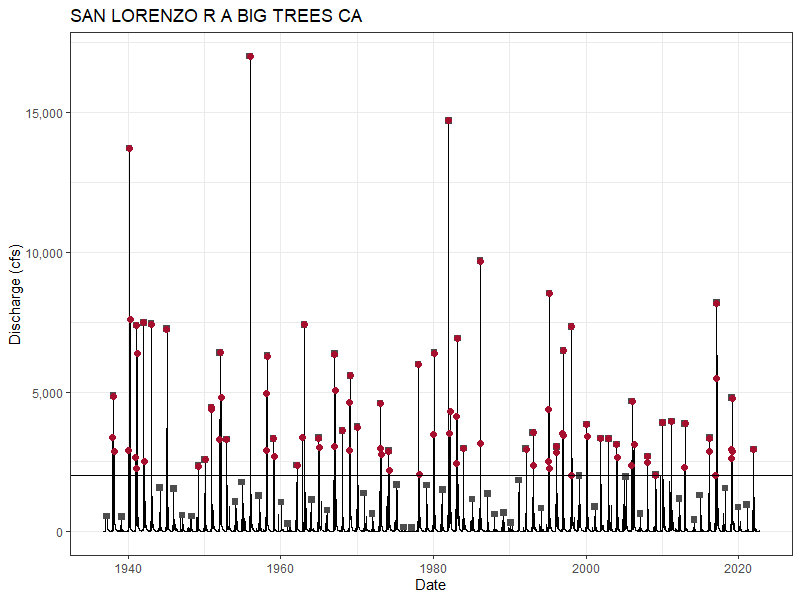
Choose a low and high plausible threshold value from the diagnostic plots. Enter the value of your low threshold on line 49 and your high threshold on line 56. If you run the code block from lines 48-54 it will produce a summary of the PDS with all the information we are looking for, plus a plot of the generalized Pareto distribution fit to the data, and a timeseries plot that has the daily average flow time series, the annual maximum daily average flows (as grey squares), the threshold (a black line) and the PDS (red circles). The code on lines 48-54 produces a summary for the low threshold, and the code on lines 55-61 will produce the summary for the high threshold. Note what your threshold choices are and the values for the five data summary items listed above, and look at the plots that are produced. Compare and contrast the results for these two threshold choices.
Using the diagnostic plots is a bit subjective, but solutions for plausible low and high values are below.
Low threshold: 1,000 cfs. This is the lower end of where both the shape plot and mean excess plot indicate stable behavior.
- Number of events: 157
- Mean rate: 1.83 events per year
- Mean excess: 2,300 cfs
- Generalized Pareto distribution parameters: location 1000; scale 2194; shape -0.046.
- Estimate of the 0.99 AEP event: 13,898 cfs


High threshold: 3,000 cfs. The shape plot isn't as stable in this range, but the mean excess plot looks ok up to 3,000 cfs (and slightly beyond).
- Number of events: 64
- Mean rate: 0.744 events per year
- Mean excess: 2,409 cfs
- Generalized Pareto distribution parameters: location 3000; scale 2007; shape -0.167.
- Estimate of the 0.99 AEP event: 15,640 cfs


The high threshold estimate results in a mean rate less than 1 event per year, which isn't a deal-breaker but is worth re-considering, especially if a review of the historical time series shows that flows less than this threshold are still important to capture and can happen multiple times per year, and this is more likely to happen than no significant floods in a year.
Step 7: Threshold at Bankfull Discharge
At many sites, bankfull discharge can be a useful starting estimate for a threshold that divides routine (in-channel) flows from flood flows. There are several ways to estimate the bankfull discharge. One way is to use regional regression equations to estimate bankfull channel geometry, and then use Manning's equation with some assumptions to back into a bankfull discharge. These values can be obtained from USGS StreamStats. Another way is to use flow measurements at the site and look for a break-over point in the rating curve. We will use the flow measurement data we downloaded from NWIS and try the second option. The block of code from lines 63-70 will plot the flow measurements we downloaded earlier and include a smoothing line to help visualize the results. Run them to produce a plot.

QUESTION 5. Can you estimate bankfull discharge for this gage from this plot? If so, what is its value? If not, why not?
For this site, the channel is deeply incised and the rating curve shows no signs of breakover - it is concave up across the entire range of discharges. There is no clear point where we could pick up an estimate for bankfull discharge based on the measurements.
In fact, there is a journal paper about this very site reaching the same conclusion: https://onlinelibrary.wiley.com/doi/10.1002/esp.5299 It remarks that only a couple of events have exceeded the bankfull stage in the record. Bankfull discharge will not be a useful tool to find a threshold here.
As an extra note, if you use the regional geomorphologic regression equations from StreamStats, it results in nonsensical geometry when solving for an equivalent trapezoidal shape.
In the event that you want to test an estimated value for bankfull discharge, you can enter it on line 71 and run the code on lines 71-72 to produce a PDS summary using that threshold.
Step 8: Threshold at Minimum Annual Maximum
Using the minimum annual maximum flow has two advantages; first, it is easy to compute, and second, it ensures all your AMS events are also in your PDS. However, it has some drawbacks. For ephemeral streams, or streams that have years during which no flows would be classified as floods, this can be a very poor threshold. Line 75 computes the minimum annual maximum daily flow from the values we extracted earlier, and lines 76-80 produces the summary data, fit plot, and timeseries plot for this threshold choice.
Note what your threshold is and the values for the five data summary items listed above, and look at the plots that are produced.
QUESTION 6. What is the primary issue with using the minimum annual maximum threshold for this specific site?
The threshold corresponding to the minimum annual maximum is 128 cfs. This is a very low threshold and indicates that this stream can experience prolonged periods of low flows and produce years where the largest flows are not floods. This value is well outside the range of the diagnostic plots and is likely to produce poor results.
- Number of events: 311
- Mean rate: 3.62 events per year
- Mean excess: 1,327 cfs
- Generalized Pareto distribution parameters: location 128; scale 566.9; shape -0.573.
- Estimate of the 0.99 AEP event: 27,965 cfs


The resulting fit has a very very heavy shape parameter and a resulting estimate for the 100-year flow that is extremely high. It also does not fit the data in the PDS very well.
Step 9: Threshold at 1 Event Per Year
Using 1 event per year as a criterion ensures that the sample size is the same between the PDS and the AMS. It doesn't have any special meaning beyond that, but is a useful guideline absent any other information. The code on line 82 produces a zoomed-in version of the threshold-count tradeoff plot in the range of 2,000 - 3,000 cfs so you can see where the 1 event per year line crosses the tradeoff line. Choose the largest threshold value that's on the intersection between the horizontal black line and the red tradeoff line (to the nearest 50 cfs is fine). Enter the threshold value on line 83.
QUESTION 7. How do you feel about the performance of the 1 event per year threshold at this site?
The threshold corresponding to 1 event per year is about 2,450 cfs. I chose the highest threshold in the flat spot of the threshold-event count tradeoff plot. In this situation, the 1 event per year criterion is not a bad choice when also considering the diagnostic plots.
- Number of events: 86
- Mean rate: 1.0 events per year
- Mean excess: 2,279 cfs
- Generalized Pareto distribution parameters: location 2450; scale 1900; shape -0.166.
- Estimate of the 0.99 AEP event: 15,580 cfs


These results are not significantly different than the "high threshold" estimate above even with 24 additional events in the sample. This is a good sign that the results are relatively insensitive to threshold choice in this range. This is a very good fit to the data and produces quite reasonable results. This won't always work everywhere, especially in places where the variation in count per year in the PDS is significant, but is always worth a check.
Task 3: Test Separation Criteria
Here, we will choose a constant threshold value and test the methods we use to separate out independent flood events. First we will use a simple time-based separation criterion with a small and a large value of separation (we have already tested the drainage-area based guideline as one point). Then, we will use a more advanced separation technique that requires the flow between adjacent events to recede beneath a threshold.
Step 10: Get a Baseline
First, we will set a control for the next few tests. We will get a summary for the default time separation criteria (10 days computed using the \lceil 5+\ln(DA) \rceil rule) and a threshold of 2,000 cfs. The code block from lines 89-96 will compute a summary and generate plots for this "default" case that we will use for the baseline. Note the summary values and look over the plots after running this code.
2,000 cfs is in the middle of the "stable" range for the shape plot and mean excess plot and should produce a similar result to other thresholds in this region.
- Number of events: 99
- Mean rate: 1.15 events per year
- Mean excess: 2,402 cfs
- Generalized Pareto distribution parameters: location 2000; scale 2310; shape -0.0385.
- Estimate of the 0.99 AEP event: 14,014 cfs


Lowering the threshold from the 1 event per year range actually flattened the frequency curve (see the increase in shape parameter and decrease in estimate of the 1% flood).
Step 11: Time-Based Separation
We will test two additional separation durations: 3 and 21 days, and see how the results change (holding the threshold constant at 2,000 cfs). The code block from lines 97-103 will summarize the 3-day condition, and lines 104-110 for the 21-day separation. Run both of these blocks and compare the results.
3 days is quite short, much less than our standard rule (which produces spacings of 10 days). 21 days is long and would provide good assurance of event independence, but may discard some secondary peaks that are in fact independent.
3 days
- Number of events: 115
- Mean rate: 1.34 events per year
- Mean excess: 2,025 cfs
- Generalized Pareto distribution parameters: location 2000; scale 2025; shape -0.0734.
- Estimate of the 0.99 AEP event: 13,916 cfs

Note how tightly some of the events are clustered together in the PDS. This also dropped the mean excess quite a bit, meaning at a given threshold there are more events closer to the threshold than before.
21 days
- Number of events: 74
- Mean rate: 0.860 events per year
- Mean excess: 2,884 cfs
- Generalized Pareto distribution parameters: location 2000; scale 3237; shape 0.122.
- Estimate of the 0.99 AEP event: 13,108 cfs


This clearly separates clusters and cuts out quite a few events near the threshold (the mean excess increases quite a bit). Additionally, there is a variance-skew tradeoff here, where the scale parameter of the distribution leaps up and the tail thins out. By increasing the time separation criterion, the shape parameter changed from negative to positive, which implies an upper bound on the distribution. Note how there is a second inflection in the distribution around 0.9 on the CDF where the curve turns concave down.
Step 12: Time-Based Separation with Recession
Finally, we will test the effect of separating events not only by time, but also by requiring that flow goes below a certain recession threshold between events in order for them to be considered independent. Here is a link to the USGS daily flow page for this gage showing the wet part of WY1982 which had a number of large peaks: https://waterdata.usgs.gov/nwis/dv?cb_00060=on&format=gif_default&site_no=11160500&legacy=&referred_module=sw&period=&begin_date=1981-12-01&end_date=1982-05-01 Take a look at the behavior of the hydrograph between the peaks. The recession is based on how high the prior peak is and how much time has passed. We will try a couple of recession thresholds based on this plot, a higher (more permissive) threshold at 500 cfs, and a lower (less permissive) one at 100 cfs, and also combine the 500 cfs threshold with a shorter time separation criteria to reduce the influence of timing in favor of the recession threshold. The code block from lines 111-117 will use the defaults with a 500 cfs minimum recession, lines 118-123 uses the default threshold, 3 day separation, and a 500 cfs minimum recession, and lines 124-129 runs with the default threshold, 3 day separation, and 100 cfs minimum recession. Identify the differences between these three choices and the baseline model we started with.
500 cfs is enough for many of the largest peaks to be captured without any fear of ruling them out due to a lack of recession. 100 cfs really tightens the criteria to make sure the flow has probably returned to baseflow (or at least very close to it). The first uses the default 10 day spacing computed from the simple rule, the second and third use a reduced minimum spacing of 3 days. All three use the default threshold of 2,000 cfs.
500 cfs
- Number of events: 94
- Mean rate: 1.09 events per year
- Mean excess: 2,431 cfs
- Generalized Pareto distribution parameters: location 2000; scale 2313; shape -0.0486.
- Estimate of the 0.99 AEP event: 14,180 cfs


500 cfs with 3 day spacing
- Number of events: 99
- Mean rate: 1.15 events per year
- Mean excess: 2,355 cfs
- Generalized Pareto distribution parameters: location 2000; scale 2237; shape -0.0501.
- Estimate of the 0.99 AEP event: 13,974 cfs

100 cfs with 3 day spacing
- Number of events: 62
- Mean rate: 0.721 events per year
- Mean excess: 2,901 cfs
- Generalized Pareto distribution parameters: location 2000; scale 2794; shape -0.0369.
- Estimate of the 0.99 AEP event: 14,929 cfs


The very low recession threshold, 100 cfs, reduces the number of events very close to the POT threshold, raising the mean excess quite a bit. The shorter spacing does increase the number of events between the two 500 cfs recession threshold PDS but only by 5 events. 100 cfs is probably too restrictive since some very large secondary peaks get dropped. Some combination of a reasonable time spacing and recession threshold is probably the safest bet.