Download PDF
Download page Viewing and Printing Bulletin 17 Analysis Results.
Viewing and Printing Bulletin 17 Analysis Results
The user can view output from the flow frequency analysis directly from the Bulletin 17 Editor. The output consists of tabular results, various plots, and a report documenting the data and computations which were performed.
Tabular Output
Once the computations for the flow frequency analysis are completed, the user can view tabular output by opening the Tabular Results tab. When this tab is pressed, the results will be displayed as shown in Figure 1.

Output on the results tab consists of three tables: Frequency Curves, Distribution Parameters, and Events. The Frequency Curve output table contains the percent chance exceedance ordinates, the computed Log Pearson III frequency curve quantiles, the expected probability adjusted frequency curve quantiles (if selected on the General tab), the variance of each quantile (if using 17C EMA), and the computed confidence limits (0.05 and 0.95, by default). Data in the frequency curve table can be sorted in either ascending or descending order by clicking in the column header (two mouse clicks are required the first time). The percent chance exceedance ordinates and frequency curves will sort so that the lowest values are on top or the highest values are on top.
The Distribution Parameters table contains (in log space) the mean, standard deviation, and station skew of the data, the user entered regional skew (if entered), weighted skew (weighted between station skew and regional skew), and the adopted skew for the analysis. This table also contains the EMA Estimate of mean square error (at-site skew) and Grubbs-Beck Critical Value.
The Events table tabulates the number of historic events, high outliers (if using 17B Methods), low outliers and zero flows, missing values, systematic events, the number of years in the historic period, and an equivalent record length (ERL) in years (if using 17C EMA).
More information pertaining to ERL computations can be found here. Additional ERL computation output can be found within the Report file.
The tabular results can be printed by using the Print button at the bottom of the Bulletin 17 Editor. When the print button is pressed, a window will appear giving the user options for how they would like the table to be printed.
Graphical Output
Graphical output of the frequency curves can be obtained by pressing the Plot Curve button. When the Plot Curve button is pressed, a frequency curve plot will appear in a separate window as shown in Figure 2. The user can modify the plot properties by selecting the Edit | Plot Properties menu option. A plot properties window will open that lets the user change the line style for each data type, change the axis labels, modify the plot title, and edit other plot properties. The user can also edit line styles by placing the mouse on top of the line or data point in the plot or legend and clicking the right mouse button. Then select the Edit Properties menu option in the shortcut menu. Both the Y and X-axis properties can be edited by placing the mouse on top of axis and clicking the right mouse button. Then select the Edit Properties menu option in the shortcut menu. For example, the user can turn on minor tic marks for the y-axis and modify the minimum and maximum scale for the x-axis.

The data contained within the plot can also be tabulated by selecting Tabulate from the File menu. When this option is selected, a separate window will appear with the data tabulated. The Edit menu on the graphic window contains several options for customizing the graphic. These options include Plot Properties, Configure Plot Layout, Default Line Styles, and Default Plot Properties. Also, a shortcut menu will appear with further customizing options when the user right-clicks on a line on the graph or the legend.
The code used in developing the plots in HEC-SSP is the same as that which is used for developing graphics in HEC-DSSVue and several other HEC applications. Please refer to the HEC-DSSVue Documentation for details on customizing plots.
Variable Time Window Results
If either the Compute Using Moving Window or Compute Using Expanding Window options were selected on the Options tab and a compute has been successfully completed, the Variable Time Window Results tab will become active. When this tab is pressed, the results will be displayed as shown in Figure 3.
The variable time window option is a way to explore how individual flood peaks impact a flow-frequency analysis as well as the parameters of the Log Pearson Type III Distribution. An example application of the Variable Time Window option can be found here.
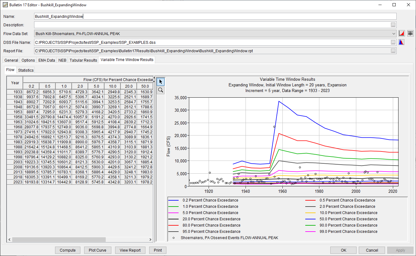
Two sub-tabs are contained within the Variable Time Window Results tab: Flow and Statistics.
Flow
Output on the Flow tab consists of a table of computed quantiles for each time window and output frequency ordinate as well as a plot of the results.
The user can double left-click the chart to create a separate window containing the plot. Colors, symbols, and various chart properties can then be edited.
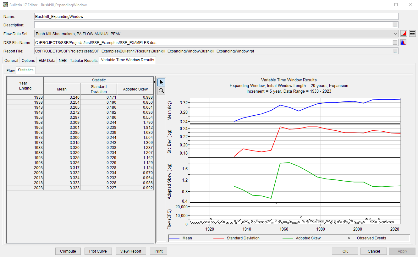
Statistics
Output on the Statistics tab consists of a table of computed mean, standard deviation, and skew for each time window as well as a plot of the results, as shown in Figure 4.
Viewing the Report File
When the Bulletin 17 computations are performed, a report file documenting the statistical computations is created. The report file lists all of the input data and user settings, plotting positions of the data points, intermediate results, each of the various statistical tests performed (i.e. high and low outliers, historical data, etc…), and the final results. This file is often useful for understanding how the software arrived at the final frequency curve.
Press the View Report button at the bottom of the Bulletin 17 Analysis editor to view the report file. When this button is pressed a window will appear containing the report as shown in Figure 5.

Viewing Results of Multiple Analyses
Plots, tables and reports can also be created for several analyses at the same time by selecting options from the Results menu.
At least one Bulletin 17 Analysis must be selected in the study explorer before selecting one of the options on the Results menu.
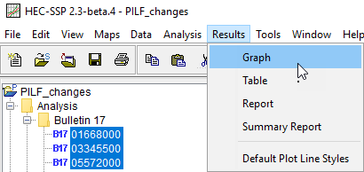
Graph
The Results | Graph menu option, as shown within Figure 6, can be used to plot many Bulletin 17 analyses in a single graph, as shown in Figure 7.

Curves can be highlighted within these plots by clicking on the corresponding legend items. Also, individual items can be hidden, edited, and/or removed by right clicking on the item of interest and selecting the corresponding option.
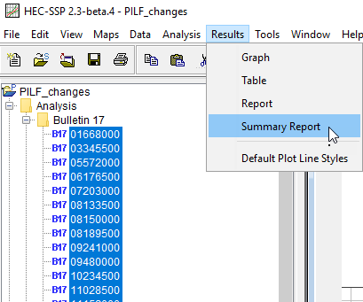
Summary Report
The Results | Summary Report menu option, as shown within Figure 8, will create a summary table of statistics and frequency curve ordinates for the selected analyses, as shown in Figure 9. The Summary Table contains the following information:
- A Summary Statistics table containing mean, standard deviation, at-site skew, regional skew, weighted skew, adopted skew, # of historical events, high outliers (if using 17B Methods), low outliers, zero/missing flows, systematic events, historical period, skew MSE, ERL, and Multiple Grubbs-Beck threshold
- A Frequency Curve Ordinates table containing the computed curves
- A Upper Confidence Limit Ordinates table containing the upper confidence limits
- A Lower Confidence Limit Ordinates table containing the lower confidence limits
- A Variance Ordinates table containing quantile variances (if using 17C EMA)