Download PDF
Download page Acquisition Module Overview.
Acquisition Module Overview
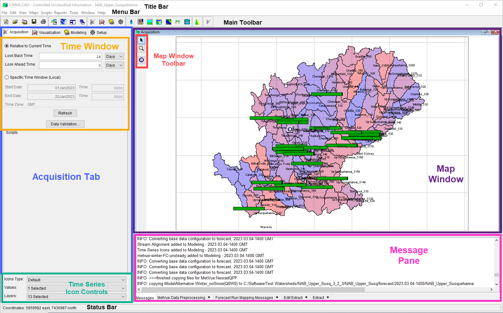
The Acquisition module provides tools to monitor and validate incoming data. The map window and components of the Acquisition module are illustrated in the figure below. A detailed discussion of common screen components is presented in Overview of the CWMS Interface.

Menu Bar
The following is an overview of the menu bar when the Acquisition module is active. The File, View, Maps, Scripts, Tools, Windows, and Help menus are discussed in Overview of the CWMS Interface. The commands available from the menus will facilitate the acquisition and management of time-series data for a watershed.
- Edit Menu
- Icon Quality Colors - edit the icon color bar settings
- Data Validation - graphically edit and validate data sets
- Create Validation List - create a new data validation list
- Delete Validation List - delete a current data validation list
- Data Exchange in the CWMS Database - configure data exchange sets for the CWMS database
- Reports Menu
- Data Status Summary - view the status of time series data
Commands
The Acquisition tab contains buttons that execute commands specific to the Acquisition module. These Refresh button updates time series icons in the map window based on changes made to the time window settings. The Data Validation button opens the Data Validation Editor (further details are available in Data Validation Editor).
Map Window
The Map Window of the Acquisition module contains map layers and layers of time series icons that allow you to view data acquisition processes in a georeferenced context. You can customize how time series icons appear according to your needs and objectives. For example, time series locations you evaluate daily for an individual watershed may appear as quality color bars to facilitate quick review of incoming data. On the other hand, you might wish time series icons to display as space-conserving graphical images or dots if you are monitoring data acquisition for an entire office. You can customize the time series icon layers through the Setup module (Time Series Icons).
Quality color bars and/or thumbnail plots are normally used in the Acquisition module because these icons allow you to quickly scan the displayed gages and determine where problems may exist. Both of these icons can be set to update dynamically to reflect the relative quality of the incoming data.
Time Series Icon Controls
The Time Series Icon Controls allows you to select attributes for the time series icon layers that are displayed. The time series icon controls are located on the Acquisition tab near the bottom of its pane. There are three attributes available: Icons Type, Values, and Layers.
![]()
- Icons Type - Forces all icons within the map window to display as the selected Icon Type in the list. Selecting the Default option in the list will display the icons as they were set originally in the Setup module.
- Values - Allows you to display the time series icon's data as labels, which display next to or on the location of their associated time series icons. For example, you can choose to display the data's total, minimum, and maximums values as labels. Multiple values can be selected at once.
- Layers - Allows you to select the sub-layers that are visible in the map window. Multiple layers can be selected at once.
By selecting the attributes, you can change how time series icons are displayed within the Acquisition module. For more detailed information on how to configure the properties that control the threshold color bar icons displayed, see Time Series Icons Layers.